Mixed Effects
Misc
- Packages
- {modeldiagramR} - Generate Model Diagrams for Linear Mixed Effect Models
- Papers
{ggplot2}
Example 1: Fixed Effect + Varying Intercepts
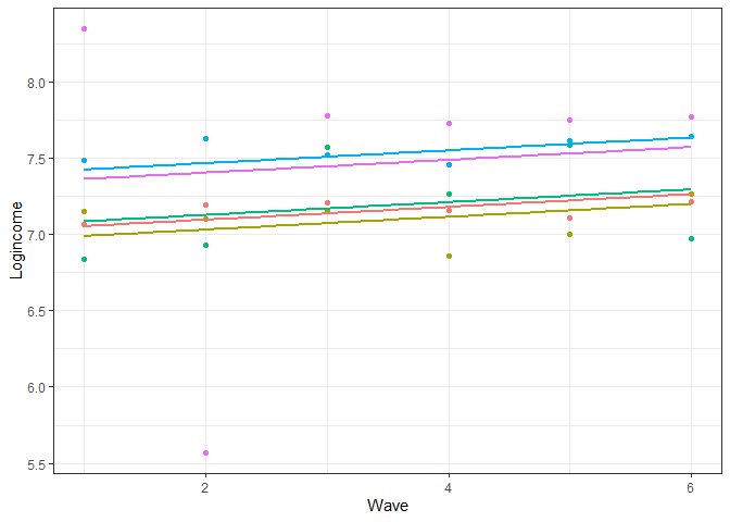
usl$pred_m1 <- predict(m1) usl %>% filter(pidp %in% 1:5) %>% # select just five individuals ggplot(aes(wave, pred_m1, color = pidp)) + geom_point(aes(wave, logincome)) + # points for observed log income geom_smooth(method = lm, se = FALSE) + # linear line showing wave0 slope theme_bw() + labs(x = "Wave", y = "Logincome") + theme(legend.position = "none")- Model from Mixed Effects, General >> Examples >> Example 1
- wave was indexed to 0 for the model but now wave starts at 1. He might’ve reverted wave to have a starting value of 1 for graphing purposes
- Lines show the small, positive, fixed effect slope for wave0
- Parallel lines means we assume the change in log income over time is the same for all the individuals
- i.e. We assume there is no between-case variation in the rate of change.
Example 2: Varying Slopes and Intercepts
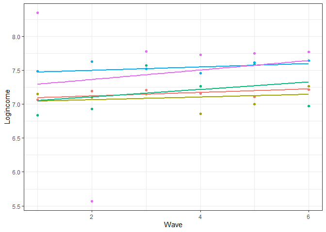
usl$pred_m2 <- predict(m2) usl %>% filter(pidp %in% 1:5) %>% # select just two individuals ggplot(aes(wave, pred_m2, color = pidp)) + geom_point(aes(wave, logincome)) + # points for observed logincome geom_smooth(method = lm, se = FALSE) + # linear line based on prediction theme_bw() + # nice theme labs(x = "Wave", y = "Logincome") + # nice labels theme(legend.position = "none")- Model from Mixed Effects, General >> Examples >> Example 1
- Different slopes for each person
{ggeffects}
Example 1: {ggeffects} Error Bar Plot
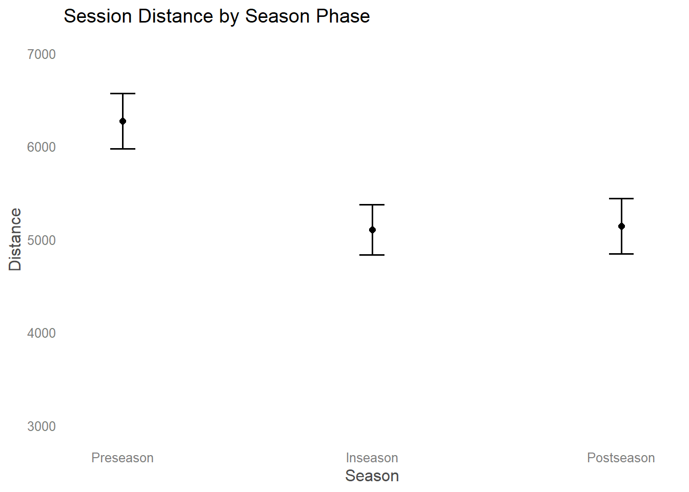
library(ggeffects); library(ggplot2) # create plot dataframe # Has 95% CIs for fixed effects and lists random effects plot_data <- ggpredict( fit, terms = c("Season") ) #create plot plot_data |> #reorder factor levels for plotting mutate( x = ordered( x, levels = c("Preseason", "Inseason", "Postseason") ) ) |> #use plot function with ggpredict objects plot() + #add ggplot2 as needed theme_blank() + ylim(c(3000,7000)) + ggtitle("Session Distance by Season Phase")- Description:
- Outcome: Distance
- Fixed Effect: Season
- Random Effect: Athlete
- Description:
{merTools}
Example 1: Visualize Random Effects]
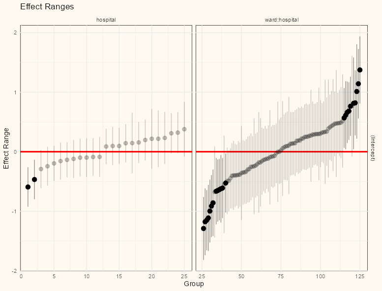
library(merTools) REsim(mod_stress_nested) |> plotREsim() + theme_notebook()- Model from Mixed Effects, General >> Examples >> Example 3
- The visual makes it apparent there’s much more variance in the random effects for ward than there is for hospital.