General
Misc
- First contact with an unfamiliar database
- select * from limit 50
- Look for keys/fields to connect tables
- Make running list of Q’s, try to answer them by poking around first
- Find team/code responsible for DB and ask for time to review questions – communication can be a superpower here!
- Use domain knowledge to assess peculier relationships
- Example: Is there a nonlinear relationship between Driver hours and Incentive Level
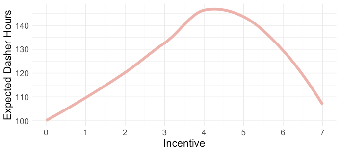
- Common sense says if we raise payment bonuses, we should see more drivers want to work more hours.
- Reason behind the relationship shown in this chart is omitted variables: weather and holiday.
- Incentives stop having an effect on drivers because they hate going out in shitty weather and want to stay home with their family on the holidays.
- Example: Is there a nonlinear relationship between Driver hours and Incentive Level
Basic Cleaning
- Tidy column names
- Shrink long column names to something reasonable enough for an axis label
- Make sure continuous variables aren’t initially coded as categoricals and vice versa
- Make note of columns with several values per cell and will need to be separated into multiple columns (e.g. addresses)
- Find duplicate rows
- See
- These can cause data leakage if the same row is in the test and train sets.
- Make a note to remove columns that the target is a function of
- e.g. Don’t use monthly salary to predict yearly salary
- Remove columns that occur after the target event
- e.g. Using info occurring in or after a trial to predict something pre-trial
- You won’t have this info beforehand when you make your prediction
- e.g. Using info occurring in or after a trial to predict something pre-trial
- Ordinal categorical
Reorder by a number in the text (parse_number)
mutate(income_category = fct_reorder(income_category, parse_number(income_category)),
      # manually fix category that is still out of order
      # moves "Less thatn $40K" to first place in the levels
      income_category = fct_relevel(income_category, "Less than $40K"))
Packages
- Comparisons
- Exploratory Data Analysis in R (also includes basic usage code)
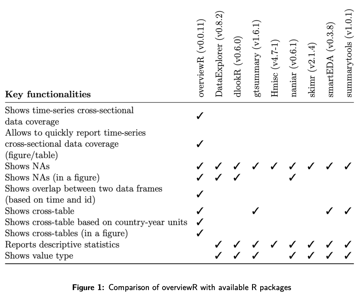
- Exploratory Data Analysis in R (also includes basic usage code)
- Fast Plotting
- Base R
coplotcan be used for quick plots of all combinations of categorical and continuous variables for up to 4 variables - {ggauto} - Automatically create an appropriate ggplot2 chart type based on the classes of the provided variables.
- {ggstatsplot} - Difference in means tests (parametric, nonparametric), two sample tests, robust options
- {ggpmisc} - Nice correlation, line fitting functions, mean difference tests (only parametric currently)
- {tinyplot} - Fast group by and facetting via formula
- See Continuous Predictor vs Outcome >> Continuous Outcome
- See Categorical Predictor vs Outcome >> Continuous Outcome
- See Geospatial,, Spatial Weights >> Diagnostics >> Connectedness >> Example
- {tidyplots} (Gallery) - Fast plots w/annotations, heatmaps, mean difference tests, beeswarm boxplots.
add(ggplot2::geom_text())can be used to add any ggplot2 feature not included in the package- I also think that a
+on the final tidyplots function and then adding a ggplot function will work. At least this works withtheme. Theaddfunctionality may be if you want to add a ggplot function in between two tidyplot functions.
- I also think that a
- See Geospatial, Spatial Weights >> Diagnostics >> Connectedness >> Example 2
- Base R
- Reports
- {AssumpSure} - A user-friendly R Shiny application that helps researchers validate statistical assumptions and select appropriate tests before analysis, ensuring valid, transparent, and reproducible results.
- {dataexplorer}
Report
create_report(airquality) create_report(diamonds, y = "price") # specify response variable- Runs multiple functions to analyze dataset
- {dataxray} - Table with interactive distributions, summary stats, missingness, proportions. (dancho article/video)
- {explore} - Interactive data exploration or automated report
explore- If you want to explore a table, a variable or the relationship between a variable and a target (binary, categorical or numeric). The output of these functions is a plot (automatically checks if an attribute is categorical or numerical, chooses the best plot-type and handles outliers).describe- If you want to describe a dataset or a variable (number of na, unique values, …) The output of these functions is a text.explain- To create a simple model that explains a target.explain_tree()for a decision tree,explain_forest()for a random forest andexplain_logreg()for a logistic regression.report- To generate an automated report of all variables. A target can be defined (binary, categorical or numeric)abtest- To test if a difference is statistically significant
- {Hmisc::describe}
Example
sparkline::sparkline(0) des <- describe(d) plot(des) # maybe for displaying in Viewer pane print(des, 'both') # maybe just a console df of the numbers maketabs(print(des, 'both'), wide=TRUE) # for Quarto- “both” says display “continuous” and “categorical”
- “continuous”
.png)
- “categorical”
.png)
- Columns (from Hmisc Ref Manual)
- Info - Says how informative your discrete outcome variable is. Its how statistically efficient (i.e. informative quality given your sample size) as compared to if it was a continuous variable. (For more details, see Stack Exchange)
Helps you derive the sample size needed to have a reliable model or to achieve a certain statistical power for a certain comparison. (See first example)
- If there is significant measurement error in Y, efficiency and effective sample size will be lower than what Info indicates.
Formula
\[\text{Info} = \frac{1 - \frac{1}{n^3}\sum_{i=1}^k n_i^3}{1-k^2}\]
Range: [0,1]
- 0 says not informative and has the worst possible statistical efficiency (e.g. binary outcome variable with no events — straight zeros, homey)
- The lowest information comes from a variable having only one distinct value following by a highly skewed binary variable.
- 1 says as informative as a continuous variable with no ties in the data
- 0 says not informative and has the worst possible statistical efficiency (e.g. binary outcome variable with no events — straight zeros, homey)
Examples
- A very imbalanced binary \(Y\) may have Info of 0.2 indicating roughly speaking that you could achieve the same statistical efficiency and power from a continuous \(Y\) with only 20% of the sample size
- An ordinal \(Y\) with 5 well-populated levels may have an Info of 0.98 which indicates that it almost has the same statistical information (especially for the purpose of studying associations with other variables) as a truly continuous \(Y\) with no ties.
- Binary Splits (Harrell):
- Split at the median \(\rightarrow\) a minimum of a 20% information loss
- Split at 10th percentile \(\rightarrow\) a minimum of a 70% information loss
- Mean and Sum (Binary): The sum (number of 1’s) and mean (proportion of 1’s)
- Gini \(|\Delta|\) is the Gini Mean Difference which is a robust substitute for standard deviation. (See Feature Engineering, General >> Transformation >> Standardization)
- Info - Says how informative your discrete outcome variable is. Its how statistically efficient (i.e. informative quality given your sample size) as compared to if it was a continuous variable. (For more details, see Stack Exchange)
- {GWalkR} - Tableau style spreadsheet and chart builder
- Lux - Jupyter notebook widget that provides visual data profiling via existing pandas functions which makes this extremely easy to use if you are already a pandas user. It also provides recommendations to guide your analysis with the intent function. However, Lux does not give much indication as to the quality of the dataset such as providing a count of missing values for
- {pandas_profiling} - Produces a rich data profiling report with a single line of code and displays this in line in a Juypter notebook. The report provides most elements of data profiling including descriptive statistics and data quality metrics. Pandas-profiling also integrates with Lux.
- {pointblank::scan_data}, {pointblank::col_summary_tbl}, {pointblank::missing_vals_tbl}
scan_dataoutputs a throrough EDA report either through viewer/browser or exported to a HTML file.section = “OVICMS” (default) says what information to include in the report
- “O”: “overview”
- “V”: “variables”
- “I”: “interactions”
- “C”: “correlations”
- “M”: “missing”
- “S”: “sample”
Some dropdowns in the report include plots (e.g. histograms for categorical variables)
Just printing the ptblank_tbl_scan class object (e.g. tbl_scan in example) will render the report in the
- Seems to work better when viewed in a browser window
Example: Export to file
tbl_scan <- scan_data(tbl = dplyr::storms, sections = "OVS")

# Write to an HTML file
export_report(
  tbl_scan,
  filename = "tbl_scan-storms.html"
)
- {skimr} - Overall summary, check completion percentage for vars with too many NAs
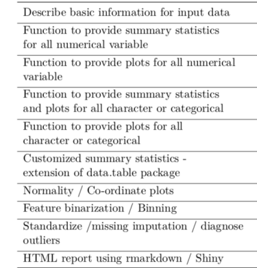
- {smartEDA} - Helps in getting the complete exploratory data analysis just by running the function instead of writing lengthy r code
- {sweetviz} - Provides a comprehensive and visually attractive dashboard covering the vast majority of data profiling analysis needed. This library also provides the ability to compare two versions of the same dataset which the other tools do not provide.
- {trelliscope} - Quick, interactive, facetted pairwise plots, built with JS
- {visdat} has decent visualization for group comparison, missingness, correlation, etc.
- {ydata-profiling} - Data profiling, automates, and standardizes the generation of detailed reports, complete with statistics and visualizations
Missingness
Also see
- Missingness
- Model Building, tidymodels >> Recipe >> Imputation
Packages
- {naniar} - Tidy ways to summarize, visualize, and manipulate missing data with minimal deviations from the workflows in ggplot2 and tidy data
- {mde} - Functions for percentage stats and various preprocessing (group) actions (e.g. dropping, recoding, etc.)
- {qreport} - Harrell package
- A few of the charts aren’t intuitive and don’t have good documentation in terms of explaining how to interpret them.
- Fits an ordinal logistic regression model to describe which types of subjects (based on variables with no NAs) tend to have more variables missing.
- Hierarchically clusters variables that have similar observations missing
- See naclus docs, RMS Ch.19.1, R Workflow Ch.2.7 (interprets the clustering), Ch.6 (interpretes the ordinal regression) (possibly more use cases in that ebook)
Questions
- Which features contain missing values?
- What proportion of records for each feature comprises missing data?
- Is the missing data missing at random (MAR) or missing not at random (MNAR) (i.e. informative)?
- Are the features with missing values correlated with other features?
Pairwise Missingness
Pairwise missingness could indicate MNAR missingness
Example: Upset Plot (source)
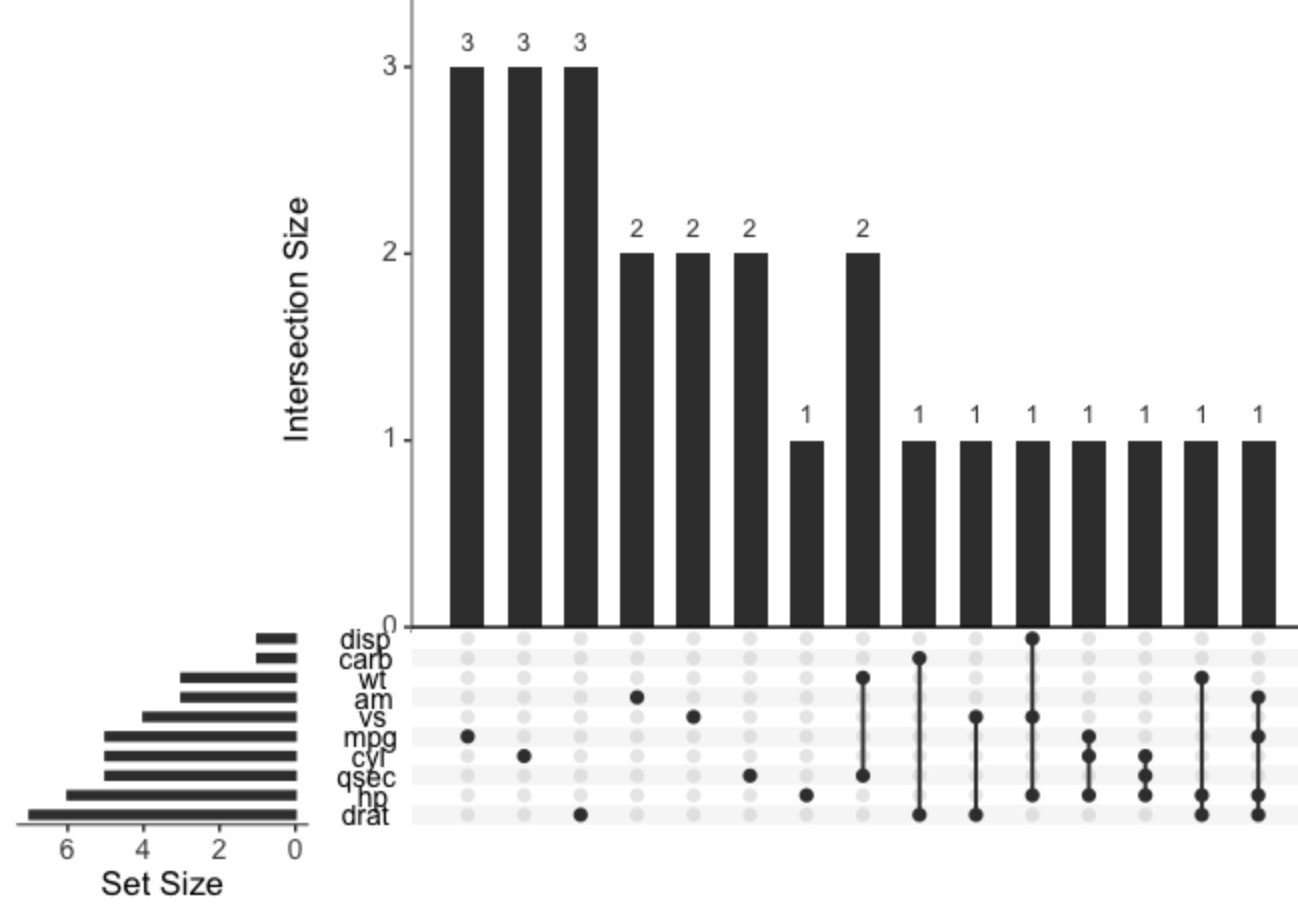
Code
library(tidyverse) library(UpSetR) # Insert random NA's into mtcars mask <- matrix( data = sample(c(T,F), 32*11, replace = T, prob = c(0.1, 0.9)), nrow = 32, ncol = 11 ) mtcars[mask] <- NA # Plot joint missingness mtcars |> mutate(across(everything(), \(x) as.integer(is.na(x)))) |> upset(nsets=10, text.scale = 1.5)- The main column chart indicates how many missing values are present for each combination of variables
- Combinations
- mpg has 3 missing values
- drat and carb have 1 missing value in the same row
- hp, cyl, and mpg have 1 missing value in the same row
- The Set Size bar chart (left) indicates the number of combinations each variable is involved in.
- This chart is also available in {naniar::gg_miss_upset}
Example: Counting (source)
N <- nrow(bfi.items) coverage <- lavaan:::lav_data_missing_patterns( bfi.items, coverage = TRUE)$coverage coverage*N # number of pairwise observations # are any cases with zero pairwise coverage? any(coverage*N < 1) #> [1] FALSE- No pairwise missingness, so it’s less likely MNAR is the case.
Categoricals for binary classification
.png)
train_raw %>% select( damaged, precipitation, visibility, engine_type, flight_impact, flight_phase, species_quantity ) %>% pivot_longer(precipitation:species_quantity) %>% ggplot(aes(y = value, fill = damaged)) + geom_bar(position = "fill") + facet_wrap(vars(name), scales = "free", ncol = 2) + labs(x = NULL, y = NULL, fill = NULL)- The NAs (top row in each facet) aren’t 50/50 between the two levels of the target. The target is imbalanced and the NAs seem to be predictive of “no damage,” so they aren’t random.
- Since these NAs look predictive, you can turn them into a category by using
step_unknownin the preprocessing recipe.
Outliers
- Also see
- Outliers
- Anomaly Detection
- Feature-Engineering, General >> Continuous >> Binning - Depending on the modeling algorithm, binning can help with minimizing the influence of outliers and skewness. Beware of information loss due to too few bins. Some algorithms also don’t perform well with variables with too few bins.
- Geospatial, Spatio-Temporal >> Kriging >> Examples >> Example2 >> Residuals
- Last chart shows a robust distributional boxplot using the median and MAD
- Packages
- {AdaptiveBoxplot} - Sample Size Aware Boxplots
- See Mathematics, Statistics >> Null Hypothesis Significance Testing (NHST) for definitions of FDR and FWER.
bh_boxplot- Control the False Discovery Rate (FDR) via the Benjamini-Hochberg procedureholm_boxplot- Control the Family-Wise Error Rate (FWER) via the Holm procedure.
- {AdaptiveBoxplot} - Sample Size Aware Boxplots
- Boxplots
- Extreme counts in charts when grouping by a cat var
- Why is one category’s count so low or so high?
- May need subject matter expert
- What can be done to increase or decrease that category’s count?
- Why is one category’s count so low or so high?
- For prediction, experiment with keeping or removing outliers while fitting baseline models
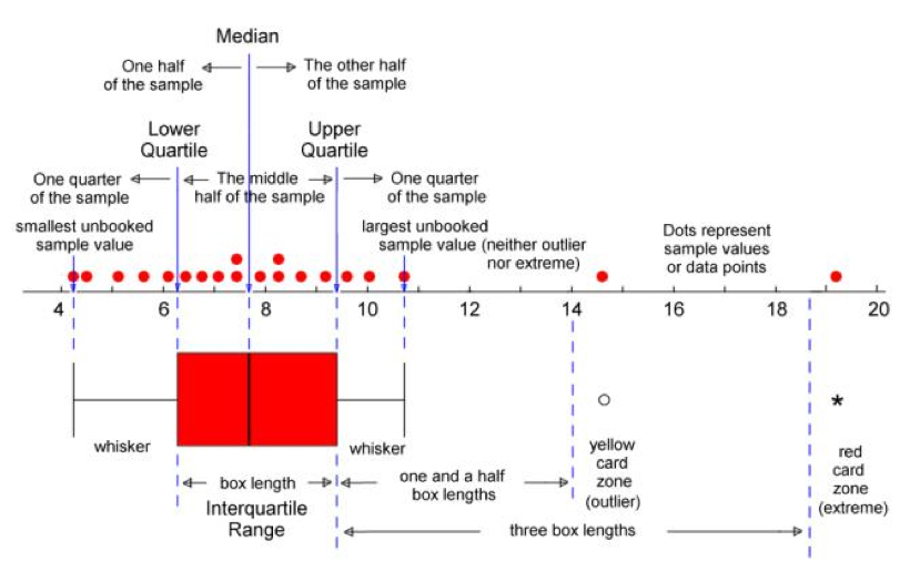
- IQR
- Observations above \(q_{0.75} + (1.5 \times \text{IQR})\) are considered outliers
- Observations below \(q_{0.25} - (1.5 \times \text{IQR})\) are considered outliers
- Where \(q_{0.25}\) and \(q_{0.75}\) correspond to first and third quartile respectively, and IQR is the difference between the third and first quartile
- {rquest} - Functions for CIs and hypothesis tests around quantiles including IQR
- Hampel Filter
Observations above \(\text{median} + (3 \times \text{MAD})\) are considered outliers
Observations below \(\text{median} - (3 \times \text{MAD})\) are considered outliers
Use
mad(vec, constant = 1)for the MADExample: {performance} (source)
library(performance)

# Create some artificial outliers and an ID column
data <- rbind(mtcars[1:4], 42, 55)
data <- cbind(car = row.names(data), data)

outliers <-
  check_outliers(data,
                 method = "zscore_robust",
                 ID = "car")
outliers
#> 2 outliers detected: cases 33, 34.
#> - Based on the following method and threshold: zscore_robust (3.291).
#> - For variables: mpg, cyl, disp, hp.
#>
#> -----------------------------------------------------------------------------
#>
#> The following observations were considered outliers for two or more
#>   variables by at least one of the selected methods:
#>
#>   Row car n_Zscore_robust
#> 1  33  33               2
#> 2  34  34               2
#>
#> -----------------------------------------------------------------------------
#> Outliers per variable (zscore_robust):
#>
#> $mpg
#>    Row car Distance_Zscore_robust
#> 33  33  33                    3.7
#> 34  34  34                    5.8
#>
#> $cyl
#>    Row car Distance_Zscore_robust
#> 33  33  33                     12
#> 34  34  34                     17
Checked 4 variables independently
{performance} uses \(\pm\) 3.29 MAD as a threshold
Visualize
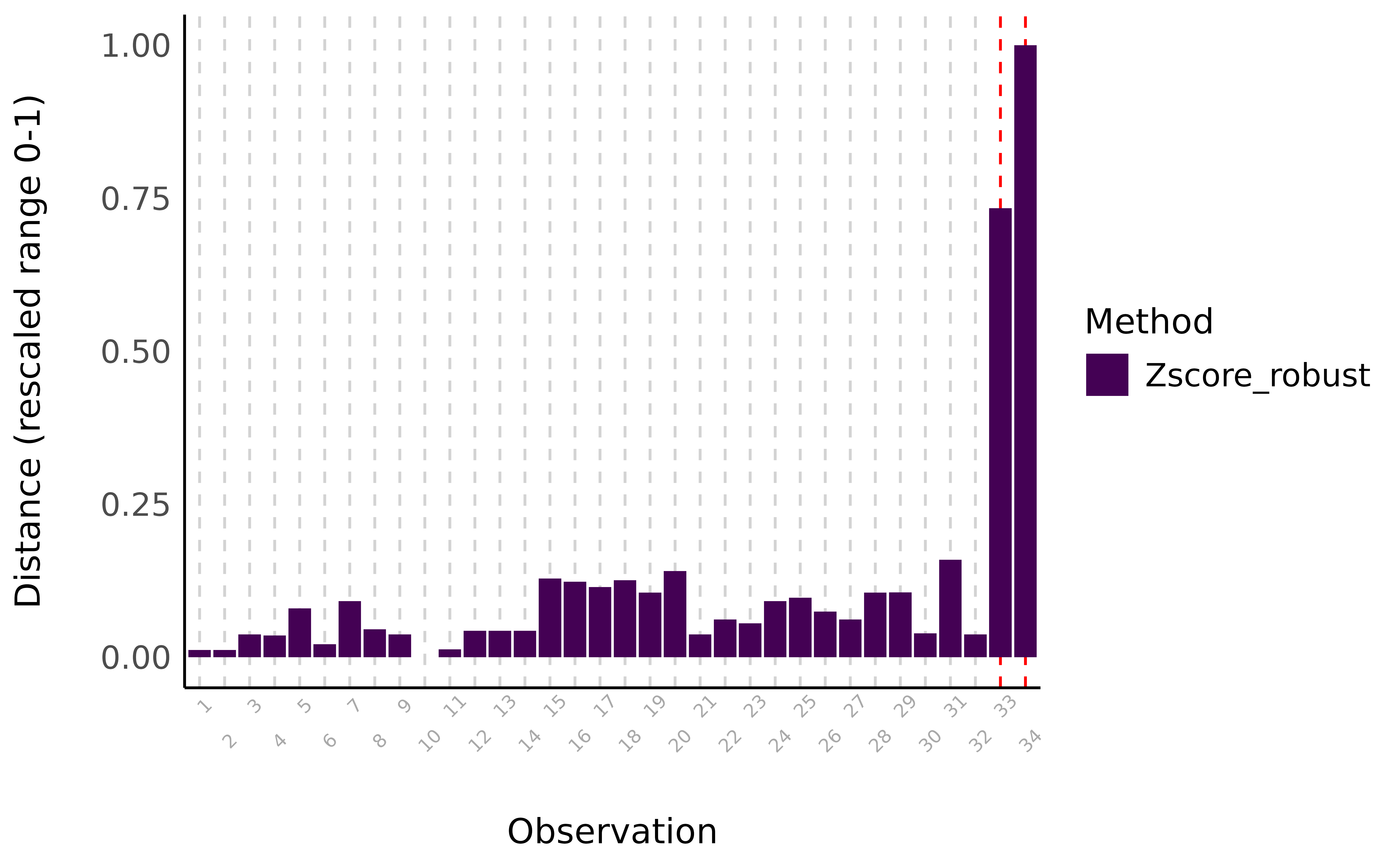
Code
library(see)
plot(outliers)
- Multivariate
Example: {performance} (source)
outliers <- check_outliers(data, method = "mcd", verbose = FALSE) outliers #> 2 outliers detected: cases 33, 34. #> - Based on the following method and threshold: mcd (20). #> - For variables: mpg, cyl, disp, hp.- Checked 4 variables jointly using Minimum Covariance Determinant, a robust version of the Mahalanobis distance
- To visualize (Same column chart as above):
plot(outliers)
Other methods available in {performance} (docs)
- Robust Mahalanobis Distance: A robust version of Mahalanobis distance using an Orthogonalized Gnanadesikan-Kettenring pairwise estimator
- Invariant Coordinate Selection (ICS): The method relies on a generalized diagonalization and on the selection of the invariant components associated with the largest eigenvalues. (See paper for details. Reminds me of a PCA procedure.)
- Works best when there’s a small proportion of outliers lying in a low-dimensional subspace
- OPTICS: The Ordering Points To Identify the Clustering Structure (OPTICS) algorithm uses similar concepts to DBSCAN.
- Local Outlier Factor: Based on a K nearest neighbors algorithm, LOF compares the local density of a point to the local densities of its neighbors instead of computing a distance from the center
Group Calculations
Descriptive Statistics
Example: {table1} (article)
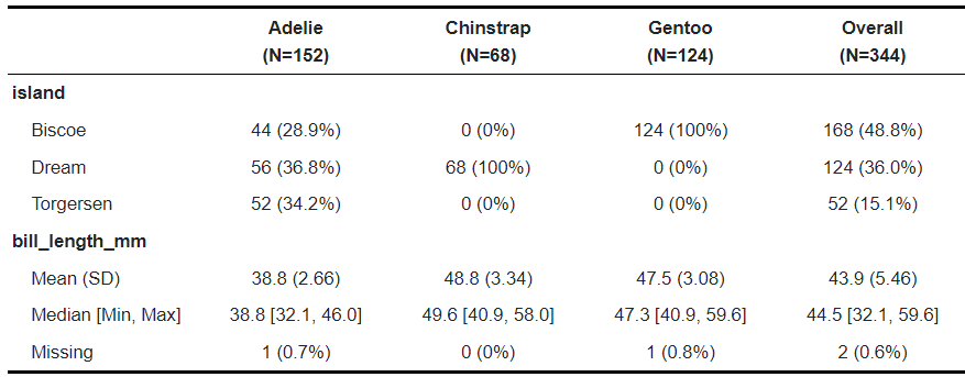
library(table1); library(palmerpenguins) table1(~ island + bill_length_mm | species, penguins)- species is the grouping variable with its categories along the top
- island is discrete with cells for frequency counts and percentage-of-total
- bill_length_mm is continuous with basic descriptive stats in the cells
- Package is pretty versatile with styling, labelling, and options to use alternative stat functions.
Variance of Value by Group
- Example: how sales vary between store types over a year
- important to standardize the value by group
- group_by(group), mutate(sales = scale(sales))
- Which vary wildly and which are more stable
Rates by Group
- Example: sales($) per customer
- group_by(group), mutate(sales_per_cust = sum(sales)/sum(customers)
- Example: sales($) per customer
Avg by Group(s)
dat %>%
select(cat1, cat2, num) %>%
group_by(cat1, cat2) %>%
summarize(freq = n(),
          avg_cont = mean(num))
Continuous Variables
Also see
- Distributions >> Fitting Distributions
- Feature-Engineering, General >> Continuous >>
- Binning - Depending on the modeling algorithm, binning can help with minimizing the influence of outliers and skewness. Beware of information loss due to too few bins. Some algorithms also don’t perform well with variables with too few bins.
- Transformations >> Logging - Can help with skewed variables
Packages
- {sshist} - Optimal Histogram Binning Using Shimazaki-Shinomoto Method
- Minimizes the mean integrated squared error (MISE) and features a C++ backend for high performance and shift-averaging to remove edge-position bias
- {sstn} - Self-Similarity Test for Normality
- A Monte Carlo procedure that iteratively estimates the characteristic function of the sum of standardized i.i.d. random variables and compares it to the characteristic function of the standard normal distribution.
- {sshist} - Optimal Histogram Binning Using Shimazaki-Shinomoto Method
Does the variable have a wide range. (i.e. values across multiple magnitudes: 101 and 102 and … etc.)
- If so, log the variable
Check Shape of Distribution
Looking at skew. Is it roughly normal?
Does filter(another_var > certain_value) (see below) help it look more normal?
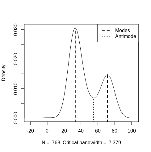
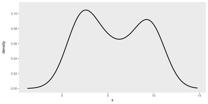
Is it multi-modal
- See Regression, Other >> Multi-Modal
- {multimode} (Vignette) - Different methods for testing and exploring (including the mode tree, mode forest and SiZer) the number of modes using nonparametric techniques
- Test for more than one mode:
multimode::modetest(dat) orperformance::check_multimodal(which uses {multimode})- Performs Ameijeiras-Alonso excess mass test/dip statistic
- Ha: More than 1 mode
- Find location of modes:
multimode::locmodes(dat, mod0 = 2, display = TRUE)
- Test for more than one mode:
- {gghdr} - Visualization of Highest Density Regions in ggplot2
- Anti-Mode location might be a good place for a cutpoint
- Interactions >> Categorical Outcome >> Binary Outcome (pct_event) vs Discrete by Discrete (or binary in this case)
Is the variable highly skewed
- With Boxplot or Histogram
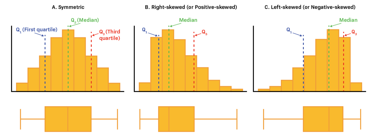
- Mode > Median > Mean \(\rightarrow\) Negative Skewed
- Mode < Median < Mean \(\rightarrow\) Positive Skewed
- Long Whiskers \(\rightarrow\) Long-Tailed Distribution
- Short Whiskers \(\rightarrow\) Short-Tailed Distribution
- If so, try:
- Changing units (e.g min to hr),
filter(some_var > some_value)- Some combination of the above make more normal?
- Normality among predictors isn’t necessary, but I think it improves fit or prediction somewhat
- Transformations
- Log transformation is best for right-skewed data and multiplicative relationships (if the skew isn’t too extreme)
- {lmtest::petest} - Compares linear vs. log-linear specifications in linear regressions (source)
If the linear specification is correct then adding an auxiliary regressor with the difference of the log-fitted values from both models should be non-significant.
Conversely, if the log-linear specification is correct then adding an auxiliary regressor with the difference of fitted values in levels should be non-significant.
One or more predictors are typically logged in the log-linear model, but I don’t think it’s a requirement
Example:
data("HousePrices", package = "AER") hp_lin <- lm(price ~ . , data = HousePrices) hp_log <- update(hp_lin, log(price) ~ . - lotsize + log(lotsize)) lmtest::petest(hp_lin, hp_log) #> Model 1: price ~ lotsize + bedrooms + bathrooms + stories + driveway + #> recreation + fullbase + gasheat + aircon + garage + prefer #> Model 2: log(price) ~ bedrooms + bathrooms + stories + driveway + recreation + #> fullbase + gasheat + aircon + garage + prefer + log(lotsize) #> Estimate Std. Error t value Pr(>|t|) #> M1 + log(fit(M1))-fit(M2) -74774 12068 -6.1961 1.159e-09 *** #> M2 + fit(M1)-exp(fit(M2)) 0 0 -0.5688 0.5697- The log-linear model has a non-significant p-value, therefore it’s the correct specification.
- {lmtest::petest} - Compares linear vs. log-linear specifications in linear regressions (source)
- Cube root transformation is useful when dealing with negative values
- Log transformation is best for right-skewed data and multiplicative relationships (if the skew isn’t too extreme)
- See Regresson, Quantile
- See Mixed Effects, General >> Misc >> {skewlmm}
- With Boxplot or Histogram
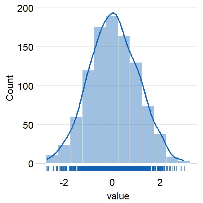
Density
Example: Bi-Modal
emp_density <- density(cont_var, n = 10000)
den_curve <- data.frame(x = emp_density$x, y = emp_density$y)

ggplot(data = den_curve, aes(x = x, y = y)) +
  geom_line(linewidth = 1) +
  scale_y_continuous(name = "density\n",
                     limits = c(0, 0.11),
                     breaks = seq(0, .10, by = .02)) +
  scale_color_manual(values = colors) +
  theme(panel.grid = element_blank())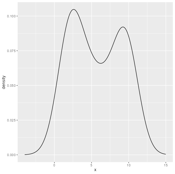
ggplot(data.frame(x = cont_var), aes(x = x)) +
 geom_density() +
 xlim(-4, 15)
Histogram
ggplot(aes(var)) +
    geom_histogram()
Histogram + Density + Rug (source)
ggplot(data = data, aes(x = value, fill = day)) + smplot2::sm_hist()- day is just grouping variable. The package can show these plots by a grouping variable with multiple categories (See source)
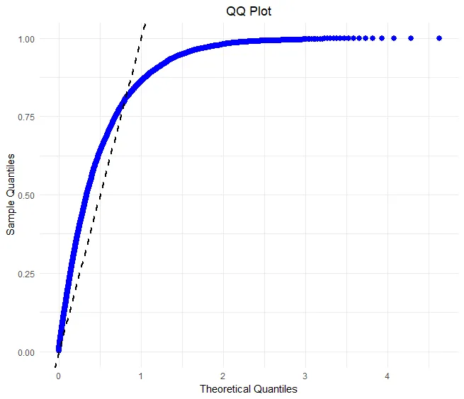
Q-Q plot to check fit against various distributions
Also see Mathematics, Probability >> Plots >> Q-Q Plots
Packages
{qqplotr} - Charts for both quantile-quantile (Q-Q) and probability-probability (P-P) points, lines, and confidence bands.
- The functions of this package also allow a detrend adjustment of the plots to help reduce visual bias when assessing the results
- Functions
stat_qq_pointThis is a modified version ofggplot2::stat_qqwith some parameters adjustments and a new option to detrend the points.stat_qq_lineDraws a reference line based on the data quantiles, as instats::qqline.stat_qq_bandDraws confidence bands based on three methods:- “pointwise” constructs simultaneous confidence bands based on the normal distribution;
- “boot” creates pointwise confidence bands based on a parametric boostrap;
- “ks” constructs simultaneous confidence bands based on an inversion of the Kolmogorov-Smirnov test;
- “ts” constructs tail-sensitive confidence bands, as proposed by Aldor-Noiman et al.(2013).
{ggplot}
ggplot(data)+ stat_qq(aes(sample = log_profit_rug_business))+ stat_qq_line(aes(sample = log_profit_rug_business))+ labs(title = 'log(profit) Normal QQ')- A plot of the sample (or observed) quantiles of the given data against the theoretical (or expected) quantiles.
- See article for the math and manual code
stat_qq, stat_qq_linedefault distributions are Normal- ggplot::stat_qq docs have some good examples on how to use q-q plots to test your data against different distributions using
MASS::fitdistrto get the distributional parameter estimates. Available distributions: “beta”, “cauchy”, “chi-squared”, “exponential”, “gamma”, “geometric”, “log-normal”, “lognormal”, “logistic”, “negative binomial”, “normal”, “Poisson”, “t” and “weibull”
{dataexplorer}
## View quantile-quantile plot of all continuous variables
plot_qq(diamonds)

## View quantile-quantile plot of all continuous variables by feature `cut`
plot_qq(diamonds, by = "cut")
Various Distribution Shapes (source)
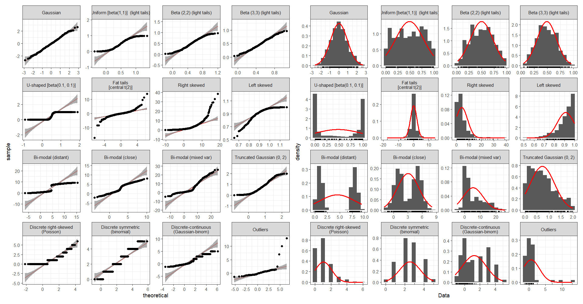
Skewed Variables
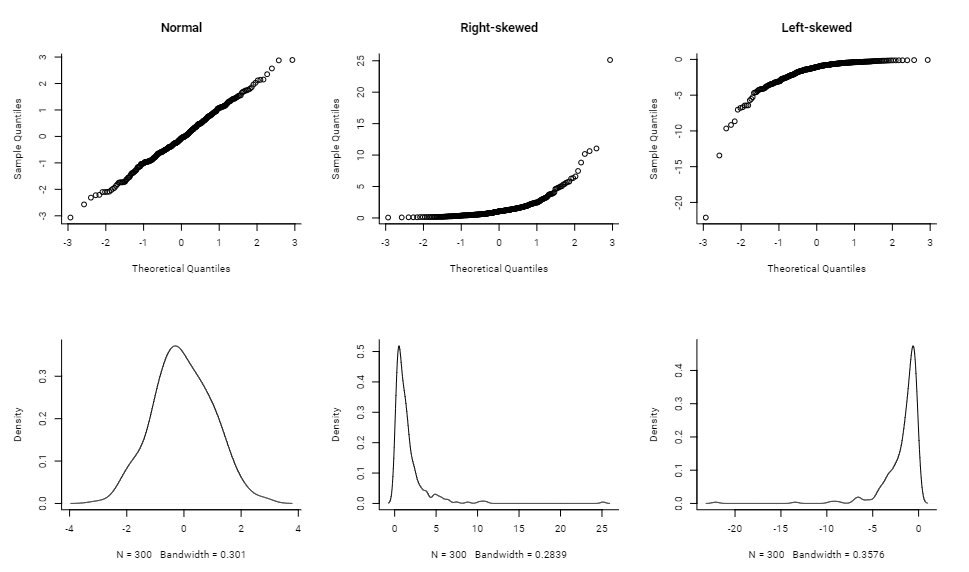
x <- list()
n <- 300
x[[1]] <- rnorm(n)
x[[2]] <- exp(rnorm(n))
x[[3]] <- -exp(rnorm(n))

par(mfrow = c(2,3), bty = "l", family = "Roboto")

qqnorm(x[[1]], main = "Normal")
qqnorm(x[[2]], main = "Right-skewed")
qqnorm(x[[3]], main = "Left-skewed")
lapply(x, function(x){plot(density(x), main = "")})
Good fits
- normal distribution
- Bad fits
- Uniform data tested against a normal distibution
- Uniform data tested against an exponential distribution
- Uniform data tested against a normal distibution
- normal distribution
Is the mean/median above or below any important threshold?
e.g. CDC considers a BMI > 30 as obese. Health Insurance charges rise sharply at this threshold
- Is there an important threshold value?
- 1 value –> split into a binary
- Multiple values –> Multinomial
- Examples
- Binary
- Whether a user spent more than $50 or didn’t (See Charts >> Categorical Predictors vs Outcome)
- If user had activity on the weekend or not
- Multinomial
- Timestamp to morning/afternoon/ night,
- Order values into buckets of $10–20, $20–30, $30+
- Binary
- Is there an important threshold value?
Empirical Cumulative Density function (ecdf)
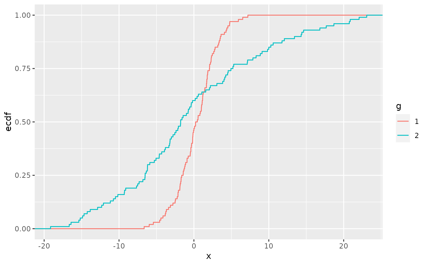
ggplot(aes(x = numeric_var, color = cat) +
    stat_ecdf()
Shows the percentage of sample (y-axis) that are below a numeric_var value (x-axis)
{sfsmisc::ecdf.ksCI} - plots the ecdf and 95% CIs (see Harrell for details of the CI calculation)
Can view alongside a table of group means to see if the different percentiles differ from the story of just looking at the mean.
data %>%
    group_by(categorical_var) %>%
    summarize(mean(numeric_var))
Categorical/Discrete Variables
Packages
- {flextable::proc_freq} outputs nice html crosstabs
- {modelsummary::datasummary} - Crosstabs, frequencies, correlations, balance (a.k.a. “table 1”), and more
- {nomiShape} - Visualization and Analysis of Nominal Variable Distributions
- Introduces centered frequency plots, in which nominal categories are ordered from the most frequent category at the center toward less frequent categories on both sides, facilitating the detection of distributional patterns such as uniformity, dominance, symmetry, skewness, and long-tail behavior.
- Pareto charts for the study of dominance and cumulative frequency structure in nominal data
- {SimTablR} - Frequency and summary tables with:
- Automatic percentages (row, column, or total)
- Statistical tests (Chi-squared, Fisher’s exact, McNemar’s)
- Effect measures (Prevalence Ratios, Odds Ratios with confidence intervals)
- Column stratification for complex cross-tabulations
- Flexible output formats (console, data.frame, flextable)
- {summarytools}
freq- Frequency Tables featuring counts, proportions, cumulative statistics as well as missing data reportingctable- Cross-Tabulations (joint frequencies) between pairs of discrete/categorical variables, featuring marginal sums as well as row, column or total proportions
- {summarytabl} - Provides functions for tabulating and summarizing ordinal, and categorical variables in data frame
Count number of rows per category level
tbl |> count(cat_var, sort = True)Imbalance
- Looking for how skewed data might be (only a few categories have most of the obs)
- If levels are imbalanced, consider:
initial_split(data, strata = imbalanced_var) - For categorical variables with levels with too few counts, consider lumping together
- Levels with too few data will have large uncertainties about the effect and the bloated std.devs can cause some models to throw errors
Count Variables
- Check distribution
- Square root transformation for moderate right skewness
- Check distribution
Year variable
data |> count(year) |> arrange(desc(year)) |> ggplot(aes(year, n)) + geom_line()- Looking for skew.
- Is data older or more recent?
Free Text
- Generate features from it text length, appearance/frequency of certain keywords, etc.
- Tokenize
- See below code for “Facetted bar by variable with counts of the values” and the use of
separate_rowsto manually tokenize more useful when the columns don’t have stopwords
- See below code for “Facetted bar by variable with counts of the values” and the use of
Visualize value counts for multiple variables
Facetted bar by variable with counts of the values
.png)
categorical_variables <- board_games %>% # select all cat vars select(game_id, name, family, category, artist, designer, mechanic) %>% # "type" receives all colnames; "value" receives their values gather(type, value, -game_id, -name) %>% filter(!is.na(value)) %>% # Some values of vars are free text separated by commas; code makes each value into a separate row separate_rows(value, sep = ",") %>% arrange(game_id) categorical_counts <- categorical_variables %>% count(type, value, sort = TRUE) categorical_counts %>% # type is gathered colnames of the variables group_by(type) %>% # high cardinality variables, so only show top 10 top_n(10, n) %>% ungroup() %>% mutate(value = fct_reorder(value, n)) %>% ggplot(aes(value, n, fill = type)) + geom_col(show.legend = FALSE) + facet_wrap(~ type, scales = "free_y") + coord_flip() + labs(title = "Most common categories")- “type” has the names of the variables, “value” has the levels of the variable
Correlation/Association
Misc
Also see
- Association, General
- Notebook >> Statistical Inference >> Correlation
- Interactions >> Continuous Outcome >> Correlation Heatmaps
For binary vs. binary, also see Association, General >> Discrete >> Binary Similarity Measures and Cramer’s V
{greybox::association} will run Pearson, Cramer’s V, or a regression (mixed type) that returns the coefficient on variables in a df or matrix. (P-Values also included)
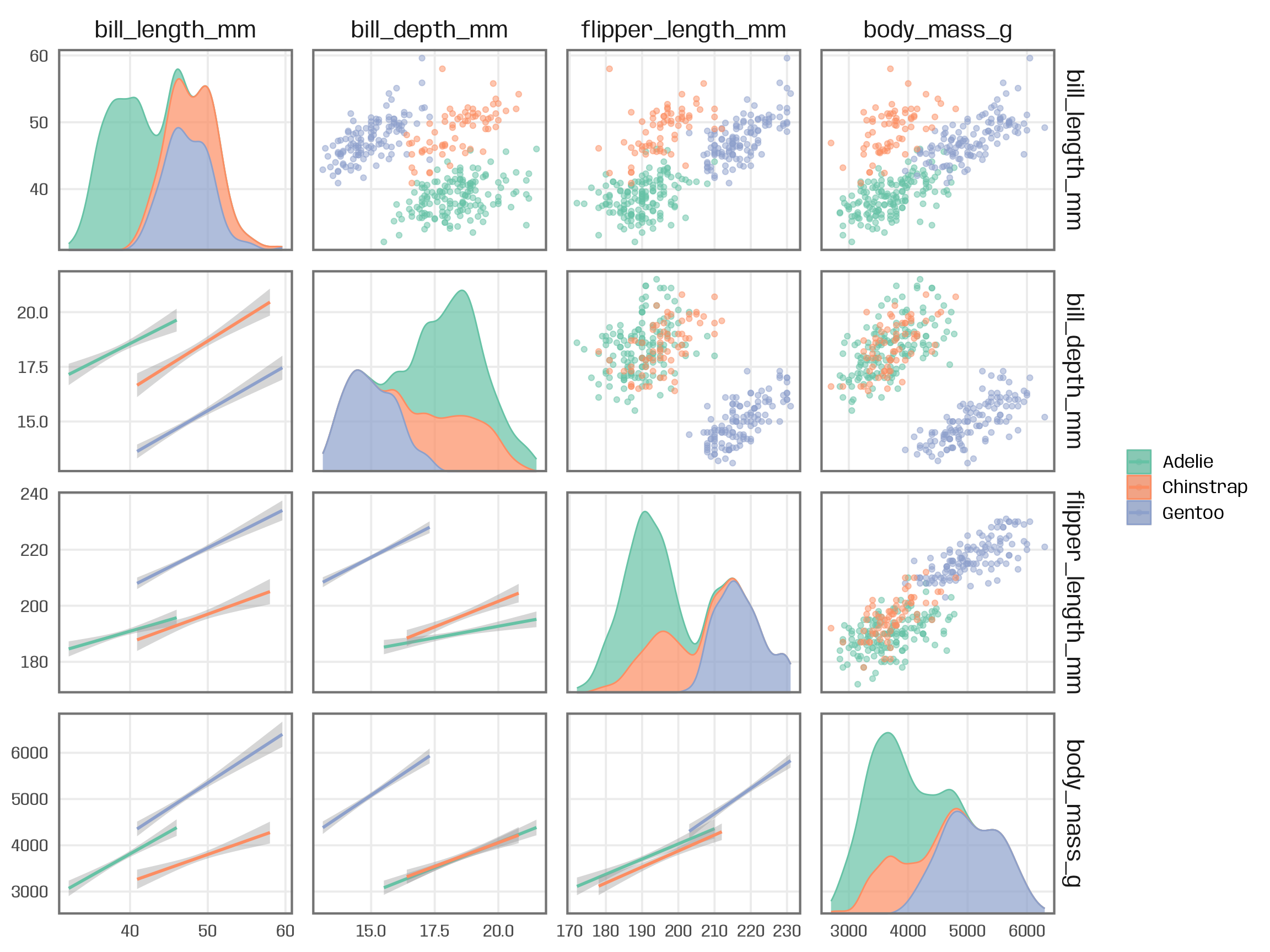
Pairwise Plots
Packages
Relationships (source)
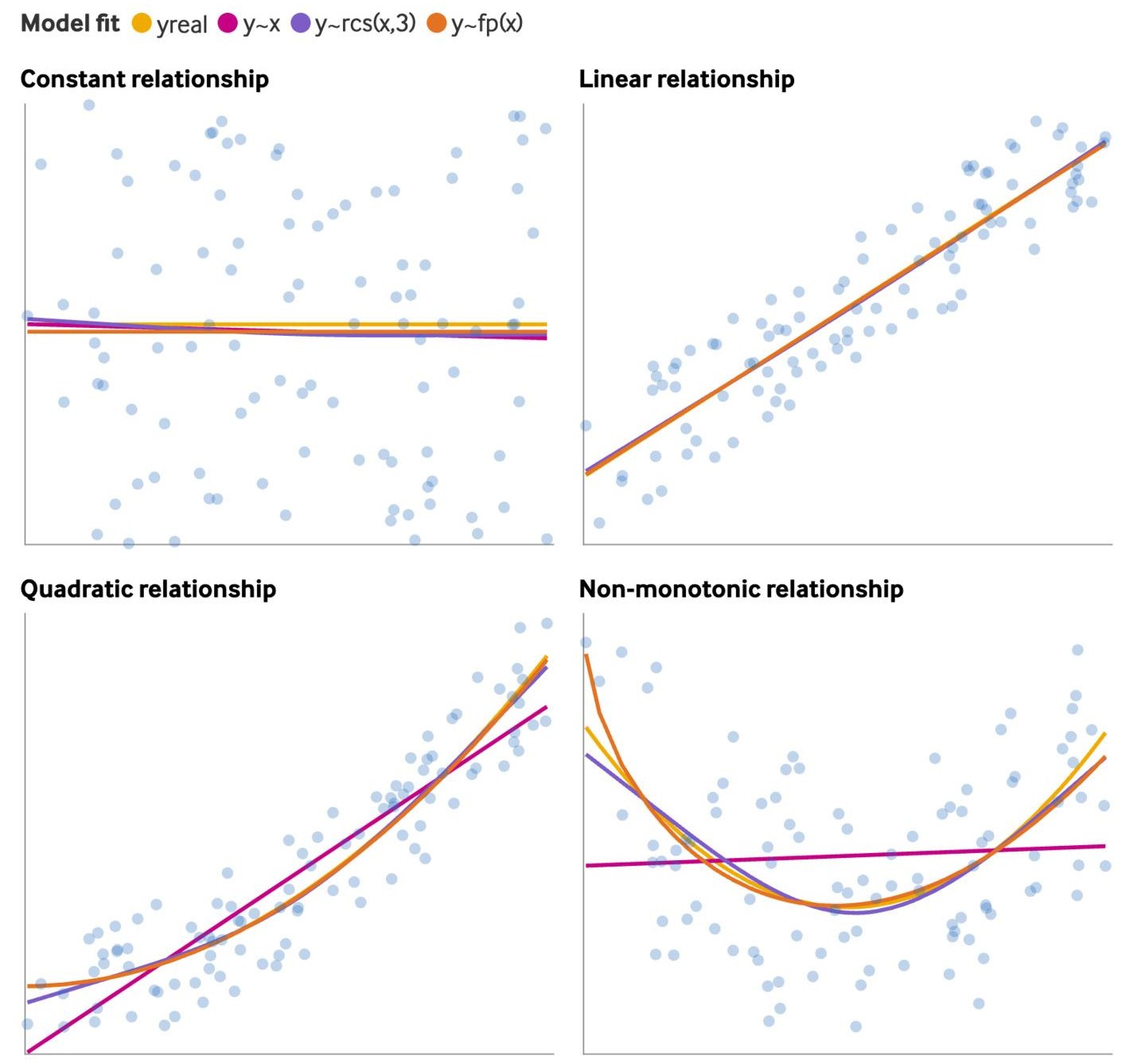
rcsis a restricted cubic spline andfpis a fractional polynomial (See Feature Engineering, Splines >> Misc >> Packages >> {mfp2})- Fractional polynomials and splines have similar fits
- Fitting a spline or fp to a linear relationship results in a slightly worse fit while not fitting a spline or fp to a nonlinear relationship results in a substantially worse fit.
Outcome vs Predictor
Predictor vs Predictor
- Interactions
- Multicollinearity
Correlation/Association scores for linear relationships
Histograms for variations between categories
Example: {ggforce}
ggplot(palmerpenguins::penguins, aes(x = .panel_x, y = .panel_y)) + geom_point(aes(color = species), alpha = .5) + geom_smooth(aes(color = species), method = "lm") + ggforce::geom_autodensity( aes(color = species, fill = after_scale(color)), alpha = .7 ) + scale_color_brewer(palette = "Set2", name = NULL) + ggforce::facet_matrix(vars(names), layer.lower = 2, layer.diag = 3)Example: {ggpmisc} by group (source)
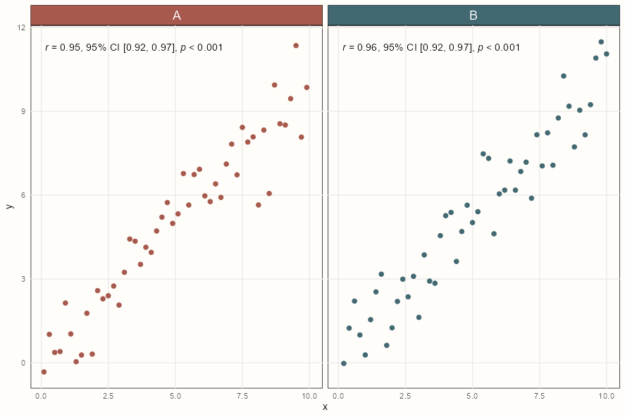
ggplot(my.data, aes(x, y)) +
  geom_point() +
  ggpmisc::stat_correlation(
    use_label("R", "R.CI", "P"),
    small.r = TRUE,
    small.p = TRUE) +
  facet_wrap(~ group)
Styled Version Code
strip <- ggh4x::strip_themed( text_x = element_text(size = 14, color = "white"), background_x = elem_list_rect(fill = notebook_colors[c(5,6)]) ) ggplot(my.data, aes(x, y)) + geom_point(aes(color = group), size = 2) + scale_colour_manual(values = notebook_colors[c(5,6)], guide = FALSE) + ggpmisc::stat_correlation( use_label("R", "R.CI", "P"), small.r = TRUE, small.p = TRUE) + ggh4x::facet_wrap2(~ group, strip = strip) + theme_notebook()- Pearson (default), Kendall or Spearman correlation available (uses
cor.test)
- Pearson (default), Kendall or Spearman correlation available (uses
Linear
{greybox::association} - Along with standard continuous and categorical association measures, it measures the correlation between different types of variables by fitting a regression model (
cont ~ cat) and using the R2 as correlation value{corrplot} - Correlation matrices in various styles. Can include shapes to help recognize multicollinearity patterns.
{correlation} - Multiple non-standard correlation measures that include partial correlations, Bayesian correlations, multilevel correlations, polychoric correlations, biweight, percentage bend or Sheperd’s Pi, and distance measures.
{correlationfunnel} - Dancho’s package; bins numerics, then dummies all character and binned numerics, then runs a pearson correlation vs the outcome variable. Surprisingly it’s useful to use Pearson correlations for binary variables as long as you have a mix of 1s and 0s in each variable. (Cross-Validated post)
churn_df %>% binarize() %>% correlate(<outcome_var>) %>% plot_correlation_funnel()correlatereturns a sorted? tibble in case you don’t want the plot- The funnel plot is a way of combining and ranking all the correlation plots into a less eye-taxing visual.
- Uses
stats::corfor calculation so you can pass args to it and but changing the method (e.g.method = c("pearson", "kendall", "spearman")) won’t matter, since pearson and spearman (and probably kendall) will be identical for binary variables.
{lares::corr_cross} - Very similar to {correlationfunnel} except it does all the preprocessing in one function. There’s also a type = 2 plot option that helps understand the skewness or randomness of some correlations found. See article.
Multicollinearity
- Misc
- Packages
- {VisCollin} - Methods to calculate and visualize diagnostics for multicollinearity among predictors in a linear or generalized linear model
- If multicollinearity is a present and
- The interpretation of coefficients is the goal, see Feature Selection >> Basic
- If using Bayesian regression, then a prior on that coefficient will help to reduce its posterior variance.
- If you’re are only interested in predicting / explaining an outcome, and not the model coefficients or which are “significant”, collinearity can be largely ignored. The fitted values are unaffected by collinearity.
- Although some diagnostic methods can be misleading (e.g. PDPs, Feature Importance, SHAP). See Diagnostics, Model Agnostic for details and alternate options.
- The interpretation of coefficients is the goal, see Feature Selection >> Basic
- Collinearity isn’t a disease that needs curing
- tl;dr
- Collinearity is a form of lack of information that is appropriately reflected in the output of your statistical model.
- When collinearity is associated with interpretational difficulties, these difficulties aren’t caused by the collinearity itself. Rather, they reveal that the model was poorly specified (in that it answers a question different to the one of interest), that the analyst overly focuses on significance rather than estimates and the uncertainty about them or that the analyst took a mental shortcut in interpreting the model that could’ve also led them astray in the absence of collinearity.
- If you do decide to “deal with” collinearity, make sure you can still answer the question of interest.
- Boosted by McElreath who adds that this DAG, X \(\rightarrow\) Z \(\rightarrow\) Y, when modelled by
lm(Y ~ X + Z)will not show any effects of collinearity even though X and Z are highly correlated. (Thread)
- tl;dr
- Collinearity four more times
- Lumley shows some interesting collinearity/confounding structures and how they affect coefficients and VIF.
- It’d be interesting what the Variance Decomposition Proportions look like.
- Packages
- VIF
Variance inflation factors measure the effect of multicollinearity on the standard errors of the estimated coefficients and are proportional to
\[\text{VIF}_j = \frac{1}{1-R^2_{j \sim X/j}}\]
- Where \(R^2_{j \sim X/j}\) is from the predictor variable, \(j\), being regressed against the other predictors (not including \(j\))
performance::check_collinearity(fit)orcar::viforgreybox::determorvif(fit))Guideline: equal to 1 means no collinearity; between 5 to 10 typically an acceptable amount; >10 is a problem
Example: source
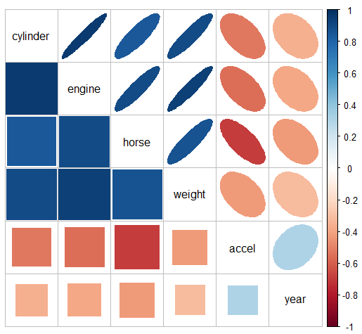
{corrplot} - Check for multicollinearity pattern
Code
data(cars) R <- cars |> select(cylinder:year) |> tidyr::drop_na() |> cor() corrplot::corrplot.mixed(R, lower = "square", upper = "ellipse", tl.col = "black")- The message here seems to be that there are two clusters of predictors with high correlations: {cylinder, engine, horse, and weight}, and {accel, year}.
Check the damage with VIF
cars.mod <- lm (mpg ~ cylinder + engine + horse + weight + accel + year, data=cars) car::vif(cars.mod) #> cylinder engine horse weight accel year #> 10.63 19.64 9.40 10.73 2.63 1.24 sqrt(car::vif(cars.mod)) #> cylinder engine horse weight accel year #> 3.26 4.43 3.07 3.28 1.62 1.12- The standard error of cylinder (and therefore its CI) has been inflated by a factor of 3.26, and it’s t-value divided by this number, compared with the case when all predictors are uncorrelated. engine, horse, and weight suffer a similar fate.
- Condition Number
Formula
\[h(x) = \frac{\lambda_{\text{max}}}{\lambda_{\text{min}}}\]
- Where \(\lambda_{\text{min}}\) and \(\lambda_{\text{max}}\) are the highest and lowest eigenvalues of \(X^t \; X\) where \(X\) is your model matrix.
Guideline: \(h(x) \lt 100\) is good and \(h(x) \gt 1000\) means you have severe multicollinearity.
Related to the upper bound of VIF: \(\max(\text{VIF}) \le \frac{h(x)^2}{4}\)
kappais computes the Condition Number. It uses the 2-norm (default) of the model matrix but generates the condition number. Use almfit or a a matrix of predictors as input.
- Variance Decomposition Proportions
Large VIFs indicate variables that are involved in some nearly collinear relations, but they don’t indicate which other variable(s) each is involved with.
Requirements for interpreting a variance decomposition proportion (Belsley 1991):
- The condition index, \(\kappa_j\), must be large
- High (Danger): Values \(\gt\) 10
- Medium (Warning): Values in between 5 and 10
- Low (Okay): Values \(\lt\) 5
- The variance proportion should be high (e.g. \(\ge 0.5\))
- The condition index, \(\kappa_j\), must be large
Condition Indices
\[\kappa_j = \sqrt{\frac{\lambda_1}{\lambda_j}}\]
- For completely uncorrelated predictors, all \(\kappa_j = 1\)
Example (source)
Variance Decomposition Proportions
cd <- VisCollin::colldiag(cars.mod, center = TRUE) print(cd, fuzz = 0.5) #> Condition #> Index Variance Decomposition Proportions #> cylinder engine horse weight accel year #> 1 1.000 . . . . . . #> 2 2.252 . . . . . 0.787 #> 3 2.515 . . . . . . #> 4 5.660 . . . . . . #> 5 8.342 . . 0.654 0.715 . . #> 6 10.818 0.563 0.981 . . . .- Dimension 5 reflects the high correlation between horse and weight
- Dimension 6 reflects the high correlation between number of cylinder and engine.
- Note that the high variance proportion for year (0.787) on the second component creates no problem and should be ignored because (a) the condition index is low and (b) it shares nothing with other predictors
Visualization
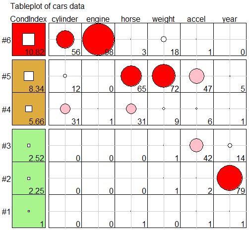
VisCollin::tableplot(cd,
                     title = "Tableplot of cars data",
                     cond.max = 30 )
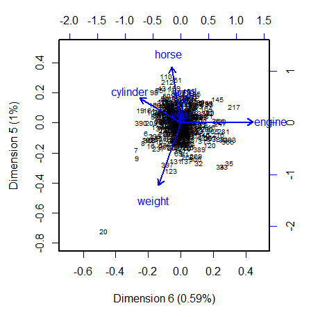
- PCA
Using the last couple dimensions (contrary to using the first few in typical PCA analysis) is useful for visualizing the relations among the predictors that lead to nearly collinear relations
The projections of the variable vectors on the dimension axes are proportional to their variance decomposition proportions (see previous section). The relative lengths of these variable vectors can be considered to indicate the extent to which each variable contributes to collinearity for these two near-singular dimensions.
Example: (source)
Code
data(cars, package = "VisCollin") cars.X <- cars |> select(where(is.numeric)) |> select(-mpg) |> tidyr::drop_na() cars.pca <- prcomp(cars.X, scale. = TRUE) # 6 dimensions # Make labels for dimensions include % of variance pct <- 100 *(cars.pca$sdev^2) / sum(cars.pca$sdev^2) lab <- glue::glue("Dimension {1:6} ({round(pct, 2)}%)") # Direction of eigenvectors is arbitrary. Reflect them cars.pca$rotation <- -cars.pca$rotation op <- par(lwd = 2, xpd = NA ) biplot(cars.pca, choices=6:5, # only the last two dimensions scale=0.5, # symmetric biplot scaling cex=c(0.6, 1), # character sizes for points and vectors col = c("black", "blue"), expand = 1.7, # expand variable vectors for visibility xlab = lab[6], ylab = lab[5], xlim = c(-0.7, 0.5), ylim = c(-0.8, 0.5) ) par(op)- Dimension 6 is largely determined by engine size, with a substantial (negative) relation to cylinder.
- Dimension 5 has its strongest relations to weight and horse.
- There is one observation, #20, that stands out as an outlier in predictor space, far from the centroid. It turns out that this vehicle, a Buick Estate wagon, is an early-year (1970) American behemoth, with an 8-cylinder, 455 cu. in, 225 horse-power engine, and able to go from 0 to 60 mph in 10 sec. (Its MPG is only slightly under-predicted from the regression model, however.)
Nonlinear
- Scatterplots for non-linear patterns,
- Correlation metrics
- Also see General Additive Models >> Diagnostics for a method of determining a nonlinear relationship for either continuous or categorical outcomes.
Categorical
- Packages
- {kitesquare} - A representation of observed and conditional quantities of a 2x2 contingency plot along with a representation of the \(\chi^2\) test in a kite-square plot.
- As with a lot of discrete visualizations, it’s a bit convoluted and not intuitively interpreted, but it’s interesting. May be useful for making a lot of 2x2 comparisons once you get the hang of interpreting it.
- {kitesquare} - A representation of observed and conditional quantities of a 2x2 contingency plot along with a representation of the \(\chi^2\) test in a kite-square plot.
- 2-level x 2-level: Cramer’s V
- 2-level or multi-level x multi-level
- Chi-square or exact tests
- Levels vs Levels correlation
- Multiple Correspondence Analysis (MCA) (See Association, General >> Discrete)
- Binary outcome vs Numeric predictors
Using AUC
# numeric vars should be in a long tbl. Use pivot longer to make two columns (e.g. metric (var names) value (value)) numeric_gathered %>% group_by(metric) %>% # rain_tomorrow is the outcome; event_level says which factor level is the event your measuring roc_auc(rain_tomorrow, value, event_level = "second") %>% arrange(desc(.estimate)) %>% mutate(metric = fct_reorder(metric, .estimate)) %>% ggplot(aes(.estimate, metric)) + geom_point() + geom_vline(xintercept = .5) + labs(x = "AUC in positive direction", title = "How predictive is each linear predictor by itself?", subtitle = ".5 is not predictive at all; <.5 means negatively associated with rain, >.5 means positively associated")- 0.5 is not predictive at all; <0.5 means negatively associated with rain, >0.5 means positively associated
Also see {greybox::association} in the Linear section which reverses the model formula and fits a linear regression to measure correlation
Ordinal
- Also see {correlation} the Linear section which has polychoric measures
- Polychoric
Continuous Predictor vs Outcome
Misc
- If the numeric-numeric relation isn’t linear, then the model will be misspecified: an influential variable may be overlooked or the assumption of linearity may produce a model that fails in important ways to represent the relationship.
- Also see General Additive Models >> Diagnostics for a method of determining a nonlinear relationship for either continuous or categorical outcomes.
Continuous Outcome
Continuous vs Continuous
Example: Test Spline Fit
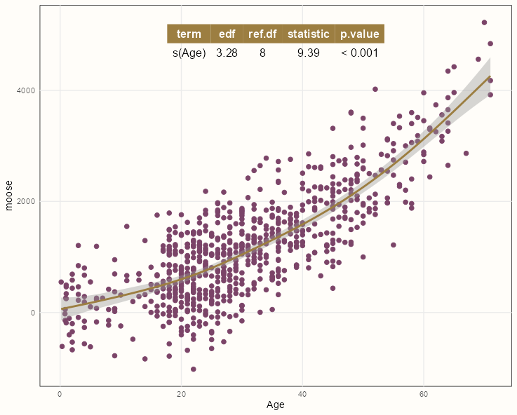
pacman::p_load(mgcv, ggpmisc)

formula <- y ~ x + s(x, m = c(2, 0), bs = 'tp')

ggplot(dat, aes(Age, moose)) +
  geom_point() +
  geom_smooth(method = "gam",
              formula = formula) +
  stat_fit_tb(method = "gam",
              method.args = list(formula = formula,
                                 method = "REML"))
Styled Version Code
pacman::p_load(mgcv, ggpmisc) summary_theme <- gridExtra::ttheme_minimal( colhead = list(bg_params = list(fill = notebook_colors[[7]]), fg_params = list(col = "white")) ) formula <- y ~ x + s(x, m = c(2, 0), bs = 'tp') ggplot(dat, aes(Age, moose)) + geom_point(color = notebook_colors[[9]], size = 2) + geom_smooth(method = "gam", formula = formula, color = notebook_colors[[7]]) + stat_fit_tb(method = "gam", method.args = list(formula = formula, method = "REML"), tb.params = c("s(Age)" = 1), table.theme = summary_theme) + theme_notebook()- See {gridExtra} vignette for details on styling
- See {ggpp} Reference >> Geoms for pre-made theme options
- See
- Generalized Additive Models >> Diagnostics >> Formal test for the necessity of a smooth for details on the test
- {ggpmisc} vignette for details on
stat_fit_tb
- If the p-value is below 0.05, then it’s suitable to use a spline transformation for that predictor variable.
- The formula needs to use the {ggplot2} mapped variables (x, y) and not the variable names in the data.
Continuous vs Continuous by Continuous
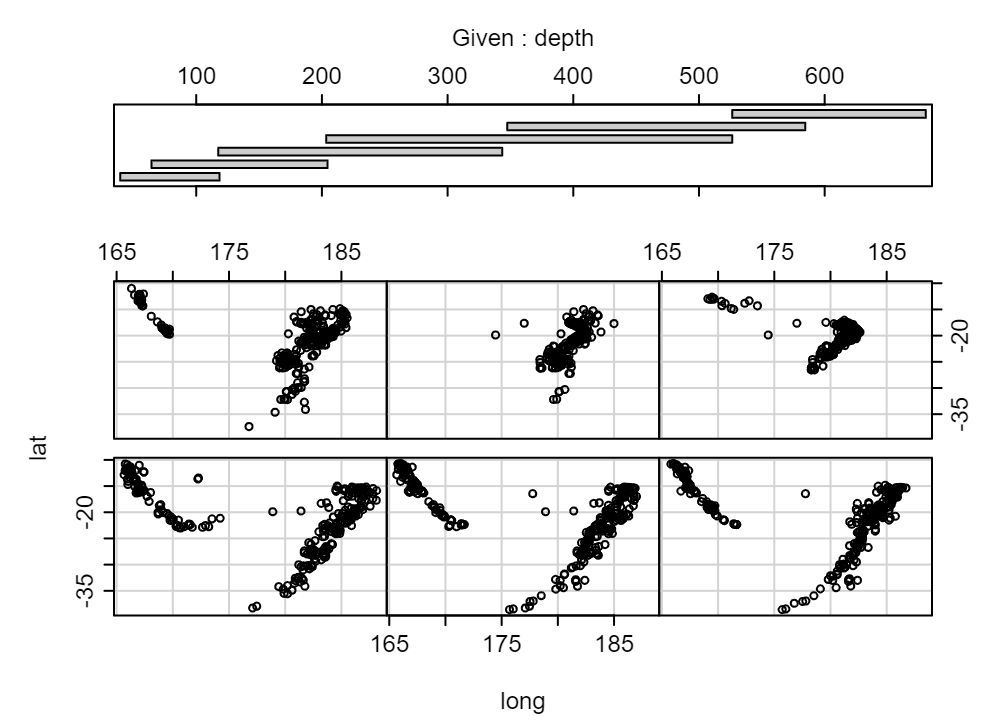
coplot(lat ~ long | depth, data = quakes)coplotis base R.- Examples from Six not-so-basic base R functions
- The six plots show the relationship of these two variables for different values of depth
- The bar plot at the top indicates the range of depth values for each of the plots
- From lowest depth to highest depth, the default arrangement of the plots is from bottom row, left to right, and upwards
- e.g. The 4th lowest depth is on the top row, farthest to the left.
- rows = 1 would arrange all plots in 1 row.
- overlap = 0 will remove overlap between bins
Continuous vs Continuous by Continuous by Continuous
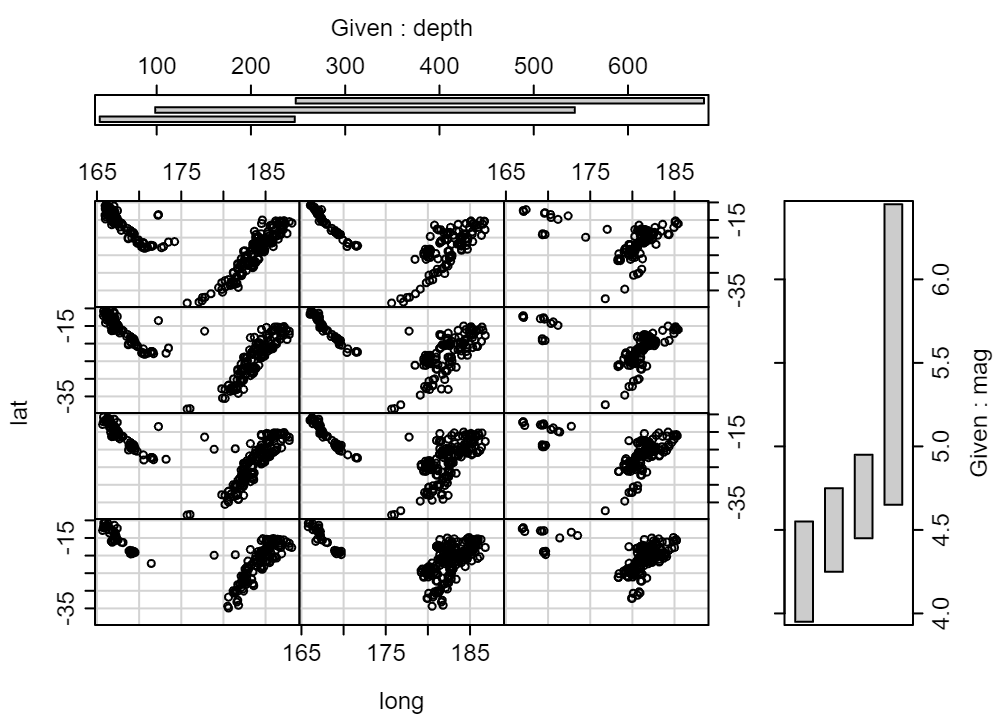
coplot(lat ~ long | depth * mag, data = quakes, number = c(3, 4))- Shows the relationship with depth from left to right and the relationship with magnitude from top to bottom.
- number = c(3, 4) says you want 3 bins for depth and 4 bins for mag
- From lowest depth, mag to highest depth, mag, the arrangement of the plots is from bottom row, left to right, and upwards
- e.g. The 2nd lowest depth (columns) and 3rd lowest mag (rows) is in the 3rd from bottom row and 2nd column.
Continuous vs Continuous by Categorical
Example: {tinyplot} (source)
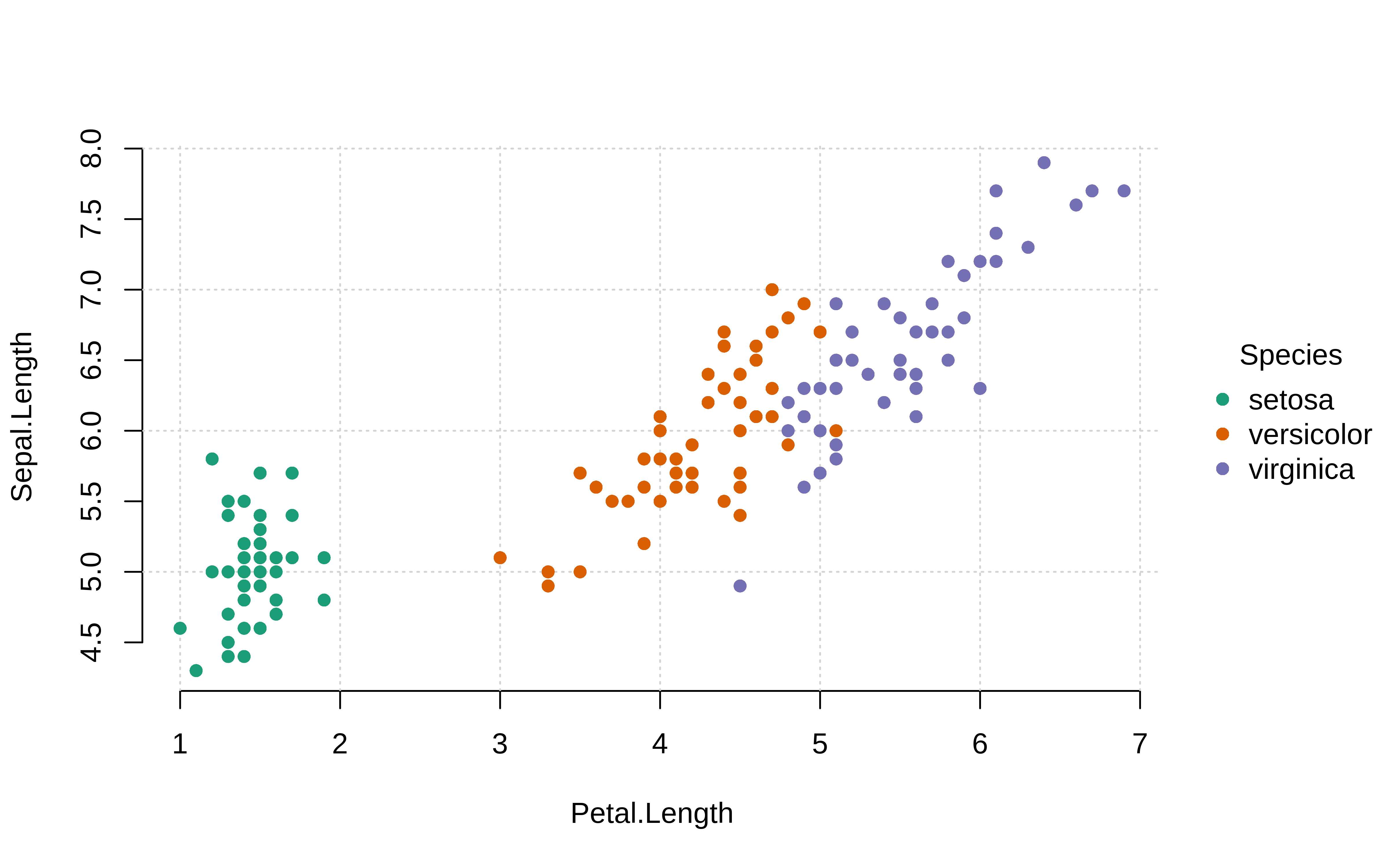
tinyplot::plt( Sepal.Length ~ Petal.Length | Species, data = iris, palette = "dark", pch = 16, grid = TRUE, frame = FALSE )Example: {tinyplot} facetted

tinyplot::plt(
  Sepal.Length ~ Petal.Length | Sepal.Length,
  data = iris,
  facet = ~Species,
  facet.args = list(bg = "grey90"),
  pch = 19,
  main = "Faceted Species!",
  grid = TRUE,
  frame = FALSE
)
Continuous vs Continuous by Categorical by Categorical
Example: {tinyplot} facetted (source)
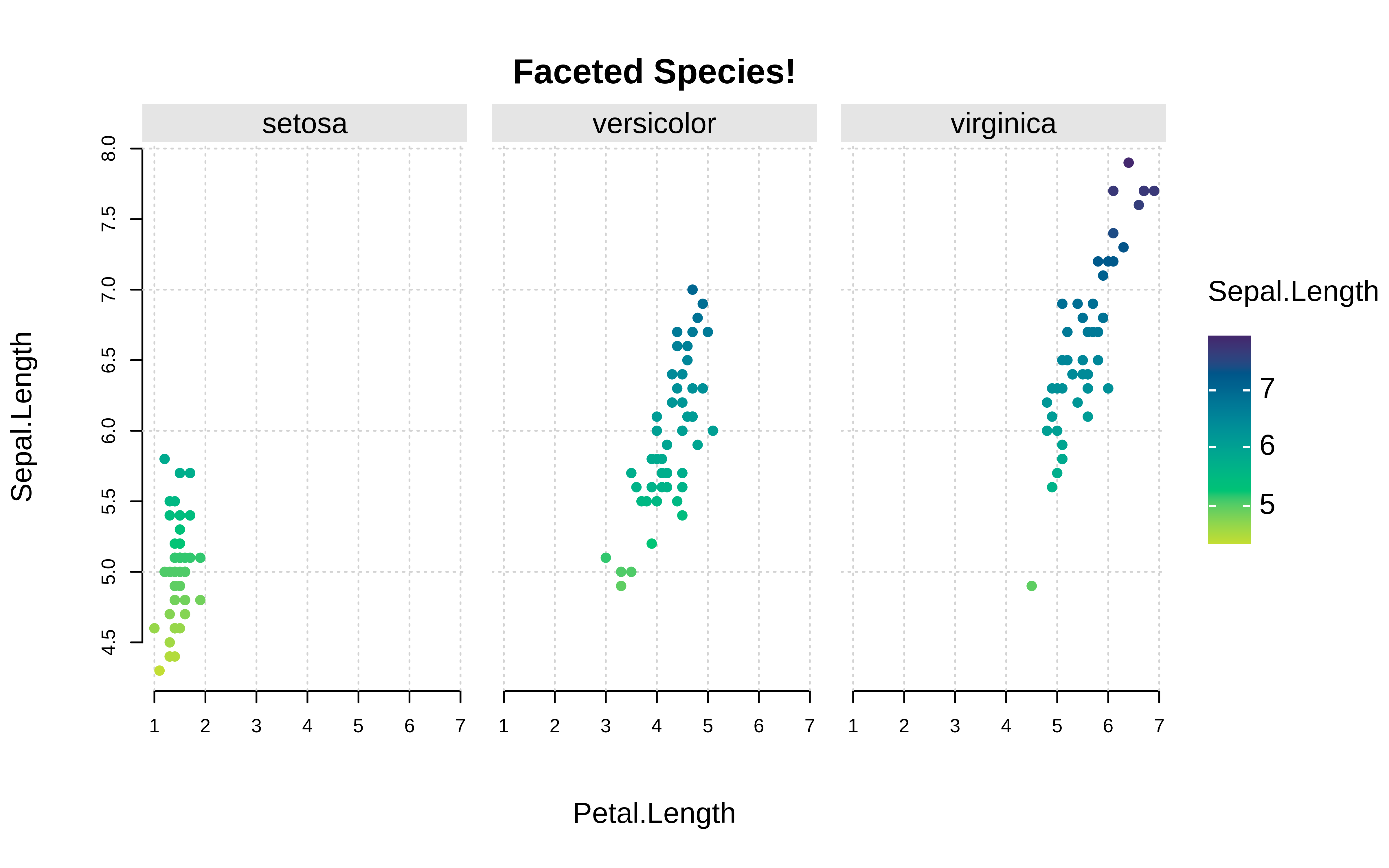
plt( Sepal.Length ~ Petal.Length | Sepal.Length, data = iris, facet = ~Species, facet.args = list(bg = "grey90"), pch = 19, main = "Faceted Species!", grid = TRUE, frame = FALSE )Example: continuous vs. continuous by categorical vs categorical interaction
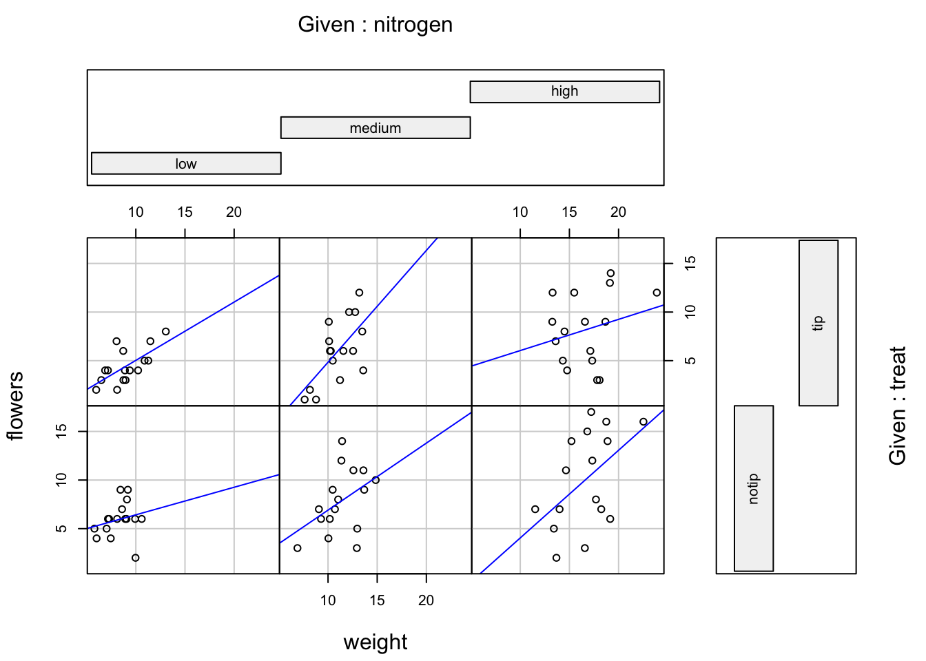
coplot(flowers ~ weight|nitrogen * treat, data = flowers, panel = function(x, y, ...) { points(x, y, ...) abline(lm(y ~ x), col = "blue")})- From An Introduction to R
- Same arrangement scheme as the plots above
- e.g. nitrogen = “medium” and treat = “tip” is the cell at middle column, top row
Scagnostics (paper) - metrics to examine numeric vs numeric relationships
- {scagnostics}
- Scagnostics describe various measures of interest for pairs of variables, based on their appearance on a scatterplot. They are useful tool for discovering interesting or unusual scatterplots from a scatterplot matrix, without having to look at every individual plot
- Metrics: Outlying, Skewed, Clumpy, Sparse, Striated, Convex, Skinny, Stringy, Monotonic
- “Straight” (paper) seems to have been swapped for “Sparse” (package)
- Potential use cases
- Finding linear/nonlinear relationships
- Clumping or clustered patterns could indicate an interaction with a categorical variable
- Score Guide
.png)
- High value: Red
- Low value: Blue
- Couldn’t find the ranges of these metrics in the paper or the package docs
- Shows how scatterplot patterns correspond to metric values
Categorical Outcome
Continuous vs Categorical
Example: Test Spline Fit
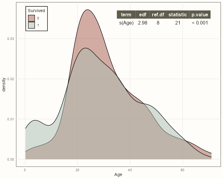
pacman::p_load(mgcv, ggpmisc)

formula <- y ~ x + s(x, m = c(2, 0), bs = 'tp')

ggplot(dat, aes(x = Age, fill = factor(Survived))) +
  geom_density(alpha = 0.5) +
  stat_fit_tb(aes(y = Survived),
              method = "gam",
              method.args = list(formula = formula,
                                 method = "REML",
                                 family = binomial),
              label.x = "right",
              label.y = "top") +
  ylab("density")
Styled Version Code
summary_theme <- gridExtra::ttheme_minimal( colhead = list(bg_params = list(fill = notebook_colors[[8]]), fg_params = list(col = "white")) ) ggplot(dat, aes(x = Age, fill = factor(Survived))) + geom_density(alpha = 0.5) + scale_fill_manual(values = notebook_colors[c(5,2)], guide = FALSE) + stat_fit_tb(aes(y = Survived), method = "gam", method.args = list(formula = formula, method = "REML", family = binomial), tb.params = c("s(Age)" = 1), table.theme = summary_theme, label.x = "right", label.y = "top") + ylab("density") + guides(fill = guide_legend(title = "Survived", position = "inside")) + theme_notebook( legend.position.inside = c(0.1, 0.9) )- See {gridExtra} vignette for details on styling
- See {ggpp} Reference >> Geoms for pre-made theme options
See
- Generalized Additive Models >> Diagnostics >> Formal test for the necessity of a smooth for details on the test
- {ggpmisc} vignette for details on
stat_fit_tb
If the p-value is below 0.05, then it’s suitable to use a spline transformation for that predictor variable.
The formula needs to use the {ggplot2} mapped variables (x, y) and not the variable names in the data.
Within
stat_fit_tb, the y (Survived) mapping must be defined for the GAM formula, since it can’t not defined in the density part of the chartCould also do this with a boxplot, etc.
For binary outcome, look for variation between numeric variables and each outcome level
.png)
# numeric vars should be in a long tbl.
# Use pivot longer to make two columns (e.g. metric (var names) value (value)) with the binary outcome (e.g rain_tomorrow) as a separate column
numeric_gathered %>%
  ggplot(aes(value, fill = rain_tomorrow)) +
  geom_density(alpha = 0.5) +
  facet_wrap(~ metric, scales = "free")
# + scale_x_log10()
Separation between the two densities would indicate predictive value.
If one of colored density is further to the right than the other then the interpretation would be:
- Higher values of metric result in a greater probability of <outcome category of the right-most density>
Normalize the x-axis with
rank_percentile(value)
.png)
numeric_gathered %>% mutate(rank = percent_rank(value)) %>% ggplot(aes(rank, fill = churned)) + geom_density(alpha = 0.5) + facet_wrap(~ metric, scales = "free")- Not sure why you’d do this unless there was a reason to compare the separation of densities (i.e. strength of association with outcome) between the predictors.
Estimated AUC for binary outcome ~ numeric predictor (From DRob’s SLICED Competition Lap 1 Video)
numeric_gathered <- train %>% mutate(rainfall = log2(rainfall + 1)) %>% gather(metric, value, min_temp, max_temp, rainfall, contains("speed"), contains("humidity"), contains("pressure"), contains("cloud"), contains("temp")) numeric_gathered %>% group_by(metric) %>% yardstick::roc_auc(rain_tomorrow, value, event_level = "second") %>% arrange(desc(.estimate)) %>% mutate(metric = fct_reorder(metric, .estimate)) %>% ggplot(aes(.estimate, metric)) + geom_point() + geom_vline(xintercept = .5) + labs(x = "AUC in positive direction", title = "How predictive is each linear predictor by itself?", subtitle = ".5 is not predictive at all; <.5 means negatively associated with rain, >.5 means positively associated")- rain_tomorrow is a binary factor variable
- second says the event we want the probability for is the second level of the binary factor variable
Categorical Predictor vs Outcome
Continuous Outcome
Also see
- Regression, Linear >> Contrasts >> Polynomial Contrasts
- Tests for a nonlinear (polynomial) relationship between a ordinal predictor and continuous response
- Regression, Linear >> Contrasts >> Polynomial Contrasts
Halves by Categorical
Code
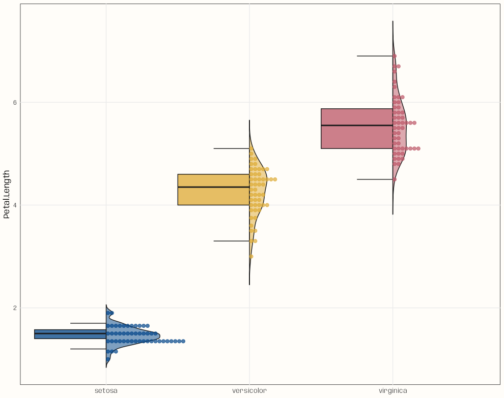
library(ggplot2); library(gghalves) data("iris") ggplot( iris, aes( x = Species, y = Petal.Length, fill = Species ) ) + geom_half_boxplot( side = "left", width = 1, varwidth = TRUE, alpha = 0.75, outlier.shape = NA, errorbar.draw = TRUE, color = "grey10", linewidth = 0.5 ) + geom_half_violin( side = "right", alpha = 0.5, trim = FALSE, width = 0.75, color = "grey10", linewidth = 0.5 ) + geom_half_dotplot( mapping = aes(color = Species), dotsize = 0.7, alpha = 0.7, # binwidth = 0.05, binwidth = 0.1, stackratio = 1.1 # closeness of dots ) + paletteer::scale_colour_paletteer_d("khroma::highcontrast") + paletteer::scale_fill_paletteer_d("khroma::highcontrast") + guides(color = "none", fill = "none") + labs( x = NULL ) + theme_notebook()- This could be a function. Besides x and y being arguments, binwidth should be included — maybe alpha too.
Density Plot by Categorical
Example: {tinyplot} (source)
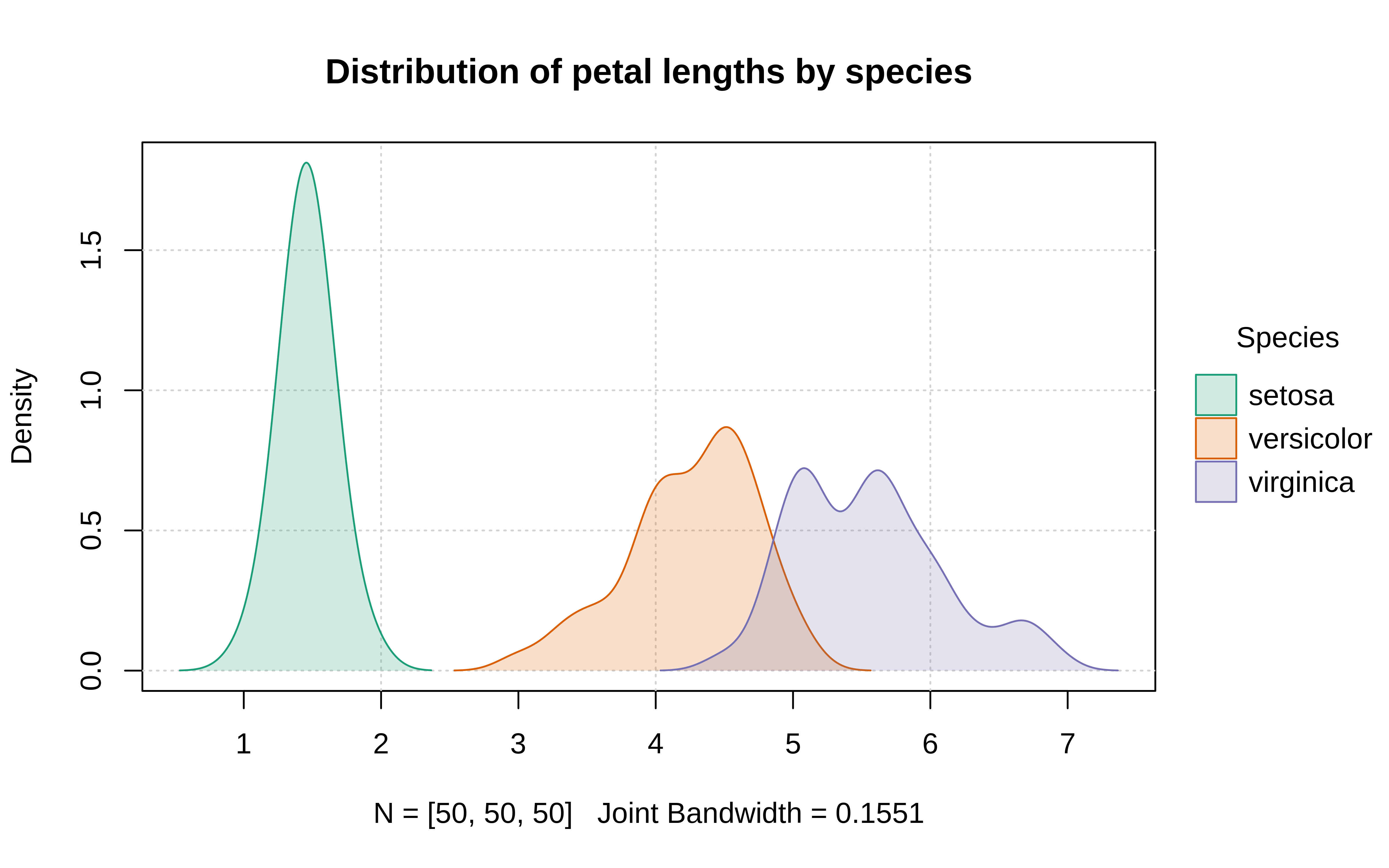
plt(
  ~ Petal.Length | Species,
  data = iris,
  type = "density",
  palette = "dark", fill = "by",
  grid = TRUE,
  main = "Distribution of petal lengths by species"
)
Boxplot by Categorical
Example: Order by continuous
fct_reordersays order cat_var by a num_var- Make sure data is NOT grouped
data %>% mutate(cat_var = fct_reorder(cat_var, numeric_outcome)) %>% ggplot(aes(numeric_outcome, cat_var)) + geom_boxplot()- If all the medians line up then no relationship. A slope or nonlinear shows relationship.
Example: Create “Other” Variable
fct_lumpcan be used to create an “other” group..png)
data %>% mutate(cat_var = fct_lump(cat_var, 8), cat_var = fct_reorder(cat_var, numeric_outcome)) %>% ggplot(aes(numeric_outcome, cat_var)) + geom_boxplot()- Useful for cat_vars with too many levels which can muck-up a graph
- Says to keep the top 8 levels with the highest counts and put rest in “other”.
- Also takes proportions. Negative values says keep lowest.
Example: Titanic5 Interpretation
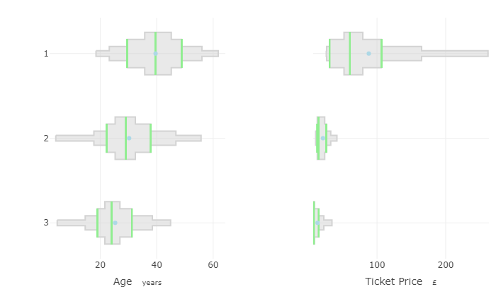
- Y-Axis is the “Class” categorical with 3 levels
- For ticket price, only class 1 shows any variation
- For Age, there’s a clear trend but also considerable overlap between classes
Density Plot + One-Way ANOVA
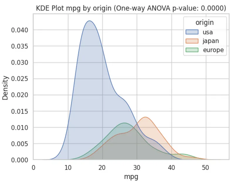
- The ANOVA confirms that all mpg means stratified by country are different (pval < 0.05) and the density plot visualizes that a difference in means is very likely due to the US and there’s also potentially a difference between Japan and Europe.
Boxplot + ANOVA Tests + Multiple Comparison Correction
Also see Post-Hoc, ANOVA
Example: Tukey’s Test (source)
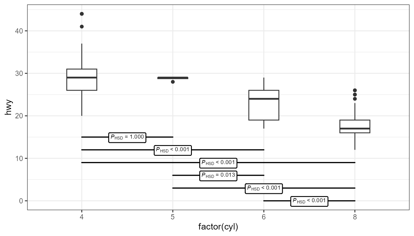
ggplot(mpg, aes(x = factor(cyl), y = hwy)) + geom_boxplot(width = 0.33) + ggpmisc::stat_multcomp( label.y = seq(from = 15, by = -3, length.out = 6), size = 2.5) + expand_limits(y = 0)- The Tukey test compares differences in means between each category
- It uses the “Honest Significant Difference” as a distance measure, which is why there’s a “HSD” subscript
- label.y - Sets the locations on the y-axis where you want each of the horizontal p-value interval boxes
- By default, they’re placed at the top of the chart, but sometimes that location can squish the boxes and whiskers and make interpretation more difficult.
- Boxes can be removed and only the value the label used. See source.
- p.adjust.method - Can be set to adjust p-values. Available ethods are: “single-step”, “Shaffer”, “Westfall”, “free”, “holm”, “hochberg”, “hommel”, “bonferroni”, “BH”, “BY”, “fdr”, “none”.
- The Tukey test compares differences in means between each category
Example: Dunnett’s Test
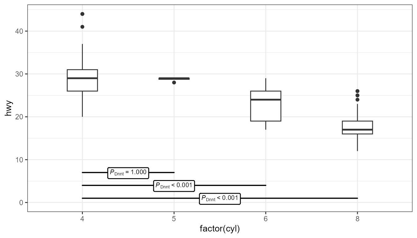
ggplot(mpg, aes(factor(cyl), hwy)) + geom_boxplot(width = 0.33) + ggpmisc::stat_multcomp( label.y = c(7, 4, 1), contrasts = "Dunnet", size = 2.75) + expand_limits(y = 0)- Dunnett’s test compares differences in means between a reference category and all other categories
- See Tukey example for more details.
Nonparametric group comparison
Code
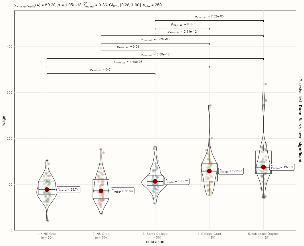
library(tidyverse); library(ggstatsplot) data(Wage, package = "ISLR") set.seed(1) dat <- Wage |> group_by(education) |> sample_n(50, replace = TRUE) ggbetweenstats( data = dat, x = education, y = wage, type = "nonparametric", ggplot.component = list( scale_color_manual(values = notebook_colors[4:8]), theme_notebook(legend.position = "none") ) )- Also see Post-Hoc, General >> Frequentist Difference-in-Means >> Non-Parametric
- Wage is continuous, and Education is multilevel categorical. So, the function performs a nonparametric One-Way ANOVA which is a Kruskal-Wallis test, and measures the effect size with Rank Epsilon Squared (Docs)
- Top:
- Kruskal-Wallis rejects the Null which says there exists a difference in means among the categorical levels but not which ones.
- Ranked Epsilon Squared says the effect of Education on Wage is large.
- Body
- Dunn’s Test is performed given that the Kruskal-Wallis test is significant. By default, only significant pairwise associations are shown (pairwise.display = “significant”)
Categorical Outcome
Histograms of cat_vars split by response_var
df %>% select(cat_vars) %>% pivot_longer(key, value = cat_vars, response_var) %>% ggplot(aes(value)) + geom_bar(fill = response_var) + facet_wrap( ~key, scales = "free")- Just looking for variation in the levels of the cat_var given response var. More variation = more likely to be a better predictor
- Each facet will be a level of the response variable
Error Bar Plot
# outcome variable is a binary for whether or not it rained on that day group_binary_prop <- function(tbl) { ret <- tbl %>% # count of events for each category (successes) summarize(n_rain = sum(rain_tomorrow == "Rained"), # count of rows for each category (trials) n = n()) %>% arrange(desc(n)) %>% ungroup() %>% # probability of event for each category mutate(pct_rain = n_rain / n, # jeffreys interval # bayesian CI for binomial proportions low = qbeta(.025, n_rain + .5, n - n_rain + .5), high = qbeta(.975, n_rain + .5, n - n_rain + .5)) %>% # proportion of all events for each category mutate(pct = n_rain / sum(n_rain)) # this was the original but this would just be proportion of the total data for each caategory # mutate(pct = n / sum(n)) ret } # error bar plot # cat vs probability of event w/CIs train %>% # cat predictor group_by(location = fct_lump(location, 50)) %>% # apply custom function group_binary_prop() %>% mutate(location = fct_reorder(location, pct_rain)) %>% ggplot(aes(pct_rain, location)) + geom_point(aes(size = pct)) + geom_errorbarh(aes(xmin = low, xmax = high), height = .3) + scale_size_continuous(labels = percent, guide = "none", range = c(.5, 4)) + scale_x_continuous(labels = percent) + labs(x = "Probability of raining tomorrow", y = "", title = "What locations get the most/least rain?", subtitle = "Including 95% confidence intervals. Size of points is proportional to frequency")- Binary Outcome: Group by cat predictors and calculate proportion of event
- This needs some tidyeval so it can generalize to other binary(?) outcome vars
Simpler (uncommented) version
summarize_churn <- function(tbl) {
    tbl %>%
        summarize(n = n(),
                  n_churned = sum(churned == "yes"),
                  pct_churned = n_churned/n,
                  low = qbeta(.025, n_churned + .5, n - n_churned + .5),
                  high = qbeta(.975, n_churned + .5, n - n_churned + .5)) %>%
        arrange(desc(n))
}

plot_categorical <- function(tbl, categorical, ...) {
    tbl %>%
        ggplot(aes(pct_churned, cat_pred), ...) +
        geom_col() +
        geom_errorbar(aes(xmin = low, xmax = high), height = 0.2, color = red) +
        scale_x_continuous(labels = percent) +
        labs(x = "% in category that churned")
}

data %>%
    group_by(cat_var) %>%
    summarize_churn() %>%
    plot_categorical(cat_var)
Binary Outcome vs Two Binned Continuous
.png)
summarize_churn <- function(tbl) { tbl %>% summarize(n = n(), n_churned = sum(churned == "yes"), pct_churned = n_churned/n, low = qbeta(.025, n_churned + .5, n - n_churned + .5), high = qbeta(.975, n_churned + .5, n - n_churned + .5)) %>% arrange(desc(n)) } data %>% mutate(avg_trans_amt = total_trans_amt / total_trans_ct, total_transactions = ifelse(total_trans_ct >= 50, "> 50 Transactions", "< 50 Transactions"), avg_transaction = ifelse(avg_trans_amt >= 50, "> $50 Average", "< $50 Average") ) %>% group_by(total_transactions,avg_transaction) %>% summarize_churn() %>% ggplot(aes(total_transactions, avg_transaction)) + geom_tile(aes(fill = pct_churned)) + geom_text(aes(label = percent(pct_churned, 1))) + scale_fill_gradient2(low = "blue", high = "red", midpoint = 0.3) + labs(x = "How many transactions did the customer do?", y = "What was the average transaction size?", fill = "% churned", title = "Dividing customers into segments")- Segmentation chart
- Each customer’s spend is averaged and binned (> or < $50)
- Each customer’s transaction count is binned (> or < 50)
- The df is grouped by both binned vars, so you get 4 subgroups
- Proportions of each subgroup that falls into the event category of then binary variable (e.g. churn) are calculated
- Low and high quantiles for churn counts are calculated (typical calc of CIs for the proportions of binary variables)
- Used to add context of whether these are high proportions, low proportions, etc.
Theseus Plot: Binary Outcome (proportion) vs Categorical (2 categories) vs Categorical
- {TheseusPlot} - Calculates the contributions of the subgroups to a change in proportion
- Uses a method that “replaces subgroup data from one group with that of another step by step, recalculating the overall metric at each stage to quantify subgroup contributions.”

pacman::p_load(dplyr, ggplot2, TheseusPlot, nycflights13) data <- flights |> filter(!is.na(arr_delay)) |> mutate(on_time = arr_delay <= 0) |> # Arrived on time left_join(airlines, by = "carrier") |> mutate(carrier = name) |> # Convert carrier abbreviations to full names select(year, month, day, origin, dest, carrier, dep_delay, on_time) data |> head() #> # A tibble: 6 × 8 #> year month day origin dest carrier dep_delay on_time #> <int> <int> <int> <chr> <chr> <chr> <dbl> <lgl> #> 1 2013 1 1 EWR IAH United Air Lines Inc. 2 FALSE #> 2 2013 1 1 LGA IAH United Air Lines Inc. 4 FALSE #> 3 2013 1 1 JFK MIA American Airlines Inc. 2 FALSE #> 4 2013 1 1 JFK BQN JetBlue Airways -1 TRUE #> 5 2013 1 1 LGA ATL Delta Air Lines Inc. -6 TRUE #> 6 2013 1 1 EWR ORD United Air Lines Inc. -4 FALSE data_Nov <- data |> filter(month == 11) data_Dec <- data |> filter(month == 12) data_Nov |> summarise(on_time_rate = mean(on_time)) |> pull(on_time_rate) #> [1] 0.6426161 data_Dec |> summarise(on_time_rate = mean(on_time)) |> pull(on_time_rate) #> [1] 0.4672835- We want to analyze the decrease in the average number of on-time flights from November to December.
- About 64% of flights in November were on-time compared to around 47% in December so there does seem to be a substantial difference.

ship <- create_ship(data_Nov, data_Dec, y = on_time, labels = c("November", "December"), text_size = 1.7) ship$plot(origin) ship$table(origin) #> # A tibble: 3 × 8 #> origin contrib n1 n2 x1 x2 rate1 rate2 #> <chr> <dbl> <int> <int> <int> <int> <dbl> <dbl> #> 1 EWR -0.0831 9603 9410 6251 3901 0.651 0.415 #> 2 JFK -0.0565 8645 8923 5702 4332 0.660 0.485 #> 3 LGA -0.0358 8723 8687 5379 4393 0.617 0.506- Each outer column shows the on-time proportions for the two given categories, November and December, of the month variable from the original dataset which was split into 2 datasets.
- The inner grouped columns shows a representation of sample sizes of the third variable — in this case, flight origin. The left column is the sample size for that origin category in November, and the right column is the sample size for that origin category in December
- Sample sizes do affect contribution size (i.e. larger sample size means larger proportion), so they’re something to be mindful of.
- The waterflow areas represent the contribution of the origin categories to the change in average on-time proportions of each month.
- The table method gives us the sample sizes, contributions, and proportions.
Unfortunately, the author of this package didn’t provide an argument to change the fill colors, so it must hacked.
Examining the ggplot2 object >> layers shows us that the plot is composed of a
geom_collayer,geom_rectlayers (created throughannotate), and other text layers that we aren’t concerned with.The columns (red/blue) are in the center of the plot and annotated rectangles are on the outside (green) along with the waterfall plot (gray) connecting them.
First, we must programmatically identify these layers. Then, we can replace their fill color values with our own.
thes_plot <- ship$plot(origin) + 1 scale_fill_manual(values = notebook_colors[c(5,6)]) + guides(fill = "none") + theme_notebook() change_fill_color <- function(thes_obj, columns_color, waterfall_color) { # convert plot layers to dataframes 2 thes_bld <- ggplot_build(thes_obj) # from dfs, find geom_rect layers 3 find_rect_layers <- function(layer) { cols <- names(layer) is_flipped <- cols == "flipped_aes" is_fill <- cols == "fill" if (any(is_flipped) == FALSE & any(is_fill) == TRUE) { rect_layer <- TRUE } else { rect_layer <- FALSE } return(rect_layer) } ls_is_rect <- purrr::map(thes_bld$data, \(x) find_rect_layers(x)) # indices for geom_rect ind_rect <- which(ls_is_rect == TRUE) # indices the outer columns and waterfall layers cols_outer <- c(ind_rect[[1]], ind_rect[[length(ind_rect)]]) cols_waterfall <- ind_rect[2:(length(ind_rect)-1)] 4 # change fill color for outer columns thes_obj$layers[[cols_outer[[1]]]]$aes_params$fill <- columns_color thes_obj$layers[[cols_outer[[2]]]]$aes_params$fill <- columns_color # change fill color for waterfall columns purrr::walk( cols_waterfall, \(x) thes_obj$layers[[x]]$aes_params$fill <- waterfall_color ) return(thes_obj) } thes_plot_new <- change_fill_color(thes_plot, notebook_colors[[3]], notebook_colors[[2]]) thes_plot_new- 1
-
The column colors (center) can be changed easily by using the traditional
scale_fill_manualmethod - 2
-
ggplot_buildoutputs two elements: a list of data frames (one for each layer), and a panel object, which contain all information about axis limits, breaks etc. We’re interested in the list of dataframes. - 3
-
The dataframes from
ggplot_buildcontain geom arguments as column names. Thegeom_colandgeom_rectlayers both have a fill argument, but thegeom_rectdoes not have flipped_aes argument(?). - 4
-
From the package, the author appends both
geom_rectcolumns at the beginning and end of the list of layers in the ggplot2 object. This allows use to hardcode those indices. The watefall indices are the ones in-between. Using this knowledge, we can now change the fill colors in the original ggplot2 object.

thes_plot_flip <- ship$plot_flip(carrier, n = 5) + scale_fill_manual(values = notebook_colors[c(5,6)]) + guides(fill = "none") + theme_notebook() thes_plot_flip_new <- change_fill_color(thes_plot_flip, notebook_colors[[3]], notebook_colors[[2]]) thes_plot_flip_new- When your third variable (analysis variable?) has many categories and/or categories with long names, it can be easier to view them on the Y-axis.
- Most of the categories will likely have small contributions which can muddy the visual. You can collapse them into an “other” category using the n argument to control how many top contributing categories you want displayed.
- {TheseusPlot} - Calculates the contributions of the subgroups to a change in proportion
Interactions
Misc
Y-Axis is the response, X-Axis is the explanatory variable of interest, and the Grouping Variable is the moderator
Interpretation
- Significant Interactions - The lines of the graph cross or sometimes if they converge (if there’s enough data/power)
- This pattern is a visual indication that the effects of one IV change as the second IV is varied.
- If either line has a non-linear pattern (e.g. U-Shaped), yet still cross, it may indicate a non-linear interaction
- Non-Significant Interactions - Lines that are close to parallel.
- Significant Interactions - The lines of the graph cross or sometimes if they converge (if there’s enough data/power)
Also see
- Regression, Interactions for details
- Diagnostics, Model Agnostic >> DALEX >> Instance Level >> Break-Down >> Example: Assume Interactions
Typical Format: outcome_mean vs pred_var by pred_var
data %>% group_by(pred1, pred2) %>% summarize(out_mean = mean(outcome)) %>% ggplot(aes(y = out_mean, x = pred1, color = pred2)+ geom_point() + geom_line()- May also need a “group = pred2” in the aes function
Continuous Outcome
Continuous vs Continuous, Scatter with Smoother by a Categorical
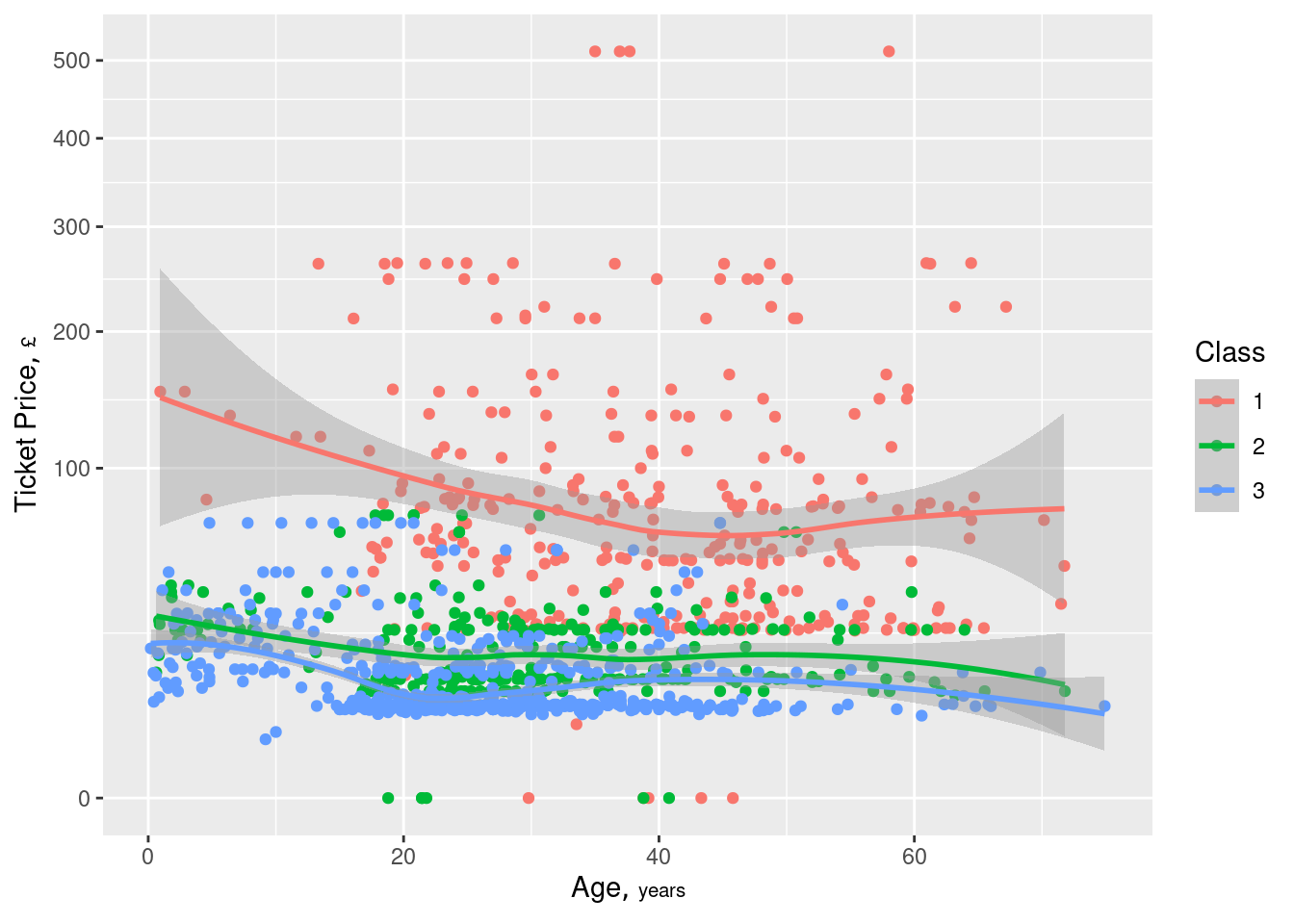
ggplot(w, aes(x=age, y=price, color=factor(class))) + geom_point() + geom_smooth() + scale_y_continuous(trans='sqrt') + guides(color=guide_legend(title='Class')) + hlabs(age, price)- Continuous outcome has been transformed so that the lower values can be more visible
- “Class” == 1 ⨯ Age shows some variation but the other two classes do not seem to show much. Lookng at the scatter of red dots, I’m skeptical that variation being shown by the curve.
- Although the decent separation of the “Class” groups may be what indicates an informative interaction
Continuous vs Binary by Binary
.png)
- Significant interaction effect (crossing)
- Variable A had no significant effect on participants in Condition B1 but caused a decline from A1 to A2 for those in Condition B2
- Significant interaction effect (crossing)
Continuous vs Continuous by Categorical
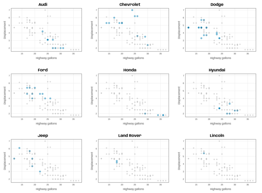
plot_manufacturer <- function(group) {

  ## check if input is valid
  if (!group %in% mpg$manufacturer) stop("Manufacturer not listed in the data set.")

  ggplot(mapping = aes(x = hwy, y = displ)) +
    ## filter for manufacturer of interest
    geom_point(data = filter(mpg, manufacturer %in% group),
               color = "#007cb1", alpha = .5, size = 4) +
    ## add shaded points for other data
    geom_point(data = filter(mpg, !manufacturer %in% group),
               shape = 1, color = "grey45", size = 2) +
    scale_x_continuous(breaks = 2:8*5) +
    ## add title automatically based on subset choice
    labs(x = "Highway gallons", y = "Displacement",
         title = group, color = NULL)
}

groups <- unique(mpg$manufacturer)
map(groups, ~plot_manufacturer(group = .x))
The grouping variable is the facet variable but also highlights the dots with color
Highlighting plus using all the data in each chart helps add context with the other groups when you want to compare groups but in a low data situation.
Continuous vs Continuous by Ordinal
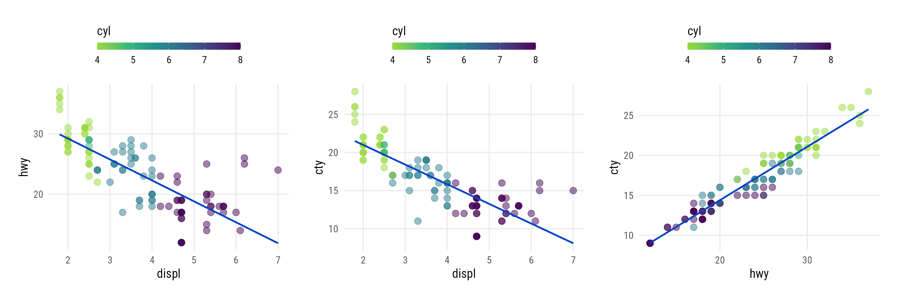
plot_scatter_lm <- function(data, var1, var2, pointsize = 2, transparency = .5, color = "") {

  ## check if inputs are valid
  if (!is.data.frame(data)) stop("data needs to be a data frame.")
  if (!is.numeric(pull(data[var1]))) stop("Column var1 needs to be of type numeric, passed as string.")
  if (!is.numeric(pull(data[var2]))) stop("Column var2 needs to be of type numeric, passed as string.")
  if (!is.numeric(pointsize)) stop("pointsize needs to be of type numeric.")
  if (!is.numeric(transparency)) stop("transparency needs to be of type numeric.")
  if (color != "") { if (!color %in% names(data)) stop("Column color needs to be a column of data, passed as string.") }

  g <-
    ggplot(data, aes(x = !!sym(var1), y = !!sym(var2))) +
    geom_point(aes(color = !!sym(color)), size = pointsize, alpha = transparency) +
    geom_smooth(aes(color = !!sym(color), color = after_scale(prismatic::clr_darken(color, .3))),
                method = "lm", se = FALSE) +
    theme_minimal(base_family = "Roboto Condensed", base_size = 15) +
    theme(panel.grid.minor = element_blank(),
          legend.position = "top")

  if (color != "") {
    if (is.numeric(pull(data[color]))) {
      g <- g + scale_color_viridis_c(direction = -1, end = .85) +
        guides(color = guide_colorbar(
          barwidth = unit(12, "lines"), barheight = unit(.6, "lines"), title.position = "top"
        ))
    } else {
      g <- g + scale_color_brewer(palette = "Set2")
    }
  }

  return(g)
}

map2(
  c("displ", "displ", "hwy"),
  c("hwy", "cty", "cty"),
  ~plot_scatter_lm(
    data = mpg, var1 = .x, var2 = .y,
    color = "cyl", pointsize = 3.5
  )
)
A continuous color scale is used for the ordinal variable
Trend shows relationship follows the ordinal variable values for the most part which might indicate that this interaction would be predictive
- Interesting values might be at dots where the colors are swapped — defying the order of the ordinal variable
Continuous vs Continuous by Categorical by Categorical
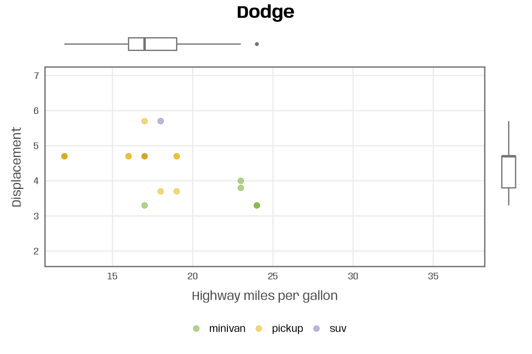
plot_manufacturer_marginal <- function(group, save = FALSE) { ## check if input is valid if (!group %in% mpg$manufacturer) stop("Manufacturer not listed in the data set.") if (!is.logical(save)) stop("save should be either TRUE or FALSE.") ## filter data data <- filter(mpg, manufacturer %in% group) ## set limits lims_x <- range(mpg$hwy) lims_y <- range(mpg$displ) ## define colors pal <- RColorBrewer::brewer.pal(n = n_distinct(mpg$class), name = "Dark2") names(pal) <- unique(mpg$class) ## scatter plot main <- ggplot(data, aes(x = hwy, y = displ, color = class)) + geom_point(size = 3, alpha = .5) + scale_x_continuous(limits = lims_x, breaks = 2:8*5) + scale_y_continuous(limits = lims_y) + scale_color_manual(values = pal, name = NULL) + labs(x = "Highway miles per gallon", y = "Displacement") + theme(legend.position = "bottom") ## boxplots right <- ggplot(data, aes(x = manufacturer, y = displ)) + geom_boxplot(linewidth = .7, color = "grey45") + scale_y_continuous(limits = lims_y, guide = "none", name = NULL) + scale_x_discrete(guide = "none", name = NULL) + theme_void() top <- ggplot(data, aes(x = hwy, y = manufacturer)) + geom_boxplot(linewidth = .7, color = "grey45") + scale_x_continuous(limits = lims_x, guide = "none", name = NULL) + scale_y_discrete(guide = "none", name = NULL) + theme_void() ## combine plots p <- top + plot_spacer() + main + right + plot_annotation(title = group) + plot_layout(widths = c(1, .05), heights = c(.1, 1)) ## save multi-panel plot if (isTRUE(save)) { ggsave(p, filename = paste0(group, ".pdf"), width = 6, height = 6, device = cairo_pdf) } return(p) } plot_manufacturer_marginal("Dodge")- {ggside} should be able to add these marginal plots with fewer lines of code.
- This is one of a set of facetted charts by the categorical, “manufacturer”
- Dots are grouped by categorical, “class”
- Top boxplot shows a minivan as an outlier in terms of hwy mpg.
- Box plots and the scatter plot are combined using {patchwork}
Correlation Heatmaps
- Filter data by different levels of a categorical, then note how correlations between numeric predictors and the numeric outcome change
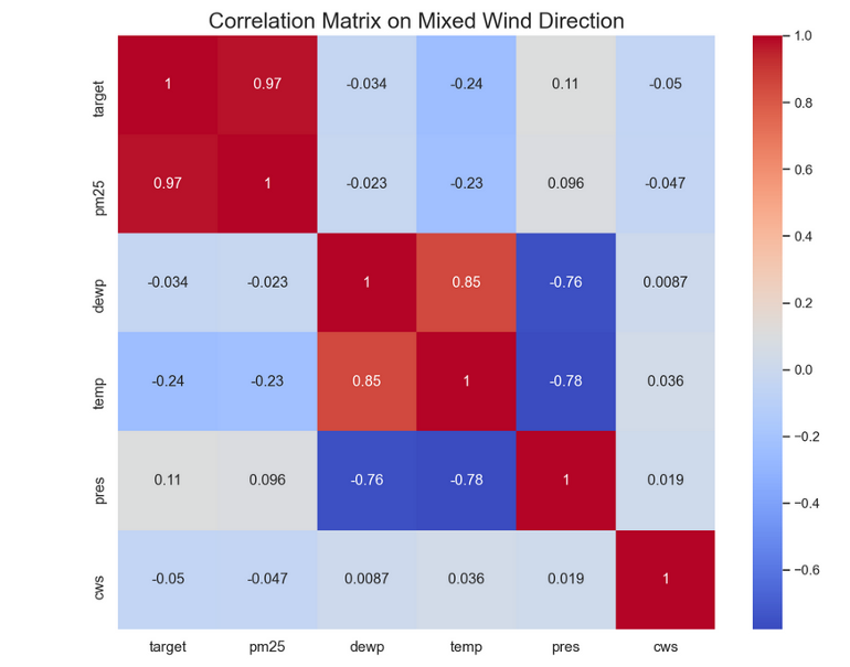
- Example: PM 2.5 pollution (outcome) vs complete dataset and filtered for Wind Direction = NE
- Complete
- Wind Direction = NE
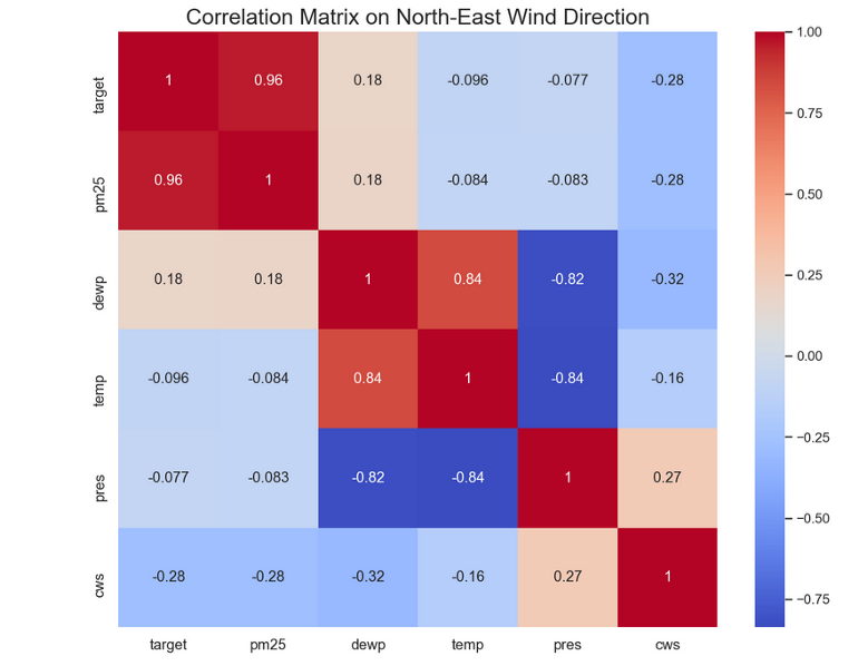
- Interpretation
- Temperature’s correlation (potentially its predictive strength) would lessen if would be interacted with Wind Direction. So we do NOT want to interact wind direction and temperature
- Article didn’t show whether it increases with other directions
- Wind Strength’s (cws) correlation with the outcome would increase if interacted with Wind Direction. So we do want to interacted wind direction and wind strength
- For ML, I think you’d dummy the wind direction, then multiply windspeed times each of the dummies.
- Temperature’s correlation (potentially its predictive strength) would lessen if would be interacted with Wind Direction. So we do NOT want to interact wind direction and temperature
- Complete
Boxplot by Discrete (Binned) Continuous
pmincan be similarily used as fct_lump (see below) but for discrete integer variablesIf the distribution of the discrete numeric is skewed to the right, then pmin will bin all integers larger than some number
- Most of the distribution are small integers and the rest will be binned into a sort of “other” category (e.g. 14)
If the distribution is skewed to the left,
pmaxcan be used similarily.
.png)
data %>% mutate(integer_var = pmin(integer_var, 14) %>% ggplot(aes(int_var, numeric_outcome, group = int_var)) + geom_boxplot()- If all the medians line up then no relationship. A slope or nonlinear pattern shows relationship.
Categorical Outcome
Numeric vs Numeric by Cat Outcome
Scatter with 45 degree line
ggplot(aes(num_predictor1, num_predictor2, color = cat_outcome_var)) + geom_point() + geom_abline(color = "red")- Look for groupings or other patterns wrt to cat var.
- Cat-var colored points above line skew more towards the higher y-var than x-var and vice versa for below the 45 degree line.
- Line also shows how linearly correlated the two num vars are.
- If clustering present, could indicate a good interaction pair with the numeric : cat_var
Scatter with linear smooth (or loess)
.png)
ggplot(aes(num_predictor1, num_predictor2)) + geom_point(alpha = 0.25) + geom_smooth(aes(color = cat_outcome_var), method = "lm")- Produces a lm line for each outcome var category
- Looking for differing trends for ranges of values on the x-axis. A pattern for one line that is substantially different from the other line
- Example: At around 28, the blue line trend rises while the red line continues to slope downwards, and they actually cross to where at some threshold of x, the relationship is the opposite. So an interaction is likely present
Binary Outcome (pct_event) vs Discrete by Discrete (or binary in this case)
.png)
data %>% mutate(avg_trans_amt = total_trans_amt / total_trans_ct) %?% group_by(total_trans_ct = cut(total_trans_ct, c(0,30, 40, 50, 60, 80, Inf)), avg_trans_amt = ifelse(avg_trans_amt >= 50, "> $50", "< $50") %>% # use to figure out best cut point(s) that keeps the ribbon width small-ish on all lines # avg_trans_amt = cut(avg_trans_amt, c(0, 50, 100, 130, Inf)) %>% summarize(n = n(), n_churned = sum(churned == "yes"), pct_churned = n_churned/n, low = qbeta(.025, n_churned + .5, n - n_churned + .5), high = qbeta(.975, n_churned + .5, n - n_churned + .5)) %>% arrange(desc(n)) %>% ggplot(aes(total_trans_ct, pct_churned, color = avg_trans_amt) + geom_point() + geom_line() + geom_ribbon(aes(ymin = low, ymax = high))- Interpretation:
- Clear alternating trend from about 0 to 40 on the x-axis says there’s probably an interaction (at least with the binned versions of these variables) between total_trans_ct and avg_trans_amt.
- i.e. The relationship between transaction count and churned (binary outcome) (pct_churned) depends on the average transaction amount
- Clear alternating trend from about 0 to 40 on the x-axis says there’s probably an interaction (at least with the binned versions of these variables) between total_trans_ct and avg_trans_amt.
- Example: The cut points for avg_trans_amt were chosen from its distribution
- The distribution was bi-modal and the 3 cutpoints were the 1st mode, point that splits both modal distributions, and the 2nd mode.
- {Upsetr} might be useful to examine bimodal structure and determine cutpoints based on categorical predictor values and not just outcome values
- {gghdr} - viz for multi-modal distribtutions
- Also see Regression, Other >> Mult-Modal
- Example of likely no interaction
.png)
- Blue and red lines move in unison. Same trend directions.
- There is separation, so the mean value of percent churn is different. Also, the slopes are different, so the rates of increase and decrease would be different. I’m not convinced. I’d like to see if an interaction term wouldn’t be significant
- kaggle sliced s01e07 dataset - percent churn (y-axis), revolving balance bucketed (x-axis), color = total_transactions dicotomized. DRob video for the code.
- Blue and red lines move in unison. Same trend directions.
- Interpretation:
Binary Outcome (pct_event) vs Categorical by Categorical
Sliding Window Continuous vs Binary Outcome (Proportion of Event) by Categorical
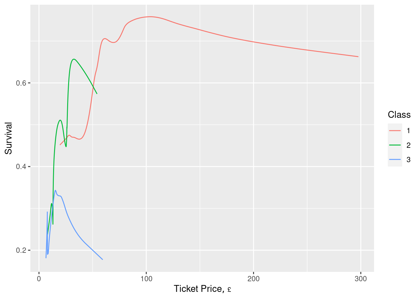
ggplot(z, aes(x=price, y=`Moving Proportion`, col=factor(class))) + geom_line() + guides(color=guide_legend(title='Class')) + xlab(hlab(price)) + ylab('Survival')- “Moving Proportion” is the mean of the binary outcome (probability of an event) over a sliding window of “Total Price”
- “Total Price” should be sorted in ascending order and grouped by “Class” before the sliding window is applied
- Harrell uses a default window of 15 observations on either side of the target point, but says the results can be noisy. Recommends passing the results through a smoother
- So, might want to add a
geom_smoothto the code chunk - I might like to see the data points to see how many points at the ends of lines there are. Smoothed lines can be misleading on the boundaries.
- So, might want to add a
Sliding Window Continuous vs Binary Outcome (Proportion of Event) by 2 Categoricals
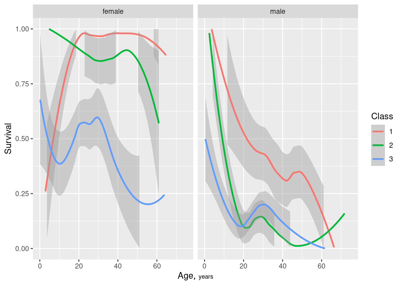
ggplot(d, aes(x=age, y=`Moving Proportion`, col=factor(class))) + geom_smooth() + facet_wrap(~ sex) + ylim(0, 1) + xlab(hlab(age)) + ylab('Survival') + guides(color=guide_legend(title='Class'))- Similar to above but grouped by 2 variables before the sliding window calculation.
Grouped Bar
.png)
summarize_churn <- function(tbl) { tbl %>% summarize(n = n(), n_churned = sum(churned == "yes"), pct_churned = n_churned/n, # Jeffrey's Interval (Bayesian CI) low = qbeta(.025, n_churned + .5, n - n_churned + .5), high = qbeta(.975, n_churned + .5, n - n_churned + .5)) %>% arrange(desc(n)) } plot_categorical <- function(tbl, categorical, ...) { tbl %>% ggplot(aes(pct_churned, [{{categorical}}]{style='color: goldenrod'}), ...) + geom_col(position = position_dodge()) + geom_errorbar(aes(xmin = low, xmax = high), height = 0.2, color = red, position = position_dodge(width = 1) + scale_x_continuous(labels = percent) + labs(x = "% in category that churned") } data %>% group_by(cat_var1, cat_var2) %>% summarize_churn() %>% plot_categorical(cat_var1, fill = cat_var2, group = cat_var2)- Interpretation: Probably not an interaction variable. Pct Churned by education Level doesn’t vary (much) by Gender especially if you take the error bars into account
- Only for “college” do you see a flip in the relationship where females churn more than men, but it’s still within the error bars.
- Interpretation: Probably not an interaction variable. Pct Churned by education Level doesn’t vary (much) by Gender especially if you take the error bars into account
Binary Outcome vs Binary by Categorical
.png)
- Not certain but I’d think you’d want your outcome on the x-axis. Although, if you swapped the x-axis variable with the grouping variable, you’d probably come to the same conclusion. Therefore, it may not matter that much
- Shows percent, and not counts