Nice implementations but package is not maintained
Notes for marketing and financial graphs taken from articles and vignettes introducing that package.
Marketing Plots
TL;DR - Most useful/popular are the Cumulative Gains and Cumulative Response graphs.
The example objective is to select the customers of a bank that are most likely to respond to an offer to purchase a “term deposit”. The outcome is binary: “term deposit” or “no”
Information from models used in these plots
Predicted probability for the target class
X-Axis: Equally sized groups based on this predicted probability
e.g. Splitting observations into deciles. Top 10% in predicted probability for target class would be in the first decile.
Number of observed target class observations in these groups
The test dataset is used for the plots to get a realistic idea of what a marketing campaign in the would would produce.
Response Plot has some GOF capability so I could maybe see using the validation set with that plot to compare models with.
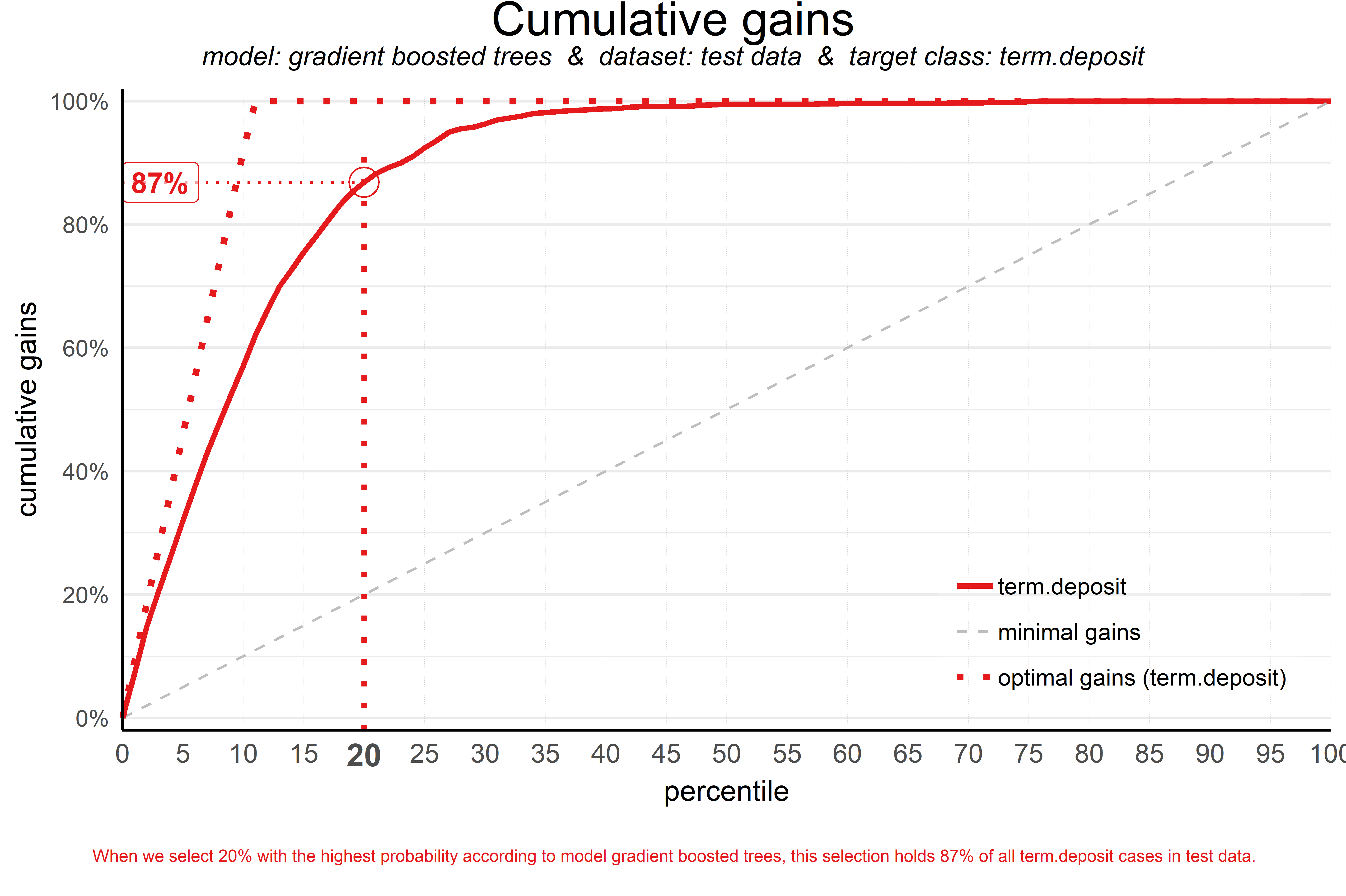
Cumulative Gains
AKA Gains Plot
Answers the question: “When we apply the model and select the best X quantiles, what % of the actual target class observations can we expect to target?”
y-axis = % of positive events (1s in binary classification) out of the entire dataset
How to apply:
Choose a probability threshold (i.e. the corresponding quantile on the x-axis). The graph shows the percentage of observations on the y-axis that are within that threshold
Choose the percentage of customers that you can afford to target with your campaign. The corresponding quantile on the x-axis shows the quantile and therefore the associated probability of positive result.
“When we select 20% with the highest probability according to gradient boosted trees, this selection holds 87% of all term deposit cases in test data.”
Says using the top 20% will include 87% of all the 1s (in binary classification) in the entire dataset.
If the gains is 87%, then there are potentially 13% of the total 1s that won’t be included in the campaign if we only target the top 20% percent.
wizard model (perfect model) line - line takes steepest route to 100% on y-axis as possible, depending on the percentage of your outcome variable is the target level.
For the graph above, it looks like around 12% of the outcome variable values are the positive event case since the line reaches the 100% on the y-axis a little past the 1st decile. So the perfect model predicts all those values as being the positive class.
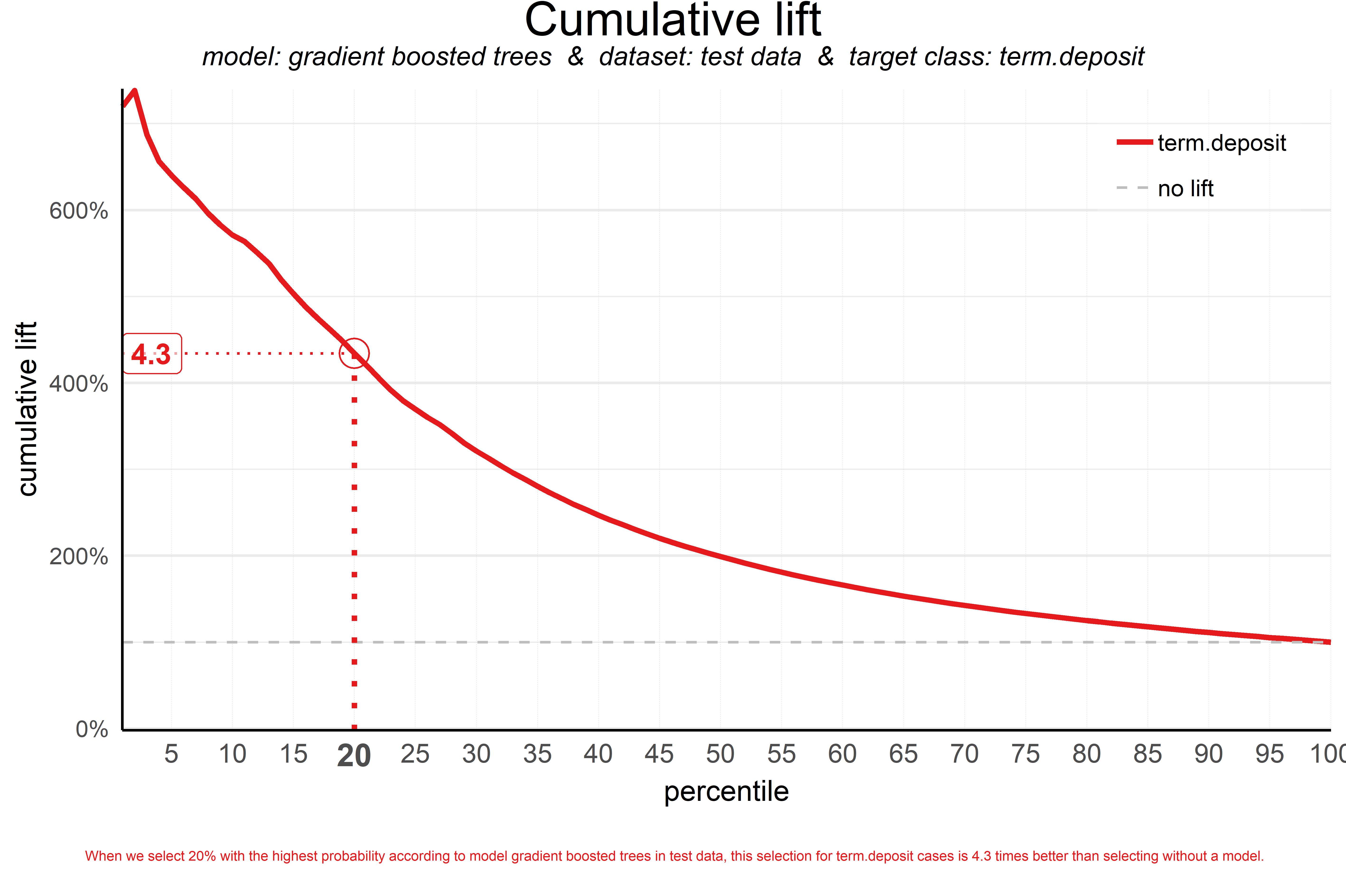
Cumulative Lift
AKA Index or Lift Plot
Especially useful for companies with little to no experience with data models
Answers the question: “When we apply the model and select the best X quantiles, how many times better is that than using no model at all?”
“no model at all” (i.e. coin flip) is a random model (also seen in the gains plot) is represented by a horizontal line at y = 1 or 100% depending on how the y-axis is specified. It is the ratio of the % of actual target category observations in each quantile to the overall % of actual target category observations after randomization of the rows of the data set.
The amount of lift can’t be generalized to all models and all data sets. So there aren’t guidelines as to what is a “good” lift score and what isn’t. If 50% of your data belongs to the target (positive) class of interest, a perfect model would ‘only’ do twice as good (lift: 2) as a random selection. If 10% of the data belong to the positive class, then lift = 10 or 1000% is the best possible lift score.
How to apply:
Choose a quantile (x-axis) and the corresponding y value can be used to explain to stakeholders how many times or what percent better this model is at selecting the top prospects than random selection.
“A term deposit campaign targeted at a selection of 20% of all customers based on our gradient boosted trees model can be expected to have a 4 times higher response (434%) compared to a random sample of customers.”
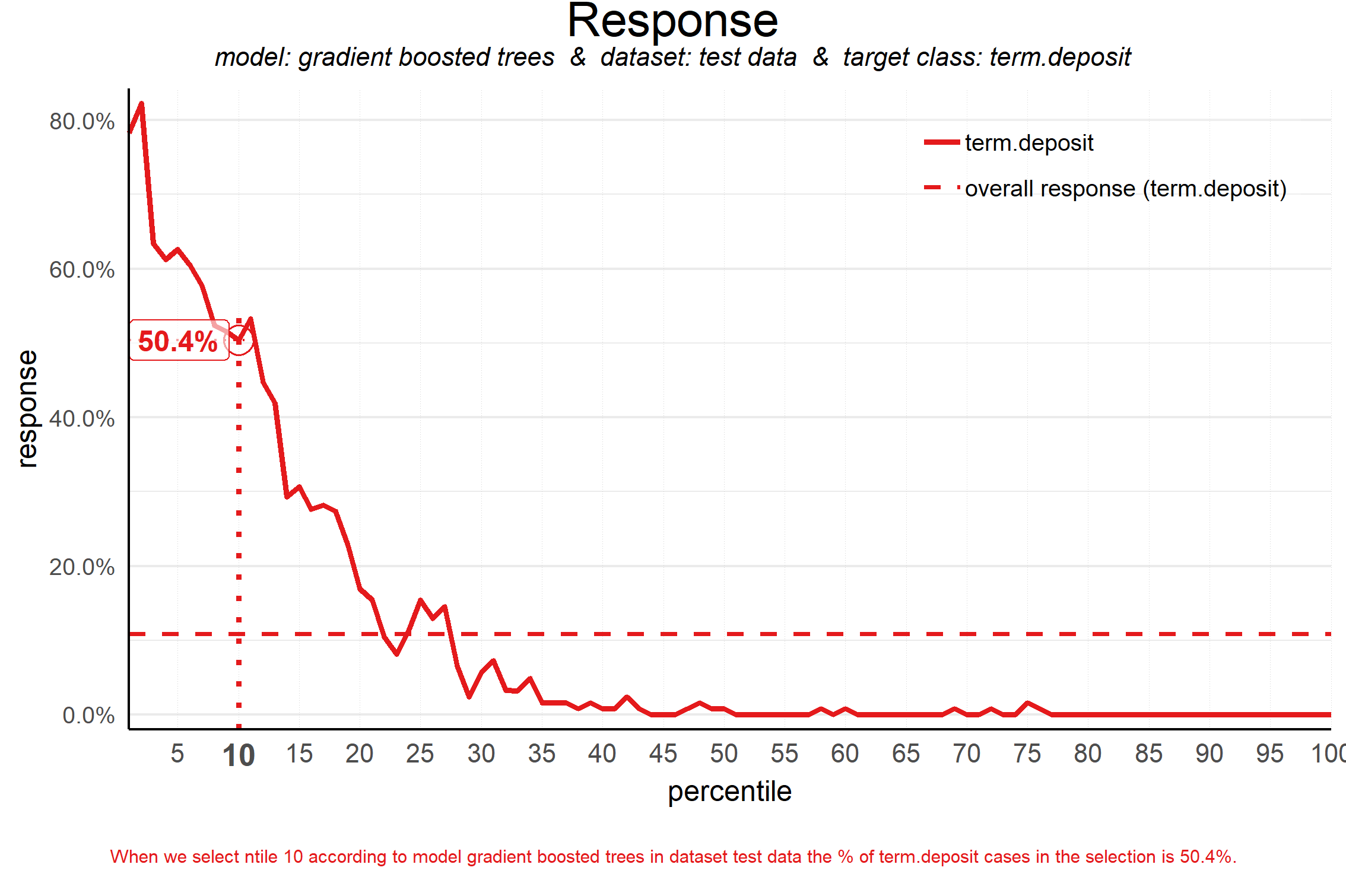
Response Plot
Plots the percentage of *target class* observations per quantile
note: the cumulative gains y-axis is total observations where this plot’s y-axis is just positive class (1s in a binary classification model)
Answers the question: “When we apply the model and select quantile X, what is the expected % of target class observations in that quantile?” but also gives information about the model fit.
How to apply:
This plot is more important in what it tells about the model fit than what it says about how many observations are in a particular quantile
A good fitting model will have a sharp sloping line with the highest response % in the lower quantiles. This says that the model is giving high probability scores to the vast majority of the positive class observations
For model comparison: the earlier the line crosses the horizontal (random model) line should indicate a steeper slope and therefore a better fit.
“When we select decile 1 (10th percentile) according to model gradient boosted trees in dataset test data the % of term deposit cases in the selection is 51%.”
The horizontal line represents a random model (i.e. the % of target class cases in the total set)
From the quantile where the line intersects the horizontal dashed-line and onwards, the % of target class cases is lower than a random selection of cases would hold.
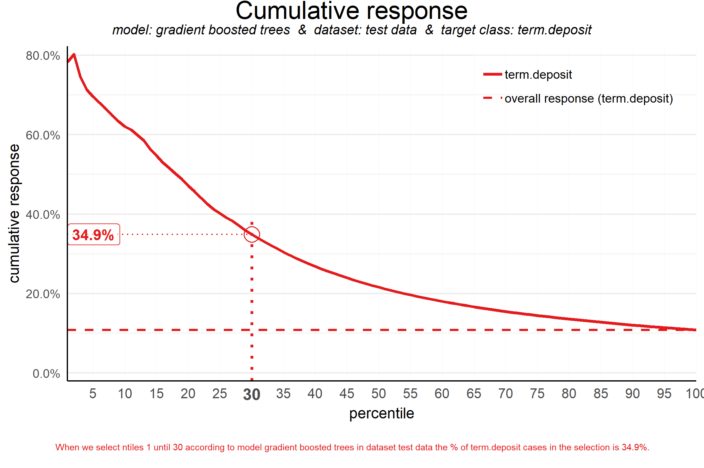
Cumulative Response
Answers the question: “When we apply the model and select up until quantile X, what is the expected % of target class observations in the selection?
Often used to decide - together with business colleagues - up until what decile to select for a marketing campaign
How to apply:
“When we select quantiles 1 until 30 according to model gradient boosted trees in dataset test data, the % of term deposit cases in the selection is 36%.”
In other words, targeting these customers should produce a response rate (percent of customers purchasing a term deposit) of 35% on average as compared to randomly selecting the same number of customers which is 12% (term deposits/total obs for the test set).
The y-axis is the percentage of 1s (in binary classification) in that subset (quantiles from 1 to 30). Different from cumulative gains where the y-axis is the percentage of 1s in the entire dataset.
Is that response big enough to have a successfull campaign, given costs and other expectations? Will the absolute number of sold term deposits meet the targets? Or do we lose too much of all potential term deposit buyers by only selecting the top 30%? To answer that question, we can go back to the cumulative gains plot.
The dashed horizontal is the same as in the Response Plot
Financial Plots
Example objective is to select the customers of a bank that are most likely to respond to an offer to purchase a “term deposit”. The outcome is binary: “term deposit” or “no”
fixed costs = $75,000 (a tv commercial and some glossy print material)
variable costs per unit = $50 (customers are given an incentive to buy)
profit per unit = $250
Information from models used in these plots
Same stuff as Marketing Plots
Fixed Costs (e.g. sales force expenses, advertising campaigns, sales promotion, and distribution costs)
Variable Costs per unit (e.g.sales commission, bonuses, and performance allowances)
Profit per Sale
The test dataset is used for the plots to get a realistic idea of what a marketing campaign in the would would cost and return. A validation set could be used on the Revenue and Costs Plot and models could be compared based risk of nonprofitability.
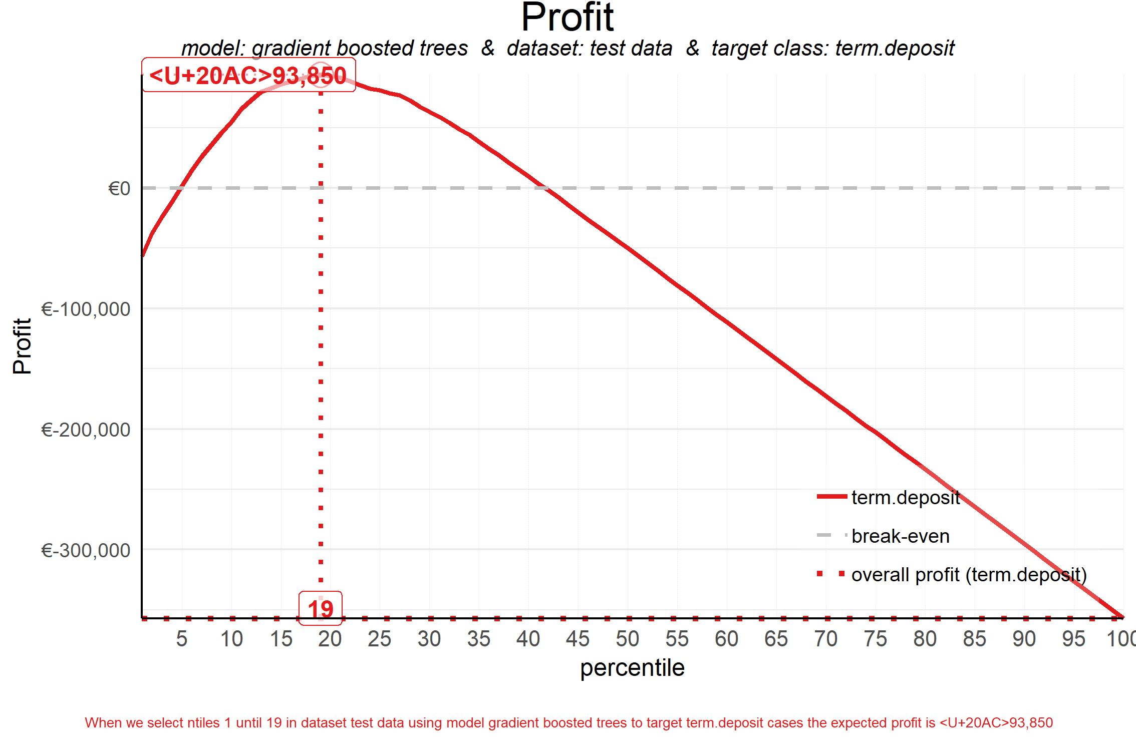
Profit Plot
Answers the question: “When we apply the model and select up until quantile X, what is the expected profit of the campaign?”
How to apply:
The most profitable quantile is the one directly under the apex of the curve.
The most profitable quantile is highlighted by default, but this can be specified if so desired
annotation means?
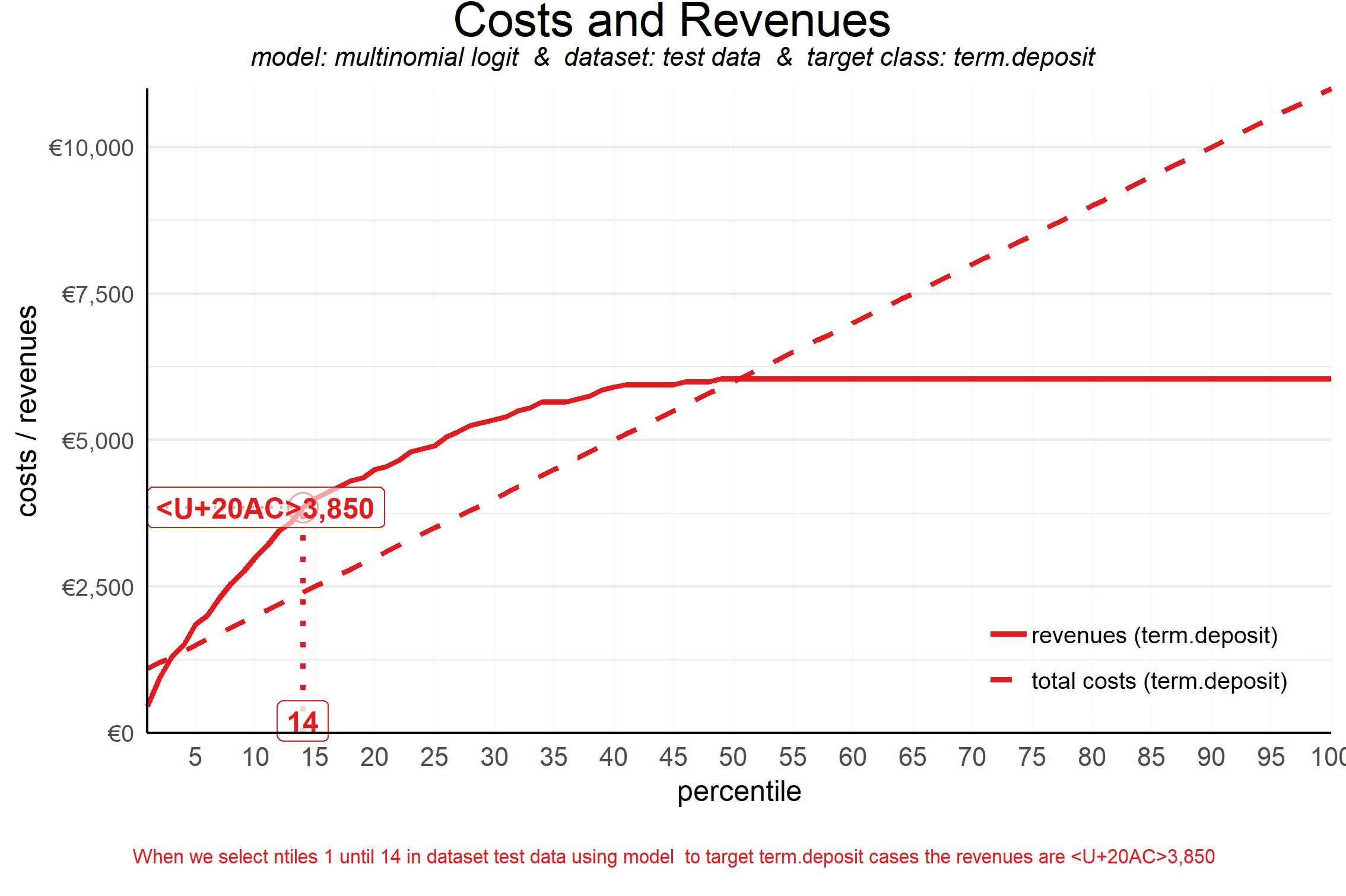
Costs and Revenues Plot
Answers the question: “When we apply the model and select up until decile X, what are the expected revenues and investments of the campaign?”
The costs are the cumulative costs of selecting up until a given decile and consist of both fixed costs and variable costs.
The revenues take into account the expected response % - as plotted in the cumulative response plot - as well as the expected revenue per response.
Solid curve is the revenue and the dashed diagonal line is the total costs
How to apply:
The campaign is profitable in the plot area where revenues exceed costs.
Gives an idea of the range of spending that can be considered while the campaign remains profitable. Ranges could be associated with risk. The smaller the range, the greater the risk given the uncertainty of the models. Various campaign ranges could be compared based on this risk.
See profits plot for optimal quantile.
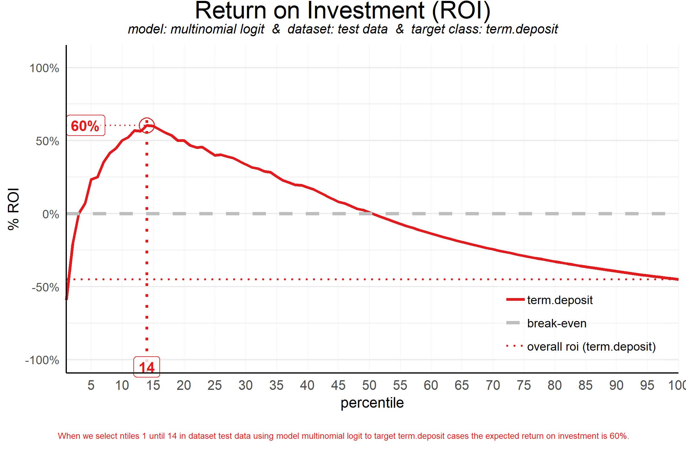
ROI Plot
Answers the question: “When we apply the model and select up until decile X, what is the expected % return on investment of the campaign?”
The quantile at which the campaign profit is maximized is not necessarily the same as the quantile where the campaign ROI is maximized
It can be the case that a bigger selection (higher decile) results in a higher profit, however this selection needs a larger investment (cost), impacting the ROI negatively.
So maximum ROI can be considered the most effficient use of resources, but it takes money to make (the most) money.
Basic formula for ROI = Net Profit / Total Investment * 100
How to apply:
The quantile directly underneath the apex of the curve is where the ROI is maximized.