Time Series
Misc
- Also see
- Resources
- {astsa} - Package, code, and docs for the books
- Time Series Analysis and Its Applications: With R Examples (graduate-level)
- See R >> Documents >> Time Series
- Time Series: A Data Analysis Approach using R (introductory)
- See R >> Documents >> Time Series
- Time Series Analysis and Its Applications: With R Examples (graduate-level)
- {astsa} - Package, code, and docs for the books
- Packages
{actfts} - A flexible approach to time series analysis by focusing on Autocorrelation (ACF), Partial Autocorrelation (PACF), and stationarity tests, generating interactive plots for dynamic data visualization.
{brolgar}
- Efficiently explore raw longitudinal data
- Calculate features (summaries) for individuals
- Evaluate diagnostics of statistical models
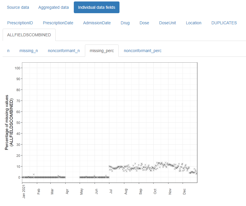
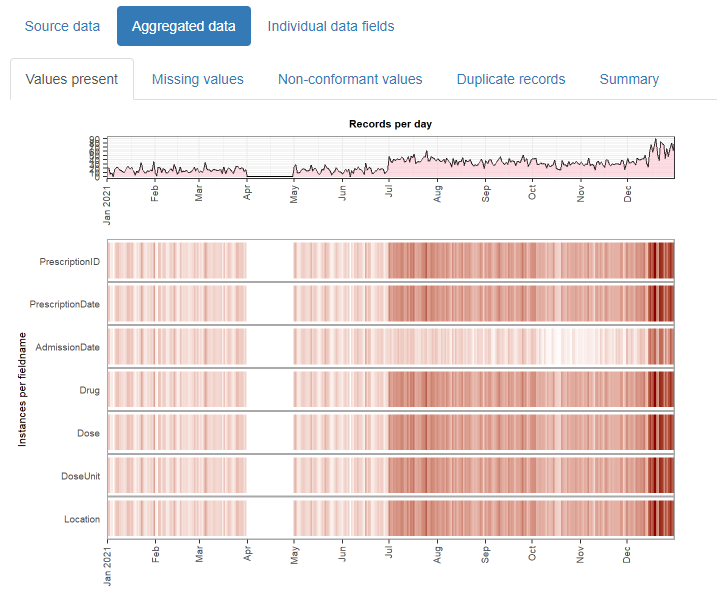
{daiquiri}
- Aggregated values are automatically created for each data field (column) depending on its contents (e.g. min/max/mean values for numeric data, no. of distinct values for categorical data)
- Overviews for missing values, non-conformant values, and duplicated rows.
{gglinedensity} - Provides a “derived density visualisation (that) allows users both to see the aggregate trends of multiple (time) series and to identify anomalous extrema.”
{ggtime} (Paper) - Various EDA ggplots for tsibble objects (Huang, Kay, Hyndman, O’Hara-Wild)
{lomb} (Paper) - Computes the Lomb-Scargle Periodogram (aka Least-Squares Spectral Analysis (LSSA)) and actogram
- Analyzes periodicity/seasonality for evenly or unevenly sampled time series (e.g. missing data on weekends/holidays).
- Effectively fits sine and cosine waves of specific frequencies to the data exactly where the data points exist, ignoring the gaps. It calculates how well different frequencies fit the observed data.
- It is invariant to time shifts and handles uneven sampling (like weekends) natively without needing imputation.
{mists} - A suite of 1d, 2d, and visual tools for exploring and polishing missing values residing in temporal data.
- Performs a “smart” removal (“polishing”) of observations when a time series dataset has NAs scattered throughout. It tries to remove bad chunks of NAs while still retaining as much information as possible by minimizing a loss function.
{MultivariateTrendAnalysis} - Univariate and Multivariate Trend Testing
{paneldesc} - Descriptive statistics EDA for panel data.
- Looks a little frustrating given the website (just create a pkgdown and some vignettes) and the fact that it uses the term “shares” instead of, what I think it means, proportions. Could just be my mood though.
{SignalY} - Signal Extraction from Panel Data via Bayesian Sparse Regression and Spectral Decomposition (Handles nonpanel data as well)
- This package has multiple use cases with methods for just about everything except actual forecasting, so I’m just sticking it here.
- Includes spectral decomposition methods for frequency analysis, bayesian sparse regression for feature selection, dimensionality reduction methods, unit root tests for stationarity
{timetk} - Various diagnostic, preprocessing, and engineering functions. Also available in Python
{trendtestR} - Exploratory Trend Analysis and Visualization for Time-Series and Grouped Data
- Uses model-based trend analysis using generalized additive models (GAM) for count data, generalized linear models (GLM) for continuous data, and zero-inflated models (ZIP/ZINB) for count data with potential zero-inflation.
- Also supports time-window continuity checks, cross-year handling in
compare_monthly_cases, and ARIMA-ready preparation with stationarity diagnostics
Basic Characteristics
Plot series
ts_tbl |> timetk::plot_time_series(date, value, .smooth = T, .smooth_span = 0.3, .interactive = F)- Includes a LOESS smoothing line. Control the curviness of LOESS using smooth_span
Missingness
- NAs affect the number of lags to be calculated for a variable
- e.g. exports only recorded quarterly but stock price has a monthly close price you want to predict. So if you’re forecasting monthly oil price then creating a lagged variable for exports is difficult
- Bizsci (lab 29), minimum_lag = length_of_sequence_of_tail_NAs +1
- tail(ts) are the most recent values
- Bizsci (lab 29), minimum_lag = length_of_sequence_of_tail_NAs +1
- e.g. exports only recorded quarterly but stock price has a monthly close price you want to predict. So if you’re forecasting monthly oil price then creating a lagged variable for exports is difficult
- Even if you don’t want a lag for a predictor var and it has NAs, you need to
recipe::step_lag(var, lag = #_of_tail_NAs). So var has no NAs. - Consider seasonality of series when determining imputation method
- NAs affect the number of lags to be calculated for a variable
Outcome Variable Distribution
For low volume data, a right-skewed distribution might be needed instead of a Gaussian.
- Thin tails - Use a Gamma distribution
- Heavier tails - Use a Log Normal or the Inverse Gaussian
Example
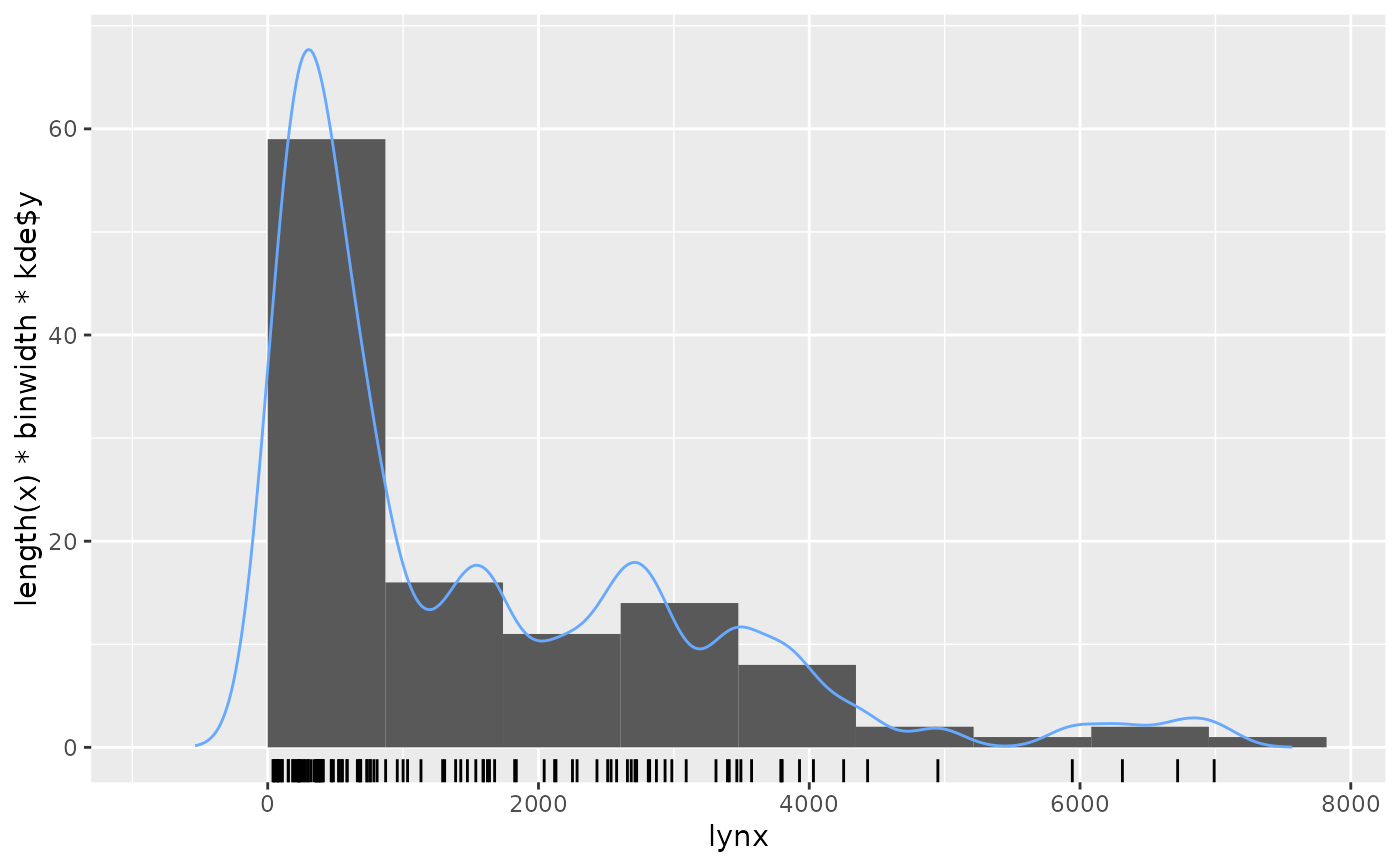
gghistogram(lynx, add.kde=TRUE)- add.normal adds a gaussian density
Zeros
- See notebook for tests on the number of zeros in Poisson section
- Might be tests in the intermittent forecasting packages, so see bkmks
- If so, see Logistics, Demand Forecasting >> Intermittent Demand for modeling approaches
- Are there gaps in the time series (e.g. missing a whole day/multiple days, days of shockingly low volume)?
Is data recorded at irregular intervals. If so:
- {BINCOR} handles cross-correlation between 2 series with irregular intervals and series with regular but different intervals
- I think common forecasting algorithms require regularly spaced data, so look towards ML, Multilevel Model for Change (MLMC), or Latent Growth Models
- May also try binning points in the series (like BINCOR does) or smoothing them to get a regular interval
Seasonality and Trend
- STL Decomposition
Also see Forecasting, Decomposition
STL uses LOESS for the seasonal component which handles fluctuations in that component better than the classical decomposition approach.
Advantages vs X-* SEATS
- Unlike SEATS and X-11, STL will handle any type of seasonality, not only monthly and quarterly data.
- The seasonal component is allowed to change over time, and the rate of change can be controlled by the user.
- The smoothness of the trend-cycle can also be controlled by the user.
- It can be robust to outliers (i.e., the user can specify a robust decomposition), so that occasional unusual observations will not affect the estimates of the trend-cycle and seasonal components. They will, however, affect the remainder component.
A multiplicative decomposition can be obtained by first taking logs of the data, then back-transforming the components.
Decompositions that are between additive and multiplicative can be obtained using a Box-Cox transformation of the data with \(0\lt \lambda \lt 1\).
- \(\lambda = 0\) gives a multiplicative decomposition while \(\lambda = 1\) gives an additive decomposition.
If we are interested in short- or long-term movements of the time series, we do not care about the various seasonalities. We want to know the trend component of the time series and if it has reached a turning point
Is there strong seasonality or trend?
If there’s a pattern in the random/remainder component, this could indicate that there are other strong influences present. This component could give you ideas of the type of features you should create.
Example: {timetk}
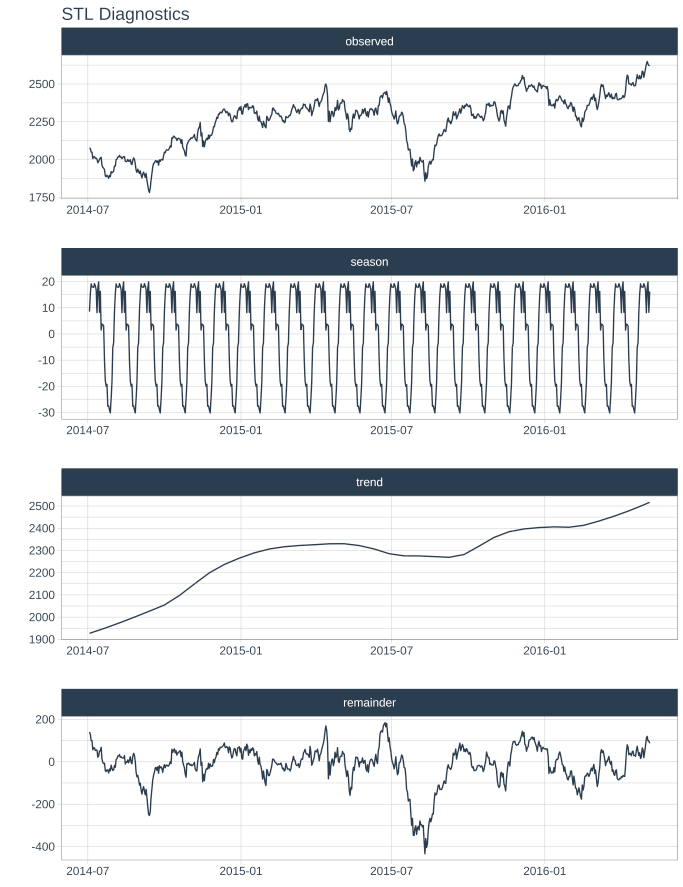
ts_tbl %>% plot_stl_diagnostics( date, value, .feature_set = c("observed", "season", "trend", "remainder"), .trend = 180, .frequency = 30, .interactive = F )- “seasadj” also available for .feature_set
- For .frequency, “auto”, a time-based definition (e.g. “2 weeks”), or a numeric number of observations per frequency (e.g. 10).
- “auto” or
tk_get_frequency()will tell you the frequency of your series.
- “auto” or
Example: {fable} (source)
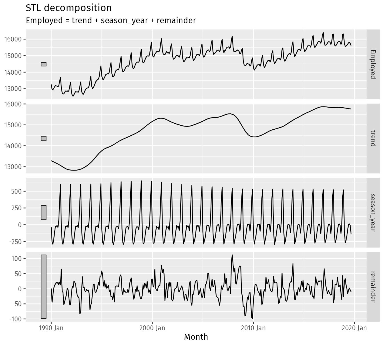
dcmp <- us_retail_employment |> model(stl = STL(Employed)) components(dcmp) #> # A dable: 357 x 7 [1M] #> # Key: .model [1] #> # : Employed = trend + season_year + remainder #> .model Month Employed trend season_year remainder season_adjust #> <chr> <mth> <dbl> <dbl> <dbl> <dbl> <dbl> #> 1 stl 1990 Jan 13256. 13288. -33.0 0.836 13289. #> 2 stl 1990 Feb 12966. 13269. -258. -44.6 13224. #> 3 stl 1990 Mar 12938. 13250. -290. -22.1 13228. #> 4 stl 1990 Apr 13012. 13231. -220. 1.05 13232. #> 5 stl 1990 May 13108. 13211. -114. 11.3 13223. #> 6 stl 1990 Jun 13183. 13192. -24.3 15.5 13207. #> 7 stl 1990 Jul 13170. 13172. -23.2 21.6 13193. #> 8 stl 1990 Aug 13160. 13151. -9.52 17.8 13169. #> 9 stl 1990 Sep 13113. 13131. -39.5 22.0 13153. #> 10 stl 1990 Oct 13185. 13110. 61.6 13.2 13124. #> # ℹ 347 more rows components(dcmp) |> autoplot()- For more flexible output, two main parameters can be chosen when using STL are the trend-cycle window trend(window = ?) and the seasonal window season(window = ?). (See source for details)
Daily Seasonal Adjustment (DSA)
- Used to remove seasonal and calendar effects from time series data with daily observations. This allows you to analyze the underlying trends and patterns in the data without being masked by predictable fluctuations like weekdays, weekends, holidays, or seasonal changes.
- In a EDA context, the deseasonalized series can be used to locate the time series trend (daily data is very noisy), identify turning points, and compare components with other series.
- Packages: {dsa}
- Notes from Seasonal Adjustment of Daily Time Series
- Example shows it outperforming Hyndman’s STR procedure in extracting seasonal components more completely.
- Daily data can have multiple seasonalities present
- Raw Time Series
- DSA Processed Time Series
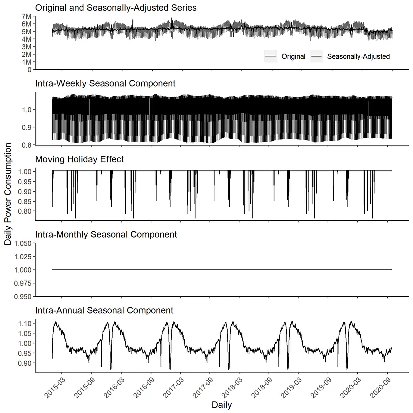
- Raw Time Series
- Combines the seasonal trend decomposition procedure using Loess (STL) with a regression model with ARIMA errors
- Procedure
- STL adjusts intra-weekly periodic patterns.
- RegARIMA estimates calendar effects, cross-seasonal effects, and outliers.
- STL adjusts intra-monthly periodic effects.
- STL adjusts intra-annual effects
- Seasonality Tests (weekly, monthly, and yearly)
- {seastests} QS and Friedman (see bkmk in Time Series >> eda for example)
- QS test’s null hypothesis is no positive autocorrelation in seasonal lags in the time series
- Friedman test’s null hypothesis is no significant differences between the values’ period-specific means present in the time series
- For QS and Friedman, pval > 0.05 indicates NO seasonality present
- Additive or Multiplicative Structure
- Is the variance (mostly) constant (Additive) or not constant (Multiplicative) over time?
- Does the amplitude of the seasonal or cyclical component increase over time?
.png)
- The amplitude of the seasonal component increases over time so this series has a multiplicative structure
- Also multiplicative, if there’s a changing seasonal amplitude for different times of the year
- {nlts::add.test} - Lagrange multiplier test for additivity in a time series
- If you have a multiplicative structure and zeros in your data (i.e. intermittent data), then they must handled in some way.
- Level Changes in Trend
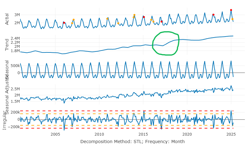
In green circle, you can see the abrupt change in level
If the cause behind this change is something that can be determined beforehand, then it can be used as a feature in the model
If you have a monotone series that’s expected to continue the new trend, then adding an indicator that will be true for all future data may be useful. (source)
ts$level_change <- ifelse(ts$date >= as.Date("2018-09-01"), 1, 0)
Groups
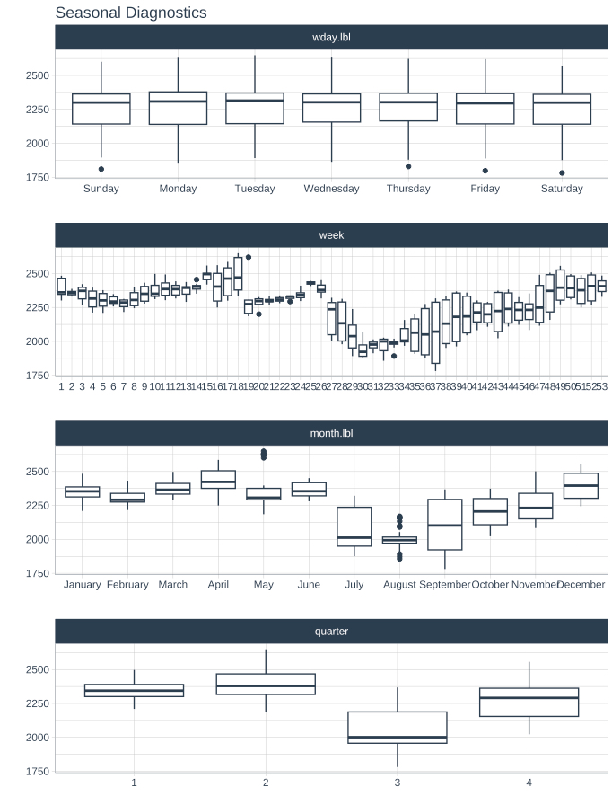
- Quantile values per frequency unit (by group and total)
{timetk::plot_time_series_boxplot}
Average closing price for each month, each day of the month, each day of the week
When are dips and peaks?
Which groups are similar
What are the potential reasons behind these dips and peaks?
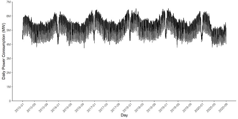
Example: Daily Power Consumption
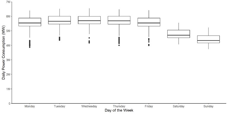
- Median, the lower quartile, and the upper quartile for Saturdays and Sundays are below the remaining weekdays when inspecting daily power consumption
- Some outliers are present during the week, which could indicate lower power consumption due to moving holidays
- Moving holidays are holidays which occur each year, but where the exact timing shifts (e.g. Easter)
Example: {timetk} Calendar Effects
ts_tbl %>% plot_seasonal_diagnostics(date, value, .interactive = F)Example: Monthly Precipitation (source)
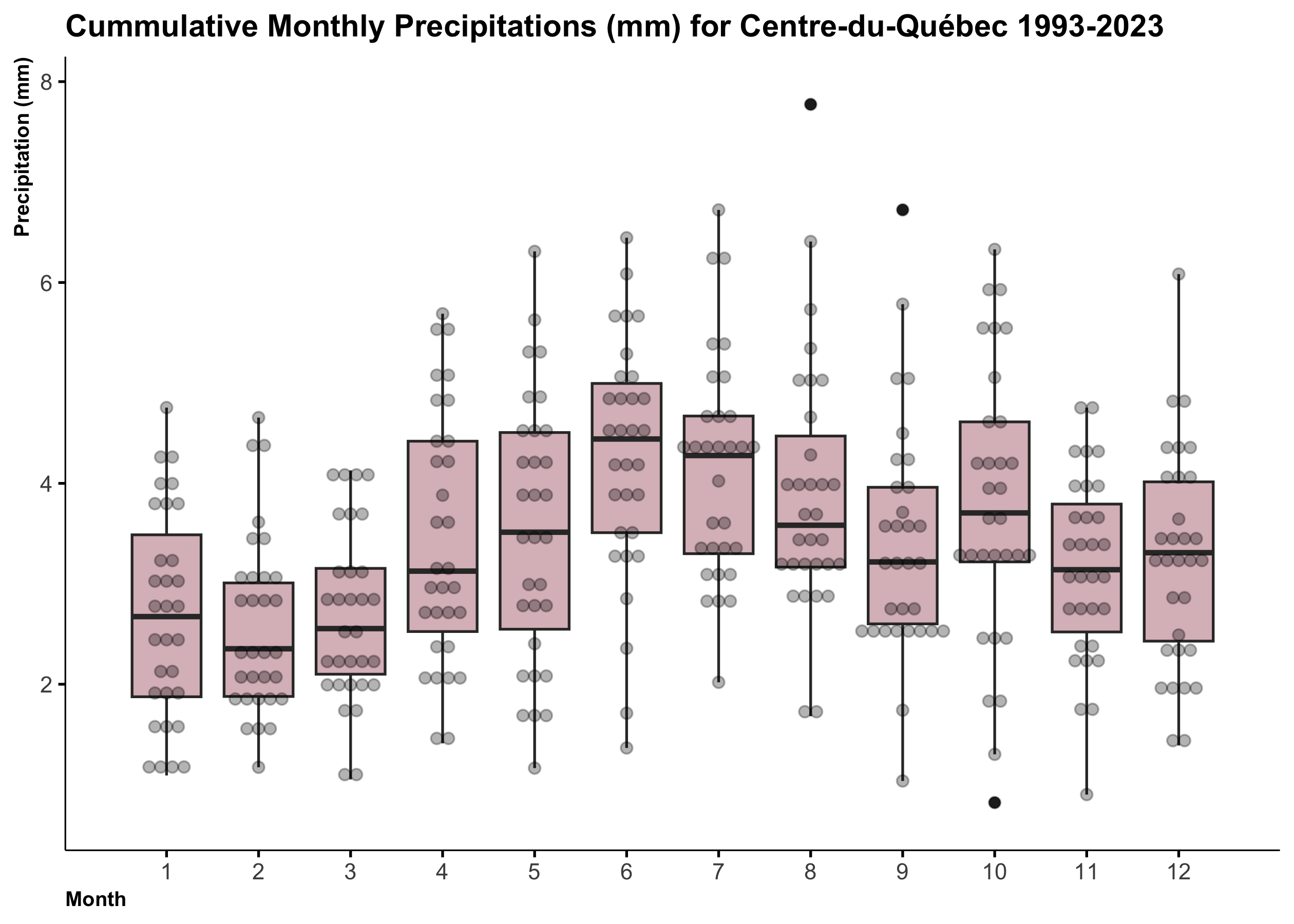
ggplot(precipitation_dt, aes(x = month, y = mean*1000, group = month)) + geom_boxplot(fill="#DBBDC3")+ geom_dotplot(binaxis = "y", stackdir = "center", dotsize = 0.5, alpha=0.3)+ labs(title="Cummulative Monthly Precipitations (mm) for Centre-du-Québec 1993-2023", x="Month", y="Precipitation (mm)")+ theme(plot.title = element_text(hjust = 0, face = "bold", size=12), axis.title.x = element_text(hjust = 0, face = "bold", size=8), axis.title.y = element_text(hjust = 1, face = "bold", size=8))+ scale_x_continuous(breaks=seq(1,12,1), limits=c(0.5, 12.5))Example: Monthly Power Consumption
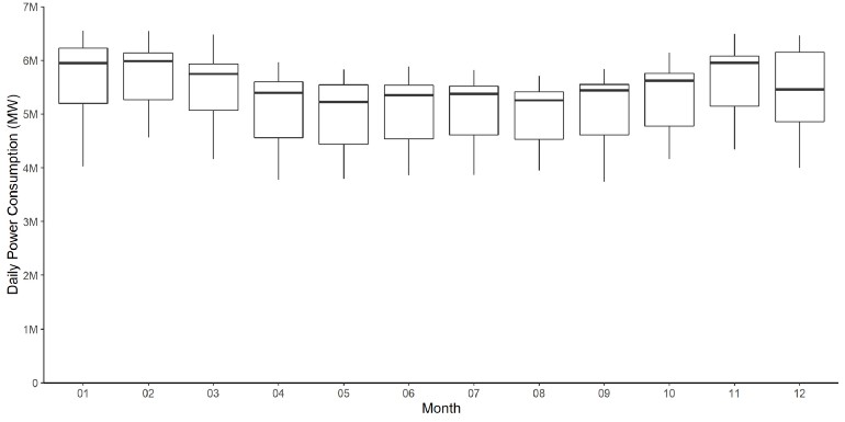
- Median, the lower quartile, and the upper quartile of power consumption are lower during the spring and summer than autumn and winter
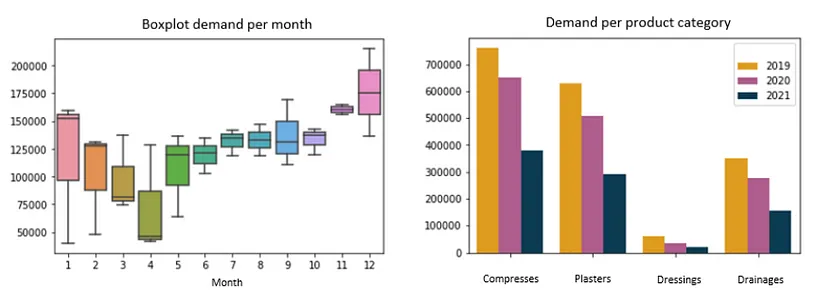
Example: Demand per Month and per Category
Interactive Spaghetti Plot (source)
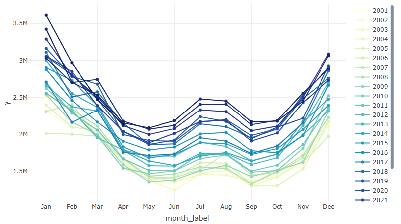
years <- unique(ts2$year)

colors <- colorRampPalette(RColorBrewer::brewer.pal(9, "YlGnBu"))(length(years))

p <- plot_ly()

for (i in seq_along(years)) {
  year_data <- ts2 |> filter(year == years[i])

  p <- p |>
    add_trace(
      data = year_data,
      x = ~month_label,
      y = ~y,
      type = 'scatter',
      mode = 'lines+markers',
      name = as.character(years[i]),
      line = list(color = colors[i]),
      marker = list(color = colors[i])
    )
}

p
- Cumulative Counts per Group
- Similar pattern indicating seasonality
- 2011 seems like an outlier
- Variance of value by group
- Example: how sales vary between store types over a year
- Important to standardize the value by group
df %>% group_by(group) %>% mutate(sales = scale(sales))
- Which groups vary wildly and which are more stable
- Important to standardize the value by group
- Example: how sales vary between store types over a year
- Rates by group
- Example: sales($) per customer
df %>% group_by(group, month) %>% mutate(sales_per_cust = sum(sales)/sum(customers)
- Example: sales($) per customer
Statistical Features
- Outliers
Also see
- “PCA the Features” below
- Anomaly Detection
A indicator variable can also be used to account for an outlier in the data. Rather than omit the outlier, an indicator variable removes its effect. (FPP 3, 7.4)
If deemed a mistake, outliers can be recoded as NA. Then an imputation/interpolation method can be applied.
Example: Using the Remainder to detect outliers (source)
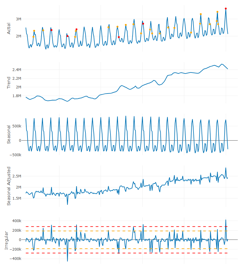
sdv <- sd(ts_stl_d$remainder) ts_stl_d <- ts_stl_d |> dplyr::mutate(sd3 = ifelse(remainder >= 3 * sdv | remainder <= -3 * sdv, y, NA ), sd2 = ifelse(remainder >= 2 * sdv & remainder < 3 * sdv | remainder <= -2 * sdv & remainder > -3 * sdv, y, NA)) table(!is.na(ts_stl_d$sd2)) #> FALSE TRUE #> 270 22 table(!is.na(ts_stl_d$sd3)) #> FALSE TRUE #> 286 6- Krispin manually made this STL plot with plotly, so see source for the code
- He used 2 and 3 times the standard deviation of the remainder as thresholds for spotting outlier points.
- Point are orange (2x) and red (3x) in the observed series. Dashed lines in the remainder indicate the thresholds.
- These points require further investiigation as they might be difficult to forecast with standard modeling techniques. Features may be built so that the model can account for them.
Example: Using quantiles of STL remainder (source)
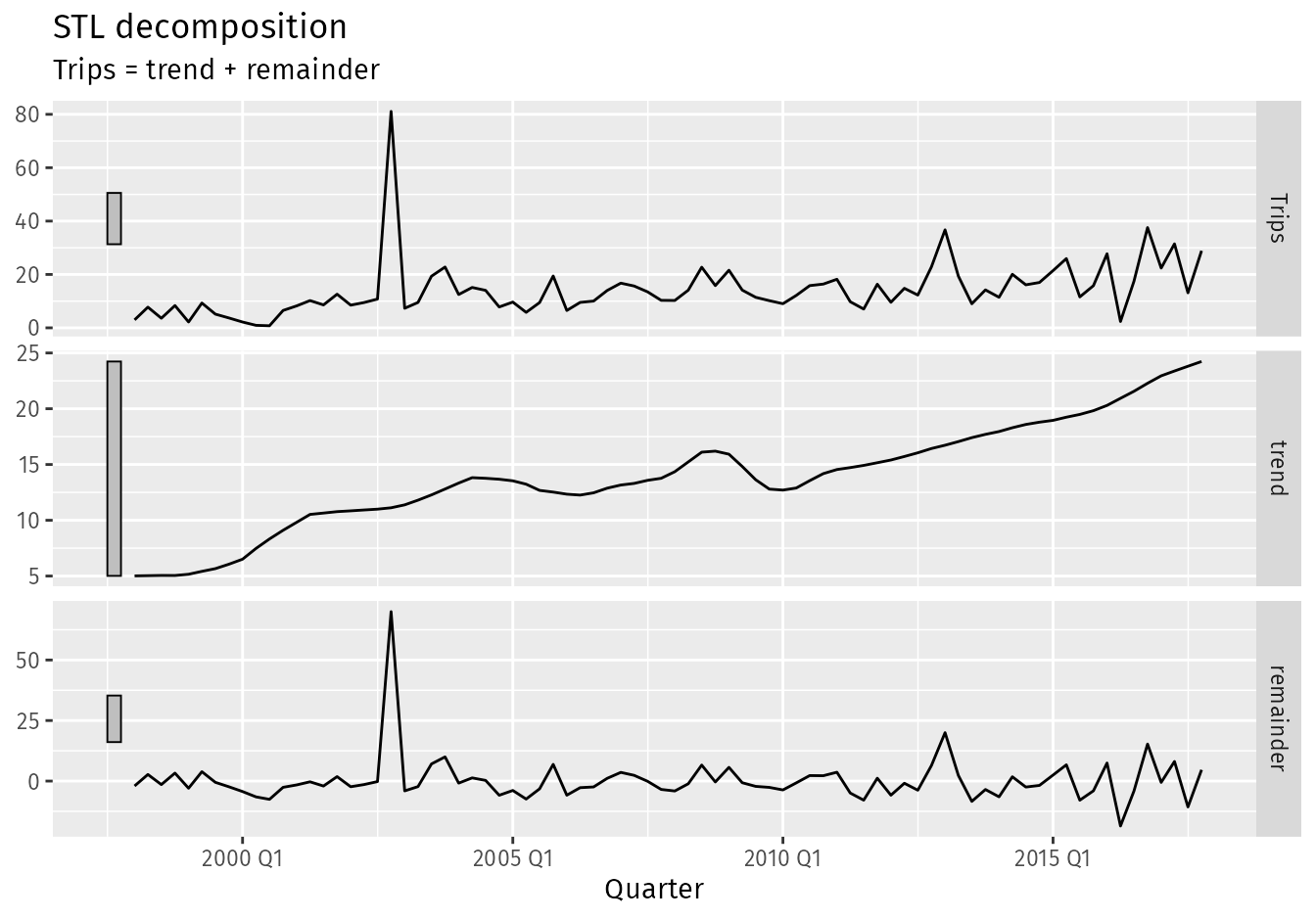
ah_decomp <- tourism |> filter( Region == "Adelaide Hills", Purpose == "Visiting" ) |> # Fit a non-seasonal STL decomposition model( stl = STL(Trips ~ season(period = 1), robust = TRUE) ) |> components() ah_decomp |> autoplot() outliers <- ah_decomp |> filter( remainder < quantile(remainder, 0.25) - 3*IQR(remainder) | remainder > quantile(remainder, 0.75) + 3*IQR(remainder) ) outliers #> # A dable: 1 x 9 [1Q] #> # Key: Region, State, Purpose, .model [1] #> # : Trips = trend + remainder #> Region State Purpose .model Quarter Trips trend remainder season_adjust #> <chr> <chr> <chr> <chr> <qtr> <dbl> <dbl> <dbl> <dbl> #> 1 Adelaide H… Sout… Visiti… stl 2002 Q4 81.1 11.1 70.0 81.1Example: {timetk}
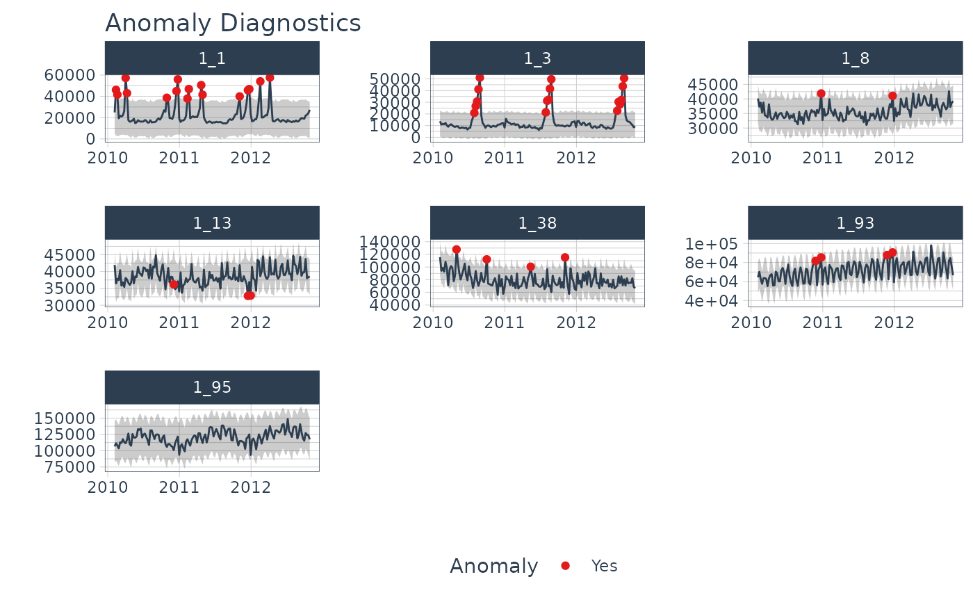
walmart_sales_weekly |>
    group_by(id) |>
    plot_anomaly_diagnostics(Date, Weekly_Sales,
                             .message = FALSE,
                             .facet_ncol = 3,
                             .ribbon_alpha = 0.25,
                             .interactive = FALSE)
- Statistical Features vs Outcome
Misc
Also see Feature Engineering, Time Series
Resources
Feature-based time series analysis (Hyndman Blog Post)
Krispin notebook that details using {tsfeatures} to extract features from a group series. Then, he PCAs and Clusters the features, and uses a shiny dashboard to eda them.
Determining seasonal strength, trend strength, spectral entropy for series might indicate a particular group of models is likely better than others at forecasting these series.
Determining outlier series may indicate further exploration is required. A different set of variables may be more predictive for these series than the others.
PCA and clustering of statistical features may indicate distinct groups of series that can be grouped together into a global model.
First Autocorrelation Coefficient vs Categorical vs Binary Outcome
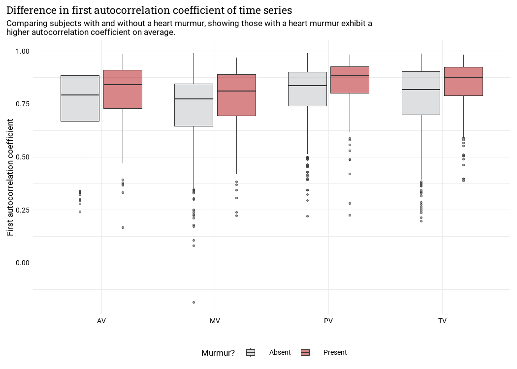
- There does seem to be some variance. An interaction between autocorrelation and the cateogorical variable might be predictive of a heart murmur event.
- Trend Strength and Seasonal Strength plots
- {tsfeatures} has seasonality strength metric
- Seems like this can tease apart the Spectral Entropy value into its constituents.
- e.g. Maybe a series has a medium positive spectral entropy score because of really strong seasonal strength but only middling trend strength.
- Cox-Stuart test - Tests whether there’s an increasing or decreasing trend
- {tsutils::trendtest} - Test a time series for trend by either fitting exponential smoothing models and comparing then using the AICc, or by using the non-parametric Cox-Stuart test.
- Shannon Spectral Entropy
feasts::feat_spectralwill compute the (Shannon) spectral entropy of a time series, which is a measure of how easy the series is to forecast.- A series which has strong trend and seasonality (and so is easy to forecast) will have entropy close to 0.
- A series that is very noisy (and so is difficult to forecast) will have entropy close to 1.
- PCA the Features
Identify characteristics for high dimensional data (From fpp3)
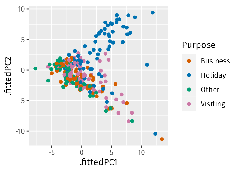
library(broom) library(feasts) tourism_features <- tourism |> features(Trips, feature_set(pkgs = "feasts")) pcs <- tourism_features |> select(-State, -Region, -Purpose) |> prcomp(scale = TRUE) |> augment(tourism_features) pcs |> ggplot(aes(x = .fittedPC1, y = .fittedPC2, col = Purpose)) + geom_point() + theme(aspect.ratio = 1)- Holiday series behave quite differently from the rest of the series. Almost all of the holiday series appear in the top half of the plot, while almost all of the remaining series appear in the bottom half of the plot.
- Clearly, the second principal component is distinguishing between holidays and other types of travel.
- The four points where PC1 > 10 stand out as outliers.
Visualize Outliers
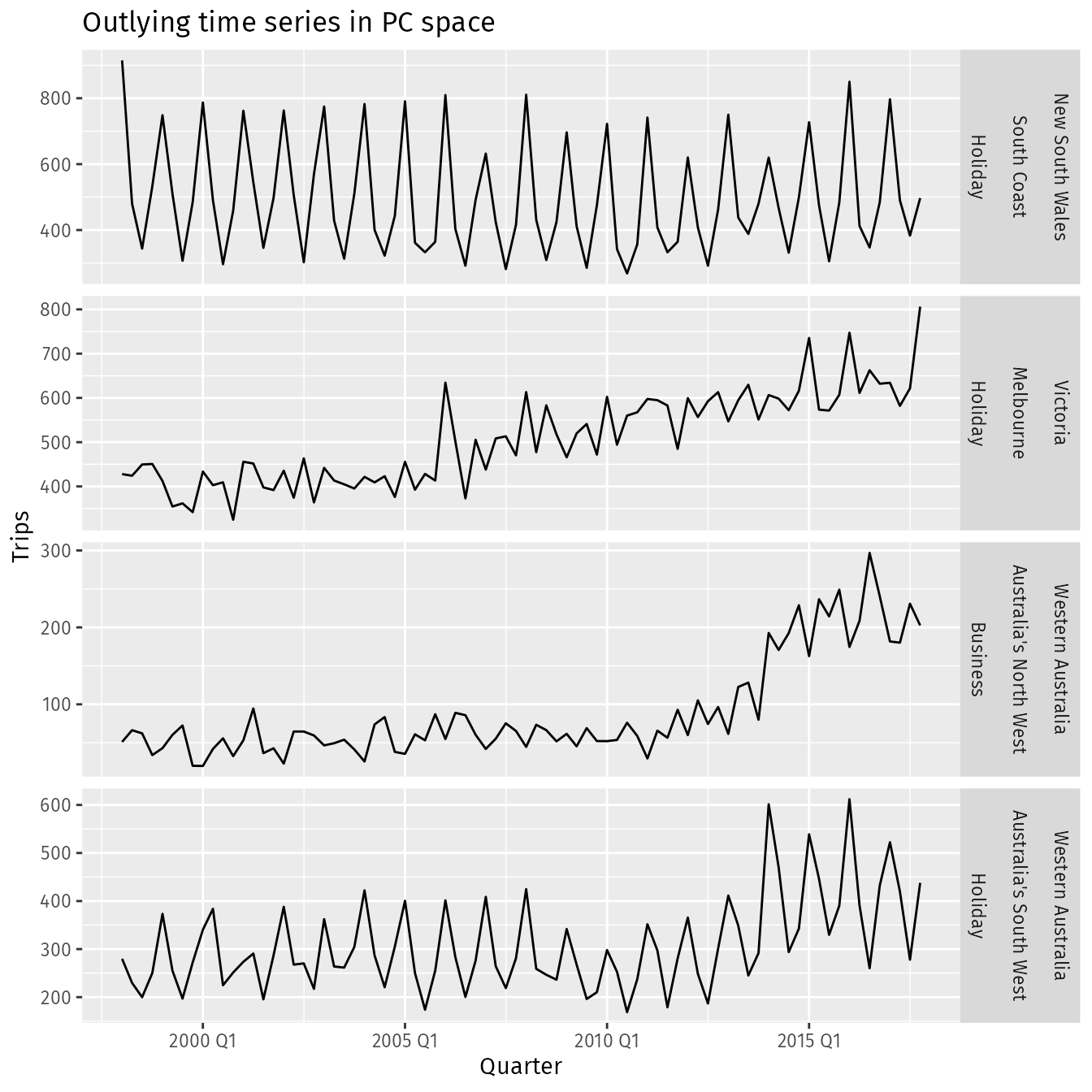
outliers <- pcs |>
  filter(.fittedPC1 > 10) |>
  select(Region, State, Purpose, .fittedPC1, .fittedPC2)
outliers
#> # A tibble: 4 × 5
#>   Region                 State             Purpose  .fittedPC1 .fittedPC2
#>   <chr>                  <chr>             <chr>         <dbl>      <dbl>
#> 1 Australia's North West Western Australia Business       13.4    -11.3
#> 2 Australia's South West Western Australia Holiday        10.9      0.880
#> 3 Melbourne              Victoria          Holiday        12.3    -10.4
#> 4 South Coast            New South Wales   Holiday        11.9      9.42
outliers |>
  left_join(tourism,
            by = c("State", "Region", "Purpose"),
            multiple = "all") |>
  mutate(Series = glue("{State}", "{Region}", "{Purpose}",
                       .sep = "\n\n")) |>
  ggplot(aes(x = Quarter, y = Trips)) +
  geom_line() +
  facet_grid(Series ~ .,
             scales = "free") +
  labs(title = "Outlying time series in PC space")
Why might these series be identified as unusual?
- Holiday visits to the south coast of NSW is highly seasonal but has almost no trend, whereas most holiday destinations in Australia show some trend over time.
- Melbourne is an unusual holiday destination because it has almost no seasonality, whereas most holiday destinations in Australia have highly seasonal tourism.
- The north western corner of Western Australia is unusual because it shows an increase in business tourism in the last few years of data, but little or no seasonality.
- The south western corner of Western Australia is unusual because it shows both an increase in holiday tourism in the last few years of data and a high level of seasonality.
- Clustering the Features
- Boxplots: Feature vs Cluster
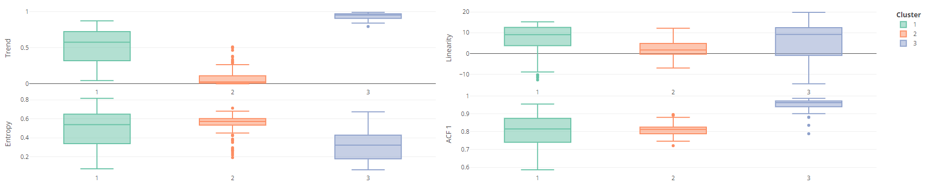
- This is from the Krispin notebook in Resources
- Features: Trend, Entropy, Linearity, and ACF 1
- Boxplots: Feature vs Cluster
Association
- See Association, Time Series
- Lag Scatter Plots
Packages
Lag scatterplots between target series and lags of the target series (i.e. yt vs yt+h)
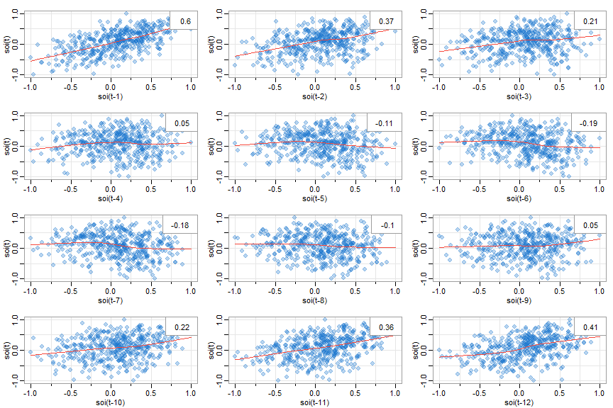
astsa::lag1.plot(y, 12) # lags 1-12 of y astsa::lag1.plot(soi, 12, col=astsa.col(4, .3), pch=20, cex=2) # prettified- Autocorrelation values in upper right corner
- Autocorrelations/Cross-Correlation values only valid if relationships are linear but maybe still useful in determining a positive or negative relationship
- LOESS smoothing line added
- Nonlinear patterns can indicate that behavior between the two variables is different for high values and low values
- Autocorrelation values in upper right corner
Lag scatterplots between target series and lags of the predictor Series (i.e. yt vs xt+h)
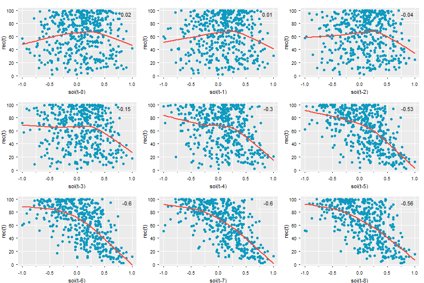
astsa::lag2.plot(y, x, 8) # y vs lags 0-8 of x astsa::lag2.plot(soi, rec, 8, cex=1.1, pch=19, col=5, bgl='transparent', lwl=2, gg=T, box.col=gray(1)) #prettified- If either series has autocorrelation, then it should be prewhitened before being inputted into the function.
- Cross-Correlation (CCF) values in upper right corner
- Autocorrelations/Cross-Correlation values only valid if relationships are linear but maybe still useful in determining a positive or negative relationship
- Nonlinear patterns can indicate that behavior between the two variables is different for high values and low values
Manual Code -{plotly}
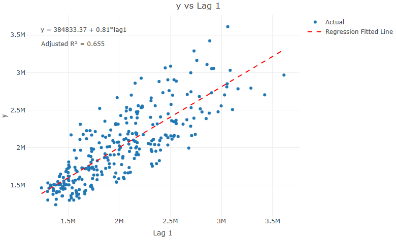
Code
library(plotly) plot_lag <- function(ts, var, lag){ d <- ts |> dplyr::mutate(lag = dplyr::lag(x= !!rlang::sym(var), n = lag)) # Create the regression formula formula <- as.formula(paste(var, "~ lag" )) # Fit the linear model model <- lm(formula, data = d) # Extract model coefficients intercept <- coef(model)[1] slope <- coef(model)[2] # Format regression formula text reg_formula <- paste0("y = ", round(intercept, 2), ifelse(slope < 0, " - ", " + "), abs(round(slope, 2)), paste("*lag", lag, sep = "")) # Get adjusted R-squared adj_r2 <- summary(model)$adj.r.squared adj_r2_label <- paste0("Adjusted R² = ", round(adj_r2, 3)) # Add predicted values to data d$predicted <- predict(model, newdata = d) # Create plot p <- plot_ly(d, x = ~ lag, y = ~get(var), type = 'scatter', mode = 'markers', name = 'Actual') %>% add_lines(x = ~ lag, y = ~predicted, name = 'Regression Fitted Line', line = list(color = "red", dash = "dash")) %>% layout(title = paste(var, "vs Lag", lag, sep = " "), xaxis = list(title = paste("Lag", lag, sep = " ")), yaxis = list(title = var), annotations = list( list(x = 0.05, y = 0.95, xref = "paper", yref = "paper", text = reg_formula, showarrow = FALSE, font = list(size = 12)), list(x = 0.05, y = 0.88, xref = "paper", yref = "paper", text = adj_r2_label, showarrow = FALSE, font = list(size = 12)) )) return(p) }- Also displays adjusted R2 and the linear regression equation
- Partial Autocorrelation
Removes the correlation between \(y_{t-k}\) and lags before it (\(y_{t-(k-1)}, \ldots, y_{t-1}\)) to get a more accurate correlation between yt and yt-k. Sort of like a partial correlation but for a univariate time series.
Can be interpreted as the amount correlation between yt-k and yt thats not explained by the previous lags.
Example:
forecast::Pacf(plot = TRUE)orforecast::ggPacf
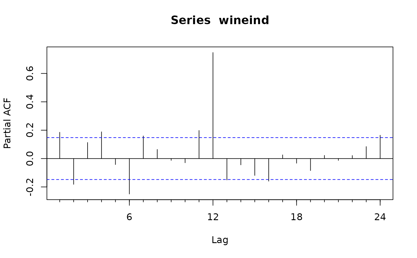
Example: {timetk} plots ACF and PACF charts
m4_hourly %>% group_by(id) %>% plot_acf_diagnostics( date, value, # ACF & PACF .lags = "7 days", # 7-Days of hourly lags .interactive = FALSE )-
- Contains several features involving partial autocorrelations including:
- The sum of squares of the first five partial autocorrelations for the original series
- The first-differenced series and the second-differenced series.
- For seasonal data, it also includes the partial autocorrelation at the first seasonal lag.
- Contains several features involving partial autocorrelations including:
Stationarity
- CCF and most statistical and ML models need or prefer stationary time series.
- Packages
- {nonstat} - Provides a nonvisual procedure for screening time series for nonstationarity
- Method combines two diagnostics: one for detecting trends (based on the split R-hat statistic from Bayesian convergence diagnostics) and one for detecting changes in variance (a novel extension inspired by Levene’s test).
- {nonstat} - Provides a nonvisual procedure for screening time series for nonstationarity
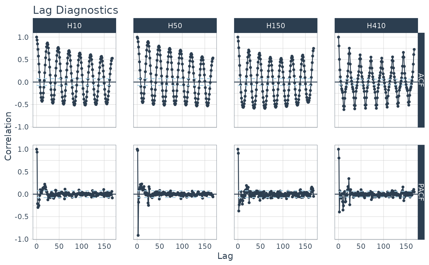
- ACF
For a stationary series, the ACF will drop to zero relatively quickly, while the ACF of non-stationary data decreases slowly.
For a non-stationary series:
- The value of r1 (correlation between yt and yt-1) is often large and positive.
- A steady, slow decline towards 0 indicates trend is present
- Is the series a trend-stationary or unit root process?
- Test all series of interest with ADF and KPSS tests (See Forecasting, Statistical >> Preprocessing >> Detrend or Difference
- Is the series a trend-stationary or unit root process?
- A scalloped pattern indicates seasonality is present
95% CIs are \(\pm \frac{1.96}{\sqrt{T}}\) where \(T\) is the length of the time series.
Example:
forecast::Acf(plot = TRUE)orforecast::ggAcf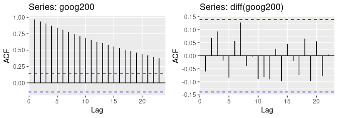
- The ACF of the differenced Google stock price (right fig) looks just like that of a white noise series. There are no autocorrelations lying outside the 95% limits, and the Ljung-Box
- Q∗ statistic (Ljung-Box) has a p-value of 0.355 (for h = 10) which implies the ts is stationary. This suggests that the daily change in the Google stock price is essentially a random amount which is uncorrelated with that of previous days.
- Ljeung-Box
stats::Box.testorfeasts::ljung_box- x: numeric or univariate ts
- lag: Recommended 10 for non-seasonal, 2m (e.g. m = 12 for monthly series, m = 4 for quarterly), maximum is T/5 where T is the length of the series.
- type: “Lj”
- Interpretation: small Q* or p-value > 0.05 means the time series is stationary.
Nonlinear
- Misc
- Packages
- {tseriesEntropy} - Tests for serial and cross dependence and nonlinearity based on Bhattacharya-Hellinger-Matusita distance.
Trho.test.AR.p- Entropy Tests For Nonlinearity In Time Series - Parallel Versionsurrogate.SA- Generates surrogate series through Simulated Annealing. Each surrogate series is a constrained random permutation having the same autocorrelation function (up to nlag lags) of the original series x.surrogate.ARs- Generates surrogate series by means of the smoothed sieve bootstrap.
- {tseriesEntropy} - Tests for serial and cross dependence and nonlinearity based on Bhattacharya-Hellinger-Matusita distance.
- Packages
- Lag Plots
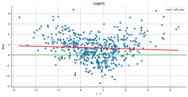
- U-pattern shown in nonlinear
- See Association for code
- Average Mutual Information
- Example: link
- ACF
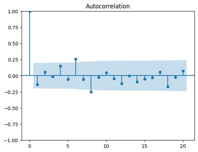
- Assuming this ts has been differenced and/or detrended and there is still autocorrelation at lags 6 and 8. So, attempts at stationarity have failed
- Average Mutual Information
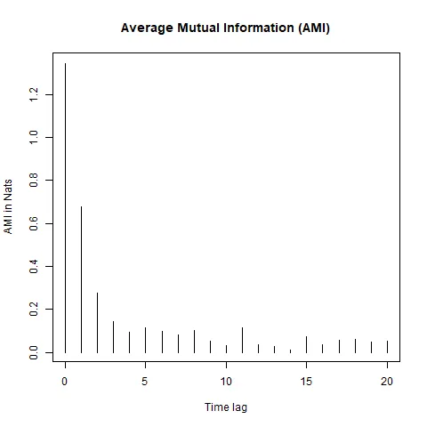
- If the time series is linear, the AMI should decay exponentially or follow a power-law decay as the time lag increases, whereas if the time series is nonlinear, the AMI may decay more slowly or exhibit specific patterns such as oscillations or plateaus, indicating the presence of nonlinear structures or long-range correlations.
- Oscillations are present in this time series.
- Compare with a surrogate model data. If the AMI decay pattern of the original time series deviates significantly from that of the surrogate data, it suggests the presence of nonlinearity.
- {nonlinearTseries::mutualInformation}
- If the time series is linear, the AMI should decay exponentially or follow a power-law decay as the time lag increases, whereas if the time series is nonlinear, the AMI may decay more slowly or exhibit specific patterns such as oscillations or plateaus, indicating the presence of nonlinear structures or long-range correlations.
- ACF
- Example: link
- Surrogate Testing
Example: From {nonlinearTseries} vignette
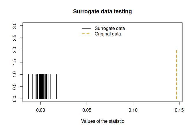
st <- surrogateTest( lor.x, significance = 0.05, one.sided = F, FUN = timeAsymmetry, do.plot=T) ## Null Hypothesis: Data comes from a linear stochastic process ## Reject Null hypothesis: ## Original data's stat is significant larger than surrogates' statstimeAsymmetryis a function that’s included in the package. It measures the asymmetry of a time series under time reversal. If linear, it should be symmetric.
- Compare Oberservational vs Surrogate Data
- Chaotic nature of the time series is obvious (e.g. frequent, unexplainable shocks that can’t be explained by noise)
- Create an artificial data set using a gaussian dgp and compare it to the observed data set
- For details see Nonlinear Time Series Analysis (pg 6 and Ch.4 sect 7.1)
- Takes the range of values, mean, and variance from the observed distribution and generates data
- Then data is filtered so that the power spectum is the same
- “Phase Portraits” are used to compare the datasets.