Spatial Weights
Misc
- Also see
- Packages
- {ArchipelagoEngine} - Spatial Weight Construction for Archipelagic Geographies
- {spdep} - Spatial Dependence: Weighting Schemes, Statistics
- {sfdep} - A {sf} and {tidyverse} friendly interface to {spdep} along with some additional functionality
- {sfisland} - Similar to {sfdep} with its {tidyverse} and {sf} friendly interface. It makes it easier to deal with geographic datasets which contain islands
- Notes from {spdep} vignettes and its docs.
- Workflows
- Possibly include plotting differences to compare neighbor algorithms to see which best aligns with analysis goals. (Also see Diagnostics)
- Graph-based
- Create a points list object (e.g.
st_centroid) \(\rightarrow\) Fit neighbors algorithm (e.g.gabrielneigh) \(\rightarrow\) Convert to neighbors list (e.g.graph2nb) \(\rightarrow\) Add spatial weights (e.g.nb2listw)- Also see Geospatial, Preprocessing >> sf >> Points in Polygons
- Create a points list object (e.g.
- Distance-based
- k-NN: Create a points list object (e.g.
st_centroid) \(\rightarrow\) If necessary, convert to geographical coordinates (viast_transform) \(\rightarrow\) Fit neighbors algorithm (e.g.knearneigh) \(\rightarrow\) Convert to neighbors list (e.g.knn2nb) \(\rightarrow\) Add spatial weights (e.g.nb2listw)- If you only have latitude and longitude columns, you need to convert to a sf object via
st_as_sfbefore creating a points list object (See Geospatial, Preprocessing >> Projections >> Geographic Coordinates) - The conversion to geographical coordinates isn’t necessary, but Great Circle distances are more accurate than planar distances.
- If you only have latitude and longitude columns, you need to convert to a sf object via
- Distance Band Method: Go through k-NN process to create a k-NN neighbors list (via
knn2nb) \(\rightarrow\) Find minimal distance needed for a graph w/no no-neighbor observations (vianbdists) \(\rightarrow\) Check if graph is fully connected by printing neighbor list object or usingn.comp.nb. If disjoint subgraphs are reported. Add more distance to upper distance parameter (d2) indnearneigh, and repeat until graph is connected \(\rightarrow\) Add spatial weights (vianb2listw)
- k-NN: Create a points list object (e.g.
- Polygon-based (aka Contiguity-based)
- Make sure you have sf object or list of SpatialPolygon objects \(\rightarrow\) Create neighbors list via
poly2nb\(\rightarrow\) Add spatial weights (e.g.nb2listw)
- Make sure you have sf object or list of SpatialPolygon objects \(\rightarrow\) Create neighbors list via
- A graph of neighbors is not based on planar distances when some neighbor links cross each other.
- You can use
igraph::diameterto answer how many steps might be needed to traverse the graphExample: Find unit from which it takes the maximum amount of steps to traverse the graph
library(spdep)
data(pol_pres15, package = "spDataLarge")

gr_wgt_b_poly <- pol_pres15 |>
  poly2nb(queen = TRUE) |>
  nb2listw(style = "B") |>
  as("CsparseMatrix") |>
  igraph::graph_from_adjacency_matrix()

igraph::diameter(gr_wgt_b_poly)
#> [1] 52

idx_max_dist_unit <- gr_wgt_b_poly |>
  igraph::distances() |>
  apply(2, max) |>
  which.max()

pol_pres15$name0[idx_max_dist_unit]
#> [1] "Lutowiska"
Neighbors Lists
Just about everything gets converted to a neighbor list of some sort at the end (e.g. adding spatial weights, moran’s test, plotting)
These are lists of length equal to the number of observations with integer vector elements.
- Observations with no-neighbors are encoded as an integer vector with a single element 0L
- Observations with neighbors as sorted integer vectors containing values in 1L:n pointing to the neighboring observations.
union.nbcan cumulate neighbor listseditcan be used to interactively add links (e.g. not detected erroneously) or remove links (e.g. mountain range separates boundaries).Types of Neighbor Lists
cell2nb- Takes regular, flat, square grids (via ncols, nrows) as inputs- type = rook (default)(shared edge) or queen (shared edge or vertex)
- torus = TRUE: The grid is mapped onto a torus, removing edge effects.
graph2nb- Takes a graph-based neighbor object- sym = FALSE says don’t add links to create symmetry
- No symmetry means if node A is a neighbor of node B, that doesn’t necessarily mean that node B is a neighbor of node A
- sym = TRUE will insert links to restore symmetry, but the graphs then no longer exactly fulfil their neighbour criteria.
- sym = FALSE says don’t add links to create symmetry
grid2nb- Takes GridTopology class object (?)- Maybe these are like H3 hexagonal grids
knn2nb- Takes a k-NN object- sym = FALSE says don’t add links to create symmetry
- No symmetry means if node A is a neighbor of node B, that doesn’t necessarily mean that node B is a neighbor of node A
- In the overwhelming majority of cases, k-NN leads to asymmetric neighbours
is.symmetric.nbcan be used to check for symmetry
- sym = FALSE says don’t add links to create symmetry
poly2nb- Takes a sf object with (multi-)polygons or a list of polygon objects with class SpatialPolygon- Builds a neighbors list based on regions with contiguous boundaries, that is sharing one or more boundary point.
- snap allows the shared boundary points to be a short distance from one another.
- e.g. A narrow body of water separates the boundaries where there’s a ferry or a bridge that could in essence make the boundaries contiguous.
- Sometimes there are geographical artefacts present which screw up the algorithm detecting continguous boundaries. By increasing the snap value, you can absorb the artefacts and detect the contiguous boundary between the shapes.
- There is also an
editfunction to interactively add missing neighbor links.
- There is also an
- Defaults
- For SpatialPolygons objects and sf objects with no coordinate reference system, it’s 1.490116e-08 whichs is
sqrt(.Machine$double.eps) - For sf objecst with coordinate reference systems, it’s 1e-7 (approx 10mm) that’s converted to units of the coordinate system.
- For SpatialPolygons objects and sf objects with no coordinate reference system, it’s 1.490116e-08 whichs is
- If queen = TRUE, then when three or more polygons meet at a single point, they all meet the contiguity condition, giving rise to crossed links.
- If queen = FALSE, (aka rook), at least two boundary points must be within the snap distance of each other
- The SDS book explains it this way, “For each observation, the function checks whether at least one (queen = TRUE, default), or at least two (rook, queen = FALSE) points are within snap distance units of each other.”
tri2nb- Takes a coordinates matrix (e.g. centroids) and is the input forsoi.graph
Convert neighbors list to a tibble in order to use {ggplot2}
Code
nb2tbl <- function(nb_list,
                   coords,
                   color = "black") {

  nb_len <- length(nb_list)

  if (length(color) == 1) {
    nb_col <- rep(color, nb_len)
  } else {
    nb_col <- color
  }

  # flattens neighbor vectors into 1 vector
  cardnb <- card(nb_list)

  # source node indexes
  i <- rep(1:nb_len, cardnb)
  # neighbor node indexes
  j <- unlist(nb_list)

  nb_tib <- tibble::tibble(
    # segment coords
    x_i = st_coordinates(coords)[, 1, drop = TRUE][i],
    x_j = st_coordinates(coords)[, 1, drop = TRUE][j],
    y_i = st_coordinates(coords)[, 2, drop = TRUE][i],
    y_j = st_coordinates(coords)[, 2, drop = TRUE][j],
    # segment colors
    seg_col = nb_col[i]
  )

  return(nb_tib)

}
For examples, see
- Neigbor Algorithms >> k-NN >> Example
- Diagnostics >> Connectedness >> Example 1
Spatial Weights
- Misc
- A spatial weights matrix defines how closely related each pair of nodes are
- A listw object is a list with three components: a nb object (neighbor list), a matching list of numerical weights, and a single element character vector containing the single letter name of the way in which the weights were calculated (normalization style).
- Functions require that your sf object has the same coordinate system that you used to create your neighbors list.
- Normalizing your weights matrix is always a good idea. Otherwise, the spatial parameters might blow up – if you can estimate the model at all. It also ensures easy interpretation of spillover effects. (source)
nb2listwwill add spatial weights to your neighbors listnb2listwdist- Supplementsnb2listwwith additional optionsDefaults: type = “idw”, alpha = 1, style = “raw” (i.e. no normalization)
If both type and style are specified, I’d guess that normalization is applied to the weights and not the distances. (i.e. first type applied, then style)
Types
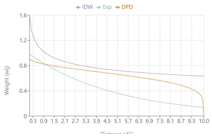
- Inverse Distance Weighting (IDW)
\[w_{ij} = d_{ij}^{-\alpha}\]- type = “idw”
- IDW weights show extreme behaviour close to 0 and can take on the value infinity. In such cases, the infinite values are replaced by the largest finite weight present in the weights list.
- There’s also a way to do this with
nb2listwby using the glist argument (See SDS Ch.14.5)
- Exponential Distance Decay
\[w_{ij} = e^{-\alpha \cdot d_{ij}}\]- type = “exp”
- Double-Power Distance
\[w_{ij} = \left[1 - \left(\frac{d_{ij}}{d_{\textrm{max}}}\right)^{\alpha}\right]^{\alpha}\]- type = “dpd”
- dmax value required; the distance value where you want the weights become zero
- This depends on your coordinate system/CRS (i.e. some CRS are in feet), but probably meters if planar distances/projected CRS and kilometers if great circle distances/geographic CRS
- \(w_{ij} = 0\) when \(d_{ij} \gt d_{\text{max}}\)
- Inverse Distance Weighting (IDW)
Visualizing the Types
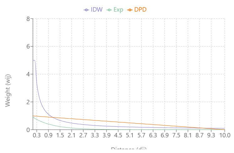
\(\alpha = 1.0\) 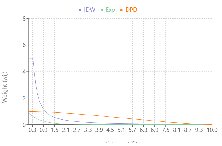
\(\alpha = 1.5\) 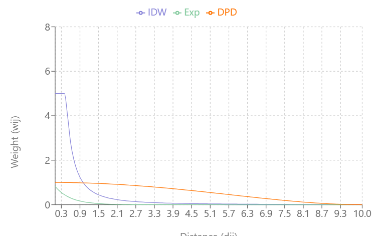
\(\alpha = 2.0\) 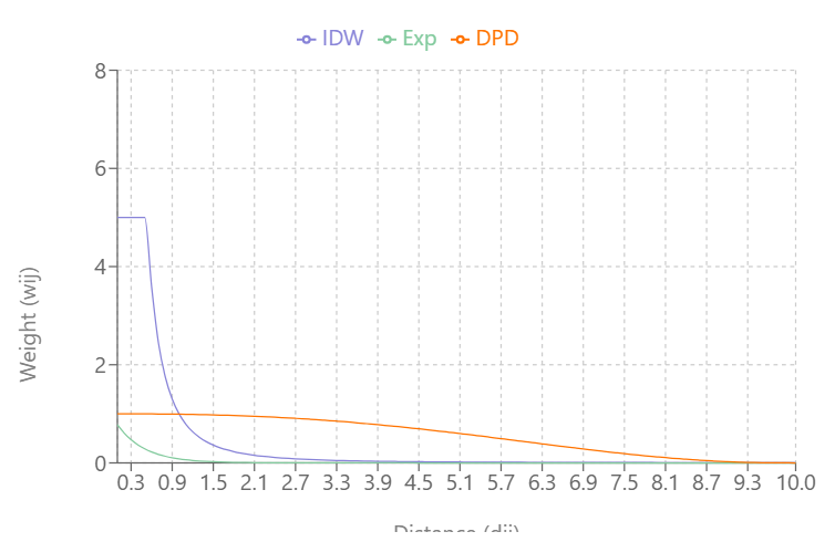
\(\alpha = 2.5\) As \(\alpha\) increases:
- IDW’s and Exponential Decay’s slopes increase and weights (Y-axis) reach zero more quickly as distance (X-axis) increases
- Double-Power Distance’s slope flattens out more at mid-distance values and the slope increases more quickly as the distance approach \(d_{\text{max}}\)
IDW produces very large weight values for small distances and small \(\alpha\)
DPD goes to exactly 0 at \(d_{\text{max}}\), while the others approach 0 asymptotically
At \(\alpha = 0.3\), IDW and Exponential Decay are giving weight to large distance values, but at \(\alpha = 0.5\), Exponential Decay weights get very close to zero at \(d_{\text{max}}\)
\(\alpha = 0.3\) 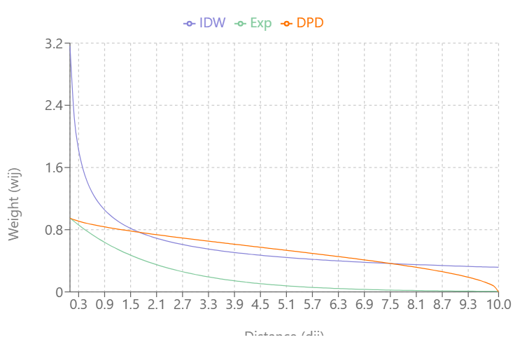
\(\alpha = 0.5\)
- Normalization Styles
- Row-Standardized (W)
Each row is standardized to sum to 1
- All the values describing a node’s relationship to each other node will sum to 1
Each weight has had its raw value divided by the sum of the row.
Most popular as it makes results comparable, i.e. one node’s set of relationships is comparable to another node’s set of relationships (rows)
- Seems to be preferred in econometric spatial models (and probably others) as it provides intuitive interpretability of impacts.
Best when the number of neighbors for each node can vary significantly.
Characteristics
- With contiguity weights, spatially lagged variables contain mean of this variable among the neighbours of \(i\)
- Proportions between units such as distances get lost
- Can induce asymmetries, \(w_{ij}\ne w_{ji}\)
Issue: Has some undesirable properties when some non-contiguity based neighbor methods are used, such as distance based neighbours. (source)
- It obscures the proportion due to dividing by a row-specific value.
- e.g. The strength of the relation for distant locations can be similar to more proximate units
Example: Analyzing how house prices are influenced by neighboring houses in a suburban area. The number of neighboring houses isn’t what primarily influences a house’s value, it’s the local houses themeselves.
Example: k-NN w/k=2
\[\begin{array}{c|cccc} & A & B & C & D \\ \hline A & 0 & 0.66 & 0.34 & 0 \\ B & 0.50 & 0 & 0.50 & 0 \\ C & 0 & 0.61 & 0 & 0.39 \\ D & 0 & 0.28 & 0.72 & 0 \end{array}\]
- Binary (B)
- Neighbor/Not Neighbor (1/0)
- Gives a weight of unity to each neighbor relationship (i.e. ignores strength of the link), and typically up-weights units with no boundaries on the edge of the study area, having a higher count of neighbors.
- Example: Studying an invasive species. It only matters whether the species is able to or not able to invade another node.
- Globally Standardized (C)
- All cells in the matrix are standardized to sum to 1
- Accounts for global pattern
- Example: Investigating voting patterns in densely populated districts vs. sparsely populated districts in a state or region. Here you want the total influence to be standardized across the entire state or region.
- Unstandardized (U)
- Just uses raw weight values (e.g. distances)
- Good when actual distances matter and not the relative distances
- Preserves absolute differences
- Problematic if distances vary greatly
- Example: Modeling air pollution dispersion from industrial sites. It’s a physical phenomenon saw distances matter as pollution concentration could decay exponentiall with distance from the site.
- Variance-Stabilizing
- Each raw weight is divided by square root of row sums
- More robust to outliers or extreme values
- Example: Analyzing disease clusters in areas with very uneven population density. Variance stabilization helps prevent false positives in dense areas
- Min/Max
- Maximum eigenvalues normalization divides each non-zero weight by the overall maximum eigenvalue \(\lambda_{\text{max}}\). Each element of \(W\) (weights matrix) is divided by the same scalar parameter, which preserves the relations, \(W/\lambda_{\text{max}}\).
- Interpretation may become more complicated
- Keeps proportions of connectivity strengths across units (relevant esp. for distance based methods) (i.e. best for distance based methods)
- Row-Standardized (W)
Neighbor Algorithms
Graph-based
Misc
- No option to use Great Circle distances for geographical coordinates, only Euclidean distance (planar)
- All the graph-based neighbour schemes always ensure that all the points will have at least one neighbour.
- Modify a neighbor list:
subset.nb(nb_q_96, !is.na(boston_96$median))(source)- Both objects have 96 observations. It removes elements of the list where median is NA (i.e. all FALSEs)
Relative Neighbor Graph (RNG)
\[d(x,y) \le \min\{\;\max\{d(x,z),d(y,z)\}\;|\; z \in S\;\}\]
- Neighbors are defined such that two points \(x\) and \(y\) are connected if the direct distance \(d(x,y)\) is less than or equal to the minimum of the maximum distances from \(x\) and \(y\) to any third point \(z \in S\)
- Does Not guarantee symmetry
Gabriel Graph (GG)
\[d(x,y) \le \min\{(d(x,z)^2 + d(y,z)^2)^{1/2} \;|\;z \in S\}\]
- Neighbors \(x\) and \(y\) are connected if the distance \(d(x, y)\) is less than or equal to the square root of the summ of squared distances from \(x\) and \(y\) to any third point \(z \in S\)
- Does NOT guarantee symmetry
Sphere of Influence Graph (SOI)
- For a point set \(S\), \(x\) and \(y\) are connected if their respective “spheres of influence” (circles centered at \(x\) and \(y\) with radii equal to the distance to their nearest neighbors) intersect in at least two places
- Takes triangulated neighbors and prunes off neighbor relationships represented by edges that are unusually long for each point, especially around the convex hull
- Guarantees symmetry
Hierarchical Relationship: RNG \(\subseteq\) GG \(\subseteq\) SOI
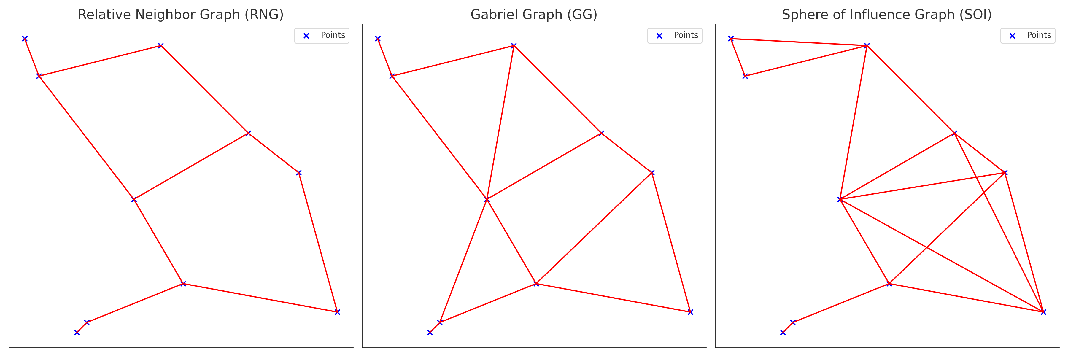
- All the links made by RNG will be made by GG, and all the links made by GG will be made by SOI
- RNG is the most restrictive while SOI is the least.
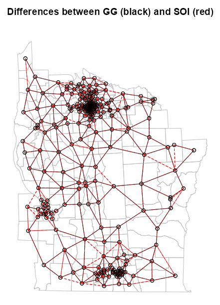
Example: SOI and GG (source)
library(spdep)

NY8_sf <-
  st_read(system.file(
            "shapes/NY8_bna_utm18.gpkg",
            package = "spData"),
          quiet = TRUE)
# validate geometries
table(st_is_valid(NY8_sf))
#> TRUE
#>  281

dplyr::glimpse(NY8_sf)
#> Rows: 281
#> Columns: 13
#> $ AREAKEY    <chr> "36007000100", "36007000200", "36007000300", "36007000400", "3600700…
#> $ AREANAME   <chr> "Binghamton city", "Binghamton city", "Binghamton city", "Binghamton…
#> $ X          <dbl> 4.069397, 4.639371, 5.709063, 7.613831, 7.315968, 8.558753, 9.206733…
#> $ Y          <dbl> -67.3533, -66.8619, -66.9775, -65.9958, -67.3183, -66.9344, -67.1789…
#> $ POP8       <dbl> 3540, 3560, 3739, 2784, 2571, 2729, 3952, 993, 1908, 948, 1172, 1047…
#> $ TRACTCAS   <dbl> 3.08, 4.08, 1.09, 1.07, 3.06, 1.06, 2.09, 0.02, 2.04, 0.02, 1.03, 3.…
#> $ PROPCAS    <dbl> 0.000870, 0.001146, 0.000292, 0.000384, 0.001190, 0.000388, 0.000529…
#> $ PCTOWNHOME <dbl> 0.32773109, 0.42682927, 0.33773959, 0.46160483, 0.19243697, 0.365178…
#> $ PCTAGE65P  <dbl> 0.14661017, 0.23511236, 0.13800481, 0.11889368, 0.14157915, 0.141077…
#> $ Z          <dbl> 0.14197, 0.35555, -0.58165, -0.29634, 0.45689, -0.28123, -0.24605, 0…
#> $ AVGIDIST   <dbl> 0.2373852, 0.2087413, 0.1708548, 0.1406045, 0.1577753, 0.1726033, 0.…
#> $ PEXPOSURE  <dbl> 3.167099, 3.038511, 2.838229, 2.643366, 2.758587, 2.848411, 2.951257…
#> $ geom       <MULTIPOLYGON [m]> MULTIPOLYGON (((421808.5 46..., MULTIPOLYGON (((421794.…

# calculate centroids in counties that will be nodes
NY8_ct_sf <-
  st_centroid(st_geometry(NY8_sf),
              of_largest_polygon = TRUE)
class(NY8_ct_sf)
#> [1] "sfc_POINT" "sfc"
coords_ct <- st_coordinates(NY8_ct_sf)
class(coords_ct)
#> [1] "matrix" "array"
# convert point list to neighbor list NY84_nb <- tri2nb(coords = NY8_ct_sf) # fit the soi graph and convert graph obj to a neighbor list NY85_nb_soi <- graph2nb(soi.graph(tri.nb = NY84_nb, coords = NY8_ct_sf)) summary(NY85_nb_soi) #> Neighbour list object: #> Number of regions: 281 #> Number of nonzero links: 1238 #> Percentage nonzero weights: 1.567863 #> Average number of links: 4.405694 #> 2 disjoint connected subgraphs #> Link number distribution: #> #> 1 2 3 4 5 6 7 8 #> 4 29 45 64 70 49 19 1 #> 4 least connected regions: #> 228 231 246 247 with 1 link #> 1 most connected region: #> 133 with 8 links NY85_nb_gg <- graph2nb(gabrielneigh(coords = NY8_ct_sf)) summary(NY85_nb_gg) #> Neighbour list object: #> Number of regions: 281 #> Number of nonzero links: 592 #> Percentage nonzero weights: 0.7497372 #> Average number of links: 2.106762 #> 20 regions with no links: #> 35, 51, 55, 67, 78, 82, 109, 190, 210, 212, 219, 234, 235, 241, 243, 251, 277, 278, 279, 281 #> Non-symmetric neighbours list #> Link number distribution: #> #> 0 1 2 3 4 5 #> 20 68 105 48 30 10 #> 68 least connected regions: #> 10 16 18 27 30 31 32 33 34 45 46 48 49 50 56 64 66 73 77 81 89 90 91 94 100 104 107 108 123 146 149 153 160 161 164 167 168 179 189 194 202 209 214 215 220 222 223 231 232 240 242 246 247 248 249 250 255 256 257 258 260 262 263 271 272 275 276 280 with 1 link #> 10 most connected regions: #> 37 41 58 63 70 102 112 114 184 239 with 5 links- There are two neighbor list conversions:
tri2nbreturns a special list required as input forsoi.graph. Also, I think {dbscan} is required to be installed forsoi.graphbut maybe not the others.graph2nbconverts a graph object to a neighbor list that’s used for graphing the network
- The RNG method (
relativeneigh) is fit the same way as the GG method.
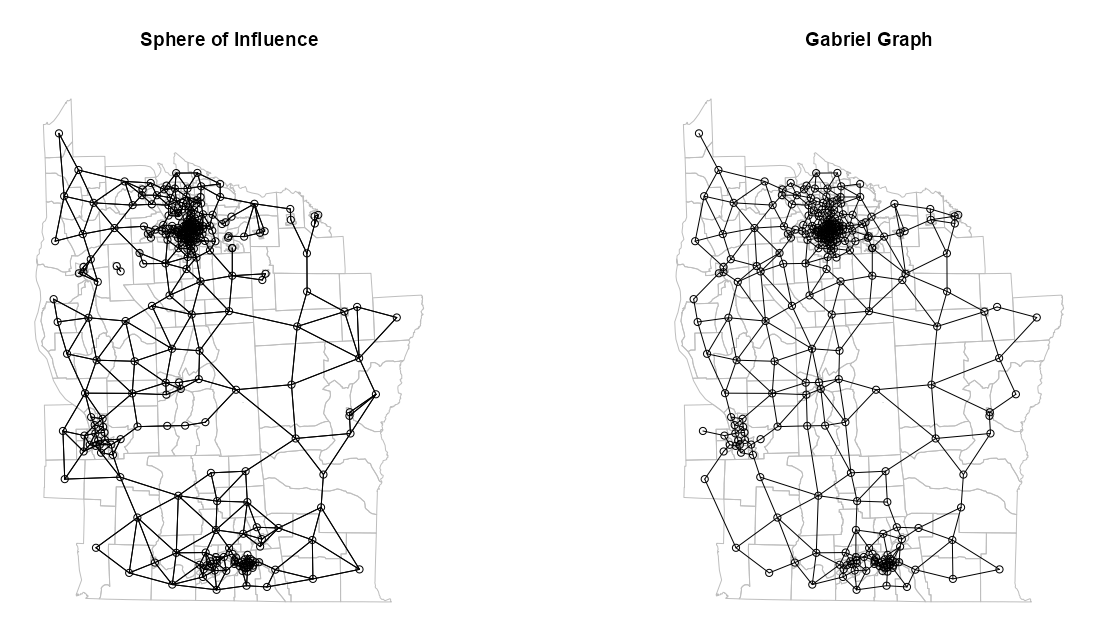
par(mfrow = c(1, 2)) plot(st_geometry(NY8_sf), border = "gray") plot(NY85_nb_soi, coords = coords_ct, add = TRUE) title(main = "Sphere of Influence") # plot boundaries plot(st_geometry(NY8_sf), border = "gray") # plot edges and nodes plot(NY85_nb_gg, coords = coords_ct, add = TRUE) title(main = "Gabriel Graph")- I thought the difference would be more apparent between the two methods, but they’re pretty similar.
- I feel the GG graph is more connected overall, but the SOI is more connected in areas where the nodes are denser.
- There are two neighbor list conversions:
Distance-based
- k-NN
Creates a graph where all units have at least k neighbors (when symmetry is coerced). A small k should be used.
Does NOT guarantee symmetry (almost always asymmetric)
knn2nbhas a sym argument to permit the imposition of symmetry
Example: (source)
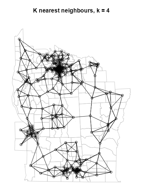
NY88_nb_sf <- knn2nb(knearneigh(
  NY8_ct_sf,
  k = 4
))

# plot boundaries
plot(st_geometry(NY8_sf), border="gray")
# plot edges and nodes
plot(
  NY88_nb_sf,
  coords = coords_ct,
  add = TRUE
)
title(main="K nearest neighbours, k = 4")
See Graph-based >> Example for code for NY8_sf, NY8_ct_sf, and coords_ct
- Where NY8_ct_sf is a point list of county centroids and coords_ct is the same thing but in a point matrix
knn2nbcoverts the knn graph object to a neighbor list for graphingIf longlat = TRUE, Great Circle distances in kilometers are used (See DIstance Neighbors >> Example 2)
# Convert to geographic coordinates
NY8_ct_ll <- st_transform(NY8_ct_sf, 4326)
st_is_longlat(NY8_ct_ll)
#> [1] TRUE
For larger datasets, changing the engine to S2 (spatial indexing) along with the coordinates being geographical, spherical distances are calculated which can be an acceptable compromise between accuracy and speed
sf_use_s2(TRUE)
pts_ll1_nb <- knn2nb(knearneigh(NY8_ct_ll, k = 4))
Code
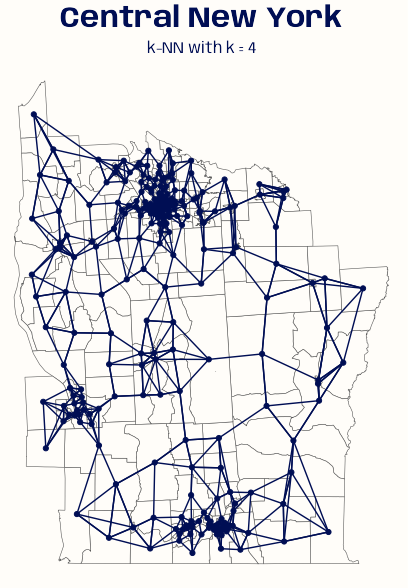
ny_sf <- st_read(system.file( "shapes/NY8_bna_utm18.gpkg", package = "spData"), quiet = TRUE) ny_sf_ll <- st_transform(ny_sf, 4326) ny_ct_ll <- st_centroid(st_geometry(ny_sf_ll), of_largest_polygon = TRUE) st_is_longlat(ny_ct_ll) ny_nb_ll <- knn2nb(knearneigh(ny_ct_ll, k = 4, longlat = TRUE)) # Convert neighbors list to tibble tbl_nb <- nb2tbl(ny_nb_ll, ny_ct_ll) # colors, fonts, theme settings systemfonts::scan_local_fonts() theme_set(theme_void()) theme_update( plot.background = element_rect(fill = "#FFFDF9FF", color = "#FFFDF9FF"), plot.margin = margin(0, 0, 0, 0), plot.title = element_text(family = "Anybody", face = "bold", size = 22, color = "#000E54", hjust = 0.5), plot.subtitle = element_text(family = "Anybody", size = 12, color = "#000E54", hjust = 0.5) ) ggplot() + geom_sf(data = ny_sf_ll, fill = "#FFFDF9FF") + geom_sf(data = ny_ct_ll, color = "#000E54") + geom_segment(aes(x = x_i, y = y_i, xend = x_j, yend = y_j), data = tbl_nb, color = "#000E54") + ggtitle( "Central New York", subtitle = "k-NN with k = 4" )- Code for
nb2tblis at the bottom of Neighbors Lists
- Distance-band
Identifies neighbors within a euclidean (default) distance range using a k-NN graph
- So, larger the upper threshold, then more links will be made.
- This fraction could correspond to a “reasonable” walking or driving distance if you’re studying neighborhood effects.
Specifying thresholds may be useful (to get rid of very small non-zero weights)
Example: Reduce sparseness (source)
queens.nb <- poly2nb(msoa.spdf,
                     queen = TRUE, #
                     snap = 1)
W <- nb2mat(queens.nb, style = "B")
print(W[1:10, 1:10])

#>    1 2 3 4 5 6 7 8 9 10
#> 1  0 0 0 0 0 0 0 0 0  0
#> 2  0 0 1 0 0 0 0 0 0  0
#> 3  0 1 0 0 1 0 0 0 0  0
#> 4  0 0 0 0 0 1 0 0 0  1
#> 5  0 0 1 0 0 1 1 0 0  0
#> 6  0 0 0 1 1 0 1 0 1  1
#> 7  0 0 0 0 1 1 0 1 1  0
#> 8  0 0 0 0 0 0 1 0 0  0
#> 9  0 0 0 0 0 1 1 0 0  1
#> 10 0 0 0 1 0 1 0 0 1  0

coords <- st_geometry(st_centroid(msoa.spdf))
dist_3.nb <- dnearneigh(coords, d1 = 0, d2 = 3000)

W2 <- nb2mat(dist_3.nb, style = "B")
W2[1:10, 1:10]
#>    1 2 3 4 5 6 7 8 9 10
#> 1  0 0 0 0 0 0 0 0 0  0
#> 2  0 0 1 0 1 0 0 0 0  0
#> 3  0 1 0 0 1 1 1 0 0  0
#> 4  0 0 0 0 1 1 1 0 1  1
#> 5  0 1 1 1 0 1 1 1 1  1
#> 6  0 0 1 1 1 0 1 1 1  1
#> 7  0 0 1 1 1 1 0 1 1  1
#> 8  0 0 0 0 1 1 1 0 1  0
#> 9  0 0 0 1 1 1 1 1 0  1
#> 10 0 0 0 1 1 1 1 0 1  0
If you set the the distance threshold (i.e. upper bound, d2) to be too large:
- In cases where the distance between neighbors is substantially irreg, the number of neighbors can grow rapidly as the distance threshold increases. This can lead to an overconnected neighborhood structure, where many regions have an artificially high number of neighbors.
If you set the distance threshold to be too small:
- This can lead to disjoint subgraphs. (See Diagnostics >> Disjointedness)
Regularity of Spacing
- If the spacing between locations was “regular,” then all locations would be equal distant from each other.
- An uneven distribution of neighbors due to irregular spacing can lead to biased results in spatial analyses, as regions with many neighbors may dominate the analysis (i.e. overweighted), while regions with few or no neighbors may be effectively excluded.
- Substantial irregularity can make the distance neighbors algorithm inappropriate due to being able to find a satisfactory distance threshold
Example 1: (source)
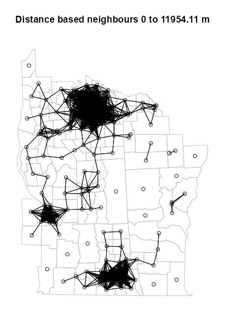
dsts <- unlist(nbdists(nb = NY88_nb_sf, coords = NY8_ct_sf)) max_1nn <- max(dsts) max_1nn #> [1] 26564.68 NY810_nb <- dnearneigh(NY8_ct_sf, d1 = 0, d2 = 0.45 * max_1nn) # plot boundaries plot(st_geometry(NY8_sf), border="grey", reset=FALSE, main = paste0("Distance based neighbours 0 to ", format(0.45 * max_1nn), " m") ) # plot edges and nodes plot(NY810_nb, coords_ct, add = TRUE)nbdistsreturns the Euclidean distances along the links of k-NN graph- Where NY88_nb_sf is the neighbor list of the k-NN graph object (see k-NN example) and NY8_ct_sf and coords_ct are the point list and point matrix of county centroids respectively (see Graph-based example)
- The max of these distances is 26,564.68 meters or 26.6 km which is the minimum distance needed to make sure that all the areas are linked to at least one neighbor.
- Even though there will no no-neighbor observations (their presence is reported by the print method for nb objects), the graph may not be connected, e.g. a pair of observations are each others’ only neighbors.
- When printing the neighbor list object, if any “disjoint connected subgraphs” are reported, then your graph is not connected
- If graph is not connected at that distance (e.g. 26.6 km), than add to it until the graph is connected.
- The 75th percentile of the max of those distances is used as the upper threshold for the distance neighbors algorithm. As expected, using this threshold, there are disjointed subgraphs. (Also see Diagnostics >> Disjointedness)
- If longlat = TRUE, then Great Circle distance in kilometers is used (See Example 2)
- If x is an “sf” object, coordinates are geographical, and use_s2 = TRUE (spatial indexing), spherical distances in kilometers are used.
- See this vignette section for a discussion on this setting and dwithin
sf_use_s2(TRUE)might also need to be set
Example 2: Geographical Distances
ny_sf <- st_read(system.file( "shapes/NY8_bna_utm18.gpkg", package = "spData"), quiet = TRUE) ny_sf_ll <- st_transform(ny_sf, 4326) dplyr::glimpse(ny_sf_ll) #> Rows: 281 #> Columns: 13 #> $ AREAKEY <chr> "36007000100", "36007000200", "36007000300", "36007000400", "36007000500", "… #> $ AREANAME <chr> "Binghamton city", "Binghamton city", "Binghamton city", "Binghamton city", … #> $ X <dbl> 4.069397, 4.639371, 5.709063, 7.613831, 7.315968, 8.558753, 9.206733, 10.180… #> $ Y <dbl> -67.3533, -66.8619, -66.9775, -65.9958, -67.3183, -66.9344, -67.1789, -66.87… #> $ POP8 <dbl> 3540, 3560, 3739, 2784, 2571, 2729, 3952, 993, 1908, 948, 1172, 1047, 3138, … #> $ TRACTCAS <dbl> 3.08, 4.08, 1.09, 1.07, 3.06, 1.06, 2.09, 0.02, 2.04, 0.02, 1.03, 3.02, 5.07… #> $ PROPCAS <dbl> 0.000870, 0.001146, 0.000292, 0.000384, 0.001190, 0.000388, 0.000529, 0.0000… #> $ PCTOWNHOME <dbl> 0.32773109, 0.42682927, 0.33773959, 0.46160483, 0.19243697, 0.36517857, 0.66… #> $ PCTAGE65P <dbl> 0.14661017, 0.23511236, 0.13800481, 0.11889368, 0.14157915, 0.14107732, 0.23… #> $ Z <dbl> 0.14197, 0.35555, -0.58165, -0.29634, 0.45689, -0.28123, -0.24605, 0.02683, … #> $ AVGIDIST <dbl> 0.2373852, 0.2087413, 0.1708548, 0.1406045, 0.1577753, 0.1726033, 0.1912999,… #> $ PEXPOSURE <dbl> 3.167099, 3.038511, 2.838229, 2.643366, 2.758587, 2.848411, 2.951257, 2.9833… #> $ geom <MULTIPOLYGON [°]> MULTIPOLYGON (((-75.9458 42..., MULTIPOLYGON (((-75.946 42....,… # calculate centroids in counties that will be nodes ny_ct_ll <- st_centroid(st_geometry(ny_sf_ll), of_largest_polygon = TRUE) st_is_longlat(ny_ct_ll) #> [1] TRUE # matrix format needed for plots coords_ct_ll <- st_coordinates(ny_ct_ll)- Since we’re using geographical coordinates in our distance and centroid calcuations our boundaries have to be in the same coordinate system when plotting
- If we weren’t worried about plotting, then
st_tranformcould’ve been used on the centroids object instead of the dataframe.
# knn w/longlat = TRUE ny_nb_ll <- knn2nb(knearneigh(ny_ct_ll, k = 4, longlat = TRUE)) summary(ny_nb_ll) #> Neighbour list object: #> Number of regions: 281 #> Number of nonzero links: 1124 #> Percentage nonzero weights: 1.423488 #> Average number of links: 4 #> Non-symmetric neighbours list #> Link number distribution: #> #> 4 #> 281 #> 281 least connected regions: #> 1 2 3 4 5 6 7 8 9 10 11 12 13 14 15 16 17 18 19 20 21 22 23 24 25 26 27 28 29 30 31 32 33 34 35 36 37 38 39 40 41 42 43 44 45 46 47 48 49 50 51 52 53 54 55 56 57 58 59 60 61 62 63 64 65 66 67 68 69 70 71 72 73 74 75 76 77 78 79 80 81 82 83 84 85 86 87 88 89 90 91 92 93 94 95 96 97 98 99 100 101 102 103 104 105 106 107 108 109 110 111 112 113 114 115 116 117 118 119 120 121 122 123 124 125 126 127 128 129 130 131 132 133 134 135 136 137 138 139 140 141 142 143 144 145 146 147 148 149 150 151 152 153 154 155 156 157 158 159 160 161 162 163 164 165 166 167 168 169 170 171 172 173 174 175 176 177 178 179 180 181 182 183 184 185 186 187 188 189 190 191 192 193 194 195 196 197 198 199 200 201 202 203 204 205 206 207 208 209 210 211 212 213 214 215 216 217 218 219 220 221 222 223 224 225 226 227 228 229 230 231 232 233 234 235 236 237 238 239 240 241 242 243 244 245 246 247 248 249 250 251 252 253 254 255 256 257 258 259 260 261 262 263 264 265 266 267 268 269 270 271 272 273 274 275 276 277 278 279 280 281 with 4 links #> 281 most connected regions: #> 1 2 3 4 5 6 7 8 9 10 11 12 13 14 15 16 17 18 19 20 21 22 23 24 25 26 27 28 29 30 31 32 33 34 35 36 37 38 39 40 41 42 43 44 45 46 47 48 49 50 51 52 53 54 55 56 57 58 59 60 61 62 63 64 65 66 67 68 69 70 71 72 73 74 75 76 77 78 79 80 81 82 83 84 85 86 87 88 89 90 91 92 93 94 95 96 97 98 99 100 101 102 103 104 105 106 107 108 109 110 111 112 113 114 115 116 117 118 119 120 121 122 123 124 125 126 127 128 129 130 131 132 133 134 135 136 137 138 139 140 141 142 143 144 145 146 147 148 149 150 151 152 153 154 155 156 157 158 159 160 161 162 163 164 165 166 167 168 169 170 171 172 173 174 175 176 177 178 179 180 181 182 183 184 185 186 187 188 189 190 191 192 193 194 195 196 197 198 199 200 201 202 203 204 205 206 207 208 209 210 211 212 213 214 215 216 217 218 219 220 221 222 223 224 225 226 227 228 229 230 231 232 233 234 235 236 237 238 239 240 241 242 243 244 245 246 247 248 249 250 251 252 253 254 255 256 257 258 259 260 261 262 263 264 265 266 267 268 269 270 271 272 273 274 275 276 277 278 279 280 281 with 4 links # Get maximum neighbor distance dsts_ll <- unlist(nbdists(nb = ny_nb_ll, coords = ny_ct_ll)) max_1nn <- max(dsts_ll) max_1nn #> [1] 32.04742 # neighbors within range ny_dn_ll <- dnearneigh(ny_ct_ll, d1 = 0, d2 = 0.005 * max_1nn, longlat = TRUE) summary(ny_dn_ll) #> Neighbour list object: #> Number of regions: 281 #> Number of nonzero links: 16078 #> Percentage nonzero weights: 20.36195 #> Average number of links: 57.21708 #> 1 region with no links: #> 30 #> 2 disjoint connected subgraphs #> Link number distribution: #> #> 0 1 2 3 4 5 6 7 8 9 10 11 13 14 15 16 18 19 20 21 23 24 25 27 28 29 30 31 32 33 34 35 37 38 39 40 41 42 43 44 45 46 48 49 50 51 59 63 65 66 67 #> 1 5 5 10 9 6 5 7 5 9 7 1 5 3 3 2 5 5 7 4 1 1 1 1 2 1 1 1 1 2 3 1 1 3 1 3 8 4 3 1 7 7 1 1 1 1 1 1 2 1 2 #> 74 77 79 80 82 87 88 89 94 96 97 98 100 101 102 104 105 106 107 108 109 110 111 112 113 114 115 116 117 118 119 #> 1 1 1 1 1 1 1 1 1 1 1 1 1 1 1 1 1 1 3 2 5 4 8 10 5 17 14 9 7 8 2 #> 5 least connected regions: #> 56 75 106 109 258 with 1 link #> 2 most connected regions: #> 112 122 with 119 links- longlat = TRUE was set in both
knearneighanddnearneigh
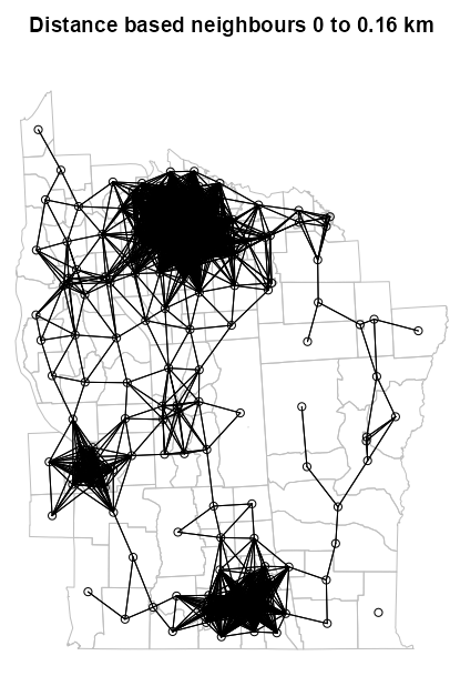
# boundaries plot(st_geometry(ny_sf_ll), border="grey", reset = FALSE, main = paste0("Distance based neighbours 0 to ", format(round(0.005 * max_1nn, 2)), " km")) # nodes and edges plot(ny_dn_ll, coords_ct_ll, add = TRUE)- Notice the distance is in kilometers and not meters
Diagnostics
- Misc
- Are the results of my analysis robust to changes in the neighborhood structure?
- Differences
- Plot differences between neighbor algorithms
It can be difficult to compare algorithms, so this helps make the differences more discernable.
Example: From Example: SOI and GG
NY8_sf <- st_read(system.file( "shapes/NY8_bna_utm18.gpkg", package = "spData"), quiet = TRUE) # calculate centroids in counties that will be nodes NY8_ct_sf <- st_centroid(st_geometry(NY8_sf), of_largest_polygon = TRUE) coords_ct <- st_coordinates(NY8_ct_sf) # convert point list to neighbor list NY84_nb <- tri2nb(coords = NY8_ct_sf) # fit the soi graph and convert graph obj to a neighbor list NY85_nb_soi <- graph2nb(soi.graph(tri.nb = NY84_nb, coords = NY8_ct_sf)) # graph-based neighbors list NY85_nb_gg <- graph2nb(gabrielneigh(coords = NY8_ct_sf), sym = TRUE) # find neighbor diffs bt soi and gg graphs diffs <- diffnb(NY85_nb_soi, NY85_nb_gg) plot(st_geometry(NY8_sf), border = "gray", reset = FALSE, main = "Differences between GG (black) and SOI (red)") plot(NY85_nb_gg, coords = coords_ct, add = TRUE) plot(diffs, coords = coords_ct, add = TRUE, col = "red", lty = 2)- lty = 2 is for dashed lines, yet there are solid red lines in the plot. A solid line indicates a symmetrical link. It happens because dashed lines are drawn from i to j and j to i. This overlap sometimes creates a solid line. (source)
- Bivand said “sometimes,” so perhaps this isn’t a sure-fire representation of all the symmetric links.
- The neighbors list
plothas an argument for adding arrows to asymmetric links
- There appears to be black dashed lines overlapped with red dashed lines. The black dashed lines are just imperfections in the rendering of the solid black lines. Maybe it’s the angle that igraph or base R has trouble with, but anyways these instances should be interpreted as solid black lines.
- lty = 2 is for dashed lines, yet there are solid red lines in the plot. A solid line indicates a symmetrical link. It happens because dashed lines are drawn from i to j and j to i. This overlap sometimes creates a solid line. (source)
- The
all.equalfunction (docs, from {terra}) can be used to examine the differences in distance calculations
- Plot differences between neighbor algorithms
- Connectedness
Spatial Lags of Neighbors are the number of steps away from a node. The neighbors at a particular spatial lag are that lag’s Order of Neighbors (e.g. 4th lag has 4th order neighbors)
- Using the analogy of a social network
- First-order neighbors (lag 1) are your direct friends
- Second-order neighbors (lag 2) are friends of your friends (but not your direct friends)
- Third-order neighbors (lag 3) are friends of friends of friends (but not including any previous connections)
- This is kind of like The Garden of Forking Paths in Statistical Rethinking where rings are orders and paths are links. (See Statistical Rethinking, Chapter 2 >> Counting the Ways)
- You can increase the number of lags until all the nodes have linked with every other node in the study area. Then, there are no more links to draw and increasing the order doesn’t amount to anything.
nblagcreates neighbor lists for specified lag orders, e.g.nb_lag_ls <- nblag(nb_list, 2)nblag_cumulcumulates the list of neighbors for the whole list of lags, e.g.nblag_cumul(nb_lag_ls)union.nbcan cumulate specified neighbor lists, e.g.union.nb(nb_lag_ls[[1]], nb_lag_ls[[2]])- Note that this is the same object as created by
nblag_cumul
- Note that this is the same object as created by
- Using the analogy of a social network
Bivand: “Both the distance bands and the graph step order approaches to spreading neighbourhoods can be used to examine the shape of relationship intensities in space, like the variogram, and can be used in attempting to look at the effects of scale.”
The order at which connectedness peaks could also provide insight on a couple things.
- It could indicate a characteristic arrangement of clustering of your data’s spatial units (locations).
- It might reflect the underlying geography - maybe the typical “width” of clusters
- At what distance spatial autocorrelation might peak
- Comparing peak connectiveness or the pattern of connectiveness between algorithms could be a way to analyze the sensitivity of algorithm choice, i.e. how much the neighbor algorithm matters to analysis.
Example 1: Explaining Spatial Lags and Neighbor Orders Visually
The data is a neighbor list for the census tracts of Syracuse, NY with spatial weights. The Polygon-based neighbor algorithm is used.
Spatial weights are not necessary for computing lags — only neighbors.
Code
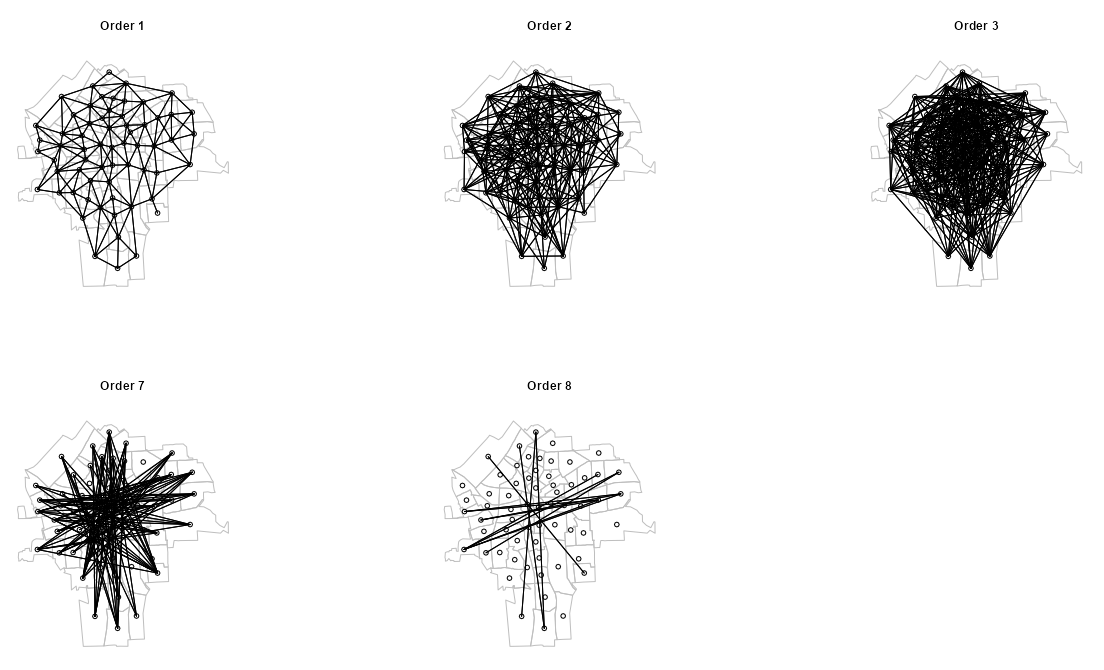
pacman::p_load( spdep, purrr, ggplot2, ggfx, # points glow, border glow gganimate ) ny_sf <- st_read(system.file( "shapes/NY8_bna_utm18.gpkg", package = "spData"), quiet = TRUE) NY_nb <- read.gal(system.file("weights/NY_nb.gal", package="spData"), region.id=as.character(as.integer(row.names(ny_sf))-1L)) sy_sf <- ny_sf[!is.na(ny_sf$AREANAME) & ny_sf$AREANAME == "Syracuse city",] Sy0_nb <- subset(NY_nb, !is.na(ny_sf$AREANAME) & ny_sf$AREANAME == "Syracuse city") # using centroids to represent the census tracts sy_coords <- st_geometry(sy_sf) |> st_centroid() lags <- 9 # pretty labels for charts lags_txt <- nombre::ordinal(1:lags, cardinal = TRUE) |> stringr::str_to_title() syr_nb_ords <- nblag(Sy0_nb, maxlag = lags) my_orders <- c(1, 2, 3, 7, 8) nb_ords_sub <- syr_nb_ords[my_orders]nblagcalculates 9 lags on a Polygons-based neighbors list.- Only really need these five orders of neighbors (aka lags) to illustrate the connectedness trend.
Code
plot_order <- function(nb_ord, ord) { plot(st_geometry(sy_sf), border = "gray") plot(nb_ord, sy_coords, add = TRUE) title(paste("Order", ord)) } par(mfrow = c(2, 3)) walk2( nb_ords_sub, my_orders, plot_order )- Order 1 (i.e. Lag 1) is the standard neighbors graph you get when plotting the neighbors list from
poly2nb - As the orders increase, the graph becomes denser with links which indicates more connectedness. This connectedness peaks around Order 3 and then declines.
- See Example 2 for a better way to visualize this trend with a heatmap and table.
Code
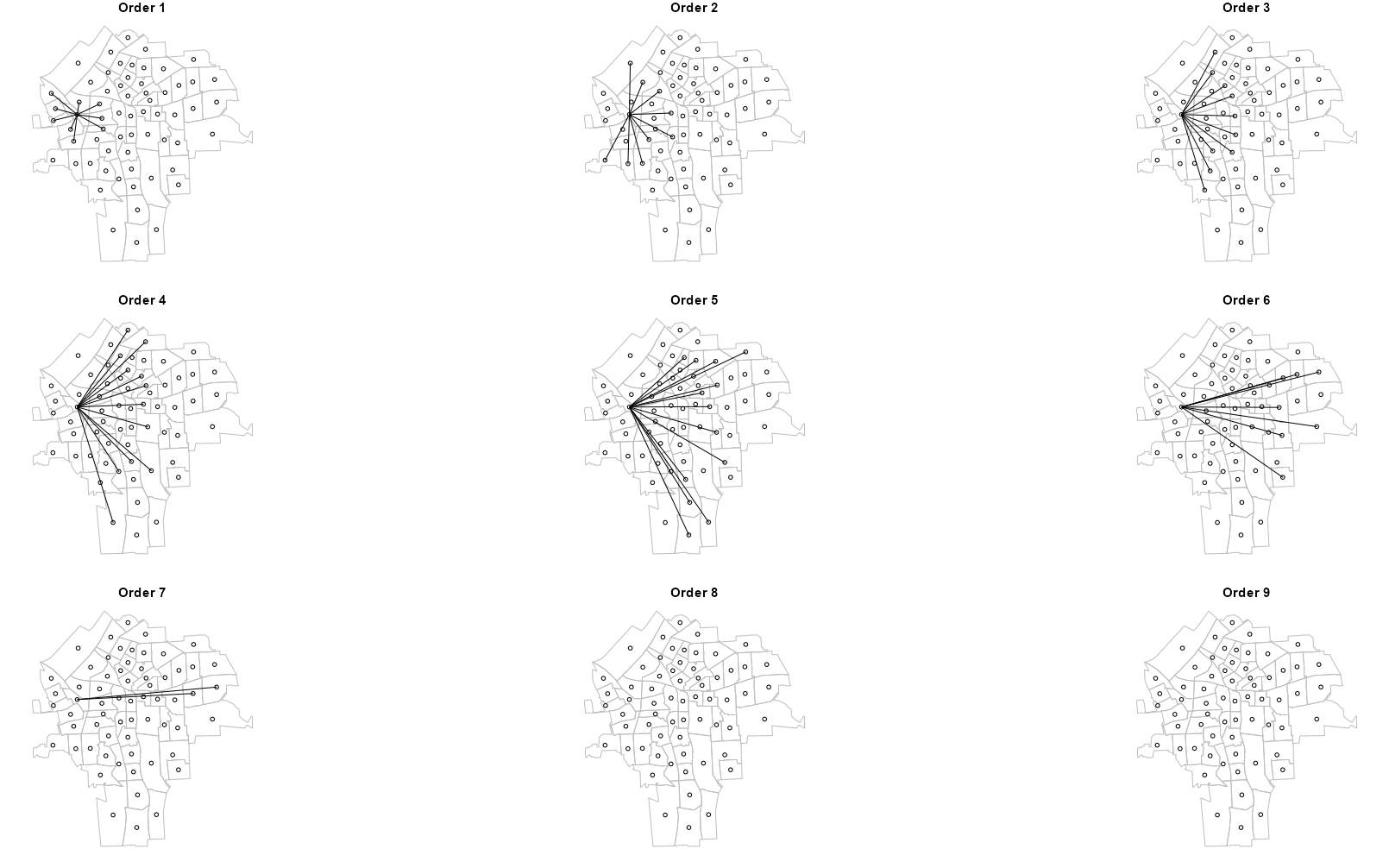
1pick_node <- function(item, item_id) { if (item_id != 28) { item <- 0L } return(item) } 2filter_node <- function(inner_list) { num_items <- length(inner_list) 3 attr_list <- attributes(inner_list) filtered_list <- map2(inner_list, 1:num_items, pick_node ) attributes(filtered_list) <- attr_list return(filtered_list) } 4syr_nb_node <- map(syr_nb_ords, filter_node) plot_order2 <- function(nb_ord, ord) { plot(st_geometry(sy_sf), border = "gray") plot(nb_ord, sy_coords, add = TRUE) title(main = paste("Order", ord), font.main = 2, # bold cex.main = 1.5) # increase font size 1.5x } par(mfrow = c(3, 3)) walk2( syr_nb_node, 1:lags, # number of orders plot_order2 )- 1
- Each node has a numeric vector listing its neighbors. This function sets every node’s neighbors vector to 0 that isn’t node 28.
- 2
-
For a particular order, this function loops through all nodes and applying
pick nodeto each one. - 3
- Each order list is a neighbor list class with various attributes. These attributes are needed for plotting, so I’m adding them back to the returned list.
- 4
-
Loops all the orders (lags) in the list generated by
nblagand appliesfilter_nodeto each one
- These plots show how each order of neighbors expands further and further away from the source node until all the nodes in the study area have been linked.
- Each node can only be linked to the source node once during the process. By Order 7, all nodes in the study region have been linked to this source node. This is indicated by Orders 8 and 9 having no links.
Code
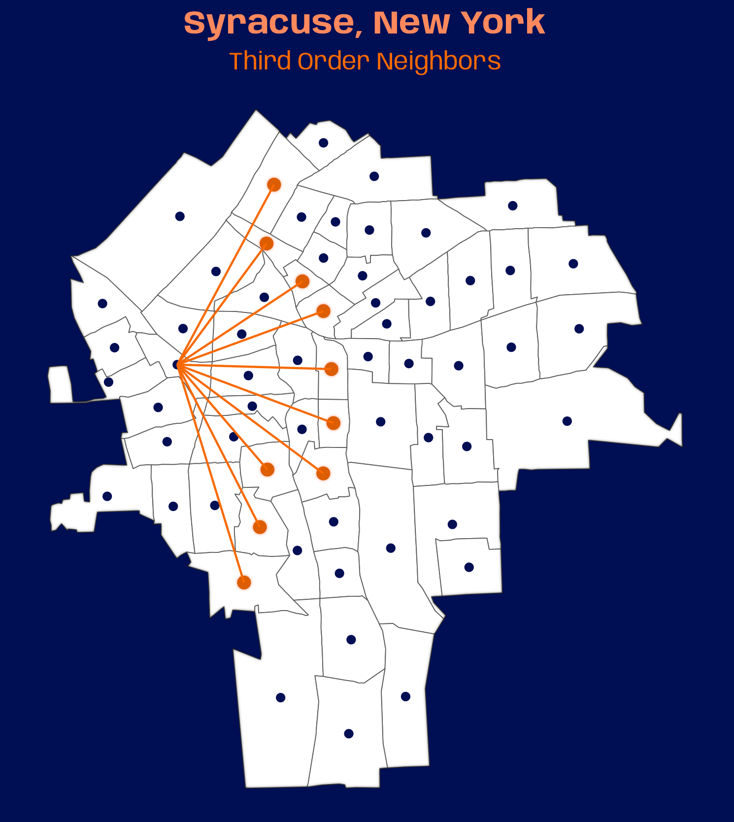
names(syr_nb_node) <- lags_txt # convert all lag nb lists to tbls tbl_lags <- map( syr_nb_node, nb2tbl, coords = sy_coords, ) |> # creates col for order labels in combined nb tbl list_rbind(names_to = "order") |> dplyr::mutate(order = factor(order, ordered = TRUE, levels = lags_txt)) # colors, fonts, theme settings systemfonts::scan_local_fonts() # going with syracuse univ. colors # colors for title, subtitle, neighbor points org_lgt_tle <- prismatic::clr_lighten("#F76900", shift = 0.30) org_dk <- prismatic::clr_darken("#F76900", shift = 0.10) org_lgt <- prismatic::clr_lighten("#F76900", shift = 0.30) theme_set(theme_void()) theme_update( plot.background = element_rect(fill = "#000E54", color = "#000E54"), plot.margin = margin(0, 0, 0, 0), plot.title = element_text(family = "Anybody", face = "bold", # size = 22, # gganimate setting size = 16, color = org_lgt_tle, hjust = 0.5), plot.subtitle = element_text(family = "Anybody", # size = 14, # gganimate setting size = 12, color = "#F76900", hjust = 0.5) ) # static plot ggplot() + # blur border with_inner_glow( geom_sf(data = sy_sf, fill = "white") ) + # inactive nodes geom_point(aes(x = st_coordinates(sy_coords)[, 1], y = st_coordinates(sy_coords)[, 2]), color = "#000E54") + # active nodes with_outer_glow( geom_point(aes(x_j, y_j), data = tbl_lags |> dplyr::filter(order == "Third"), size = 2.5, color = org_dk), colour = org_lgt ) + geom_segment(aes(x = x_i, y = y_i, xend = x_j, yend = y_j), data = tbl_lags |> dplyr::filter(order == "Third"), color = "#F76900") + ggtitle( "Syracuse, New York", subtitle = "Third Order Neighbors" ) # animated plot_anim <- ggplot() + with_inner_glow( geom_sf(data = sy_sf, fill = "white") ) + geom_point(aes(x = st_coordinates(sy_coords)[, 1], y = st_coordinates(sy_coords)[, 2]), color = "#000E54") + with_outer_glow( geom_point(aes(x_j, y_j), data = tbl_lags, size = 2.5, color = org_dk), colour = org_lgt ) + geom_segment(aes(x = x_i, y = y_i, xend = x_j, yend = y_j), data = tbl_lags, color = "#F76900") + ggtitle( "Syracuse, New York", subtitle = "{closest_state} Order Neighbors" ) + transition_states(order) animate(plot_anim, nframes = 200, fps = 20, duration = 20, width = 369, height = 448, device = "ragg_png") anim_save("nb-lags.gif", animation = last_animation(), path = "../../temp-storage")- Above is a plot of the 3rd order neighbors. The gif is 10.7MB which is too big for here given how massive this notebook already is, but it is posted on bluesky.
- The animated gif goes through all the orders of neighbors in the previous section.
- {gganimate} is magical. Two lines: one to animate and one to change the subtitle. But it wasn’t completely painless.
- To keep your font family and face settings, you need to use device = “ragg_png” in
animate. - To slow down the animation, I messed with the fps and duration settings
- fps must be a factor of a 100 — so like 5, 10, 15, 20, etc.
- Larger settings will slow the animation down.
- If you’re using a colored background, there wil probably be white space with the default resolution (i.e. width and height). Or maybe you just want to change the resolution because of the chart shape. Beware of using high values for resolution (e.g. 1200 px), because your RAM usage will EXPLODE (this already requires substantial RAM usage) and it will take forever to render.
- After your done iterating and want to deal with the resolution, take the ratio of the resolution from a static picture of your plot where you’ve trimmed the white space and apply that ratio to some values in the 300s or 400s. That was a starting point for me though. I still had to make more adjustments (lowering the width further).
- To keep your font family and face settings, you need to use device = “ragg_png” in
- Code for
nb2tblis at the bottom of Neighbors Lists
Example 2: Analyze via Heatmap and Table
The data is a neighbor list for the census tracts of Syracuse, NY with spatial weights. The Polygon-based neighbor algorithm is used.
Spatial weights are not necessary for computing lags — only neighbors.
Code
pacman::p_load(
  spdep, # nb list manipulation
  dplyr, # data manipulation
  tidyplots, # heatmap
  tinytable, # table
  ggplot2 # column chart in table
)

ny_sf <-
  st_read(system.file(
    "shapes/NY8_bna_utm18.gpkg",
    package = "spData"),
    quiet = TRUE)

NY_nb <-
  read.gal(system.file("weights/NY_nb.gal",
                       package="spData"),
           region.id=as.character(as.integer(row.names(ny_sf))-1L))
Sy0_nb <-
  subset(NY_nb,
         !is.na(ny_sf$AREANAME) & ny_sf$AREANAME == "Syracuse city")
lags <- 9 # pretty labels for charts lags_txt <- nombre::ordinal(1:lags, cardinal = TRUE) |> stringr::str_to_title() # doesn't require weights, just neighbors syr_nb_lags <- nblag(Sy0_nb, maxlag = lags) 1clean_nb <- function(nb_list, orders) { # stops messages, but will need to subset results q_as_tibble <- purrr::quietly(as_tibble) nb_list |> card() |> # get neighbor vectors table() |> # tally nodes # create tibble quietly q_as_tibble(.name_repair = "unique") |> _$result |> mutate(order = orders) } 2dat_nb <- purrr::map2( syr_nb_lags, lags_txt, clean_nb ) |> purrr::list_rbind() |> rename("tot_neigh" = `...1`, "tot_nodes" = "n") |> mutate(tot_neigh = as.integer(tot_neigh), order = factor(order, ordered = TRUE, levels = rev(lags_txt))) |> 3 filter(tot_neigh != 0) |> # make sure each order category has full range of tot_neigh 4 tidyr::complete(order, tot_neigh = 1:max(tot_neigh), fill = list(tot_nodes = 0)) |> relocate(order, .before = "tot_neigh")- 1
-
clean_nbtakes a neighbors list and extracts the neighbor vectors for each node. Then it tallies then the lengths of these neighbors vectors, i.e. how many nodes have 4 neighbors? how many nodes have 5 neighbors, etc. - 2
- This whole chunk shapes the data into a long format of the connectedness matrix in the {spdep} vignette. Long format is needed for the heatmap function.
- 3
- Bivand includes in his node tallies, the number of nodes with 0 neighbors. I need to remove these values for the heatmap to make sense.
- 4
-
I need each order category to hava full range of neighbor values. Otherwise, there’d be blank spots (NAs) in the heatmap. 0 values are used to fill in the blank spots. This function is similar to
expand.
Code
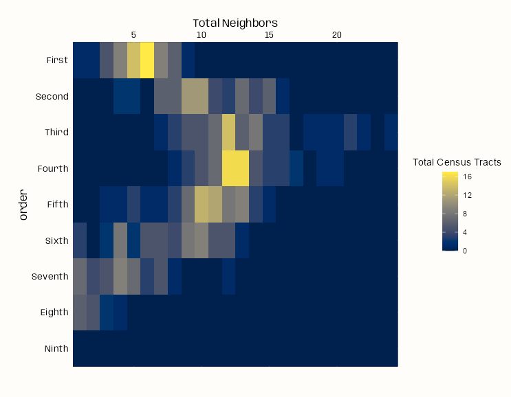
dat_nb |> tidyplot(x = tot_neigh, y = order, color = tot_nodes, width = 125, height = 125) |> add_heatmap(rotate_labels = 0) |> adjust_colors(colors_continuous_cividis) |> adjust_legend_title("Total Census Tracts") |> adjust_y_axis(title = "Order") |> adjust_x_axis(title = "Total Neighbors", position = "top") + theme_notebook( legend.title = element_text(hjust = 0.5), plot.margin = margin(25, 25, 50, 25) )- Each row of the heatmap shows the distribution of nodes (census tracts) among the potential neighbor totals for each lag (i.e. order of neighbors)
- Example: For the first lag (first row), the brightest yellow cell says there are around 16 census tracts that have 6 First Order neighbors (other census tracts) linked to them.
- Connectedness peaks in the Third Order of neighbors (3rd lag) and slightly lessens in the Fourth Order of neighbors. Most nodes in the 4th lag have around 12 or 13 Fourth Order neighbors.
- By the Ninth Order, all nodes have been linked to all other nodes and no more links are possible.
Code
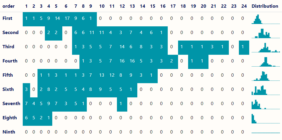
# Transform data into a matrix-style format dat_nb_wide <- dat_nb |> arrange(desc(order)) |> tidyr::pivot_wider(names_from = tot_neigh, values_from = tot_nodes, values_fill = 0) |> # add extra col for distribution chart mutate(Distribution = factor("blank")) # list of tbls for column chart plots lst_tbl_nb <- dat_nb |> split(dat_nb$order) |> rev() plot_col <- function(d, color, ...) { ggplot(d, aes(x = tot_neigh, y = tot_nodes)) + geom_col(color = color, fill = color) + # rm axes w/o using theme elts scale_x_continuous(expand = c(0, 0)) + scale_y_continuous(expand = c(0, 0)) + theme_void() } tt(dat_nb_wide) |> style_tt(background = "#FFFDF9FF") |> # headers style_tt(i = 0, bold = TRUE, color = "#000E54") |> # row names style_tt(j = 1, bold = TRUE, color = "#000E54") |> # only color nonzero values style_tt(i = dat_nb_wide > 0, background = "#0095A8FF", color = "white") |> # add column chart plot_tt(j = 26, fun = plot_col, data = lst_tbl_nb, color = "#0095A8FF", height = 2)- For each order of neighbors/spatial lag (Y-axis), the table shows the total number of nodes (census tracts) that have a certain number of neighbors (X-axis).
- e.g. There are 16 census tracts in which each have 12 fourth order neighbors.
- The pattern illustrated by spread of the colored cells and high number of neighbors reached shows that connectedness peaks in the 3rd Order of neighbors.
- The column chart in the final column shows the distribution of census tracts for each order of neighbors.
- Symmetry
- Most spatial statistics assume reciprocal relationships and will symmetrize weights if they are asymmetric. (e.g. Moran’s I)
- Symmetrizing weights can indeed introduce bias if the true underlying spatial process is inherently asymmetric (i.e. influence flows in one direction).
- Examples:
- In watershed studies where upstream locations affect downstream locations but not vice versa
- In wind dispersal where particles move predominantly in one direction
- In economic studies where influence flows from larger to smaller markets but not equally in reverse
- Examples:
- Statistical inference often assumes undirected (symmetric) relationships
- If your graph is not symmetric, you should ask how can A influence B but B not influence A in a spatial relationship.
spdep::is.symmetric.nbcan be used to check for symmetry in weight lists (e.g.spdep::graph2nb)- The neighbor’s list
plothas an argument for adding arrows to asymmetric links
- The neighbor’s list
make.sym.nbcan be used to force symmetry on a non-symmetric neighbors list by adding neighbors
- Disjointedness
These are groups of points that are connected to each other but completely separated from other groups
Think of islands in an archipelago:
- Points within each island are connected
- But there are no connections between islands
- Each island is a “component” or disjoint subgraph
Subgraphs are troubling for spatial analysis, because there is no connection between the spatial processes in those subgraphs.
- i.e. the ripples in one pond cannot cross into a separate pond if they are not connected.
Other Issues
- Disjoint components can break an assumption of connectivity between observations (aka spatial continuity)
- Block diagonal spatial weight matrices can affect computation of certain models
- Might need to analyze each block separately
Could indicate alternative clustering schemes in mixed effects models
Alternative to snap: see this Bivand example where he manually connects five areas (Slides for context)
n.comp.nbgives the number of disjoint connected subgraphs- If
n.comp.nb(nb_list)$nc == 1, then you have a fully connected graph
- If
Argument Options
- The zero.policy argument uses zero as the value for neighborless nodes if TRUE, but if FALSE causes
nb2listwto fail. - The adjust.n argument to measures of spatial autocorrelation is by default TRUE, and subtracts the count of neighborless nodes from N in an attempt to acknowledge the reduction in information available.
- snap allows the shared boundary points to be a short distance from one another. e.g. islands a short distance from the mainland that are essentially connected via ferry, bridge, etc. By using snap,
poly2nbcan make connections that should be there in all practicality. (Also see Neighbor Lists >>poly2nb)
- The zero.policy argument uses zero as the value for neighborless nodes if TRUE, but if FALSE causes
Example: Using
n.comp.nb(source)columbus <- st_read(system.file("shapes/columbus.gpkg", package="spData")[1], quiet=TRUE) col.gal.nb <- read.gal(system.file("weights/columbus.gal", package="spData")[1]) coords <- st_coordinates(st_centroid(st_geometry(columbus))) plot(col.gal.nb, coords, col="grey") col2 <- droplinks(col.gal.nb, 21) res <- n.comp.nb(col2) table(res$comp.id) plot(col2, coords, add=TRUE) points(coords, col=res$comp.id, pch=16)Example: Using snap (source)

library(spdep) file <- "etc/shapes/GB_2024_Wales_50m.gpkg.zip" zipfile <- system.file(file, package="spdep") w50m <- st_read(zipfile) nb_W_50m <- poly2nb(w50m, row.names = as.character(w50m$Constituency)) nb_W_50m ## Neighbour list object: ## Number of regions: 32 ## Number of nonzero links: 136 ## Percentage nonzero weights: 13.28125 ## Average number of links: 4.25 ## 1 region with no links: ## Ynys Môn ## 2 disjoint connected subgraphs pts <- st_point_on_surface(st_geometry(w50m)) plot(st_geometry(w50m), border="grey75" plot(nb_W_50m, pts, add = TRUE)- The Welsh constituency, Anglesey, is in the top left corner unconnected to any other location. It’s separated from the mainland by the Menai Strait. It should have two neighbors for all practical purposes.
- The summary of the neighbor list confirms that there are 2 disjoint subgraphs
- See Geospatial, Preprocessing >> sf >> Points in Polygons for details on
st_point_on_surface
dym <- c(st_distance(w50m[ynys_mon,], w50m)) sort(dym)[1:12] ## Units: [m] ## [1] 0.0000 123.4132 277.5414 16658.7265 37985.7086 54096.7729 ## [7] 58146.4320 65550.2491 67696.3323 93741.9873 113007.3659 137858.1826- ynys_mon is the Welsh name for Anglesey
- The two neighbors we want the algorithm to detect should be within 280 meters.
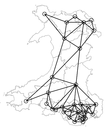
nb_W_50m_snap <- poly2nb(w50m, row.names=as.character(w50m$Constituency), snap = 280) nb_W_50m_snap ## Neighbour list object: ## Number of regions: 32 ## Number of nonzero links: 140 ## Percentage nonzero weights: 13.67188 ## Average number of links: 4.375 plot(st_geometry(w50m), border="grey75") plot(nb_W_50m_snap, pts, add = TRUE)- The neighbor list summary doesn’t list any disjoint subgraphs and the chart shows two connections to Anglesey.
- This model represents reality more accurately.
- Determining a Distance Threshold
- Determining Spacing Regularity
- Riley’s K-Function