General
Misc
Resources
- Online Interactive Cheat Sheet
- https://css-tip.com/
- https://uiverse.io/elements
- CSS code for various UI elements
- Buttons, Check Boxes, Toggle Switches, Cards, Loaders, Inputs, Radio Buttons, Forms, Patterns, and Tool Tips
- Learn CSS - Series of tutorials for various elements (more basic and comprehensive)
- Modern CSS - Series of more advanced tutorials
- Defensive CSS - Series of more advanced tutorials
Tools
- Gradient Generator
- Widget for testing parameter values for css styling a div box
- Gradient inside, shadow, border, size, etc.
- Similar tool mostly for box shadows
- Chart.css - A modern CSS framework. It uses CSS utility classes to style HTML elements as charts.
Margin, Border, and Padding
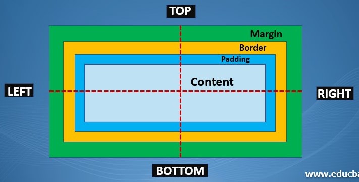
- Margin is the space between the edge of the div/border and the rest of the elements
- Padding is the space between the text and the edge of the div/border
- Syntax
- padding: 25px 50px 75px 100px;
- top padding is 25px
- right padding is 50px
- bottom padding is 75px
- left padding is 100px
- padding: 25px 50px 75px;
- top padding is 25px
- right and left paddings are 50px
- bottom padding is 75px
- padding: 25px 50px;
- top and bottom paddings are 25px
- right and left paddings are 50px
- padding: 25px;
- all four paddings are 25px
- padding: 25px 50px 75px 100px;
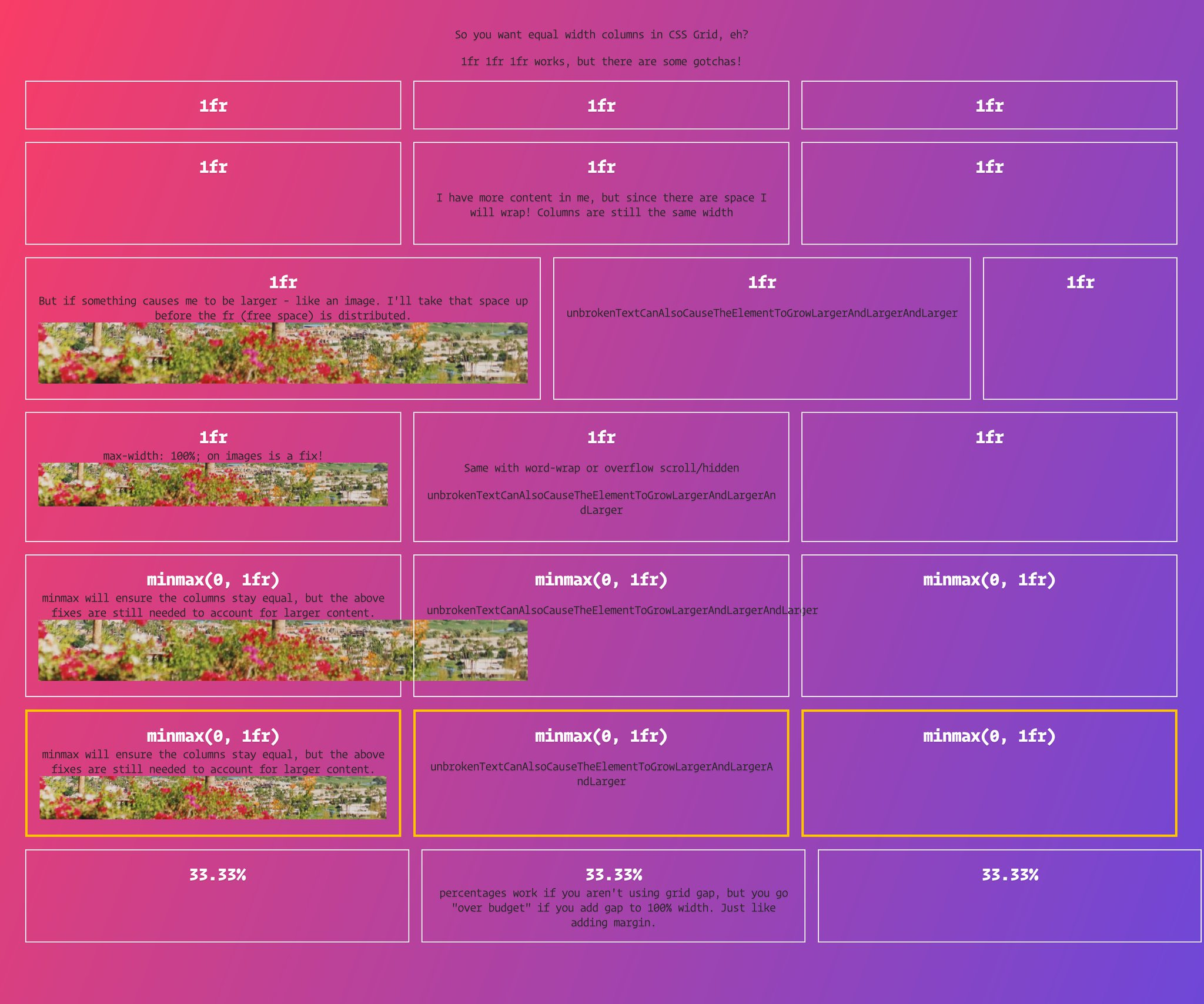
Column Widths in CSS Grid
CSS comment -
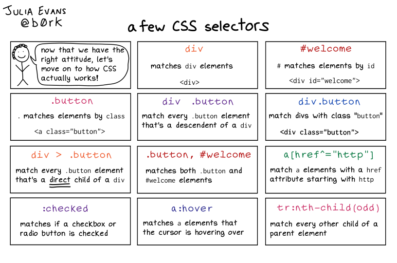
/* comment */Selector formats
- Syntax:
#<class>.<id><additional-stuff> - Example:
CSS
#header.fluid-row::before{
}
HTML
<div class="fluid-row" id="header"> == $0
::before
</div>
- Syntax:
Include css styling directly into a html page
Example: Via HTML style tag
<style> body { padding: 50px 25px 0px 25px; font-family: 'Roboto', sans-serif; font-size: 19px; } </style>Example: Via R chunk
htmltools::tags\$link(href = "https://fonts.googleapis.com/css2?family=Libre+Baskerville:ital,wght\@0,400;0,700;1,400&display=swap", rel = "stylesheet")Example: styling of a legend html div
<style type='text/css'> .my-legend .legend-title { text-align: left; margin-bottom: 8px; font-weight: bold; font-size: 90%; } .my-legend .legend-scale ul { margin: 0; padding: 0; float: left; list-style: none; } .my-legend .legend-scale ul li { display: block; float: left; width: 50px; margin-bottom: 6px; text-align: center; font-size: 80%; list-style: none; } .my-legend ul.legend-labels li span { display: block; float: left; height: 15px; width: 50px; } .my-legend .legend-source { font-size: 70%; color: #999; clear: both; } .my-legend a { color: #777; } </style>- See link for details on the legend div element that uses this CSS
Centering
- There are also instructions for placing elements in different positions (e.g. right edge)
- Notes from How To Center a Div
- There’s also code/explainer for centering elements (e.g. images) that have to stacked on top of each other
Elements
Center Horizontally with auto-margins
.element { max-width: fit-content; margin-left: auto; margin-right: auto; /* margin-inline: auto*/ }- Use when you want to horizontally center a single element without disturbing any of its siblings
- max-width is used because if width is used instead, it would lock it to that size, and the element would overflow when the container is really narrow.
- Including only margin-left: auto will force the div flush with the right side and vice verse with margin-right
- margin-inline: auto can replace both margin-left and margin-right to center the div
Centering Vertically and Horizontally
.container {
  align-content: center;
}
.element {
  max-width: fit-content;
  margin-inline: auto;
}
Center Vertically and Horizontally with Flexbox
/* single element */ .container { display: flex; justify-content: center; align-items: center; } /* multiple elements */ .container { display: flex; flex-direction: row; justify-content: center; align-items: center; gap: 4px; }- The most versatile method; it can be used to center one or multiple children, horizontally and/or vertically, whether they’re contained or overflowing.
- flex-direction controls the direction in which the items are aligned, and it can have other values: column, row-reverse, column-reverse
Text
container { display: flex; justify-content: center; align-items: center; text-align: center; }- Blocks of text can be treated as one element and can be centered using the previous methods. This code (text-align) is for centering the rows of text within a element’s block.
Viewports
Useful for elements like dialogs, prompts, and GDPR banners need to be centered within the viewport. (Think pop-ups)
Centering With Known Sizes
.element { position: fixed; inset: 0px; width: 12rem; height: 5rem; max-width: 100vw; max-height: 100dvh; margin: auto; }- Complex and has more settings that depend on the element. See article for details but there are four main concepts:
- Fixed positioning
- Anchoring to all 4 edges with
inset: 0px - Constrained width and height
- Auto margins
- Omitting top: 0px will anchor the element to the bottom
Use
calcwith max-width to make sure theres a buffer around the elementmax-width: calc( 100vw - 8px * 2 );
- Complex and has more settings that depend on the element. See article for details but there are four main concepts:
Centering Elements With Unknown Sizes
.element { position: fixed; inset: 0; width: fit-content; height: fit-content; margin: auto; }- fit-content is doing the work
Navbar
- Active Elements
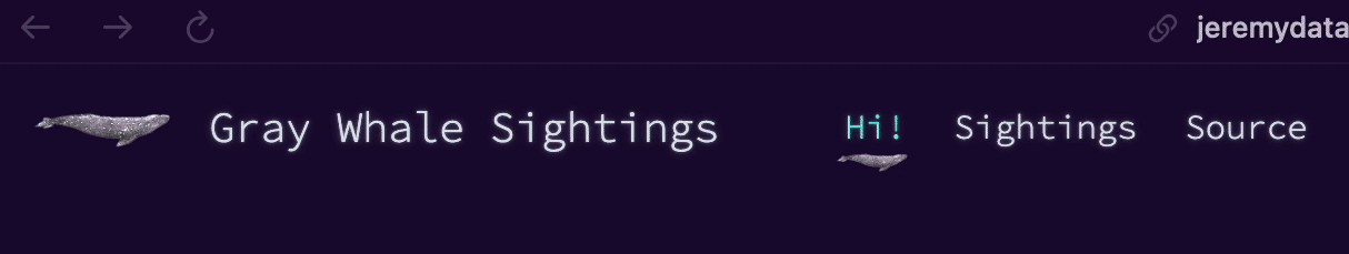
Example: Whale Image (source)
.quarto-dashboard .navbar .navbar-nav .active {
  background-image: url("images/wnba-logo.png");
  background-position: left:
  background-repeat: no-repeat;
  background-size: 20px;
}

.nav-item {
  min-width: 60px;
}

.nav-link-text {
  padding-left: 6px;
}