Model Agnostic
Misc
- Packages
- {e2tree} - Explain and interpret decision tree ensemble models using a single tree-like structure.
- A new way of explaining an ensemble tree trained through ‘randomForest’ or ‘xgboost’ packages.
- {midr} - Implements ‘Maximum Interpretation Decomposition’ (MID), a functional decomposition technique that finds an optimal additive approximation of the original model. This approximation is achieved by minimizing the squared error between the predictions of the black-box model and the surrogate model.
- {midnight} - Implements a {parsnip} engine for the {midr} package, allowing users to seamlessly fit, tune, and evaluate MID (Maximum Interpretation Decomposition) models with {tidymodels} workflows.
- {mrIML} - Multi-Response (Multivariate) Interpretable Machine Learnin
- {e2tree} - Explain and interpret decision tree ensemble models using a single tree-like structure.
- These measures can’t be used in a causal interpretation, but understanding the relationship between the target and predictors for a particular model is beneficial for multiple reasons. (source)
- Model Assessment (e.g., is the model using variables in a scientifically reasonable manner?)
- Data Insight (e.g., what patterns in the data did the model find useful for prediction?)
- Building Trust in a Prediction (e.g., do we feel comfortable making a decision based on how the model made use of the data to produce a prediction?)
- Individual prediction interpretation uses:
- Look at extreme prediction values and see what predictor variable values are driving those predictions
- Examine distribution of prediction values (on observed or new data)
- Multi-Modal? Which variables are driving the different mode’s predicitions
- Break predictions down by cat variable. If differences between levels are apparent, which predictor variable values are driving those differences in predictions
- ML model predicts customer in observed data has high probability of conversion yet customer hasn’t converted. Develop strategy around predictor variables (increase or decrease, do or stop doing something) that contributed to that prediction to hopefully nudge that customer into converting
DALEX
Misc
Notes from Explanatory Model Analysis
- Book shows code snippets for R and Python
Also available for Python models
Models from packages handled by {DALEXtra}: scikit-learn, keras, H2O, tidymodels, xgboost, mlr or mlr3
The first step is always going to be creating an “explain” object
titanic_glm_model <- glm(survived~., data = titanic_imputed, family = "binomial") explainer_glm_titanic <- explain(titanic_glm_model, data = titanic_imputed[,-8], y = titanic_imputed$survived)- Custom explainers can be constructed for models not supported by the package. You need to specify directly the model-object, the data frame used for fitting the model, the function that should be used to compute predictions, and the model label.
- {DALEXtra} has helper functions set-up to support {{sklearn}}, {{keras}}, {h2o}, {mlr3}, {tidymodels}, and {xgboost} models.
Explanatory Levels
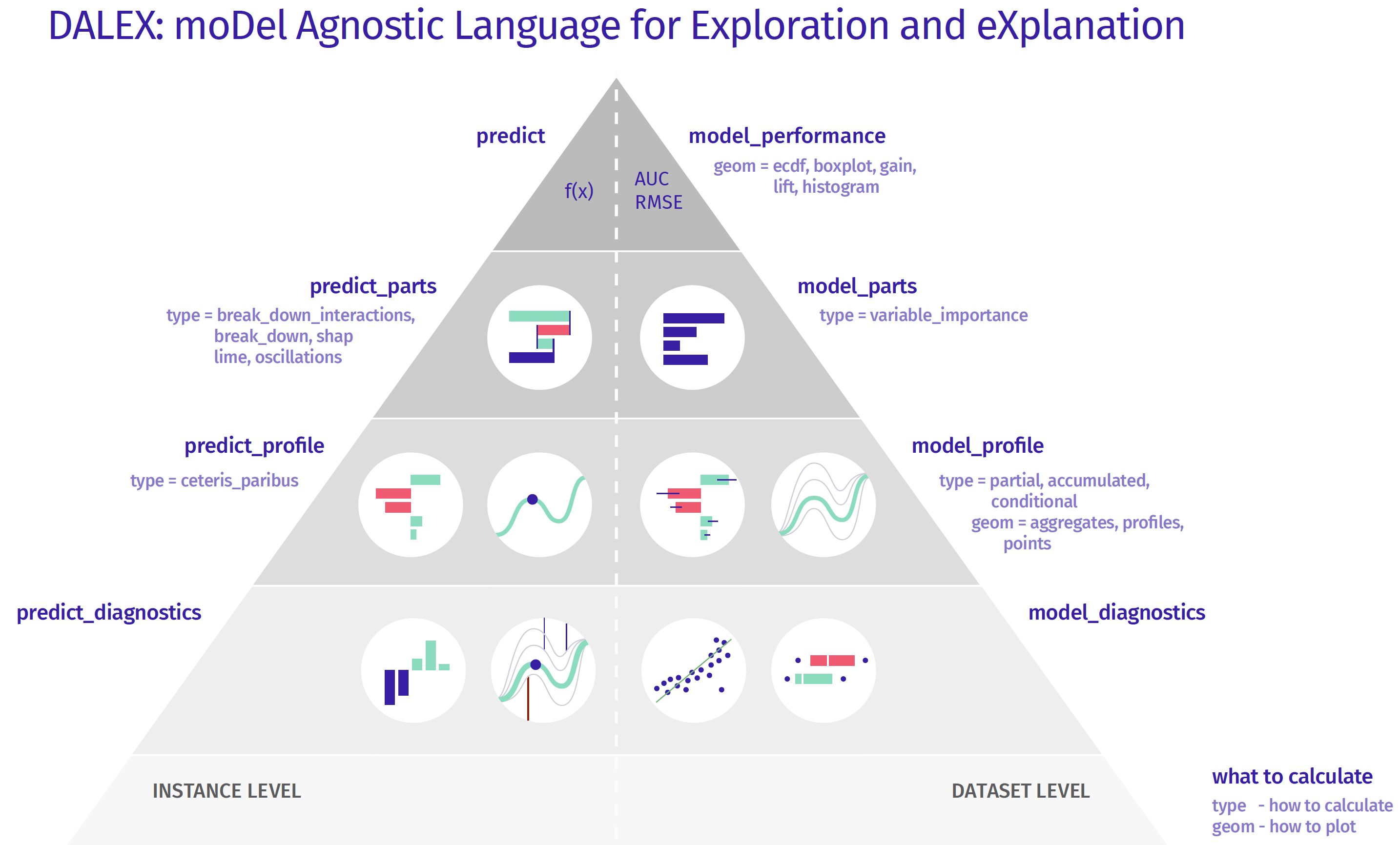
Instance Level
- The model exploration for an individual instance starts with a single number — a prediction. This is the top level of the pyramid.
- To this prediction we want to assign particular variables, to understand which are important and how strongly they influence this particular prediction. One can use methods as SHAP, LIME, Break Down, Break Down with interactions. This is the second from the top level of the pyramid.
- Moving down, the next level is related to the sensitivity of the model to change of one or more variables’ values. Ceteris Paribus profiles allow to explore the conditional behaviour of the model.
- Going further, we can investigate how good is the local fit of the model. It may happen, that the model is very good on average, but for the selected observation the local fit is very low, errors/residuals are larger than on average. The above pyramid can be further extended, i.e. by adding interactions of variable pairs.
Dataset Level
- The exploration for the whole model starts with an assessment of the quality of the model, either with F1, MSE, AUC or LIFT/ROC curves. Such information tells us how good the model is in general.
- The next level helps to understand which variables are important and which ones make the model work or not. A common technique is permutation importance of variables.
- Moving down, methods on the next level help us to understand what the response profile of the model looks like as a function of certain variables. Here you can use such techniques as Partial Dependence Profiles or Accumulated Local Dependence.
- Going further we have more and more detailed analysis related to the diagnosis of the errors/residuals.
Instance Level
- Use Case:
- Investigate extreme response values
- Investigate observations not predicted well by your model
Break-Down (BD)
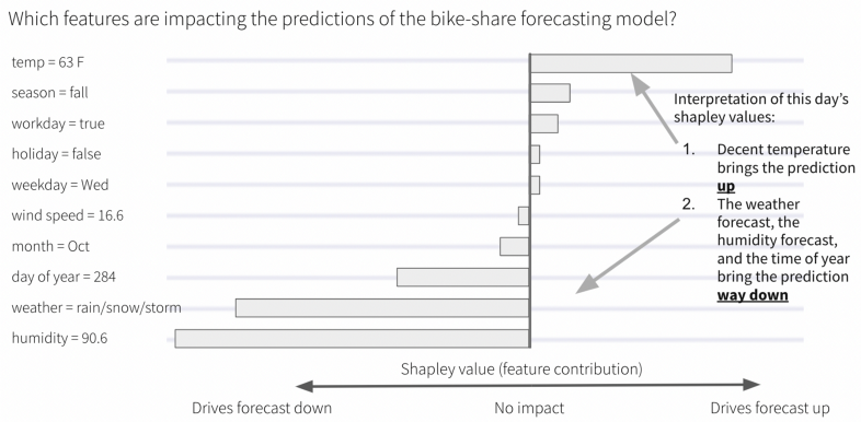
Allows you to see how predictor variables contribute to prediction.
BD Charts shows additive contributions of variables when they are sequentially added to the model
Break-down (BD) plots and Shapley values are most suitable for models with a small or moderate number of explanatory variables. Neither of those approaches is well-suited for models with a very large number of explanatory variables, because they usually determine non-zero attributions for all variables in the model.
- For data with many predictors, use LIME.
Interpretation
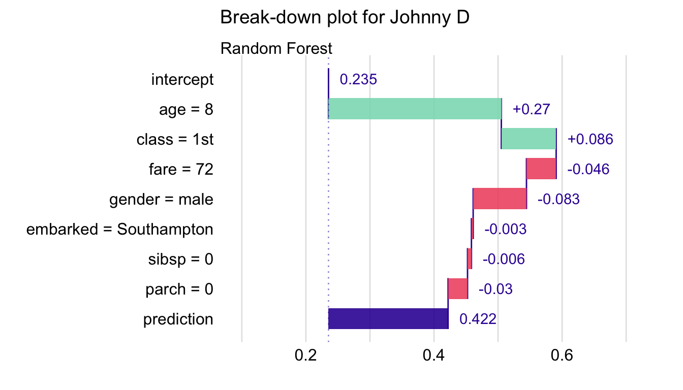
- Model predicts survival probability of a person on the Titanic
- intercept is the mean of all the predictions from of the model on the training data
- Fixing age = 8 adds 0.27 probability points to the mean overall prediction
- Fixing age = 8 and class = 1st adds \((0.27 + 0.086 = 0.356)\) to the mean overall prediction
- prediction is the point prediction for an observation that has all of these predictors fixed at these values
When interactions, whether explicit like in linear regression models or implicit like in Random Forest models, are present in the model, the order that the predictors are presented to the DALEX function affects the estimated contribution.
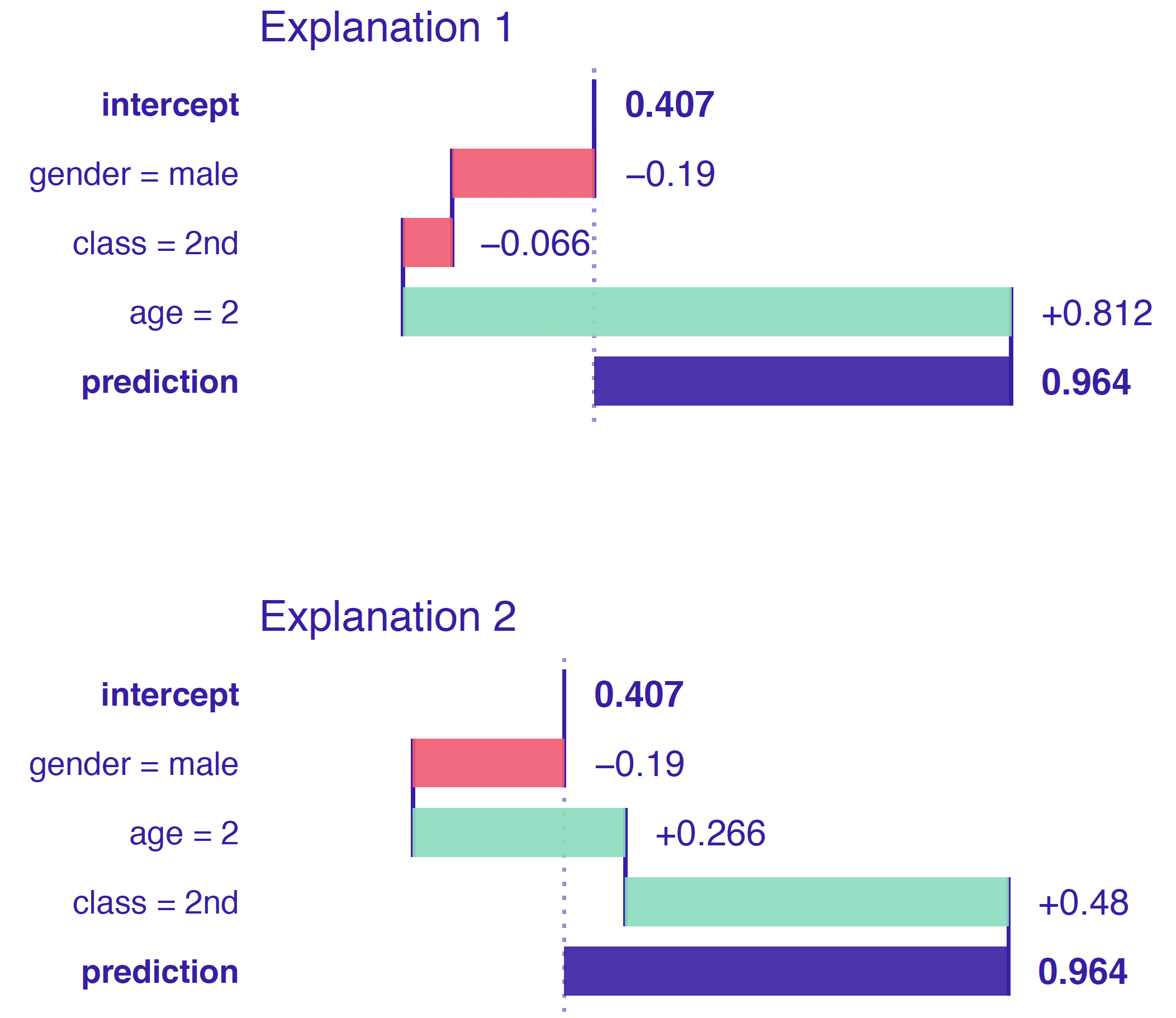
- When interactions aren’t present in the model, then contributions should be the same regardless of ordering of the predictors.
- Here class and age have been presented to the DALEX function is different orders and have different contributions which shows that the RF model is using an interaction of the two predictors.
Example: Assume No Interactions
library("randomForest") library("DALEX") explain_rf <- DALEX::explain(model = titanic_rf, data = titanic_imputed[, -9], y = titanic_imputed$survived == "yes", label = "Random Forest") bd_rf <- predict_parts(explainer = explain_rf, new_observation = henry, type = "break_down") bd_rf ## contribution ## Random Forest: intercept 0.235 ## Random Forest: class = 1st 0.185 ## Random Forest: gender = male -0.124 ## Random Forest: embarked = Cherbourg 0.105 ## Random Forest: age = 47 -0.092 ## Random Forest: fare = 25 -0.030 ## Random Forest: sibsp = 0 -0.032 ## Random Forest: parch = 0 -0.001 ## Random Forest: prediction 0.246plot(bd_rf)will plot the BD chart- type - The method for calculation of variable attribution; the possible methods are “break_down” (the default), “shap”, “oscillations”, and “break_down_interactions”
- order - A vector of characters (column names) or integers (column indexes) that specify the order of explanatory variables to be used for computing the variable-importance measures; if not specified (default), then a one-step heuristic is used to determine the order
- keep_distributions - A logical value (FALSE by default); if TRUE, then additional diagnostic information about conditional distributions of predictions is stored in the resulting object and can be plotted with the generic plot() function.
- When this is TRUE,
plotwill output the BD plot, but instead of point estimates of the contributions for each predictor, violin plots visualize the distribution of contribution values. - There are also lines that connect predictions from one distribution to the next distribution which indicates how each model prediction changed wthen the next predictor was added.
- Not very aesthetically pleasing. If you want to use these distributions in a presentation and aren’t concerned with the lines, I’d recommend getting the values and making a raincloud plot with {{ggdist}} or some other package.
- When this is TRUE,
Example: Assume Interactions
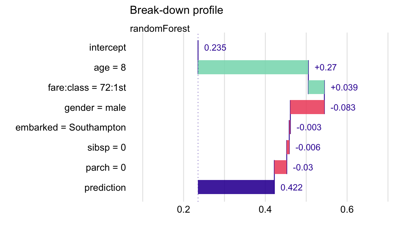
## contribution ## Random Forest: intercept 0.235 ## Random Forest: class = 1st 0.185 ## Random Forest: gender = male -0.124 ## Random Forest: embarked:fare = Cherbourg:25 0.107 ## Random Forest: age = 47 -0.125 ## Random Forest: sibsp = 0 -0.032 ## Random Forest: parch = 0 -0.001 ## Random Forest: prediction 0.246- Same code as before except in
predict_parts, type = “break_down_interactions”- Finds an ordering of the predictors in which the most important predictors are placed at the beginning
- iBD detects an important interaction between fare and class
- Can be time consuming as the running time is quadratic depending on the number of predictors, \(O(p^2)\). \(\frac{p(p+1)}{2}\) net contributions for single variables and pairs of variables have to be calculated.
- For datasets with a small number of observations, the calculations of the net contributions will be subject to a larger variability and, therefore, larger randomness in the ranking of the contributions.
- Same code as before except in
Lime
Artificial data is generated around the neighborhood of instance of interest. Predictions are generated by the black-box model. A glass-box model (e.g. lasso, decision-tree, etc.) is trained on the artificial data and predictions. Then, the glass-box model is used as a proxy model for the black-box model for interpreting that instance.
Widely adopted in the text and image analysis but also suitable for tabular data with many predictors
- For models with large numbers of variables, sparse explanations with a small number of variables offer a useful alternative to BD and SHAP.
Issues
- Requires numeric predictors, so different LIME methods will have different transformations of the categorical variables and will provide different results.
- The glass-box model is selected to approximate the black-box model, and not the data themselves, the method does not control the quality of the local fit of the glass-box model to the data. Thus, the latter model may be misleading.
- Sometimes even slight changes in the neighborhood where the artificial data is generated can strongly affect the obtained explanations.
See Ch. 9.6 for discussion of some of the differences in LIME implementation between {lime}, {localModel}, and {iml}.
Example: {localModel}
library("localModel")
locMod_johnny <-
  DALEXtra::predict_surrogate(explainer = explain_rf,
                              new_observation = johnny_d,
                              size = 1000,
                              seed = 1,
                              type = "localModel")
locMod_johnny[,1:3]
##     estimated                        variable original_variable
## 1  0.23530947                    (Model mean)
## 2  0.30331646                     (Intercept)
## 3  0.06004988                   gender = male            gender
## 4 -0.05222505                    age <= 15.36               age
## 5  0.20988506     class = 1st, 2nd, deck crew             class
## 6  0.00000000 embarked = Belfast, Southampton          embarked
type = “localModel” says which package to use
- {lime} and {iml} available
estimated shows the coefficients of a LASSO glass-box model
Note the dichotomization of the continuous variable, age
- Cutpoint chosen using ceteris-paribus profiles. The point at which the largest change in the response is chosens as the cutpoint.
CP Profile:
localModel::plot_interpretable_feature(locMod_johnny, "age")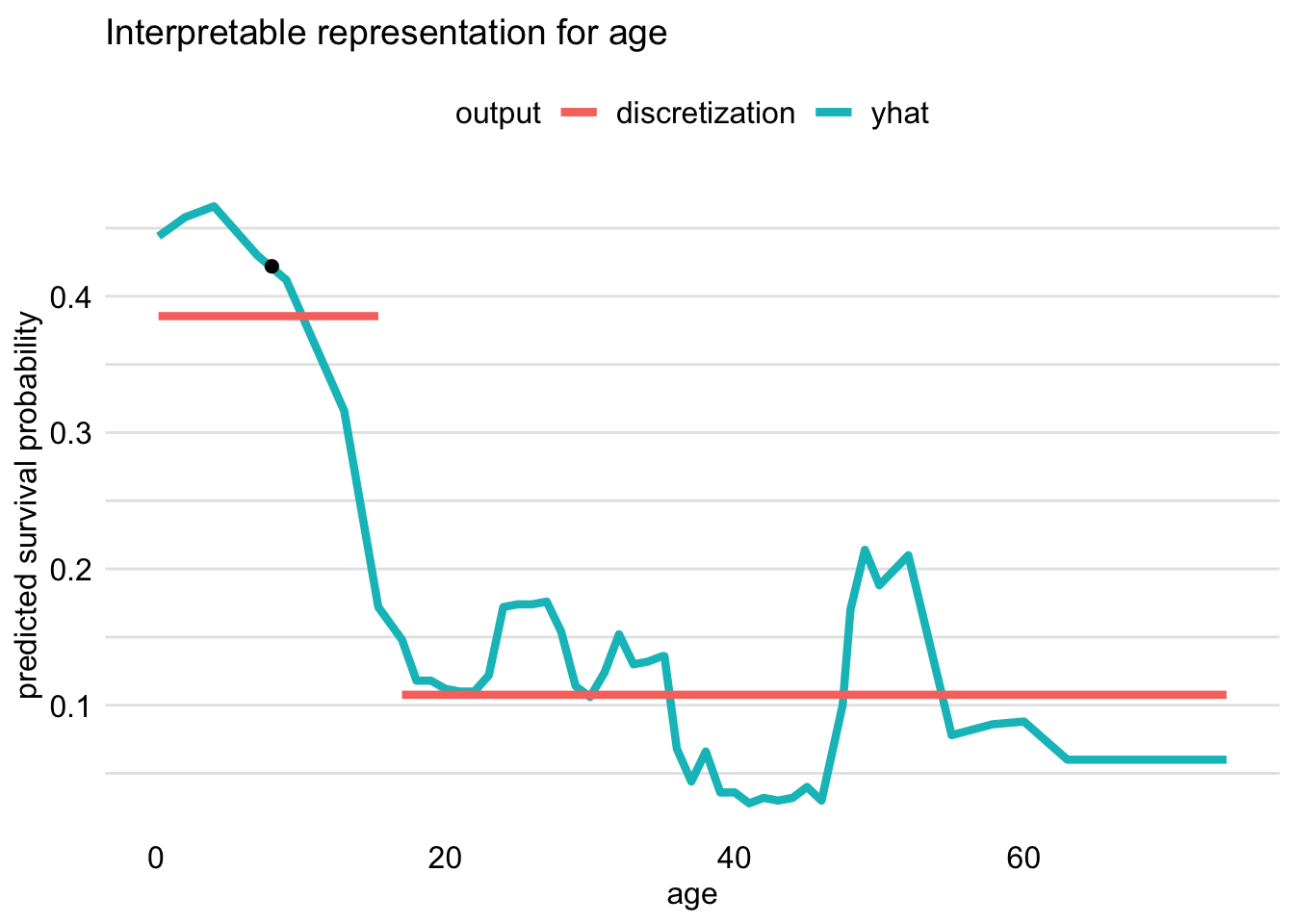
- {iml} doesn’t transform continuous variables and {lime} uses quartile cutpoints
- Cutpoint chosen using ceteris-paribus profiles. The point at which the largest change in the response is chosens as the cutpoint.
Visualizaton:
plot(locMod_johnny)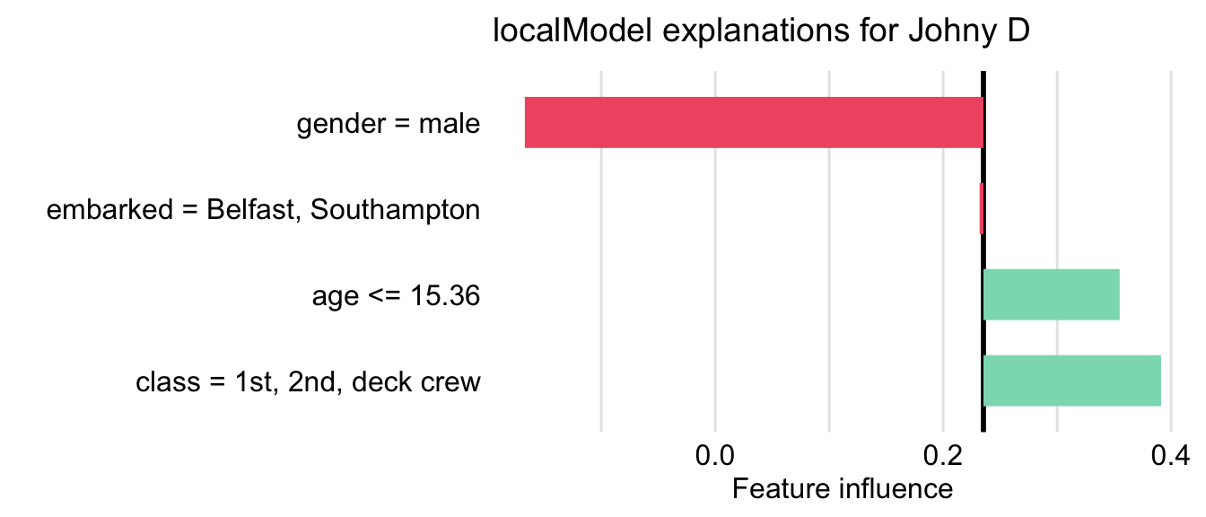
Ceteris Paribus (CP)
A CP profile shows how a model’s prediction would change if the value of a single exploratory variable changed
- A pdp is the average of cp profiles for all observations.
If calculated for multiple observations, CP profiles are a useful tool for sensitivity analysis.
The larger influence of an explanatory variable on prediction for a particular instance, the larger the fluctuations of the corresponding CP profile. For a variable that exercises little or no influence on a model’s prediction, the profile will be flat or will barely change.
For categoricals or discrete variables, bar graphs are used to visualize the CP values.
Issues
- Correlated explanatory variables may lead to misleading results , as it is not possible to keep one variable fixed while varying the other one.
- If an interaction is present, whether explicit like in linear regression models or implicit like in Random Forest models, results can be misleading.
- Pairwise interactions require the use of two-dimensional CP profiles that are more complex than one-dimensional ones.
Process
- Supply a single observation with values of your choice and a predictor.
- That predictor varies while the others in the model are held constant, and predictions are calculated.
- Responses are plotted vs the predictor.
Example: Compare 2 observations
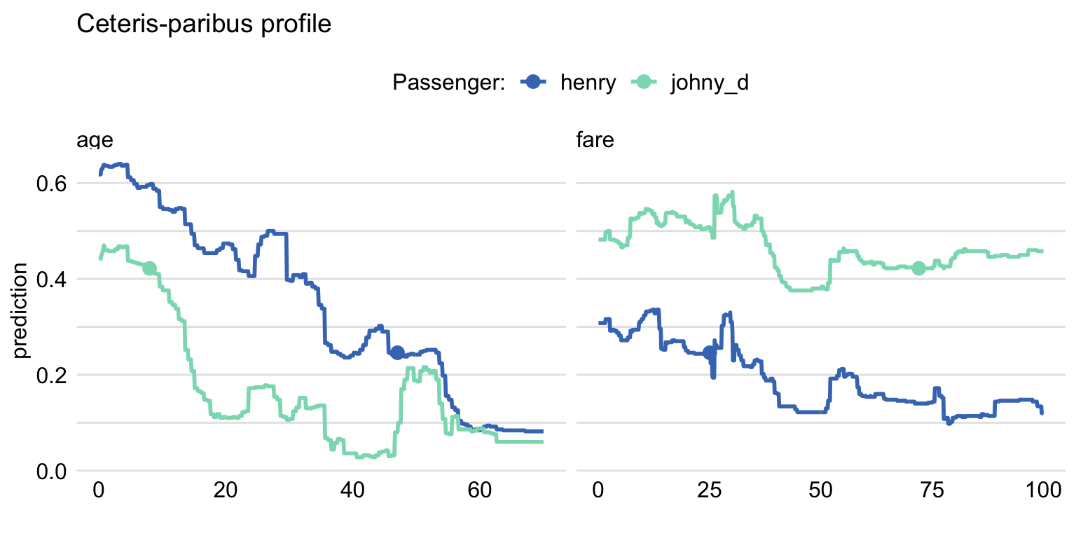
variable_splits = list(age = seq(0, 70, 0.1), fare = seq(0, 100, 0.1)) ) cp_titanic_rf2 <- predict_profile(explainer = explain_rf, new_observation = rbind(henry, johnny_d), variable_splits = variable_splits) library(ingredients) plot(cp_titanic_rf2, color = "_ids_", variables = c("age", "fare")) + scale_color_manual(name = "Passenger:", breaks = 1:2, values = c("#4378bf", "#8bdcbe"), labels = c("henry" , "johny_d"))predict_profile- variables - (Not used in this example) Names of explanatory variables, for which CP profiles are to be calculated. By default, variables = NULL and the profiles are constructed for all variables, which may be time consuming.
- variable_splits is an optional argument for providing a custom range of predictor values.
- By default the function uses the range of values in the training data which is obtained throught the explainer object.
- Also, limits the computations to the variables specified in the data.frame
plot- color = “_ids_” specifies that more than one observation is being compared
Example: Compare Multiple Models
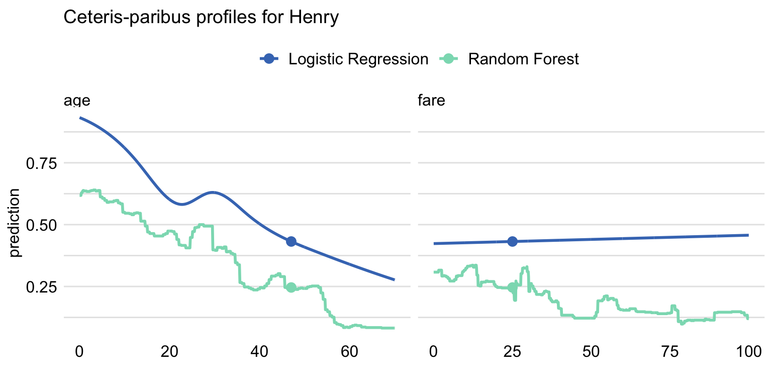
plot(cp_titanic_rf, cp_titanic_lmr, color = "_label_", variables = c("age", "fare")) + ggtitle("Ceteris-paribus profiles for Henry", "")- age has a non-linear shape because a spline transform was used
Profile Oscillations
Method to assign importance to individual CP Profiles. Useful when there are a large number of variables used in your model.
- For models with hundreds of variables or discrete variables like zip codes, visual examination can be daunting.
The method estimates the area under the CP curve by summing the differences between the CP values and the prediction at that instance.
Example: Basic
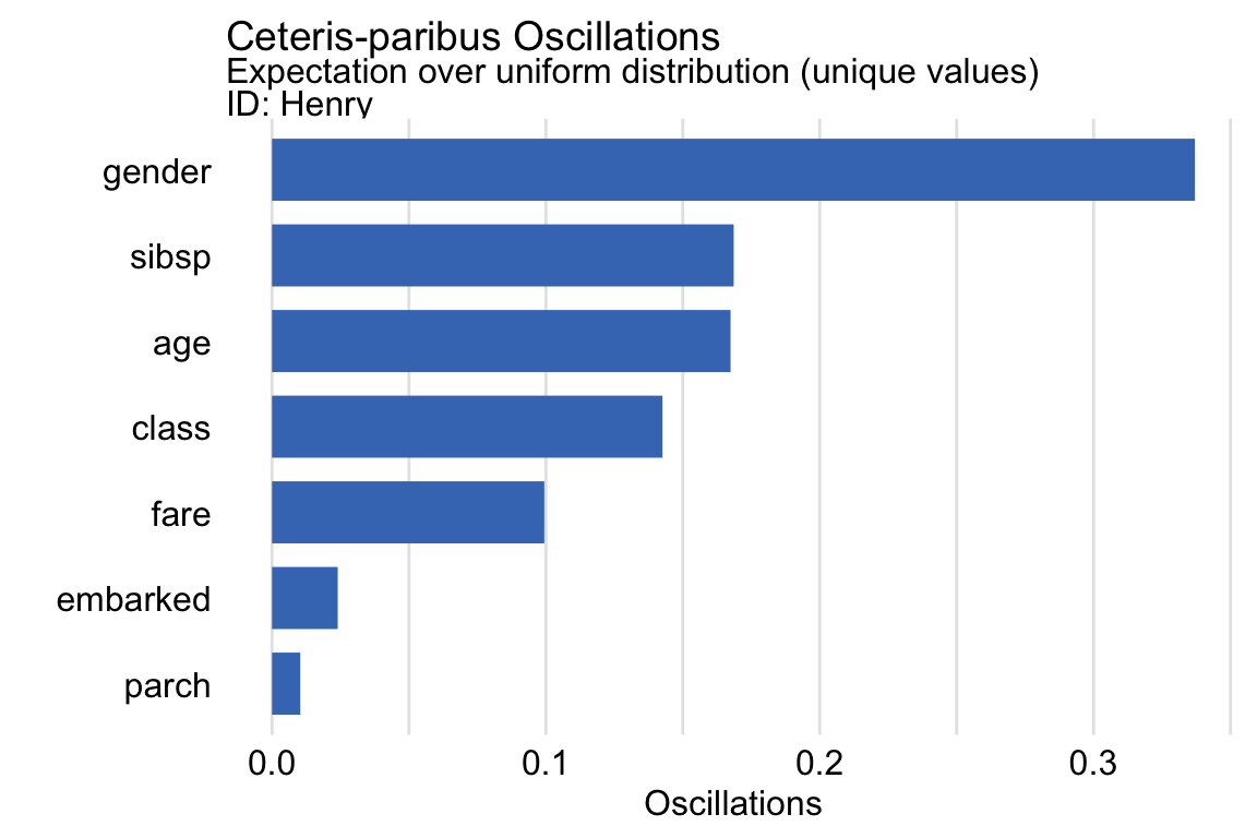
oscillations_uniform <-
  predict_parts(explainer = explain_rf,
                new_observation = henry,
                type = "oscillations_uni")

oscillations_uniform
##    _vname_ _ids_ oscillations
## 2   gender     1   0.33700000
## 4    sibsp     1   0.16859406
## 3      age     1   0.16744554
## 1    class     1   0.14257143
## 6     fare     1   0.09942574
## 7 embarked     1   0.02400000
## 5    parch     1   0.01031683

oscillations_uniform$`_ids_` <- "Henry"
plot(oscillations_uniform) +
    ggtitle("Ceteris-paribus Oscillations",
            "Expectation over uniform distribution (unique values)")
Gender is a CP Profile that you should definitely look at. Followed by sibsp, age, and probably class
variable_splits is optional. Available if you want to use a custom grid of variables and values.
type
type = “oscillations” is used when variable_splits is used. An average residual is what’s being calculated, and one main difference in the types is the divisor (e.g. number of unique values, sample size) that’s used. Here, I’m guessing this argument value sets the divisor to the number of grid values in variable_splits.
type = “oscillations_uni” assumes a uniform distribution of the “residuals” which are differences between the CP value and prediction for that instance.
Filters variables to only unique values
Quicker to compute
type = “oscillations_emp” assumes an empirical distribution of the “residuals”
- Preferred when there are enough data to accurately estimate the empirical distribution and when the distribution is not uniform.
Local Diagnostics
- Check how the model behaves locally for observations similar to the instance of interest.
- Neighbors of the instance of interest are chosen using a distance metric that includes all variables — default being the gower distance which handles categorical and continuous variables.
- Local Fidelity
Compares the distribution of residuals for the neighbors with the distribution of residuals for the entire training dataset.
A histogram with both sets of residuals is created.
- Both distributions should be similar. But, if the residuals for the neighbors are shifted towards positive or negative values, then the model has issues predicting instances with variable values in this space.
Non-parametric tests such as Wilcoxon or Kolmogorov-Smirnov test can also be used to test for differences.
- Local Stability
Checks whether small changes in the explanatory variables, as represented by the changes within the set of neighbors, have got much influence on the predictions.
CP profiles are calculated for each of the selected neighbors
- Adding residuals to the plot allows for evaluation of the local model-fit.
Interpretation
- Parallel lines suggests the relationship between the variable and the response is additive.
- A small distance between the lines suggests model predictionss are stable for values of that variable around the supplied value.
- Example
Local-Fidelity
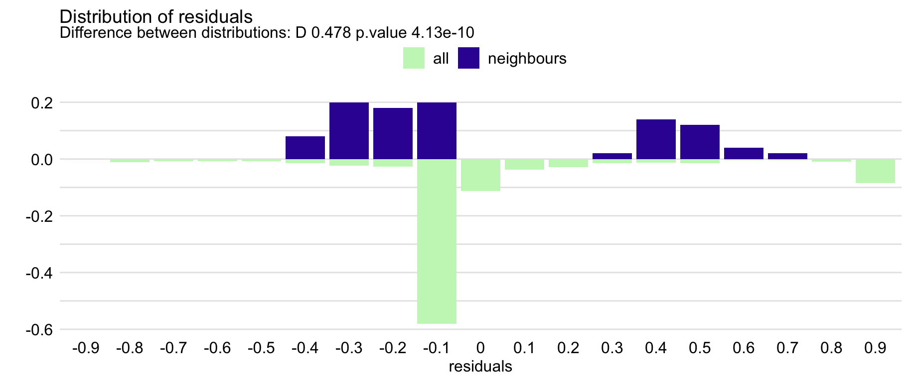
id_rf <-
  predict_diagnostics(explainer = explain_rf,
                      new_observation = henry,
                      neighbours = 100)
id_rf
##  Two-sample Kolmogorov-Smirnov test
##
## data:  residuals_other and residuals_sel
## D = 0.47767, p-value = 4.132e-10
## alternative hypothesis: two-sided
plot(id_rf)
KS-Test indicates a statistically significant difference between the two distributions
The plot suggests that the distribution of the residuals for Henry’s neighbours might be slightly shifted towards positive values, as compared to the overall distribution.
I don’t think the y-axis values are informative. This is a split axis histogram where neighbor residuals are on top and the rest of the observations are on the bottom.
There is a nbinsargument which has a default of twenty. This chart many need a few more bins
Local-Stability
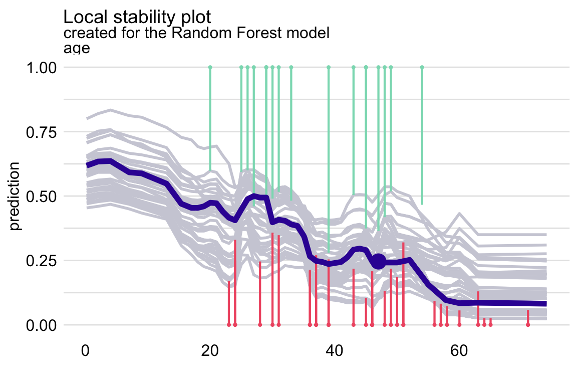
id_rf_age <-
  predict_diagnostics(explainer = explain_rf,
                      new_observation = henry,
                      neighbours = 10,
                      variables = "age")
plot(id_rf_age)
The vertical segments correspond to residuals
- Shorter the segment, the smaller the residual and the more accurate prediction of the model.
- Green segments correspond to positive residuals, red segments to negative residuals.
The profiles are relatively close to each other, suggesting the stability of predictions.
There are more negative than positive residuals, which may be seen as a signal of a (local) positive bias of the predictions.
Dataset Level
Fitted vs Observed
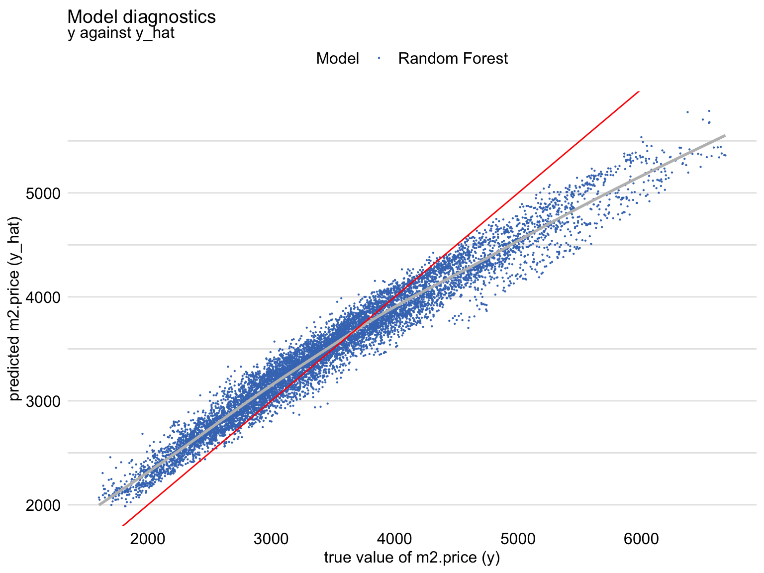
diag_ranger <- model_diagnostics(explainer_ranger)
plot(diag_ranger, variable = "y", yvariable = "y_hat") +
geom_abline(colour = "red", intercept = 0, slope = 1)- Red line is the perfect fitting model
- Shows that, for large observed values of the dependent variable, the predictions are smaller than the observed values, with an opposite trend for the small observed values of the dependent variable. (Also see Residuals vs Observed)
Residual Plots
Misc
For ML models, can help in detecting groups of observations for which a model’s predictions are biased.
From Chapter 19
Histogram Plot
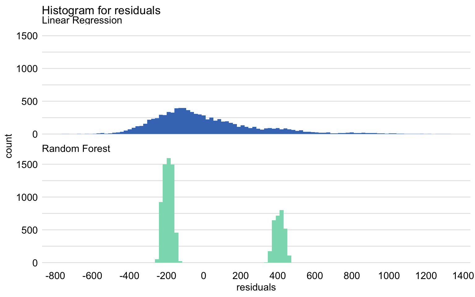
mr_lm <- model_performance(explain_apart_lm) mr_rf <- model_performance(explain_apart_rf) plot(mr_lm, mr_rf, geom = "histogram")- The split into two separate, normal-like parts, which may suggest omission of a binary explanatory variable in the model.
Boxplot
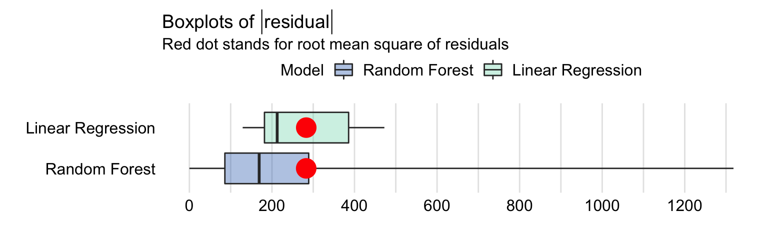
plot(mr_lm, mr_rf, geom = "boxplot")- Red dot represents RMSE (i.e. mean of the residuals)
- The residuals for the random forest model are more frequently smaller than the residuals for the linear-regression model. However, a small fraction of the random forest-model residuals is very large, and it is due to them that the RMSE is comparable for the two models.
- The separation of the red dot (mean) and line (median) indicate that the residual distribution is skewed to the right.
Residuals vs Observation ID
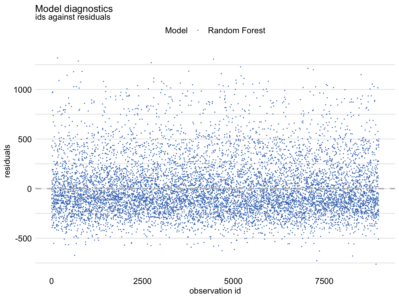
md_rf <- model_diagnostics(explainer_ranger) plot(md_rf, variable = "ids", yvariable = "residuals")- Shows an asymmetric distribution of residuals around zero, as there is an excess of large positive (larger than 500) residuals without a corresponding fraction of negative values (i.e. right-skewed distribution)
Residuals vs Fitted -
plot(md_rf, variable = "y_hat", yvariable = "residuals")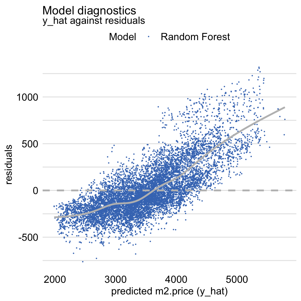
- Should be symmetric around the horizontal at zero
- Suggests that the predictions are shifted (biased) towards the average.
Residuals vs Observed -
plot(md_rf, variable = "y", yvariable = "residuals")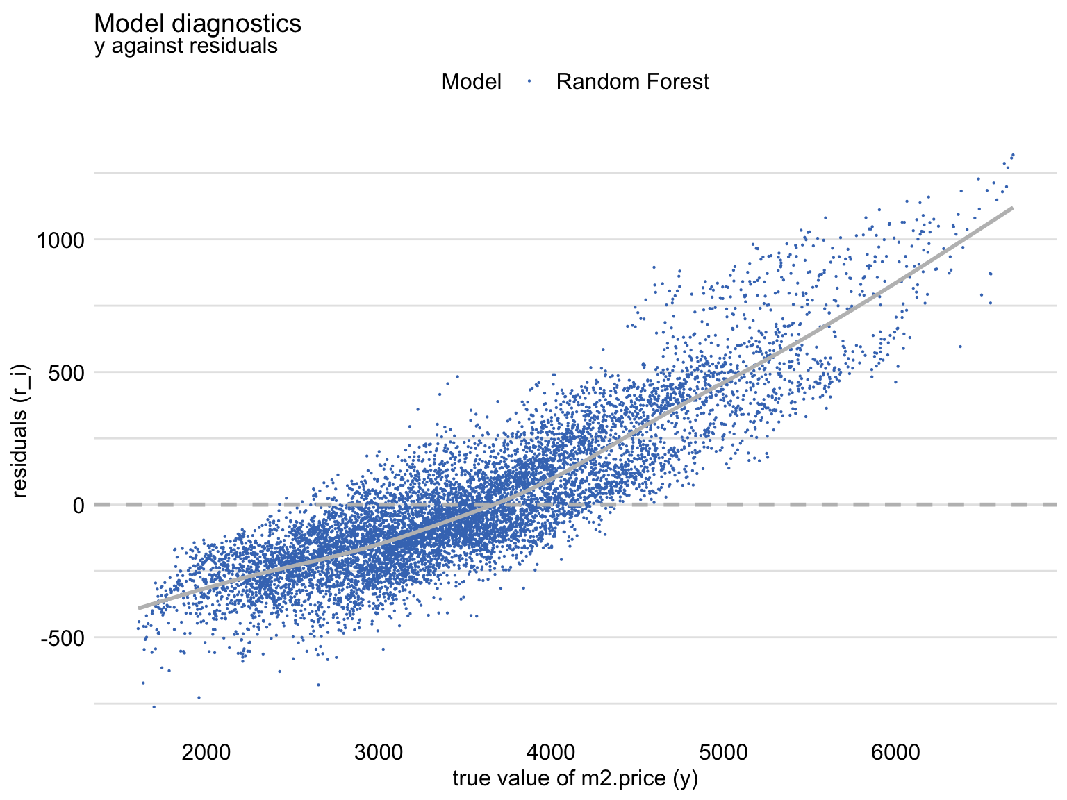
- Should be symmetric around the horizontal at zero
- Shows that, for the large observed values of the dependent variable, the residuals are positive, while for small values they are negative. This trend is clearly captured by the smoothed curve included in the graph. Thus, the plot suggests that the predictions are shifted (biased) towards the average. (See Fitted vs Observed)
Abs Residuals vs Fitted -
plot(md_rf, variable = "y_hat", yvariable = "abs_residuals")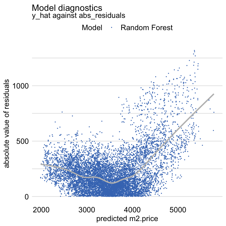
- Variation of the Scale-Location plot
- Should be symmetric scatter around a horizontal line to indicate homoskedastic variance of the residuals
- Large concern for linear regression models, but potentially not a concern for tree models like RF
- For tree models, you have to decide whether the bias is acceptable
Feature Importance
From Chapter 16
Model-agnostic method used allows comparing an explanatory-variable’s importance between models with different structures to check for agreement.
- If variables are ranked in importance differently in different models, then compare in pdp, factor, or ale plots. See if one of the models that has the variable ranked higher captures a different (e.g. non-linear) relationship with response better than the other models
The permutation step means there some randomness involved, so it should be repeated many times. This will give you a distribution of importance values for each variable. Then, you can calculate a an interval based on a chosen quantile to represent the uncertainty.
Overview
- Takes a variable, randomizes its rows, measures change in loss function from full model.
- Vars that have largest changes are of greater importance (longer bars).
Some of the Args
- N = 1000 (default), = NULL to use whole dataset (slower).
- B = 10 (default) - Number of iterations (i.e. number of times you go through the permutation process for each variable)
- Type = “raw” (default) is just the value of loss function. You can use “difference” or “ratio” (shown in Steps section), but the ranking isn’t affected
Steps for any given loss function
- Compute the value for the loss function for original model
- For variable i in {1,…,p}
- Permute values of explanatory variable
- Apply given ML model
- Calculate value of loss function
- Compute feature importance (permuted loss / original loss)
- Sort variables by descending feature importance
Example
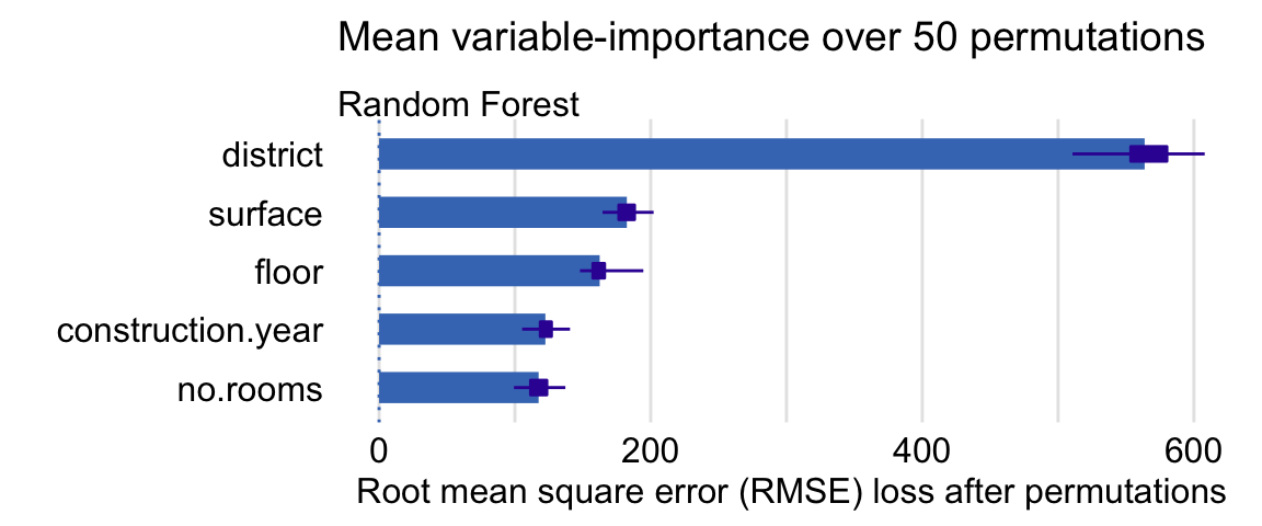
vars <- c("surface","floor","construction.year","no.rooms","district") model_parts(explainer = explainer_rf, loss_function = loss_root_mean_square, B = 50, variables = vars) library("ggplot2") plot(vip.50) + ggtitle("Mean variable-importance over 50 permutations", "")- Box-plot represents the distribution of importance values for that variable
Partial Dependence Profiles (PDPs)
Misc
- From Chapter 17
- The PDP curve represents the average prediction across all observations while holding a predictor, x, at a constant value
- Keep a new data pt constant and calculate a prediction for each observed value of the other predictors then take the average of the predictions
- Partial Dependence profiles are averages of Ceteris-Paribus profiles
- When comparing PDPs between Regression and Tree models, expect to see flatter areas for tree models as they tend to shrink predictions towards the average and they are not very good for extrapolation outside the range of values observed in the training dataset.
- For additive models, CP profiles are parallel. For models with interactions, CP profiles may not be parallel.
Use Cases
- Agreement between profiles for different models is reassuring. Some models are more flexible than others. If PD profiles for models, which differ with respect to flexibility, are similar, we can treat it as a piece of evidence that the more flexible model is not overfitting and that the models capture the same relationship.
- Disagreement between profiles may suggest a way to improve a model. If a PD profile of a simpler, more interpretable model disagrees with a profile of a flexible model, this may suggest a variable transformation that can be used to improve the interpretable model. For example, if a random forest model indicates a non-linear relationship between the dependent variable and an explanatory variable, then a suitable transformation of the explanatory variable may improve the fit or performance of a linear-regression model.
Example:
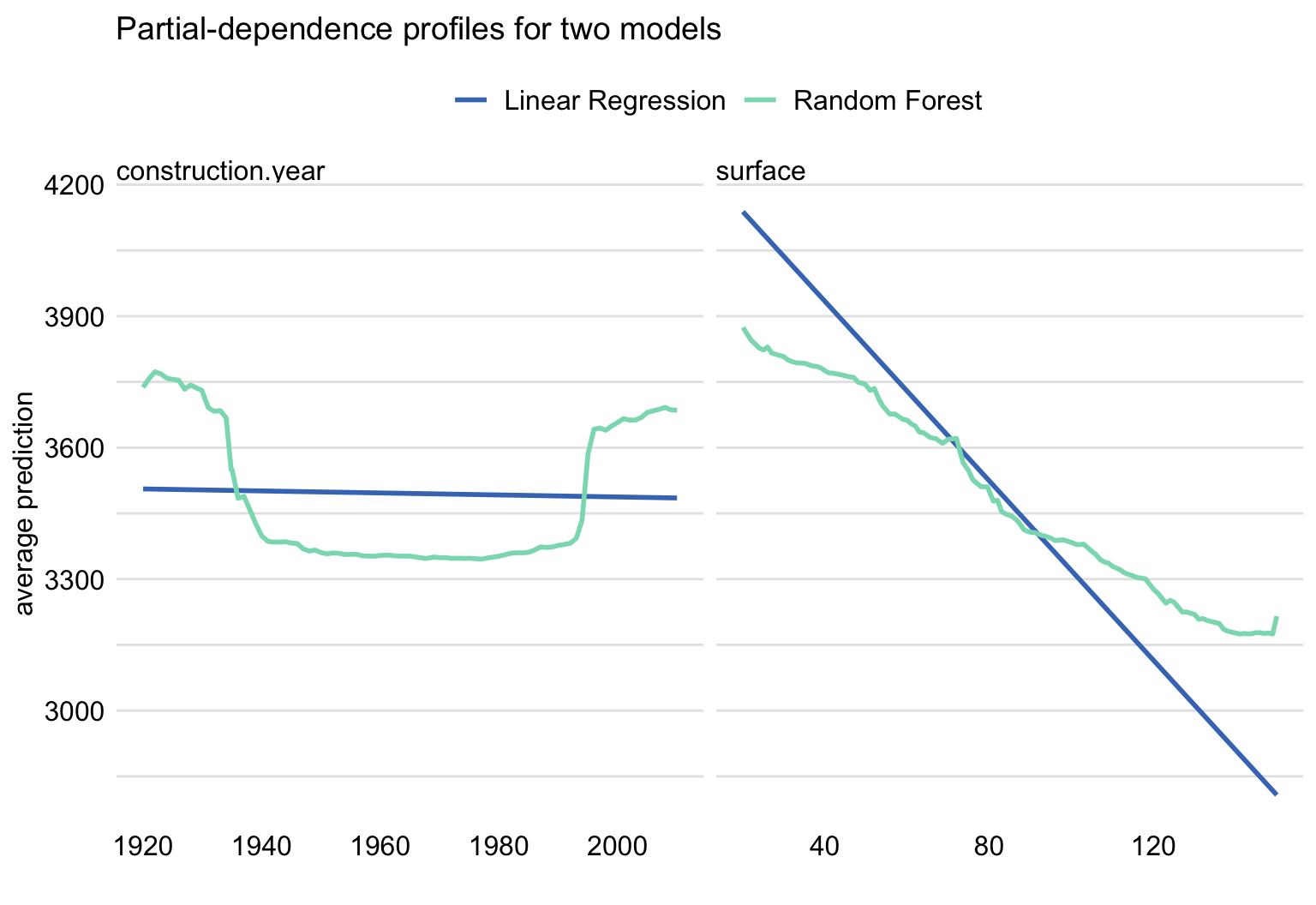
pdp_lmr <- model_profile(explainer = explainer_lmr, variables = "age") pdp_rf <- model_profile(explainer = explainer_rf, variables = "age") plot(pdp_rf, pdp_lmr) + ggtitle("Partial-dependence profiles for age for two models")- Left: Indicates that the linear regression isn’t capturing u-shape relationship
- Right: Indicates that the RF may be underestimating the effect
- Evaluation of model performance at boundaries. Models are known to have different behaviour at the boundaries of the possible range of a dependent variable, i.e., for the largest or the lowest values. For instance, random forest models are known to shrink predictions towards the average, whereas support-vector machines are known for a larger variance at edges. Comparison of PD profiles may help to understand the differences in models’ behaviour at boundaries.
Checks
- Highly Correlated Variables
- PD profiles inherit the limitations of the CP profiles. In particular, as CP profiles are problematic for correlated explanatory variables may offer a crude and potentially misleading summarization
- If highly correlated, use Accumulated Local Profies
- Check CP profile for consistent behavior
PD profiles are estimated by the mean of the CP profiles for all instances (observations) from a dataset (i.e. CP profiles are instance-level PD profiles).
The mean (i.e. PD) may not be representative of the relationship of the variable and the response
If the CP prole lines are parallel, then the PD profile is representative
Solutions (If not parallel):
- Cluster CP profiles - Cluster the CP profiles (e.g. k-means) and the entroids will be the PD lines
Example
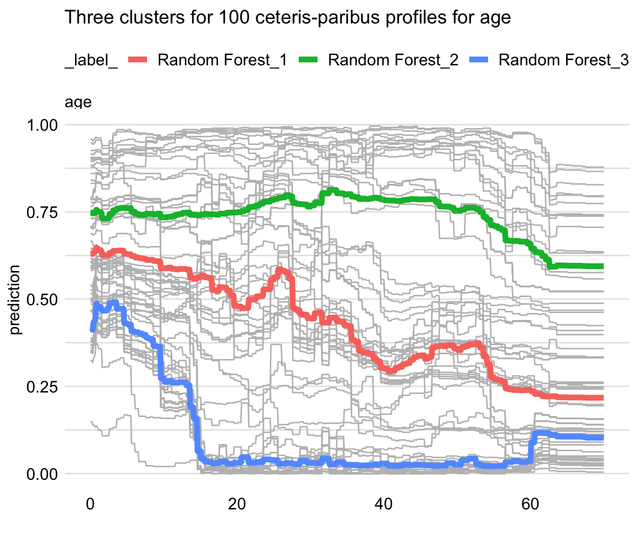
pdp_rf_clust <-
  model_profile(explainer = explainer_rf,
                variables = "age",
                k = 3)
plot(pdp_rf_clust,
     geom = "profiles") +
    ggtitle("Clustered partial-dependence profiles for age")
- Grouped-by CP profiles - Group CP profiles by a moderator variable
Distinctive PD lines can indicate an interaction
Example
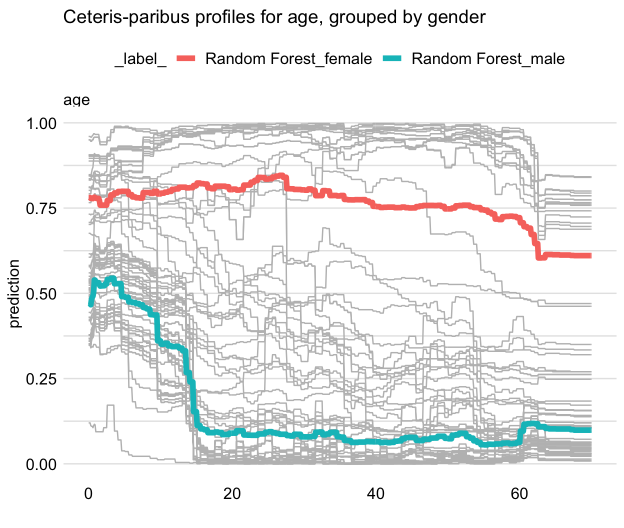
pdp_rf_gender <- model_profile(explainer = explainer_rf, variables = "age", groups = "gender") plot(pdp_rf_gender, geom = "profiles") + ggtitle("Partial-dependence profiles for age, grouped by gender")- Gender looks like a good candidate for an interaction
- Cluster CP profiles - Cluster the CP profiles (e.g. k-means) and the entroids will be the PD lines
Example: RF survival model
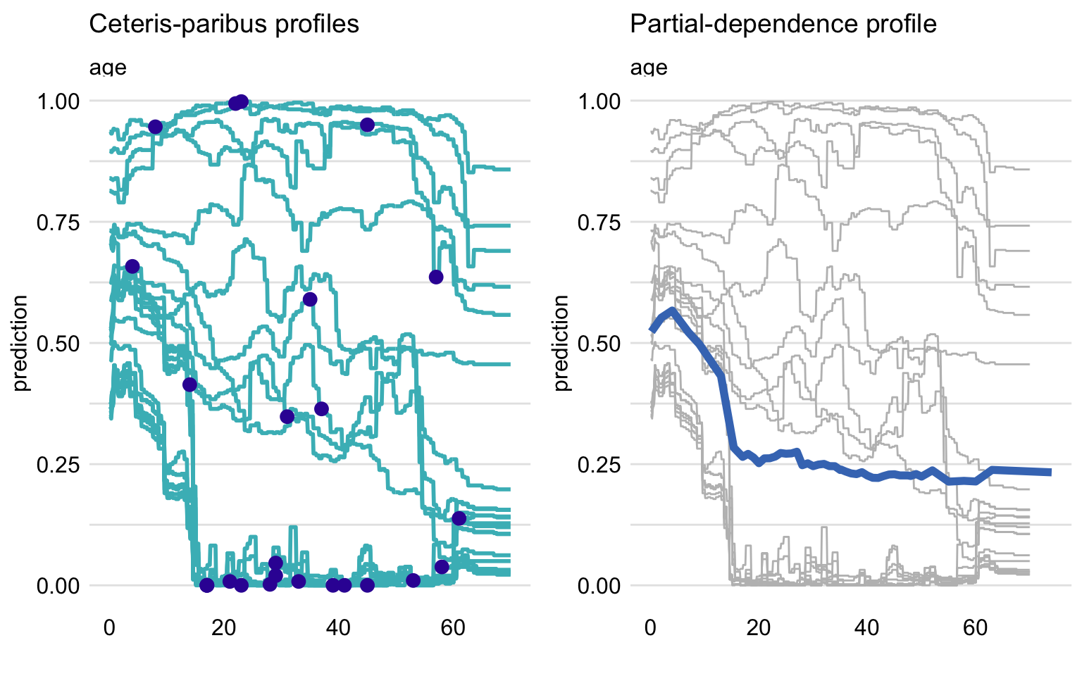
- The shape of the PD profile does not capture, for instance, the shape of the group of five CP profiles shown at the top of the panel.
- It does seem to reflect the fact that the majority of CP profiles (predicted probabilities below 0.75) suggest a substantial drop in the predicted probability of survival for the ages between 2 and 18.
- Highly Correlated Variables
Steps
- Determine grid space of j evenly spaced values across distribution of selected predictor, x
- For value i in {1,…,j} of grid space
- set x == i for all n observations (x is a constant variable)
- apply given ML model
- estimate n predicted values
- calculate the average predicted value
- graph y_hat vs x
Code
pdp_rf <- model_profile(explainer = explainer_rf, variables = "age") library("ggplot2") plot(pdp_rf) + ggtitle("Partial-dependence profile for age")- Other Args
N - The number of (randomly sampled) observations that are to be used for the calculation of the PD profiles (N = 100 by default); N = NULL implies the use of the entire dataset included in the explainer-object.
variable_type - A character string indicating whether calculations should be performed only for “numerical” (continuous) explanatory variables (default) or only for “categorical” variables.
groups - The name of the explanatory variable that will be used to group profiles, with groups = NULL by default (in which case no grouping of profiles is applied).
k - The number of clusters to be created with the help of the
hclust()function, with k = NULL used by default and implying no clustering.geom = “profiles” in the
plotfunction, we add the CP profiles to the plot of the PD profile.
- Other Args
Funnel Plot
From {DALEXtra}, lets us find subsets of data where one of models is significantly better than other ones.
Very useful in situations where we have models that have similiar overall performance, but where predictive performance of units with certain characteristics are more important to our business than others.
Can be used to create a sort of ensemble model where predictions from different models are used depending on the values of the predictors.
Example
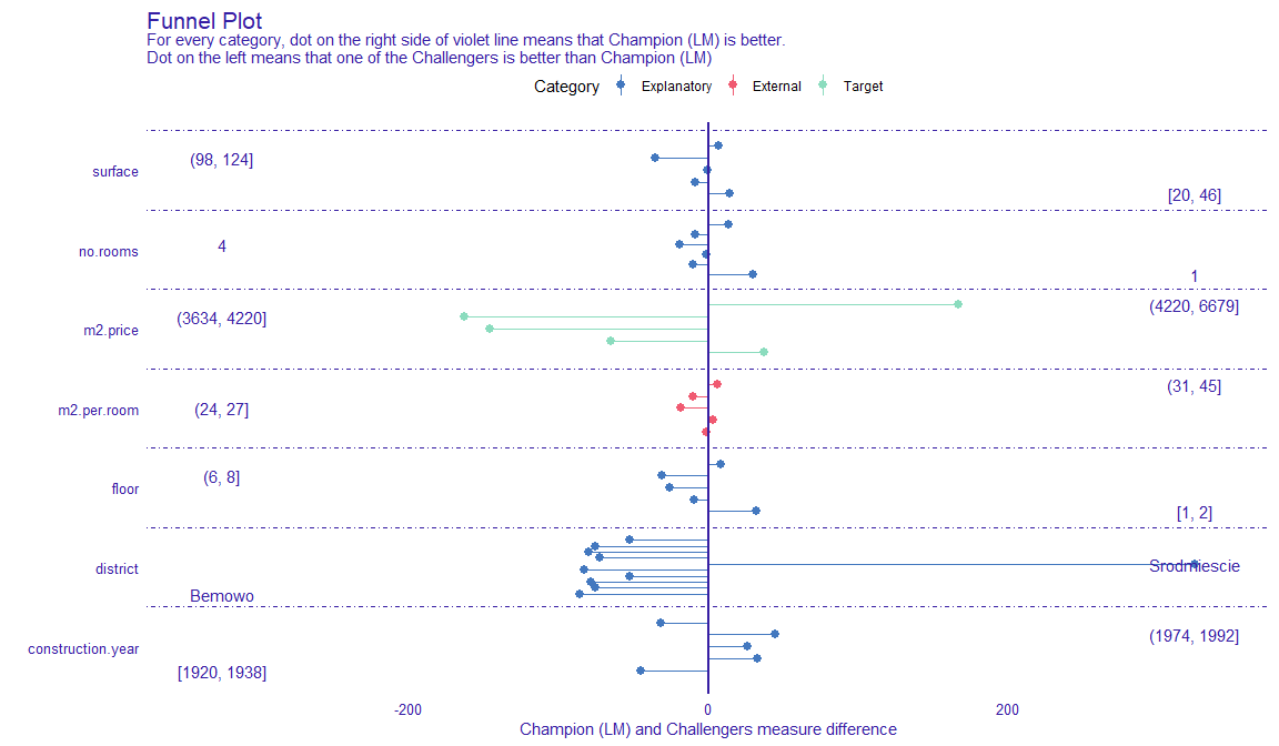
explainer_lm <- explain_mlr(model_lm, apartmentsTest, apartmentsTest$m2.price, label = "LM", verbose = FALSE, precalculate = FALSE) explainer_rf <- explain_mlr(model_rf, apartmentsTest, apartmentsTest$m2.price, label = "RF", verbose = FALSE, precalculate = FALSE) plot_data <- funnel_measure(explainer_lm, explainer_rf, partition_data = cbind(apartmentsTest, "m2.per.room" = apartmentsTest$surface/apartmentsTest$no.rooms), nbins = 5, measure_function = DALEX::loss_root_mean_square, show_info = FALSE)- nbins is the number of bins to partition continuous variables into.
- measure_function is the metric used to judge each model. Here RMSE is used.
- Length of segment is the difference in prediction performance. The longer the segments are, the better that model is at predicting for those subsets of data.
- For the most expensive and the cheapest (i.e. first and last bin of m2.price), the linear regression model performs best, while the random forest model performs best average priced (i.e. middle 3 bins of m2.price) apartments.
- The linear regression is extremely better at predicting prices for apartments in the Srodmiescie district.
triplot
Misc
Global Triplot
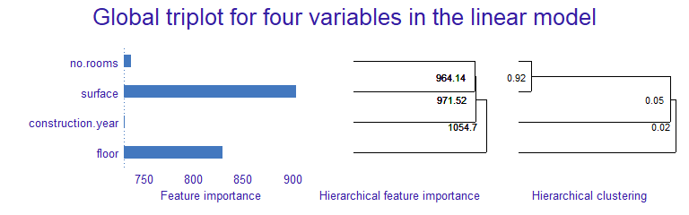
mod_explainer <- DALEX::explain(model_obj, data = dat_without_target, y = target_var, verbose = FALSE) triplot_global <- triplot::model_triplot(mod_explainer, B = num_permutations, N = num_rows_sampled, corr_method) plot(triplot_global)- Currently only correlation methods for numeric features supported
- Using small numbers of rows for permutations (N arg) will cause unstable results
- Left Panel
- The global importance of every single feature
- Permutation feature importance used
- Center Panel
- The importance of groups of variables determined by the hierarchical clustering
- Importance calc’d by permutation feature importance
- Numbers to left of the split point is the group importance
- Right Panel
- Correlation structure visualized by hierarchical clustering
- Guess this is the same as the middle panel but a correlation method is used instead of feature importance
- Interpretation: Use the middle panel to see if adding correlated features increases group importance.
- Adding too many for little gain in importance may not be worth it, depending on sample size.
- Might be useful for deciding whether or not to create a combined feature
- Unclear on the technical details on how or what exactly is being clustered.
predict_triplot (local)
Like breakdown or shapley in that it’s goal is to assess the feature contribution to the prediction
- variables can have negative or positive contributions to the prediction value
Combines the approach to explanations used by LIME methods and visual techniques introduced in a global triplot
# slice a row of original dataset that you want an explanation of the model prediction
target_row <- df %<% slice(1)
triplot_local <- triplot::predict_triplot(mod_explainer, target_row, N = num_rows_sampled, corr_method)
plot(triplot_local)
same interpretation as model_triplot but for explaining the prediction of a target observation
left panel
- the contribution to the prediction of every single feature
middle panel
- the contribution of aspects, that are built in the order determined by the hierarchical clustering
right panel
- correlation structure of features visualized by hierarchical clustering
predict_aspects (local)
aspects are groups of variables that can be thought of as latent variables
- can use the middle or right panel from predict_triplot to get ideas on how to group your variables
- there’s also a group_variables helper function that can group vars by a correlation cutoff value
# Example # group variables fifa_aspects <- list( "age" = "age", "body" = c("height_cm", "weight_kg"), "attacking" = c("attacking_crossing", "attacking_finishing", "attacking_heading_accuracy", "attacking_short_passing", "attacking_volleys")) # Compare aspect importances from different models pa_rf <- predict_aspects(rf_explainer, new_observation = target_row, variable_groups = fifa_aspects) pa_gbm <- predict_aspects(gbm_explainer, new_observation = top_player, variable_groups = fifa_aspects) plot(pa_rf, pa_gbm)- output is two, side-by-side aspect importance plots
- but they’re more like contribution plots, where aspects can have positive or negative contributions to the predicted value
- Can be used to compare models
- examples
- if one model underpredicts a target observation more than another model, how do the feature contributions to that prediction differ between the two models?
- are there different aspects more important in one model than the other?
- if they’re the same aspects at the top, does one aspect stand out in one model while in the other model the importance values are more evenly spread?
- examples
auditor
- For GOF measure, model similarity comparison using residuals. Also, uses residual plots and scores to check for asymmetry (around zero) in the distribution, trends, and heteroskedacity.
- Auditor objects only require a predict function and response var in order to be created.
- Usually scores use score(auditor_obj, type = “?”, …), plots use plot(auditor_obj, type = “?”, … )
- Plot function can facet multiple plots, e.g. plot(mod1, mod2, mod3, type = c(“ModelRanking”, “Prediction”), variable = “Observed response”, smooth = TRUE, split = “model”). smooth = TRUE adds a trend line. Split arg splits prediction vs observed plot into plots for each model.
- Regression Error Characteristic (REC) plot- GOF measure - type = “REC” - The y-axis is the percentage of residuals less than a certain tolerance (i.e. size of the residual) with that tolerance on the x-axis. The shape of the curve illustrates the behavior of errors. The quality of the model can be evaluated and compared for different tolerance levels. The stable growth of the accuracy does not indicate any problems with the model. A small increase of accuracy near 0 and the areas where the growth is fast signalize bias of the model predictions (jagged curve).
- Area Over the REC Curve (AOC) score - GOF measure - type = “REC” - is a biased estimate of the expected error for a regression model. Provides a measure of the overall performance of regression model. Smaller is better I’d think.
- Regression Receiver Operating Characteristic (RROC) plot - type = “RROC” - for regression to show model asymmetry. The RROC is a plot where on the x-axis we depict total over-estimation and on the y-axis total under-estimation.
- Area Over the RROC Curve score - GOF measure - type = “RROC” - equivalent to the error variance. Smaller is better I’d think
- Model Ranking plot and table - Multi-GOF measure - type = “ModelRanking” - radar plot of potentially five scores: MAE, MSE, RMSE, and the AOC scores for REC and RROC. They’ve been scaled in relation to the model with the best score for that particular metric. Best model for a particular metric will be farthest away from the center of the plot. In the table, larger scaled score is better while lower is better in the plain score column. You can also add a custom score function but you need to make sure that a lower value = best model.
- Residuals Boxplot - asymmetry measure - type = “ResidualBoxplot” - Pretty much the same as a regular boxplot except there’s a red dot which stands for the value of Root Mean Square Error (RMSE). Values are the absolute value of the residuals. Best models will have medians around zero and small spreads (i.e. short whiskers). Example in the documentation has a good example showing how a long whisker pulls the RMSE which is sensitive to outliers towards the edge of the box.
- Residual Density Plot - asymmetry measure - type = “ResidualDensity” - detects the incorrect behavior of residuals. For linear regressions, residuals should be normally distributed around zero. For other models, non-zero centered residuals can indicate bias. Plot has a rug which makes it possible to ascertain whether there are individual observations or groups of observations with residuals significantly larger than others. Can specify a cat predictor variable and see the shape of the density of residuals w.r.t. the levels of that variable.
- Two-sided ECDF Plot - type = “TwoSidedECDF” - stands for Empirical Cumulative Distribution Functions. There’s an cumulative distribution curve for each positive and negative residuals. The plot shows the distribution of residuals divided into groups with positive and negative values. It helps to identify the asymmetry of the residuals. Points represent individual error values, what makes it possible to identify ‘outliers’
- Residuals vs Fitted and autocorrelation plots - type = “Residual”, type = “Autocorrelation” - same thing as base R plot. Any sort of grouping, trend, or pattern suggests an issue. Looking for randomness around zero. Can specify a cat predictor variable and see the trend of residuals w.r.t. the levels of that variable.
- Autocorrelation Function Plot (ACF) - autocorrelation check - type = “ACF” - same evaluation as a ACF plot for time series
- Scale-Location Plot - type = “ScaleLocation” - The y-axis is the sqrt(abs(std_resids)) and x-axis is fitted values. Different from Resid vs Fitted since that plot uses raw residuals instead of scaled. Equation shows the resids are divided by their std.dev, so that should fix the variance at 1. The presence of any trend suggests that the variance depends on fitted values, which is against the assumption of homoscedasticity. Not every model has an explicit assumption of homogeneous variance, however, the heteroscedasticity may indicates potential problems with the goodness-of-fit. Residuals formed into separate groups suggest a problem with model structure (specification?)
- Peak Test - - type = “Peak” - tests for heteroskedacity. Score’s range is (0, 1]. Close to 1 means heteroskedacity present.
- Half-Normal Plot - GOF measure - type = “HalfNormal” - graphical method for comparing two probability distributions by plotting their quantiles against each other. Method takes info from the model and simulates response values. Your model is then fitted with the simulated response variable and residuals created. A dotted line 95% CI envelope is created from these simulated residuals. If your residuals come from the normal distribution, they are close to a straight dotted line. However, even if there is no certain assumption of a specific distribution, points still show a certain trend. Simulated envelopes help to verify the correctness of this trend. For a good-fitted model, diagnostic values should lay within the envelope.
- Half-Normal Score - GOF measure - scoreHalfNormal(auditor_obj)
- Count the number of simulated residuals for observation_i that are greater or equal than resid_i. If the number is around 0.5 the number of simulated residuals, m, then the model residual doesn’t differ that much from the simulated residuals which is a good thing.
- That calc is repeated for each residual.
- Score = sum(abs(count_i - (m/2)))
- Score’s range = [0, (nm)/2], where n is the number of observations
- Lower value indicates better model fit.
- Model PCA Plot - Similarity of models comparison - type = “ModelPCA” - vector arrows represent the models and the gray dots are the model residuals. The smaller the angle between the models, the closer their residual structure. Arrows perpendicular the residual dots mean that model’s residuals likely represent that structure. Parallel means not likely to represent that structure.
- Model Correlation Plot - Similarity of models comparison - type = “ModelCorrelation” - Densities in the diagonal are each models fitted response values. Correlations in upper right triangle are between models and between each model and the observed response.
- Predicted Response Plot (aka predicted vs observed) - GOF measure - type = “Prediction” - Should randomly envelop the diagonal line. Trends can indicate values of the response where the model over/under predicts. Groupings of residuals suggest problems in model specification.
- Receiver Operating Characteristic (ROC) curve - classification GOF measure - type = “ROC” - True Positive Rate (TPR) (y-axis) vs False Positive Rate (FPR) (x-axis) on a threshold t (probability required to classify something as an event happening) where t has the range, [0,1]. Each point on the ROC curve represents values of TPR and FPR at different thresholds. The closer the curve is to the the left border and top border of plot, the more accurate the classifier is.
- AUC score - GOF measure - type = “ROC” - guideline is > 0.80 is good.
- LIFT charts - classification GOF measure - type = “LIFT” - Rate of Positive Prediction (RPP) plotted (y-axis) vs number of True Positives (TP) (x-axis) on a threshold t.
 where P is the total positive classifications (TP + FP) predicted for that threshold and N is the total negative (TN + FN). The ideal model is represented with a orange/yellow curve. The model closer to the ideal curve is considered the better classifier.
 - Cook’s Distances Plot - influential observations - type = “CooksDistance” - a tool for identifying observations that may negatively affect the model. They can be also used for indicating regions of the design space where it would be good to obtain more observations. Data points indicated by Cook’s distances are worth checking for validity. Cook’s Distances are calculated by removing the i-th observation from the data and recalculating the model. It shows an influence of i-th observation on the model. The 3 observations (default value) with the highest values of the Cook’s distance are marked with the row number of the observation. The guideline seems to be a Cook’s Distance (y-axis) > 0.5 warrants further investigation.
SHAP
- Description
- Decomposes predictions into additive contributions of the features
- Builds model explanations by asking the same question for every prediction and feature: “How does prediction i change when feature j is removed from the model?”
- Quantifies the magnitude and direction (positive or negative) of a feature’s effect on a prediction.
- Theoretical foundation in game theory
- Issues
- Cannot be used for causal inference
- Highly correlated features
- May be indictators for a latent feature.
- These correlated features will have lower shap values than they would if only 1 were in the feature space.
- Since shap values are additive, we can add the shap values of highly correlated variables to get an estimate of the importance of this potential latent feature. (seems like the sum might be an overestimation unless the variables are Very highly correlated.)
- **See triplot section for handling models with highly correlated features
- Packages
- {shapper} - a wrapper for the Python library
- {fastshap} - uses Monte-Carlo sampling
- {treeshap}
- Fast
- Handles correlated features by explicitly modeling the conditional expected prediction
- Disadvantage of this method is that features that have no influence on the prediction can get a TreeSHAP value different from zero
- Able to compute interaction values
- Computing “residuals” might indicate how well shapley is capturing the contributions if the features are independent (py article)
- {kernelshap}
- Permute feature values and make predictions on those permutations. Once we have enough permutations, the Shapley values are estimated using linear regression
- Slow
- Doesn’t handle feature correlation. Leads to putting too much weight on unlikely data points.
- {qshap} - Computes feature-specific R-squared (R2) contributions for boosting tree models using a Shapley-value-based decomposition of the total R-squared in polynomial time.
- Supports models fitted with ‘XGBoost’ and ‘LightGBM’
- Provides efficient parallel implementations suitable for large-scale problems.
- Multiple visualization tools (ggplots) are included for interpreting and communicating feature contributions
- {shapr}, {{shaprpy}} - Implements an enhanced version of the Kernel SHAP method, for approximating Shapley values, with a strong focus on conditional Shapley values.
- Accounts for any feature dependence, and thereby produces more accurate estimates of the true Shapley values
- Offers a variety of methods for estimating contribution functions, enabling accurate computation of conditional Shapley values across different feature types, dependencies, and distributions
- Articles
- Explaining Machine Learning Models: A Non-Technical Guide to Interpreting SHAP Analyses
- Ultimate explainer
- Interpretable Machine Learning (ebook)
- math, compares packages
- Explaining Machine Learning Models: A Non-Technical Guide to Interpreting SHAP Analyses
- Steps for the approximate Shapley estimation method (used in IML package below):
- Choose single observation of interest
- For variables j in {1,…,p}
- m = random sample from data set
- t = rbind(m, ob)
- f(all) = compute predictions for t
- f(!j) = compute predictions for t with feature j values randomized
- diff = sum(f(all) - f(!j))
- phi = mean(diff)
- sort phi in decreasing order
- Interactions
- SHAP values for two-feature interactions
- Resource
- Example: Years on hormonal contraceptives (continuous) interacts with STDs (binary)
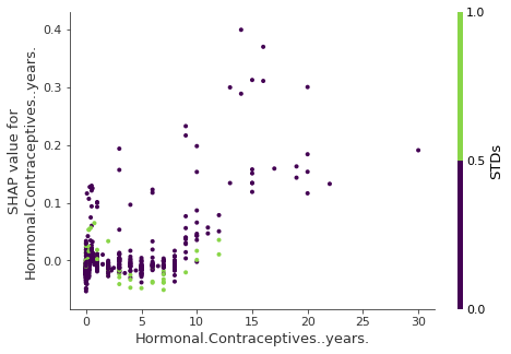
- Interpretation
- In cases close to 0 years, the occurence of a STD increases the predicted cancer risk.
- For more years on contraceptives, the occurence of a STD reduces the predicted risk.
- NOT a causal model. Effects might be due to confounding (e.g. STDs and lower cancer risk could be correlated with more doctor visits).
- Cluster by shap value
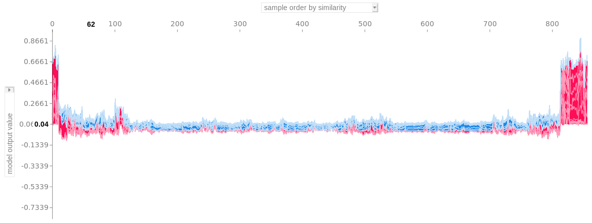
- See ebook chapter for more details
- Plot is all the force plots ordered by similarity score
- I think the “similarity score” might come from the cluster model (i.e. a distance measure from from a hierarchical cluster)
- Interpretation: group of force plots on the far right shows that the features similarily contributed to that group of predictions
- Waterfall plots
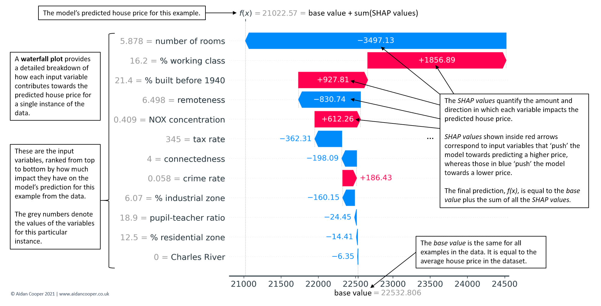
- An example waterfall plot for the individual case in the Boston Housing Price dataset that corresponds to the median predicted house
- Interpretation example
- force plot - Examines influences behind one predicted value that you input to the function.
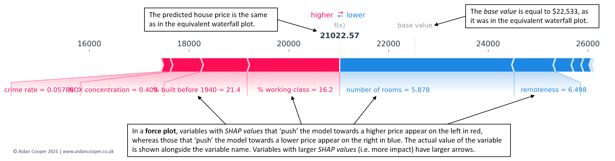
- Red arrows represent feature effects (SHAP values) that drives the prediction value higher while blue arrows are those effects that drive the prediction value lower.
- Each arrow’s size represents the magnitude of the corresponding feature’s effect.
- The “base value” (see the grey print towards the upper-left of the image) marks the model’s average prediction over the training set. The “output value” is the model’s prediction.
- The feature values for the largest effects are printed at the bottom of the plot.
- decision plot - Examines influences behind one predicted value that you input to the function. Pretty much the same exact thing as the breakdown plot in DALEX.
- The straight vertical line marks the model’s base value. The colored line is the prediction.
- Starting at the bottom of the plot, the prediction line shows how the SHAP values (i.e., the feature effects) accumulate from the base value to arrive at the model’s predicted output at the top of the plot.
- The feature name on the y-axis is bordered by 2 horzontal grid lines. In the graph, the way the prediction line behaves in between these horizontal grid lines of the feature visualizes the SHAP value, e.g. a negative slope would be equal to the blue arrow in the force plot.
- The feature values for the largest effects are in parentheses.
- For multi-variate classification
- Using lines instead of bars (like in breakdown plots) allows it to visualize the influences behind a multi-class outcome prediction where each line is for a category level probability. But the x-axis actually represents the raw (SHAP?) score, not a probability. (I think there’s an option for x-axis as probabilities)
- The magnitude of score shows strength of confidence in the prediction. A negative score says the model thinks that category level is not the case. For example, if the category level is “no disease”, then a large negative score means the model says there’s strong evidence that disease is present (score was -2.12 so I guess that’s strong).
- Can vary one predictor between a range or set of specific values and keep the rest of predictors constant. For classification, you could ask which predictors dominate influence for high probability predictions? Then use the plot to compare predictor behavior.
- Can compare how influences are different for an observation by multiple models.
IML
Interpretable Machine Learning: A Guide for Making Black Box Models Explainable (ebook)
Uses ggplot, so layers and customizations can be added. Package also has pdp, feature importance, lime, and shapley. Note from https://www.brodrigues.co/blog/2020-03-10-exp_tidymodels/, Bruno wrapped his predict function when he created a IML Predictor object. Also see article if working with workflow and cat vars, he an issue and workaround.
predict_wrapper2 <- function(model, newdata){
  predict(object = model, new_data = newdata)
}

predictor2 <- Predictor$new(
                          model = best_model_fit,
                          data = pra_test_bake_features,
                          y = target,
                          predict.fun = predict_wrapper2
                        )
Acumulated Local Effect (ALE) - shows how the prediction changes locally, when the feature is varied
- aka Partial Dependence Plot
- Chart has a distribution rug which shows how relevant a region is for interpretation (little or no points mean that we should not over-interpret this region)
Individual Conditional Expectation (ICE)
- These are curves for a chosen feature that illustrate the predicted value for each observation when we force each observation to take on the unique values of that feature.
- Steps for a selected predictor, x:
- Determine grid space of j evenly spaced values across distribution of x
- For value i in {1,…,j} of grid space
- set x == i for all n observations (x is a constant variable)
- apply given ML model
- estimate n predicted values
- The only thing that’s different here from pdp is that the predicted values, y_hats, for a particular x value aren’t averaged in order to produce a smooth line across all the x values. It allows us to see the distribution of predicted values for each value of x.
- For a categorical predictor: each category has boxplot and the boxplots are connected at their medians
- For a numerical predictor: Its a multi-line graph with each line representing row in the training set.
- The pdp line is added and highlighted with arg, method = “pdp+ice”.
Interaction PDP
- Visualizes the pdp for an interaction. Shows the how the effect of a predictor on the outcome varies when conditioned on another variable.
- Example:
- outcome (binary) = probability of getting overtime
- predictor (numeric) = monthly_income
- interaction_variable (character) = gender
- pdp shows a multi-line chart with a distinct gap between male and female
- Example:
- Can be used in conjunction using the H-statistic below to find a strong interaction to examine with this plot
- Visualizes the pdp for an interaction. Shows the how the effect of a predictor on the outcome varies when conditioned on another variable.
H-statistic
- Measures how much of the variation of the predicted outcome depends on the interaction of the features.
- Two approaches:
- Sort of an overall measure of a variable’s interaction strength
- Steps:
- for variable i in {1,…,m}
- f(x) = estimate predicted values with original model
- Think this is a y ~ i model only
- pd(x) = partial dependence of variable i
- pd(!x) = partial dependence of all features excluding i
- Guessing each non-i variable gets it’s own pd(!x)
- upper = sum(f(x) - pd(x) - pd(!x))
- lower = variance(f(x))
- ρ = upper / lower
- f(x) = estimate predicted values with original model
- Sort variables by descending ρ (interaction strength)
- for variable i in {1,…,m}
- ρ = 0 means none of variation in the predictions is dependent on the interactions involving the predictor
- ρ = 1 means all of the variation in the predictions is dependent on the interactions involving the predictor
- Steps:
- Measures the 2-way interaction strength of feature
- Breaks down the overall measure into strength measures between a variable and all the other variables
- Top variables in the first approach or variables of domain interest are usually chosen to be further examined with this method. This method will show if there are strong co-dependency relationships in the model
- steps:
- i = a selected variable of interest
- for remaining variables j in {1,…,p}
- pd(ij) = interaction partial dependence of variables i and j
- pd(i) = partial dependence of variable i
- pd(j) = partial dependence of variable j
- upper = sum(pd(ij) - pd(i) - pd(j))
- lower = variance(pd(ij))
- ρ = upper / lower
- Sort interaction relationship by descending ρ (interaction strength)
- Sort of an overall measure of a variable’s interaction strength
- Computationally intensive as feature set grows
- 30 predictors for 3 different models = a few minutes
- 80 predictors for 3 different models = around an hour
Surrogate model
- Steps:
- Apply original model and get predictions
- Choose an interpretable “white box” model (linear model, decision tree)
- Train the interpretable model on the original dataset with the predictions of the black box model as the outcome variable
- Measure how well the surrogate model replicates the prediction of the black box model
- Interpret / visualize the surrogate model
- Steps:
Feature Importance
- the ratio of the model error after permutation to the original model error
- You can specify the loss function
- “rmse” “mse” “mae”
- Anything 1 or less is interpreted as not important
- Has error bars
- You can specify the loss function
- Can also used difference instead of ratio
- the ratio of the model error after permutation to the original model error
easyalluvial
pdp plots using alluvial flows to display more than 2 dimensions at a time
helps to get an intuitive understanding how predictions of a certain ranges can be generated by the model
- Constricted alluvial paths indicate specific (or maybe a small range) predictor variable values are responsible for a certain range of outcome variable values
- Spread-out alluvial paths indicate the value of the predictor probably isn’t that important in determining that range of values of the outcome variable
There are built-in functions for caret and parsnip models, but there are methods that allow you to use any model
packages
- {easyalluvial}
- {parcats} - converts easyalluvial charts into interactive htmlwidget
- tooltip also shows probability and counts
Steps
Build model
Calculate pdp prediction values -
p = alluvial_model_response_parsnip(m, df, degree = 4, method = "pdp")- arguments
- m = model
- df = data
- degree = number of top importance variables to use
- method =
- “median” is default which sets variables that are not displayed to median mode, use with regular predictions.
- “pdp” uses pdp method
- bins = number of flows for numeric predictors (not intervals, so not sure why they used “bins”)
- params_bin_numeric_pred = list, Default: list(bins = 5, center = T, transform = T, scale = T)
- “pred” = predictions so these are binned predictions of the outcome variable
- transform = apply Yeo Johnson Transformation to predictions
- These are params to another function, and I think you can adjust the binning function there.
- bin_labels: labels for the bins from low to high, Default: c(“LL”, “ML”, “M”, “MH”, “HH”)
- High, High (HH)
- Medium, High (MH)
- Medium (M)
- Medium, Low (ML)
- Low, Low (LL)
- For numerics, 5 values (bins arg) in the range of each predictor is chosen
- These aren’t IQR values or evenly spaced so not sure what the process is
- For categoricals, I guess each level is used. Not sure how a cat var with many levels is treated.
- predictions are calculated using the method in the method arg
- predictions are transformed and binned into 5 range intervals (params_bin_numeric_pred arg)
- arguments
Plot
p(just have to call the above function)- can also add importance and marginal histograms
p_grid <- p %>%
  add_marginal_histograms(data_input = df, plot = FALSE) %>%
  add_imp_plot(p = p, data_input = df)
Extreme values
Check if extreme values of the sample distribution are covered by the alluvial
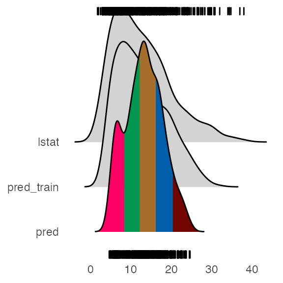
pred_train = predict(m)
plot_hist('pred', p, df,
          pred_train = pred_train, # pred_train can also be passed to add_marginal_histograms()
          scale = 50)
Distributions
- lstat is the sample distribution for the outcome variable
- pred_train is the model predictions of sample data
- pred is the predictions by the alluvial method using top importance variables
Most of the extreme values are covered by the model predictions (pred_train), but the not the alluvial method.
If you want an alluvial with preds for the extreme values, see What feature combinations are needed to obtain predictions in the lower and higher ranges in the docs.
Example - mlbench::BostonHousing; lstat(outcome var) percentage of lower status of the population; rf parsnip model
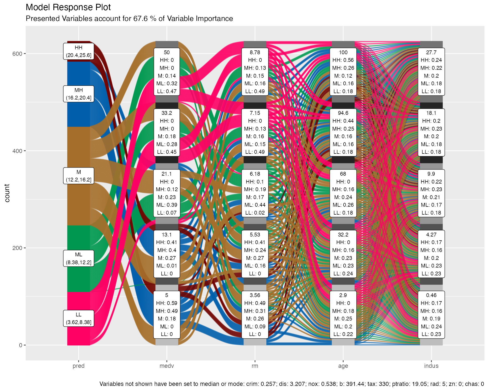
predictor variable labels:
- top number: value of the variable used in predictions
- rest: fraction of the flows of that color (predictions bin range) pass through that stratum
- e.g. 49% of the medium-high lstat predictions involve medv = 5
method = “median”, note bottom where it shows that predictions are calculated using the median/mode values of variable
Example: mtcars; disp (outcome var)
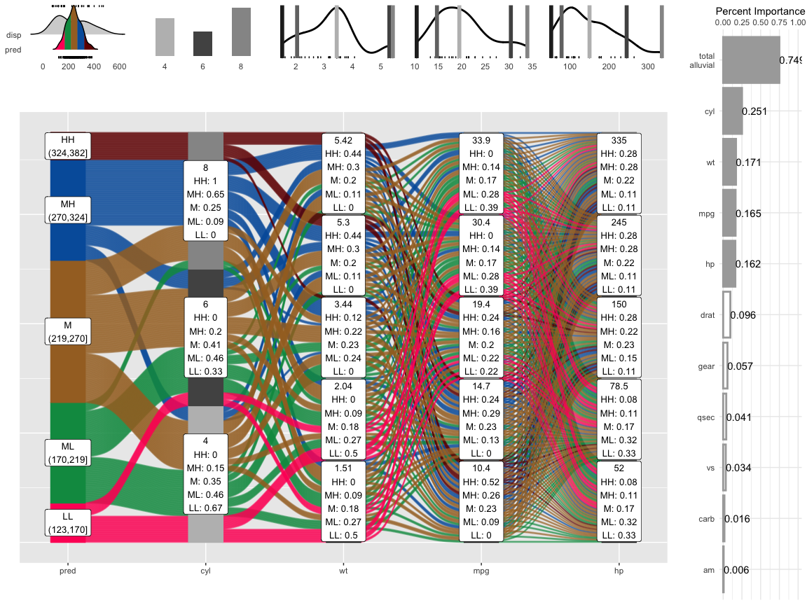
histograms/density charts
- “predictions”: density shows the shape of the predictions distribution and sample distribtution; areas for HH, MH, M, ML, LL
- predictors: shows sample density/histogram and location of the variable values used in the pdp predictions
percent importance: variable importance for the model; “total_alluvial” is the total importance of the predictor variables used in the pdp alluvial.
When comparing the distribution of the predictions against the original distribution of disp we see that the range of the predictions in response to the artificial dataspace do not cover all of the range of disp. Which most likely means that all possible combinations of the 4 plotted variables in combination with moderate values for all other predictors will not give any extreme values