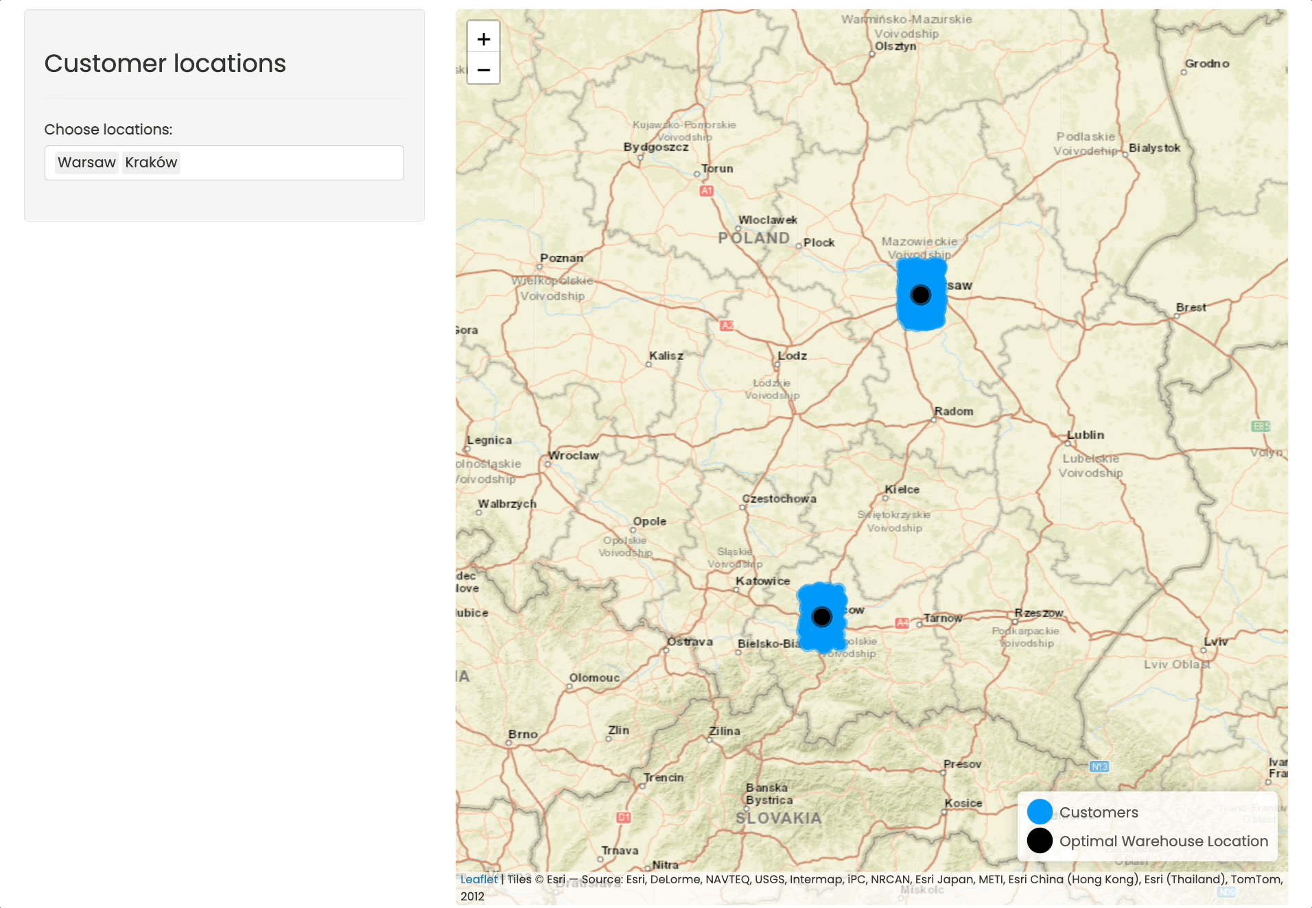
UI
Misc
- Packages
{brand_yml} - Create reports, apps, dashboards, plots and more that match your company’s brand guidelines with a single
_brand.ymlfile- For Quarto dashboards, websites, reports, etc.
- For Python shiny, seaborn, matplotlib, etc.
- For R shiny, ggplot2, plot, RMarkdown
{calcite} (Demo, Repo) - R bindings to Esri’s Calcite Design System, designed to work directly with Shiny or standalone HTML.
- Essentially a full screem map app with a slim sidebar
{dockviewR} - An interactive layout manager for Shiny apps and interactive R documents. It builds on top of dockview.
{imola} - CSS Grid and flexbox layouts for R/Shiny (e.g. allows you to put that side panel in other locations)
{linkeR} - Creates linked views in Shiny applications. When users interact with one component (like clicking a map marker), all related components (tables, charts, other maps) automatically update to show corresponding information.
Leaflet Maps ✅ Full Support Interactive maps with markers, circles, polygons DT DataTables ✅ Full Support Sortable, filterable tables Plotly Charts 🔄 Partial Requires manual event handling Custom Components 🔄 Partial Any Shiny component with click events, Requires manual event handling Base R Plots 📋 Planned Static plots with click detection Mapbox 📋 Planned Alternative mapping solution {litter} - Lit components for shiny, with a twist.
- Allows you to “observe” on any valid selector such as a .class (as opposed to shiny which can only observe on #id), this means one can have a single observe for multiple inputs.
- Create inputs that, instead of inputId, take a name argument which can be shared by multiple inputs. This makes it possible to sensibly dynamically generate inputs in R as each input does not need its corresponding observer.
- Limitations
- Only works with bslib’s Bootstrap 5.
- These inputs are not captured by Shiny’s bookmarking session
- These inputs are not captured by shinytest2
{resizableSplitLayout} - Facilitate page layouts with resizable panes for page content based on ‘split.js’ ‘JavaScript’ library (https://split.js.org/)
- Has an interactive bar down the middle of the UI that allows you slide left or right which controls the width of each pane.
{tabler} - Tabler Dashboard for Shiny: A modern dashboard framework for R Shiny using the beautiful Tabler Bootstrap theme. (tabler js site, github)
{shiny_adaptive_filter} - Filters that are aware of what the other filters were doing, and updates their own values according to the other filters.
{shinyLP} - Functions that wrap HTML Bootstrap code to enable the design and layout of informative landing home pages for Shiny applications
{shiny.fluent}, {shiny.blueprint}, {shiny.semantic}, {semantic.dashboard} - Appsilon UI theming packages
- {semantic.dashboard} is a dashboard template that uses {shiny.semantic} theming
- Resources
Design Principles
- Misc
- Notes from
- Erik Kennedy thread
- Notes from
- De-Emphasize Dividing lines
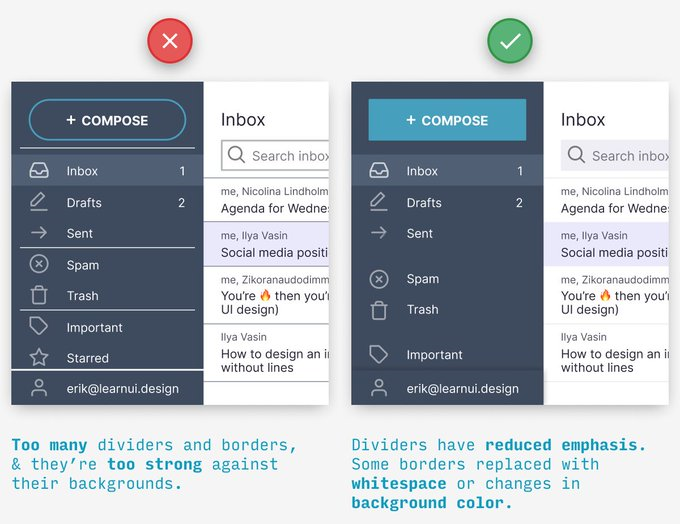
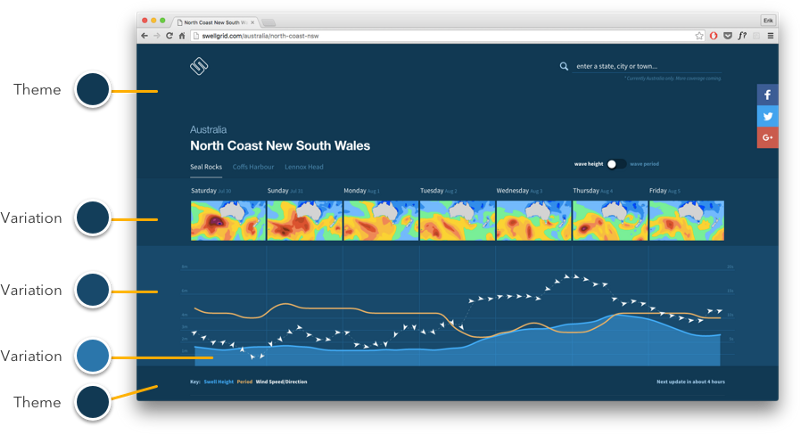
- Use variatios of the primary color (source)
- Also see Visualization, General >> Colors >> Adjustments once you’ve chosen a color (hue) to create variations upon
- Navbar, Search, Icons
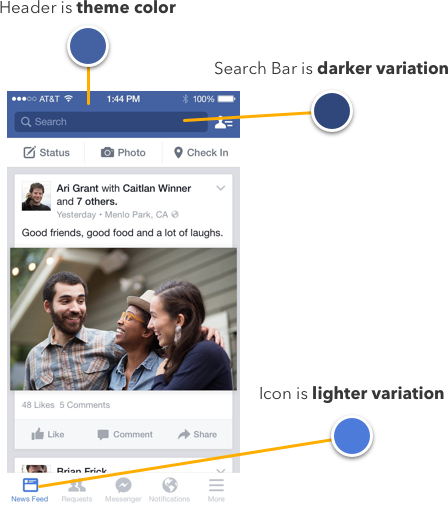
- One color as a theme (e.g. ocean)
- Tabs and Buttons: Active, Inactive, Hover
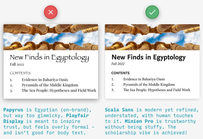
- Use fonts that subtly convey brand
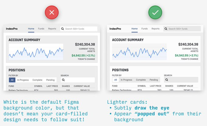
- Content cards should be lighter than their bg (in dark mode too)
- Don’t resize icons
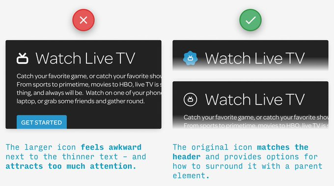
- Their level of detail and stroke weights are meant to work best at a certain size.
- Instead, try adding a border or container around them for some extra visual pop
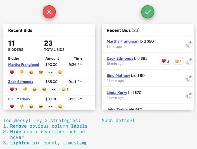
- REMOVE-HIDE-LIGHTEN for cleaner designs
- Be consistent until it’s time not to be consistent
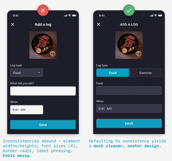
- Break consistency example: when you’re trying to catch the user’s eye
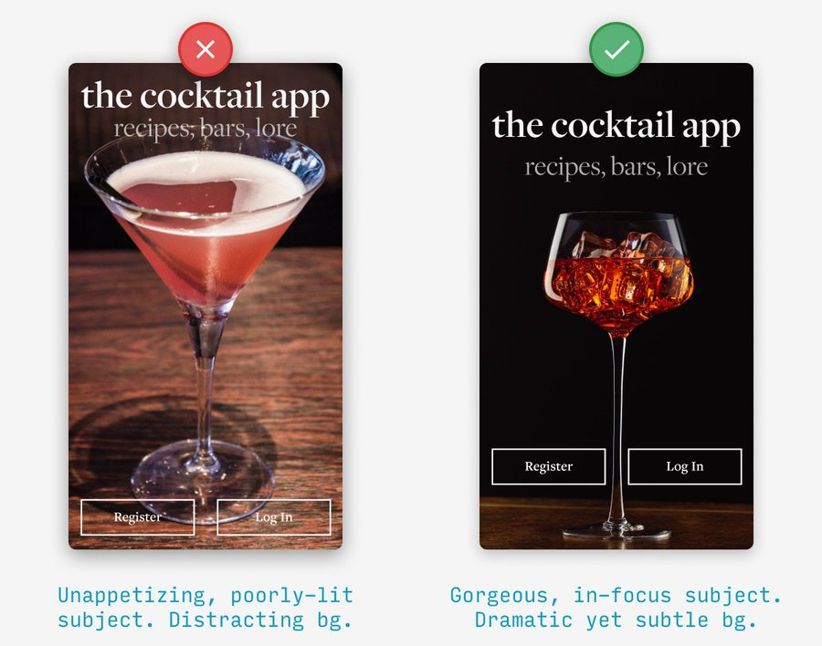
- Good imagery
- Remove Congestion
- See Designing Accessible Research with R/Shiny UI – Part 2 for an example of an iterable workflow
- Congestion is when an app shows everything, all at once and that’s stressful for the user. It doesn’t elicit the behavior we want for an engaging, learning experience.
- This stress triggers two subconscious actions – run or freeze. Both lead to cognitive load and negative perception, and ultimately, failed adoption.
- Running is expressed in bounce rate. A user will enter the app, become frustrated, and leave.
- Freezing means that a user pauses with a delayed time to understand. This can be expressed in a number of ways, but most likely a combination of longer session times with aimless user behavior.
- Minimize options, legends, etc. and move to the edges of the app (e.g. header, sides)
- Example
- Prototype
- Issues
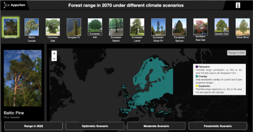
- The tree selector consumes space on the dashboard
- Selecting via images doesn’t add a lot of value as not all tree species are easily identified by image
- The UI is too dark
- The visual accessibility feature was lost as some colors don’t work on a dark background
- Issues
- Final
Dashboard
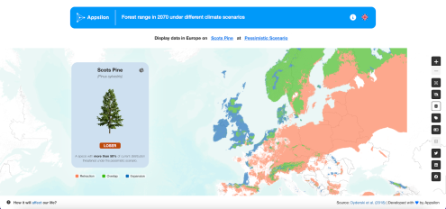
- The legend moved to the card (see mobile for more details
- Tree card gives details about species and a summary
- Clicking upper right icon flips the card to display the bar chart.
- Switching languages and information about the application moved to the header (right side of blue nav bar)
- Clicking text in header opens pop-up with options. One for type of tree and one for type of scenario (beteen blue nav bar and map)
- All other interactive elements that were scattered on the screen are now organized into the right vertical panel on the map. Here is also the color blindness option for people with visual disabilities, as the main focus of the application is on the color ratio on the map
- The legend moved to the card (see mobile for more details
Mobile
.png)
.png)
.png)
- “languages” and “about” moved to the top
- Prototype
- Example
Style
- Misc
- Images and style.css files should go into the “www” folder
- Implementing a css file
- Example: Basic
main.css file
@import url('https://fonts.googleapis.com/css2?family=Poppins&display=swap');
* {
  margin: 0;
  padding: 0;
  box-sizing: border-box;
  font-family: 'Poppins', sans-serif;
}
body {
  padding: 1rem;
}
#map {
  height: 98vh !important;
  border-radius: 0.5rem !important;
}
app.R
ui <- fluidPage(
  tags$head(tags$link(rel = "stylesheet", type = "text/css", href = "main.css")),
  sidebarLayout(
    ...
  )
)
- Example: Basic
Responsiveness
Responsiveness isn’t the same as performance. Performance is about completing an operation in the minimal amount of time, while responsiveness is about meeting human needs for feedback when executing an action
Misc
Button Click Registered
.png)
.png)
(Left) Default arrow for your app
(Middle) Hand indicates to the user that the app has registered their hovering over a button
(Right) Arrow + Pie indicates to the user that the app has registered their clicking the button
(generic) entry into CSS file
html.shiny-busy .container-fluid { cursor: wait; }- Looks like this code is to produce something like the right-side image
For touch devices (i.e. without cursor), you might want to take a look at {shinycssloaders} and/or {waiter}
If the user might have to wait longer than a few seconds for the process they’ve just set in motion to complete, you should consider a progress indicator.
.png)
.png)