ggplot2
Misc
Also see
- Styling a ggplot object produced by another package
- Regression, Logistic >> Log Binomial >> Examples >> Example 2 >> Visualizations >> Risk Ratio by Moderator
- Uses ggplot object to find the variables (in
aes) to duplicate the geoms in order to use scales to change the color and fill values
- Uses ggplot object to find the variables (in
- EDA, General >> Categorical Predictor vs Outcome >> Categorical Outcome >> Theseus Plot
- Uses
ggplot_buildto hack the ggplot2 object and change the fill values ofgeom_rects
- Uses
- Geospatial, Spatio-Temporal >> Kriging >> Examples >> Example 2 >> Model-specific >> Catboost CP Profiles
- Looks at the ggplot2 object to change a line color and facet subplot titles.
- Confirms facet variable by looking at the gtable(?) in the output from
ggplot_build
- Regression, Logistic >> Log Binomial >> Examples >> Example 2 >> Visualizations >> Risk Ratio by Moderator
- Styling a ggplot object produced by another package
Packages
- {brand_yml} - Create reports, apps, dashboards, plots and more that match your company’s brand guidelines with a single
_brand.ymlfile- For Quarto dashboards, websites, reports, etc.
- For Python shiny
- For R shiny
- Coming soon: ggplot2, plot, RMarkdown, seaborn, matplotlib, etc.
- {brandthis} - Automatic generation of a _brand.yml file using LLMs.
- {rbranding} - For project management with brand.yml
- Branding File Management: Download, update, and validate branding YAML files for consistent theming
- Project Templates: Quickly scaffold Shiny apps or Quarto websites that follow best practices for branding and accessibility
- Accessibility: Built-in support for accessible color palettes and UI components
- Integration: Easily integrates with ggplot2 bslib, thematic, and other modern R packages
- Claude Skill (intro) for generating brand.yml
- {ggannotate} - RStudio addin that makes annotating plots essentially painless
- {ggblanket} - Similar ggplot ui but with simpler structure. Stuff that would require multiple geoms are replaced with one geom and basic arguments. Compatible with popular ggplot extensions
- {ggpointgrid} - Alternative to
geom_jitterfor points and {ggrepel} for annotation (article) - {ggreveal} - Reveal a ggplot Incrementally (e.g. groups, facets)
- {ggview} - Allows you to lock the dimensions of your plot in the viewer and save it.
Example:
p <-
  ggplot(df, aes(
    x = stage,
    group = id
  )) +
  geom_point(aes(y = ve_mean)) +
  facet_wrap(~id) +
  ggview::canvas(width = 220,
                 height = 220 * 2/3,
                 units = "mm",
                 dpi = 300)
p
save_ggplot(p, "my_plot.png")
- {hrbrthemes} - hrbrmstr’s collection of themes
- Has 49 dependencies. A zero-dependency
theme_ipsom_rc(roboto condensed font) can be had in {tinythemes} - No longer maintained
- Has 49 dependencies. A zero-dependency
- {thematic} - Enables automatic styling of R plots in Shiny, R Markdown, and RStudio
- {brand_yml} - Create reports, apps, dashboards, plots and more that match your company’s brand guidelines with a single
Resources
- Docs, Aesthetic Specifications, A Complete Guide to Scales
- STHDA Tutorials
- ggplot2: Elegant Graphics for Data Analysis (Wickam, Navarro, Pederson)
- Modern Data Visualization with R
- R Graphics Cookbook
- ggplot2 extension cookbook - step-by-step, how-to extension examples (mostly Stat/geom_*)
Don’t use stat calculating geoms and set axis limits with scale_y_continuous
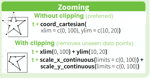
- See examples of the behavior in this thread
Defaults for any {ggplot2} geom using the default_aes field (i.e.
GeomBlah$default_aes)Functions and Loops
I’ve written a couple basic ones in the wild without tidyeval, but uses conditionals for theming: Fun1, Fun2
See Geospatial, Spatio-Temporal >> Kriging >> Starting Values >> Joint Models >> Example 1 >> EDA
- Uses tidyeval and patchwork + purrr::reduce
Example:
viz_monthly <- function(df, y_var, threshhold = NULL) { ggplot(df, aes(x = .data[["day"]], y = .data[[y_var]])) + geom_line() + geom_hline(yintercept = threshhold, color = "red", linetype = 2) + scale_x_continuous(breaks = seq(1, 29, by = 7)) + theme_minimal() }Example: (source)
m <- as.matrix(penguins[,3:6])

all_plots <- list()
for (i in 1:ncol(m)) {
  gg <- ggplot(penguins, aes(bill_len, m[, !! i])) +
    geom_point(na.rm = TRUE) +
    labs(title = sprintf("Column %i", i))
  all_plots[[i]] <- gg
}
patchwork::wrap_plots(all_plots)


all_plots <- list()
for (i in 1:ncol(m)) {
  gg <- ggplot(penguins, aes(bill_len, m[, i])) +
    geom_point(na.rm = TRUE) +
    labs(title = sprintf("Column %i", i))
  all_plots[[i]] <- patchwork::wrap_ggplot_grob(ggplotGrob(gg))
}
patchwork::wrap_plots(all_plots)
Storing geom settings in a dataframe (source)
df <- data.frame(x = seq(from = 1, to = 20, by = 1),
                 y = rnorm(20, mean = 50, sd = 4),
                 limits = "c(0,30)")

ggplot(data = df, aes(x = x, y = y)) +
  geom_line() +
  scale_y_continuous(limits= eval(parse(text=df$limits)))
Dynamic Axis Limits (source)
ggplot(...) +
  ... +
  scale_x_continuous(
    breaks = seq(2021, 2023, 1),
    limits = c(min(df$year) - .1, max(df$year) + .1),
    position = "top",
    labels = c("Baseline", "2022", "2023")
  )
Wrapping Long Axis Labels (source)
msleep |>
  filter(order == "Soricomorpha") |>
  ggplot(aes(x = sleep_total, y = name)) +
  geom_point() +
  scale_y_discrete(labels = function(x) str_wrap(x, width = 18)) +
  theme_bw()
Autofixing Axis Label Overlap (source)
ggplot(...) +
  ... +
  scale_x_continuous(
    guide = guide_axis(check.overlap = TRUE),
    expand = expansion(0, 0)
  )
Make title flush with left side of plot
theme(plot.title.position = "plot)- Useful when Y-axis labels are long\
Order bars in horizontal bar plot according to variable (source >> Example 2 >> Model-specific)
plot_data <- plot_data |>
    mutate(
      vars = factor(vars),
      vars = forcats::fct_reorder(vars, importance)
    )

plot_data |>
  ggplot(aes(x = importance, y = vars)) +
  geom_col()
Changing facet subplot titles
facet_wrap(
  ~ trans_mode,
  labeller = as_labeller(c(
    # old = new
    "bicycle" = "Bicycle",
    "foot" = "Foot",
    "car_driver" = "Car",
    "train" = "Train"
  ))
)
Legends
Removing legends
guides(color = "none", fill = "none")Legend title
labs(fill = "Fill's legend title")Control the order that multiple legends are displayed (top to bottom)
guides(
  color = guide_colorbar(order = 2),    # bottom
  size = guide_legend(order = 1)        # top
)
Reverse the order of the keys (shapes) displayed in a legend
guides(size = guide_legend(reverse = TRUE)) # e.g. largest to smallestChange the color of the keys in a legend
guides(size = guide_legend(override.aes = list(color = "#fcde9c")))Change the location of the legends
theme(legend.position = "top)
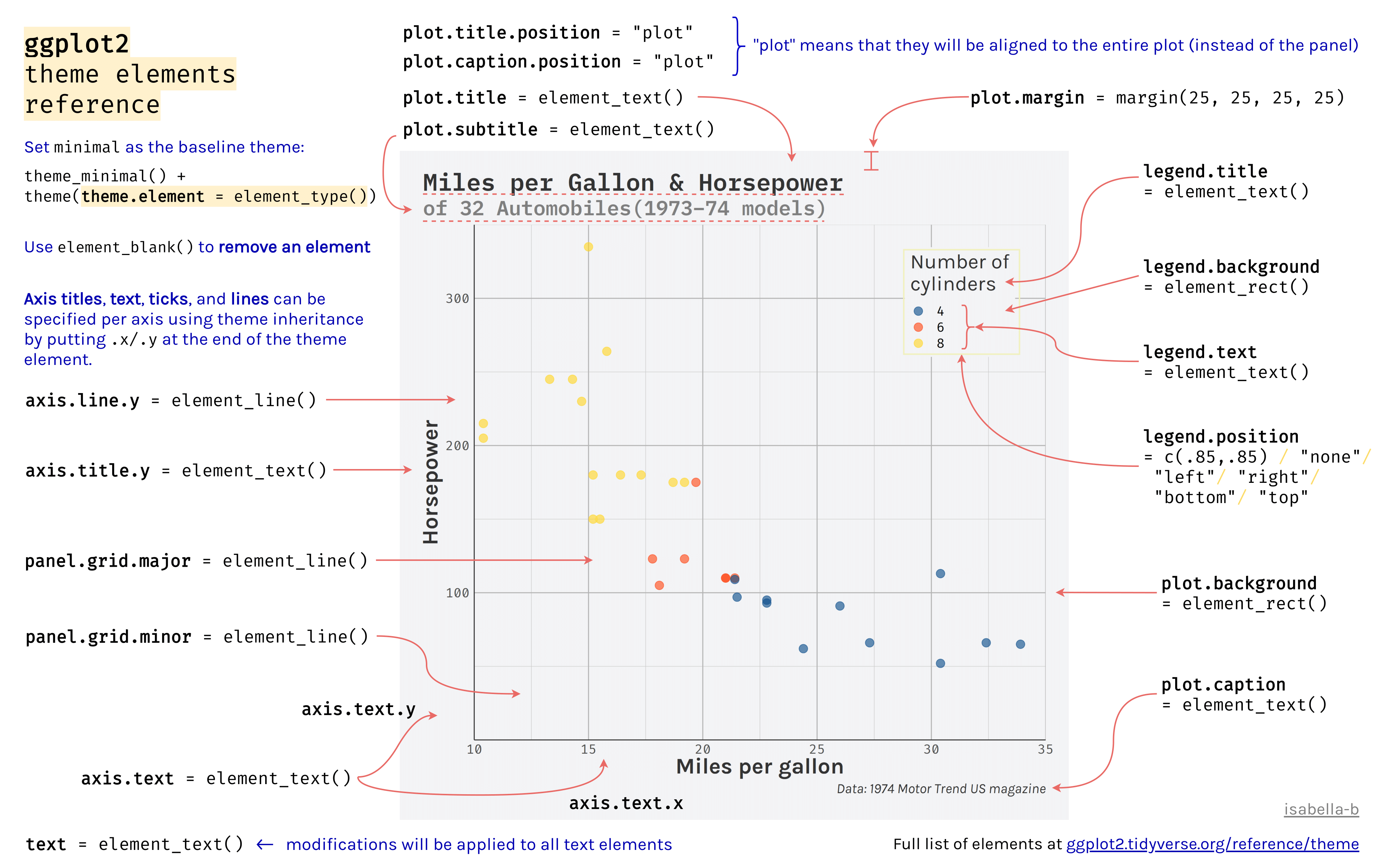
Themes
Docs
Theme Elements Cheatsheet (source)
4.0
Misc
- Point size linked to axis lable font size (Thread)
Attributes for built-in themes (source)
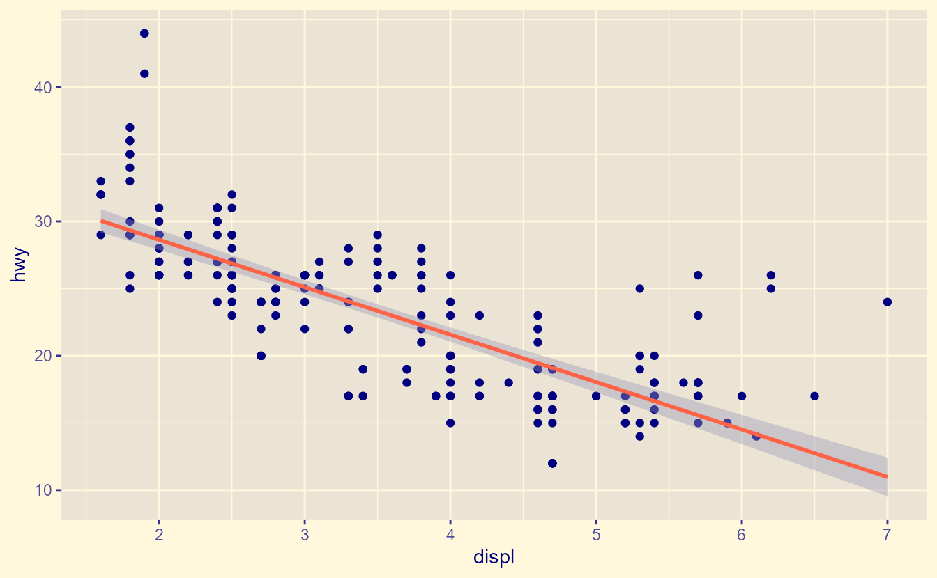
ggplot(mpg, aes(displ, hwy)) + geom_point() + geom_smooth(method = "lm", formula = y ~ x) + theme_gray(paper = "cornsilk", ink = "navy", accent = "tomato")- paper is background color, ink is the foreground color (fill, color), accent is additional ink for special cases/highlights like
geom_smooth - The panel background color is a blend between paper and ink, which is now how many elements are parametrized in complete themes
- paper is background color, ink is the foreground color (fill, color), accent is additional ink for special cases/highlights like
element_geomUsing colors and fills from the theme in geoms
ggplot(mpg, aes(class, displ)) +
  geom_boxplot(aes(colour = from_theme(accent))) +
  theme(
    geom = element_geom(accent = "tomato", paper = "cornsilk")
  )
Applying line styling
ggplot(faithful, aes(waiting)) +
  geom_histogram(bins = 30, colour = "black") +
  geom_freqpoly(bins = 30) +
  theme(geom = element_geom(
    bordertype = "dashed",
    borderwidth = 0.2,
    linewidth = 2,
    linetype = "solid"
  ))
border* would control stuff the type of line used to draw a histogram or map geometry
line* controls line type elements like a geom_line or a smooth maybe.
Setting Default Palettes
ggplot(mpg, aes(displ, hwy, shape = drv, colour = cty)) + geom_point() + theme( palette.colour.continuous = c("chartreuse", "forestgreen"), palette.shape.discrete = c("triangle", "triangle open", "triangle down open") )- All defaults scales now have palette = NULL
Use the same font family to all
geom_textandgeom_labelelementsupdate_geom_defaults("text", list(family = "Public Sans")) update_geom_defaults("label", list(family = "Public Sans"))geom_text(and probablygeom_label) is not impacted by theme settings, so setting this option keeps you from having to manually add the font family to each instance.- There’s also an
update_stat_defaults
Setting color defaults (source)
# Discrete with a list options(ggplot2.discrete.colour = list_of_colors) # Continuous with a function options( ggplot2.continuous.colour = \(...){ scico::scale_color_scico( palette = "batlow", ... ) } ) # Ordinal with a function options( ggplot2.ordinal.colour = \(...){ scale_color_viridis_d( option = "G", direction = -1, ... ) } )- If you have a particular set of palettes you like to use for projects, these options can be put into a R file and loaded via
sourcee.g.source(here::here("_defaults.R"))
- If you have a particular set of palettes you like to use for projects, these options can be put into a R file and loaded via
Basic Syntax
theme_psc <- function() {
  theme_void(base_family = "Open Sans") +
    theme()
}
Use Utility FIles
utils/base-theme.R (source)
## R/themes/base_theme.R

#' Get default theme colors
#' @param palette Optional custom color palette
#' @return List of theme colors
get_theme_colors <- function(palette = NULL) {
    list(
        background = "#f5f5f2",
        title      = "gray20",
        subtitle   = "gray30",
        text       = "gray30",
        caption    = "gray40",
        palette    = palette  # This can be overridden weekly
    )
}

#' Create base theme with consistent elements
#' @param colors List of colors from get_theme_colors()
#' @return ggplot theme object
create_base_theme <- function(colors = get_theme_colors()) {
    # Only include the truly fixed elements that don't change weekly
    theme_minimal(base_size = 14, base_family = fonts$text) +
        theme(
            plot.title.position   = "plot",
            plot.caption.position = "plot",
            legend.position       = "plot",

            # Background elements
            plot.background  = element_rect(fill = colors$background, color = colors$background),
            panel.background = element_rect(fill = colors$background, color = colors$background),

            # Common margins
            plot.margin = margin(t = 10, r = 20, b = 10, l = 20),

            # Text elements that stay consistent
            axis.text  = element_text(
                family = fonts$text,
                size   = rel(0.79),
                color  = colors$text
            ),
            axis.title = element_text(
                family = fonts$text,
                size   = rel(0.93),
                face   = "bold",
                color  = colors$text
            )

            # Note: specific theme elements should be added in the scripts
        )
}

#' Extend base theme with customizations
#' @param base_theme Existing theme to extend
#' @param new_theme_elements List of theme elements specific to this project
#' @return Modified ggplot theme
extend_base_theme <- function(base_theme, new_theme_elements) {
    base_theme + new_theme_elements
}
script.R (source)
source(here::here("utils/base_theme.R"))

# Get base colors with custom palette
colors <-
  get_theme_colors(palette = c("#f7fbff", "#9ecae1", "#2171b5", "#084594"))

base_theme <- create_base_theme(colors)

project_theme <- extend_base_theme(
    base_theme,
    theme(
        # project-specific modifications
        axis.line.x           = element_line(color = "#252525", linewidth = .2),

        panel.spacing.x       = unit(2, 'lines'),
        panel.spacing.y       = unit(1, 'lines'),
        panel.grid.major.x    = element_blank(),
        panel.grid.major.y    = element_line(color = alpha(colors[5], 0.2), linewidth = 0.2),
        panel.grid.minor      = element_blank(),
    )
)

theme_set(project_theme)
Transparent Background
p + theme( panel.background = element_rect(fill='transparent'), #transparent panel bg plot.background = element_rect(fill='transparent', color=NA), #transparent plot bg panel.grid.major = element_blank(), #remove major gridlines panel.grid.minor = element_blank(), #remove minor gridlines legend.background = element_rect(fill='transparent'), #transparent legend bg legend.box.background = element_rect(fill='transparent'), #transparent legend panel axis.title.x = element_blank(), # optional axis.title.y = element_blank() # optional ) ggsave('myplot.png', p, bg='transparent')theme_notebooktheme_notebook <- function(...) { theme_minimal() + theme( plot.title = element_text(family = "Anybody", face = "bold", size = 18), plot.subtitle = element_text(family = "Anybody", size = 14), axis.title = element_text(family = "Anybody", size = 12), axis.text = element_text(family = "Anybody", size = 10), panel.background = element_rect(fill='#FFFDF9FF'), panel.grid.minor = element_blank(), plot.background = element_rect(fill='#FFFDF9FF', color = '#FFFDF9FF'), legend.background = element_rect(color = '#FFFDF9FF', fill='#FFFDF9FF'), legend.box.background = element_rect(fill='#FFFDF9FF', color = '#FFFDF9FF'), legend.text = element_text(family = "Anybody", size = 12), legend.title = element_text(family = "Anybody", size = 12), strip.text = element_text( family = "Anybody", size = 14, face = "bold", color = "black" ), ... ) }Andrew Heiss (source)
theme_public <- function() { theme_minimal(base_family = "Public Sans") + theme( panel.grid.minor = element_blank(), plot.title = element_text(family = "Public Sans", face = "bold", size = rel(1.25)), plot.subtitle = element_text(family = "Public Sans Light", face = "plain"), plot.caption = element_text(family = "Public Sans Light", face = "plain"), axis.title = element_text(family = "Public Sans Semibold", size = rel(0.8)), axis.title.x = element_text(hjust = 0), axis.title.y = element_text(hjust = 1), strip.text = element_text( family = "Public Sans Semibold", face = "plain", size = rel(0.8), hjust = 0 ), strip.background = element_rect(fill = "grey90", color = NA), legend.title = element_text(family = "Public Sans Semibold", size = rel(0.8)), legend.text = element_text(size = rel(0.8)), legend.position = "bottom", legend.justification = "left", legend.title.position = "top", legend.margin = margin(l = 0, t = 0) ) }- Don’t think he’s particular about this font. He was just working with government survey data and that’s the font they use.
-
#' Get default theme colors
#' @param palette Optional custom color palette
#' @return List of theme colors
get_theme_colors <- function(palette = NULL) {
    list(
        background = "#FDFDFD",      #"#f5f5f2"
        title      = "gray20",
        subtitle   = "gray30",
        text       = "gray30",
        caption    = "gray40",
        palette    = palette  # This can be overridden weekly
    )
}

#' Create base theme with consistent elements
#' @param colors List of colors from get_theme_colors()
#' @return ggplot theme object
create_base_theme <- function(colors = get_theme_colors()) {
    # Only include the truly fixed elements that don't change weekly
    theme_minimal(base_size = 14, base_family = fonts$text) +
        theme(
            plot.title.position   = "plot",
            plot.caption.position = "plot",
            legend.position       = "plot",

            # Background elements
            plot.background  = element_rect(fill = colors$background, color = colors$background),
            panel.background = element_rect(fill = colors$background, color = colors$background),

            # Common margins
            plot.margin = margin(t = 10, r = 20, b = 10, l = 20),

            # Text elements that stay consistent
            axis.text  = element_text(
                family = fonts$text,
                size   = rel(0.79),
                color  = colors$text
            ),
            axis.title = element_text(
                family = fonts$text,
                size   = rel(0.93),
                face   = "bold",
                color  = colors$text
            )

            # Note: Weekly-specific theme elements should be added in the weekly scripts
        )
}

#' Extend base theme with weekly customizations
#' @param base_theme Existing theme to extend
#' @param weekly_theme_elements List of theme elements specific to this week
#' @return Modified ggplot theme
extend_weekly_theme <- function(base_theme, weekly_theme_elements) {
    base_theme + weekly_theme_elements
}
Cedric Sherer (article)
theme_set(theme_minimal(base_size = 15, base_family = "Anybody"))
theme_update(
  axis.title.x = element_text(margin = margin(12, 0, 0, 0), color = "grey30"),
  axis.title.y = element_text(margin = margin(0, 12, 0, 0), color = "grey30"),
  panel.grid.minor = element_blank(),
  panel.border = element_rect(color = "grey45", fill = NA, linewidth = 1.5),
  panel.spacing = unit(.9, "lines"),
  strip.text = element_text(size = rel(1)),
  plot.title = element_text(size = rel(1.4), face = "bold", hjust = .5),
  plot.title.position = "plot"
)
Eric Bickel
ggplot2::theme_set( theme_bw(base_size = 12) + theme( plot.title = element_text(face = 'bold', hjust = 0), text = element_text(colour = '#4e5c65'), panel.background = element_rect('#ffffff'), strip.background = element_rect('#ffffff', colour = 'white'), plot.background = element_rect('#ffffff'), panel.border = element_rect(colour = '#ffffff'), panel.grid.major.x = element_blank(), panel.grid.major.y = element_blank(), panel.grid.minor.y = element_blank(), legend.background = element_rect('#ffffff'), legend.title = element_blank(), legend.position = 'right', legend.direction = 'vertical', legend.key = element_blank(), strip.text = element_text(face = 'bold', size = 10), axis.text = element_text(face = 'bold', size = 9), axis.title = element_blank(), axis.ticks = element_blank() )theme_notebook_maptheme_notebook_map <- function(...) { theme_minimal() + theme( # Land/Panel Background panel.background = element_rect(fill = "#FFFDF9FF", color = NA), # Plot/Outer Background plot.background = element_rect(fill = "#FFFDF9FF", color = NA), # Text Styles text = element_text(color = "black"), plot.title = element_text( family = "Anybody", face = "bold", size = 18, margin = margin(b = 10) ), plot.subtitle = element_text(family = "Anybody", size = 14), # Cleaner look for dark maps axis.title = element_blank(), axis.text = element_blank(), panel.grid.major = element_blank(), panel.grid.minor = element_blank(), # Legend legend.background = element_rect(fill = "#FFFDF9FF", color = NA), legend.key = element_rect(fill = "#FFFDF9FF", color = NA), legend.text = element_text( family = "Anybody", size = 12, face = "bold" ), legend.title = element_text( family = "Anybody", size = 12, face = "bold" ), # Strip for faceted maps strip.background = element_blank(), strip.text = element_text( family = "Anybody", size = 14, face = "bold", color = "black" ), ... ) }For a map with a cooler palette that has blues (also for high-contrast colors like neon green, bright orange, or pure white)
theme_charcoal_map <- function(...) {
  theme_minimal() +
    theme(
      # Land/Panel Background
      panel.background = element_rect(fill = "#1a1a14", color = NA),
      # Plot/Outer Background
      plot.background = element_rect(fill = "#1a1a14", color = NA),
      # Text Styles
      text = element_text(color = "white"),
      plot.title = element_text(family = "Anybody",
                                face = "bold",
                                size = 18,
                                margin = margin(b = 10)),
      plot.subtitle = element_text(family = "Anybody",
                                   size = 14),
      # Cleaner look for dark maps
      axis.title = element_blank(),
      axis.text = element_blank(),
      panel.grid.major = element_blank(),
      panel.grid.minor = element_blank(),
      # Legend
      legend.background = element_rect(fill = "#1a1a14", color = NA),
      legend.key = element_rect(fill = "#1a1a14", color = NA),
      legend.text = element_text(
        family = "Anybody",
        size = 12,
        face = "bold"
      ),
      legend.title = element_text(
        family = "Anybody",
        size = 12,
        face = "bold"
      ),
      # Strip for faceted maps
      strip.background = element_blank(),
      strip.text = element_text(
        family = "Anybody",
        size = 14,
        face = "bold",
        color = "white"
      ),
      ...
    )
}
For a map with a warm color palette (e.g. gold, coral, or yellow)
theme_slate_map <- function(...) {
  theme_minimal() +
    theme(
      # Land/Panel Background
      panel.background = element_rect(fill = "#1a2327", color = NA),
      # Plot/Outer Background
      plot.background = element_rect(fill = "#1a2327", color = NA),
      # Text Styles
      text = element_text(color = "white"),
      plot.title = element_text(family = "Anybody",
                                face = "bold",
                                size = 18,
                                margin = margin(b = 10)),
      plot.subtitle = element_text(family = "Anybody",
                                   size = 14),
      # Cleaner look for dark maps
      axis.title = element_blank(),
      axis.text = element_blank(),
      panel.grid.major = element_blank(),
      panel.grid.minor = element_blank(),
      # Legend
      legend.background = element_rect(fill = "#1a2327", color = NA),
      legend.key = element_rect(fill = "#1a2327", color = NA),
      legend.text = element_text(
        family = "Anybody",
        size = 12,
        face = "bold"
      ),
      legend.title = element_text(
        family = "Anybody",
        size = 12,
        face = "bold"
      ),
      # Strip for faceted maps
      strip.background = element_blank(),
      strip.text = element_text(
        family = "Anybody",
        size = 14,
        face = "bold",
        color = "white"
      ),
      ...
    )
}
Bespoke
Barcode Plot (source)
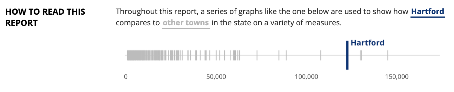
Example
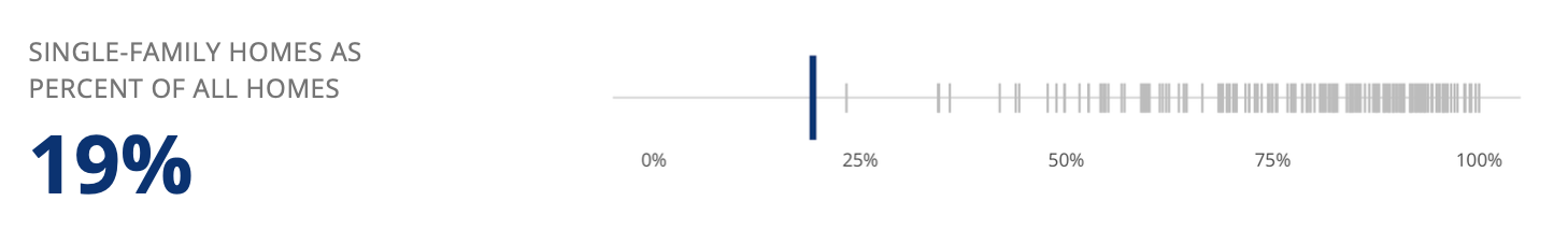
Code
library(tidyverse)
library(scales)

comparison_plot <-
  function(
    df,
    highlight_town,
    value_type,
    highlight_color
  ) {

    plot <-
      df |>
        ggplot(
          aes(
            x = value,
            y = 1
          )
        ) +
        # Light gray lines for all towns
        geom_point(
          shape = 124,
          color = "gray80"
        ) +
        # Line for town to highlight
        geom_point(
          data = df |> filter(location == highlight_town),
          shape = 124,
          color = highlight_color,
          size = 10
        )

    if (value_type == "percent") {
        final_plot <- plot +
          scale_x_continuous(
            labels = percent_format(accuracy = 1)
          )
    }

    if (value_type == "number") {
      final_plot <- plot +
        scale_x_continuous(
          labels = comma_format(accuracy = 1)
        )
    }
  }

comparison_plot(
  df = single_family_homes,
  highlight_town = "Hartford",
  value_type = "percent",
  highlight_color = psc_blue
) +
  theme_whatever()


big_number_plot <-
  function(value,
           text,
           value_color
  ) {
    ggplot() +
      # Add value
      geom_text(
        aes(
          x = 1,
          y = 1,
          label = value
        ),
        color = value_color,
        fontface = "bold",
        size = 20,
        hjust = 0
      ) +
      # Add text
      geom_text(
        aes(
          x = 1,
          y = 2,
          label = str_to_upper(text)
        ),
        color = "gray70",
        size = 7,
        hjust = 0
      )
}

big_number_plot(
  value = "19%",
  text = "Single-Family Homes as\nPercent of All Homes",
  value_color = psc_blue
) +
  theme_whatever() # should start with theme_void
Comet (source)
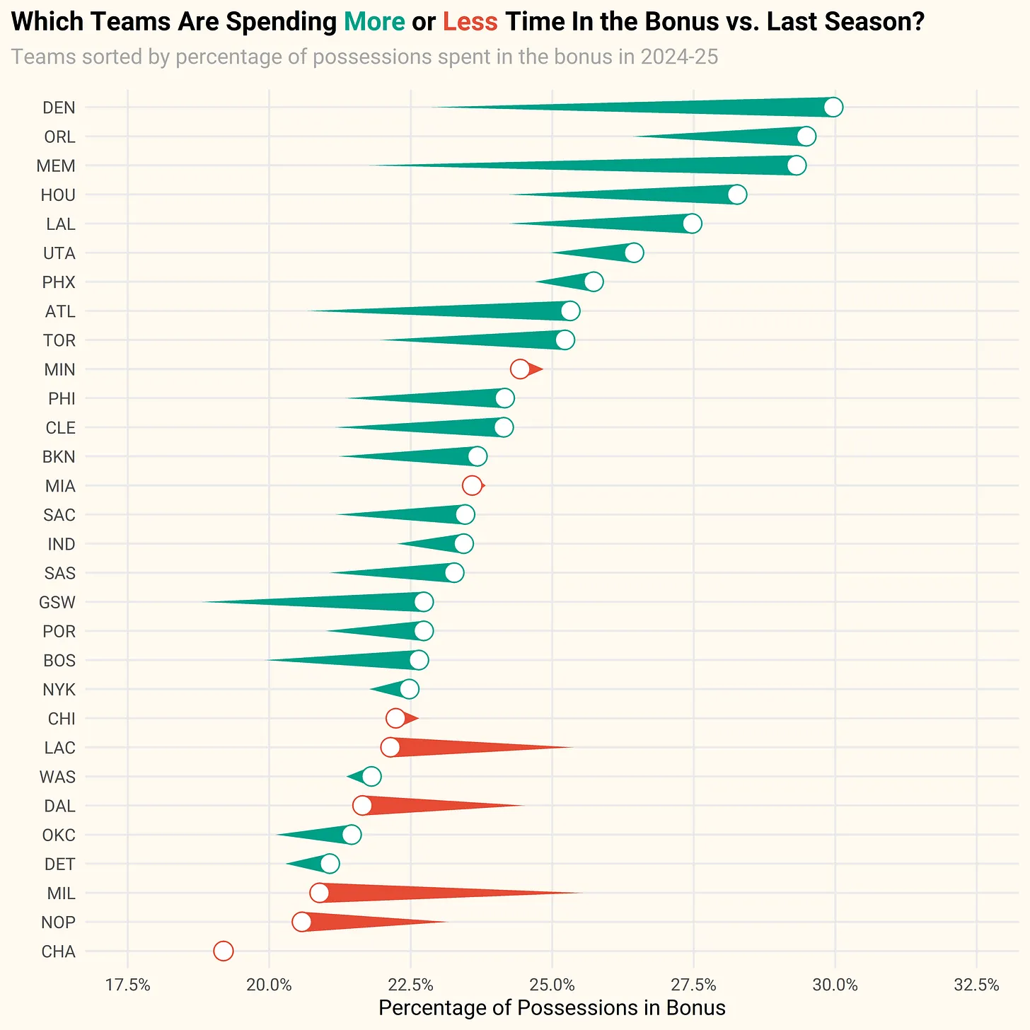
Code
library(tidyverse)
library(jsonlite)
library(ggtext)
library(ggforce)
library(extrafont)

# Custom ggplot2 theme
theme_f5 <- function () {
  theme_minimal(base_size = 9, base_family="Roboto") %+replace%
    theme(
      plot.background = element_rect(fill = 'floralwhite', color = "floralwhite"),
      panel.grid.minor = element_blank(),
      plot.subtitle = element_text(color = 'gray65', hjust = 0, margin=margin(0,0,10,0))
    )
}

# function for getting team data from pbpstats.com
get_data <- function(season) {

  url <- paste0("https://api.pbpstats.com/get-totals/nba?Season=", season, "&SeasonType=Regular%2BSeason&StartType=All&GroupBy=Season&Type=Team")

  x <- fromJSON(url)

  # select variables we care about
  df <- x$multi_row_table_data %>%
    select(TeamAbbreviation, OffPoss, PenaltyOffPoss) %>%
    mutate(bonus_pct = PenaltyOffPoss / OffPoss,
           season = season)

  return(df)

}

# get data from 2023-24 and 2024-25
dat <- map_df(c("2023-24", "2024-25"), get_data)


df <- dat %>%
  # select relevant variables
  select(TeamAbbreviation, bonus_pct, season) %>%
  # pivot data wide
  pivot_wider(names_from = season, values_from = bonus_pct) %>%
  # rename columns
  rename(abbr = TeamAbbreviation,
         bonus_pct_24 = `2023-24`,
         bonus_pct_25 = `2024-25`) %>%
  # create an indicator variable that tells us if a team is spending more or less time in bonus
  mutate(more_less = ifelse(bonus_pct_25 - bonus_pct_24 >= 0, "More Often", "Less Often"),
         # convert abbr to a factor and order data by bonus time in 2024-25
         abbr = as.factor(abbr),
         abbr = fct_reorder(abbr, bonus_pct_25))


p <- df %>%
  ggplot() +
  geom_link(
    aes(x = bonus_pct_24, xend = bonus_pct_25,
        y = abbr, yend = abbr,
        color = more_less, linewidth = after_stat(index)), n = 1000) +
  geom_point(
    aes(x = bonus_pct_25, y = abbr, color = more_less),
    shape = 21,
    fill = "white",
    size = 3.5
  ) +
  scale_color_manual(values = c("#E64B35FF", "#00A087FF")) +
  scale_linewidth(range = c(.01, 4)) +
  scale_x_continuous(limits = c(.175, .325), breaks = seq(0, .35, .025), labels = scales::percent_format(.1)) +
  coord_cartesian(clip = 'off') +
  theme_f5() +
  theme(legend.position = 'none',
        plot.title = element_markdown(size = 11, face = 'bold', family = 'Roboto'),
        plot.title.position = 'plot') +
  labs(
    title = "Which Teams Are Spending
             <span style='color:#00A087FF'>**More**</span> or
             <span style='color:#E64B35FF'>**Less**</span> Time In the Bonus vs. Last Season?",
    subtitle = "Teams sorted by percentage of possessions spent in the bonus in 2024-25",
    x = "Percentage of Possessions in Bonus",
    y = "")

ggsave(plot = p, "bonus_pct_change.png", h = 6, w = 6, dpi = 1000, device = grDevices::png)