![]()
![]()
Charts updated between noon and 1pm ET
Changelog located in NEWS.md
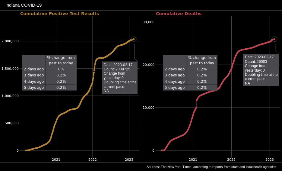
Cumulative Cases and Cumulative Deaths
ABOUT
Each point is the total cases that have accumulated until that date. The lines show the exponential nature of the spread of the virus at the beginning of the epidemic and changes in trend as policy and behavior changes.
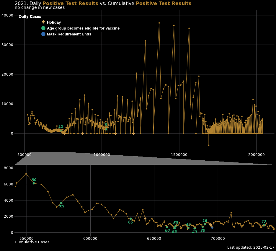
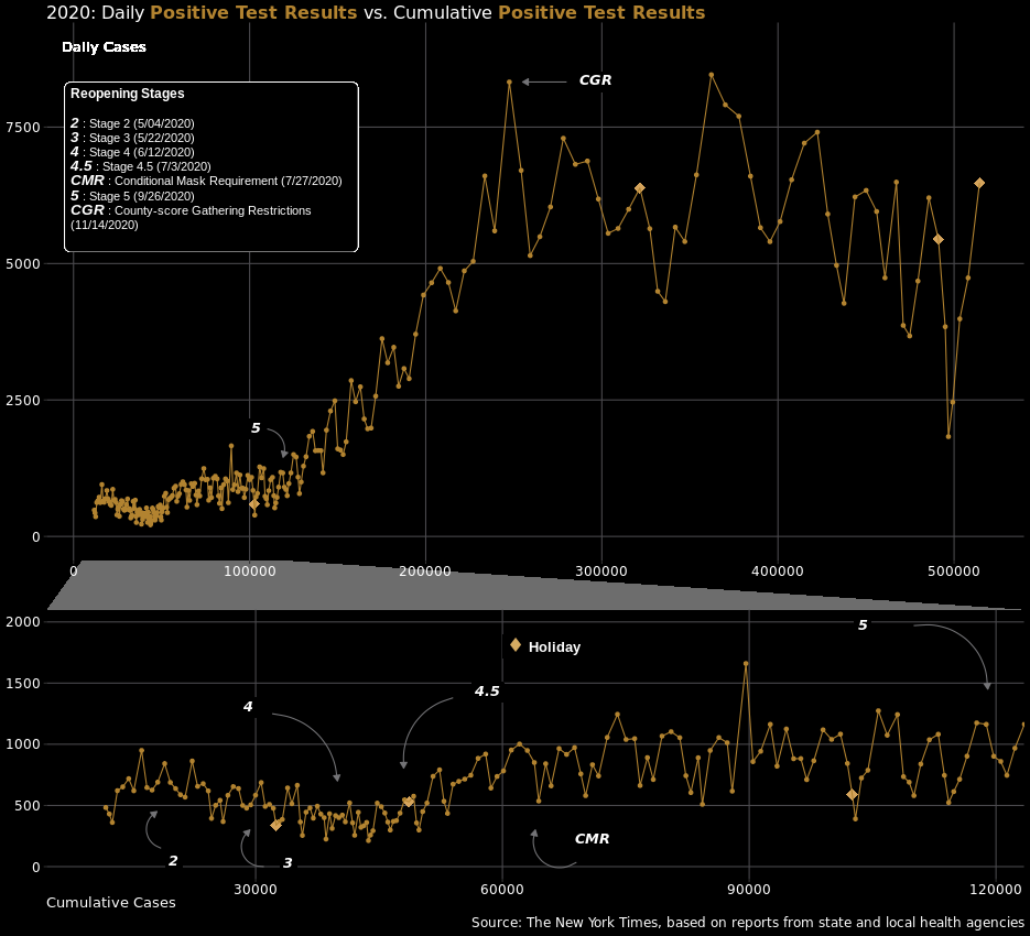
Daily Positive Cases vs Cumulative Cases
ABOUT
This chart shows the number of daily positive cases on the y-axis versus the cumulative total of positive cases on the x-axis.
Below the title, there's a counter that tracks the number of consecutive days where the value of daily cases has increased or decreased.
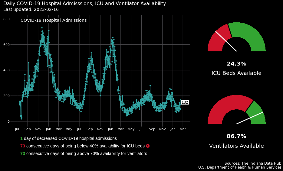
Daily Hospital Admissions, ICU Beds and Ventilator Availability
ABOUT
Even though Governor Holcomb didn't explicitly state the conditions that would necessitate a reversal to a previous stage, he did mention some benchmarks when discussing his guiding principles in his re-opening speech. By negating a few of these, we can infer what some of the snapback conditions might entail.
- An increase for 14 consecutive days in the daily total of those hospitalized for COVID-19.
- The proportion of available ICU beds to total ICU beds being below 40% for 14 consecutive days.
- The proportion of available ventilators to total ventilators being below 70% for 14 consecutive days.
Daily Positive Test Rate
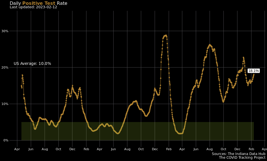
ABOUT
The Positive Test Rate is the number of positive test results divided by the number of tests administered over a period of time.
During a briefing with Gov. Holcomb and Dr. Box, it was pretty clear that they pay close attention to positivity rates and use a seven day window for their calculation along with a target rate of less than 5%.
Indiana Data Hub tends to revise its counts as it continues to collect more data. The rate is calculated over a seven day window, so it should be pretty consistent. Even so, it would be prudent not to assess the last couple rates too confidently as they are likely to change.
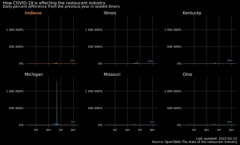
OpenTable Year-Over-Year Seated Diners
ABOUT
OpenTable is a service for reviewing and making reservations at restaurants. On its 'The state of the restaurant industry' page, it provides a couple different datasets that use reservation and food order data to summarize the state of the restaurant industry regionally by city, state, and country.
The dataset being visualized uses reservation data from a sample of restaurants across Indiana. Each data point is the median daily percent difference in seated diners from the previous year to this year. So, if the day is the first Tuesday in June 2020, then the comparison is between that day and the first Tuesday of June 2019.
Example
At stages two and three, restaurants are allowed to reopen at 50% capacity. So, if a restaurant was fully-booked on a specific day in 2019 and fully booked on that same day in 2020, then we'd still see a 50% difference in seated diners for that one restaurant during stages two and three. In stage four, restaurants can open to 75% capacity, so in the same scenario above, the fully-booked, percent difference benchmark becomes 25%. Numbers around these benchmarks could indicate the level at which hoosiers are responding after each reopening stage.For comparison, the horizontal dashed line represents Indiana's current percent difference.
Google Maps Mobility Indices
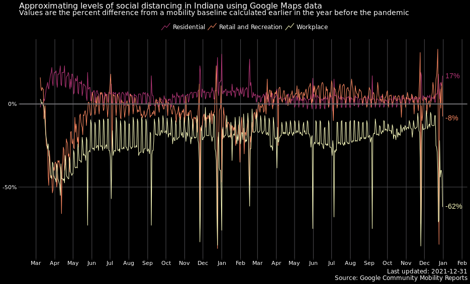
ABOUT
Google like Apple has released some of the data it collects from its Maps app that it uses to produce Community Mobility Reports and product recommendations.
From the 'About this Data' section in the report:
- These reports show how visits and length of stay at different places change compared to a baseline.
- The baseline is the median value, for the corresponding day of the week, during the 5-week period Jan 3–Feb 6, 2020.
Regional Cumulative Deaths and Cumulative Positive Cases
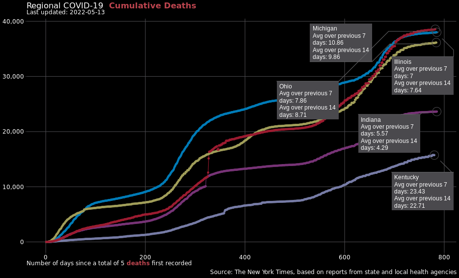
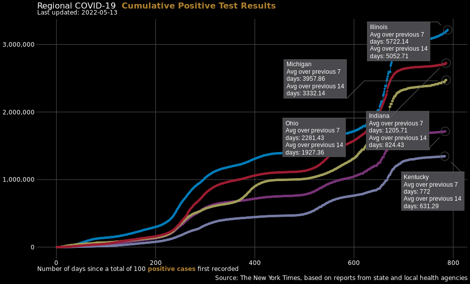
ABOUT
7-day averages greater than 14 day averages indicate an increasing trend of positive cases or deaths.7-day averages less than 14 day averages indicate a decreasing trend in positive cases or deaths.
Estimated Change in County Positive Cases
ABOUT
The top 20 counties according to estimated average percent change are shown. Counties at the top are experiencing the highest average growth rates in positive test results.
The average percent changes are estimated using county data in a log-linear model in order to capture exponential growth if an outbreak occurs.
Effective Reproductive Number
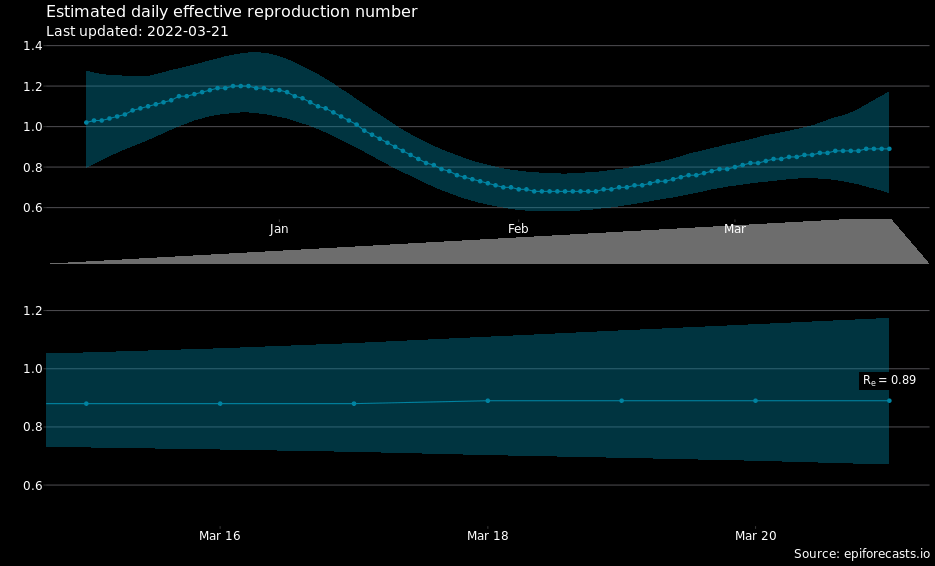
ABOUT
The instantaneous effective reproduction number, Re is an estimate of the average number of people that an infected person is spreading the virus to for that time window.- Estimates slighly lower than 1 indicate that the spread of the virus is slowly decreasing.
- Estimates slightly larger than 1 indicate a slowly increasing spread of the virus.
- Estimates of 2 or greater mean the virus is spreading rapidly.
Example
a Re of 0.5 would mean that on average, if 4 people had the virus, those 4 people would only spread the virus to 2 other people. A Re under 1 results in decreasing amounts of daily cases. The lower the Re the faster the amount of daily cases will decrease.The shaded area shows the 80% credible interval where the true value is likely to be.
Further details on this metric can be found at a research site set-up by South Western Sydney Clinical School and the Centre for Big Data Research in Health.
Excess Deaths
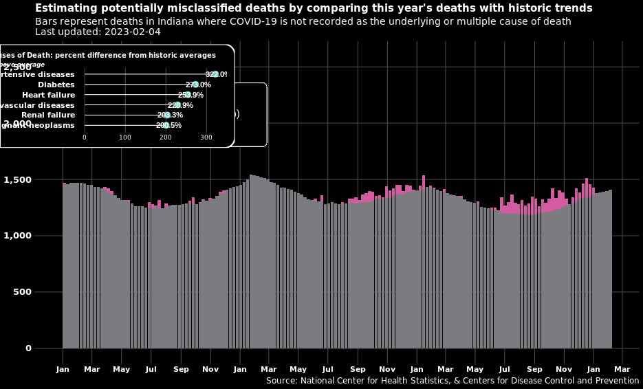
ABOUT
The CDC's model uses data from 2015 to present to calculate estimates for weekly death counts. 'Excess deaths' is defined as the difference between these estimates and the actual reported number of deaths. Some of the bars shown have no excess deaths calculated for that week. This means that either that the number of actual deaths equals the model's estimated number of deaths (gray bars) for that week or that number of actual deaths is less than the model's estimated number of deaths. The instances where it is less than is the reason why that Excess Deaths + Expected Deaths ≠ Non-COVID Classified Deaths in the Totals box.
A portion of these excess deaths could be misclassified COVID-19 deaths, 'or potentially could be indirectly related to COVID-19 (e.g., deaths from other causes occurring in the context of health care shortages or overburdened health care systems).'
From the CDC site regarding the Causes-of-deaths data, 'These causes were selected based on analyses of comorbid conditions reported on death certificates where COVID-19 was listed as a cause of death. Deaths with an underlying cause of death of COVID-19 are not included in these estimates of deaths due to other causes, but deaths where COVID-19 appeared on the death certificate as a multiple cause of death may be included in the cause-specific estimates.'